How Graphic Designer Saul Bass Revolutionized the Movie Poster

Saul Bass helped define the visual culture of the 1950s—most notably through creating memorable movie posters that are still resonant today.
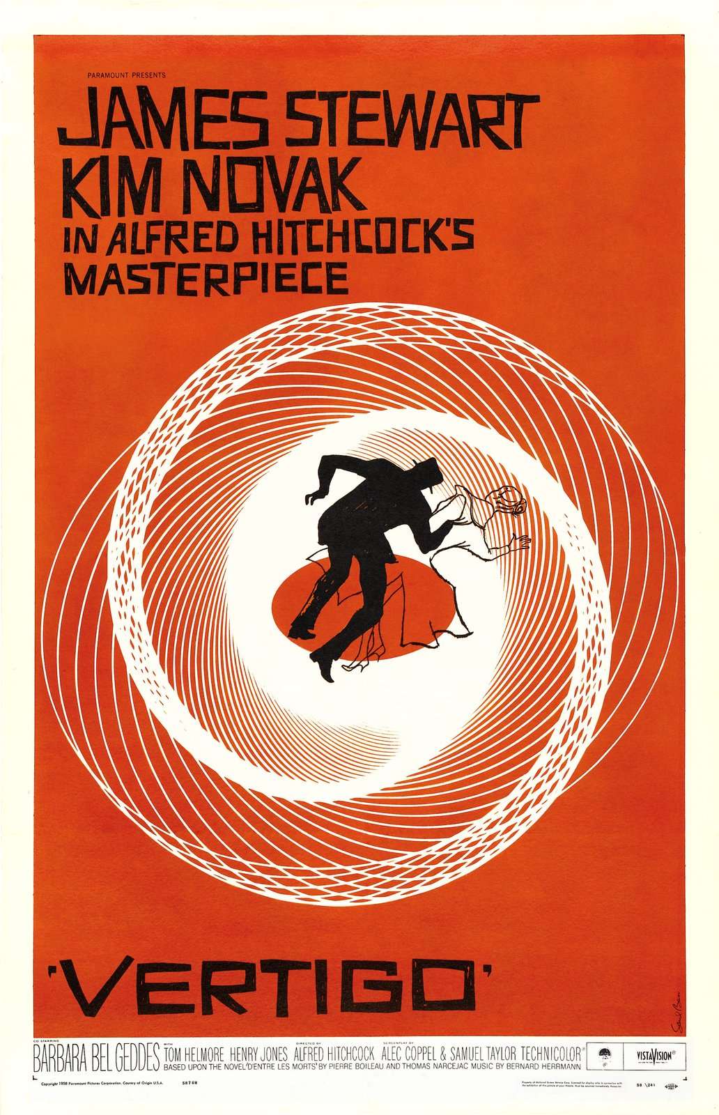
It might be the most memorable film poster of all time. Striking graphics, striking color contrast, and minimalism challenged everything we knew about movie marketing, making the Vertigo poster a pivotal moment in graphic design. For that, we can thank Saul Bass. 

He was a filmmaker, motion picture title sequence designer, and iconic logo creator—of Girl Scouts and Kleenex logo fame—yet his midcentury film poster designs would define his legacy. From a New York, Bauhaus-influenced education to working alongside the ranks of Alfred Hitchcock, Stanley Kubrick, and Martin Scorsese, Bass boasts a 40-year oeuvre that contains films spanning from Saint Joan to The Shining

What earned Bass his acclaim, though, was his spirited way of distilling an entire story into one, singular image. He was known for saying, “I just want to make beautiful things, even if nobody cares.” Well, we certaintly do: here, we spotlight some of his seminal works from the 1950s capturing the visually stunning intersection of cinema and design.

Anatomy of a Murder, 1959
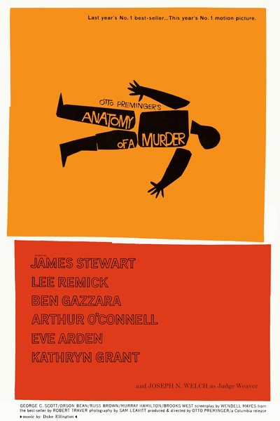
This film pushed boundaries, and so did the art. While most film posters spotlight the stars, Bass puts the attention on the victim. His take on the 1959 courtroom drama draws parallels between the anatomy of the case and a human, symbolic of the myriad components: the characters, the legal system, ethics and morals. It’s both simple and complex—as Bass did so well. The marketing campaign comprises dozens of iterations of this double—or even triple—entendres on everything from envelopes to billboards, newspaper ads, and album covers. How many ways are there to examine this story? For Bass, plenty.

Love in the Afternoon, 1957  
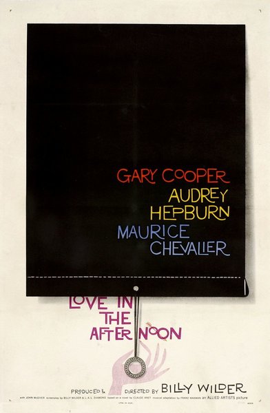
Movie Poster Allied Artists

Is there symbolism in the large, black void of the curtain? Or how about the delicate drape closure? Interpretations aside, this artwork for the romantic comedy Love in the Afternoon captures the brilliance of Bass’s thinking and how a pared-down palette alone can revive the thrill of watching a movie. This poster also shines a light on his font skills—the kinetic-meets-constructivism typography is a Bass signature, and makes his posters instantly recognizable.

Vertigo, 1958 
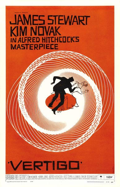
Saul Bass Poster Archive

See the full story on Dwell.com: How Graphic Designer Saul Bass Revolutionized the Movie Poster
Related stories:

  • Dwell 24: The Best Emerging Designers of 2019
  • The Design Life: What Inspires This Year’s Dwell 24?
  • Dwell 24: Wendy Andreu

Similar Posts

  • Miner Road

    The clients are a couple of environmental scientists who, along with their two sons, relocated from the Oakland Hills to the warmer climate of Orinda. Their commitment to sustainability, including a request for net-zero energy performance annually, was evident in their thinking throughout the design process. A three-bedroom program began as a remodel of a 1954 ranch house at the foot of a hill next to a seasonal creek.  After finding the existing structure and soils to be unsuitable, the direction settled on reusing the existing footprint under the shade of a Valley Oak that had grown up close to the original house. The surviving portion of the original house is the fireplace which was wrapped in concrete and utilized for structural support. This made additional grading unnecessary and allowed the new house to maintain the same intimate relation to the old oak.  The family desired an open living layout that connected directly to the landscape. A mezzanine plan evolved with a double height family space nested with a master bedroom and study stacked above the kitchen and nook. A screened pacing deck for long phone calls shades the upper level from afternoon summer sun. Downstairs, secondary bedrooms along an extendable hallway, wrap an outdoor dining area situated between the kitchen and family room.  Construction materials and methods were considered in balance between first and lifecycle costs. The Corten steel rain screen for the exterior skin and interior wood were chosen to take advantage of zero annual maintenance cost and a shotcrete foundation allowed formwork to be repurposed for wood framing.  Single use material selections such as the Corten steel and shotcrete foundation reduced complexity in detailing and labor costs allowing a larger portion of the budget to be reallocated for upgraded mechanical, insulation, and glazing systems. The same attitude for interior finishes produced acoustically insulated, unfinished oak ceilings and walls. The sum total of the limited and landscape-driven materials presents a relaxed and quiet built environment that allows the senses to focus on the natural environment. A haptic connection to the rhythms of our planet is evident.  A 14-gauge Corten rain screen provides a no-maintenance skin. High levels of insulation and glazing efficiency reduce heating and cooling loads. An 8.1kW photovoltaic system provides on-site renewable energy and produced more electrical energy than the house used the first year. Rainwater is collected via a waterfall from the roof at the end of the hallway. Buried tanks store water for use in toilets and laundry. Greywater is collected separately and reused for irrigation. Electronically commutated motors and variable speed heat pumps are used to further limit energy use and control heating and cooling. An energy recovery ventilator is used to provide fresh air.