Historic Mid-Century Modern Home in Austin Gets a Sensible, Stylish New Extension

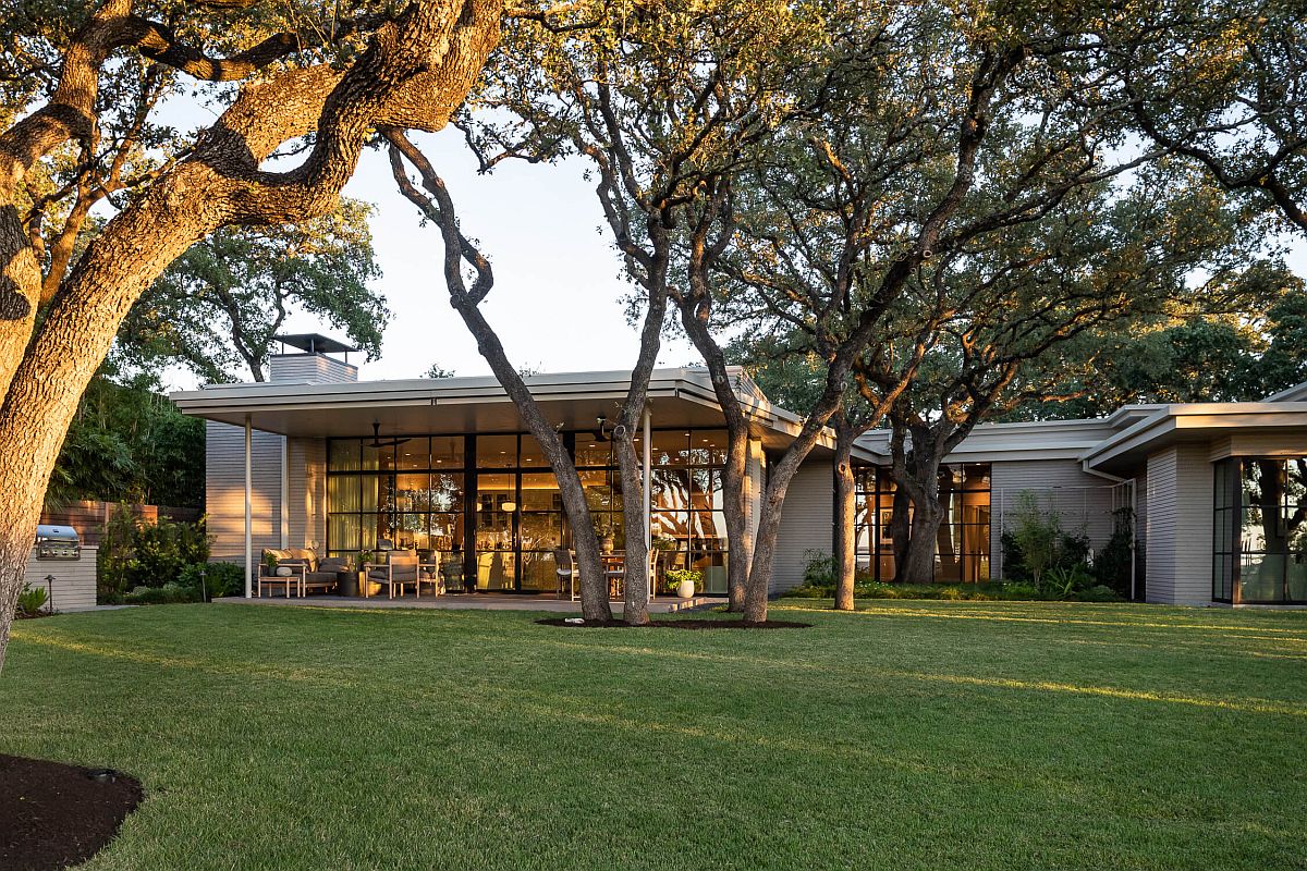
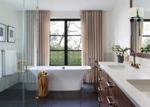
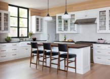
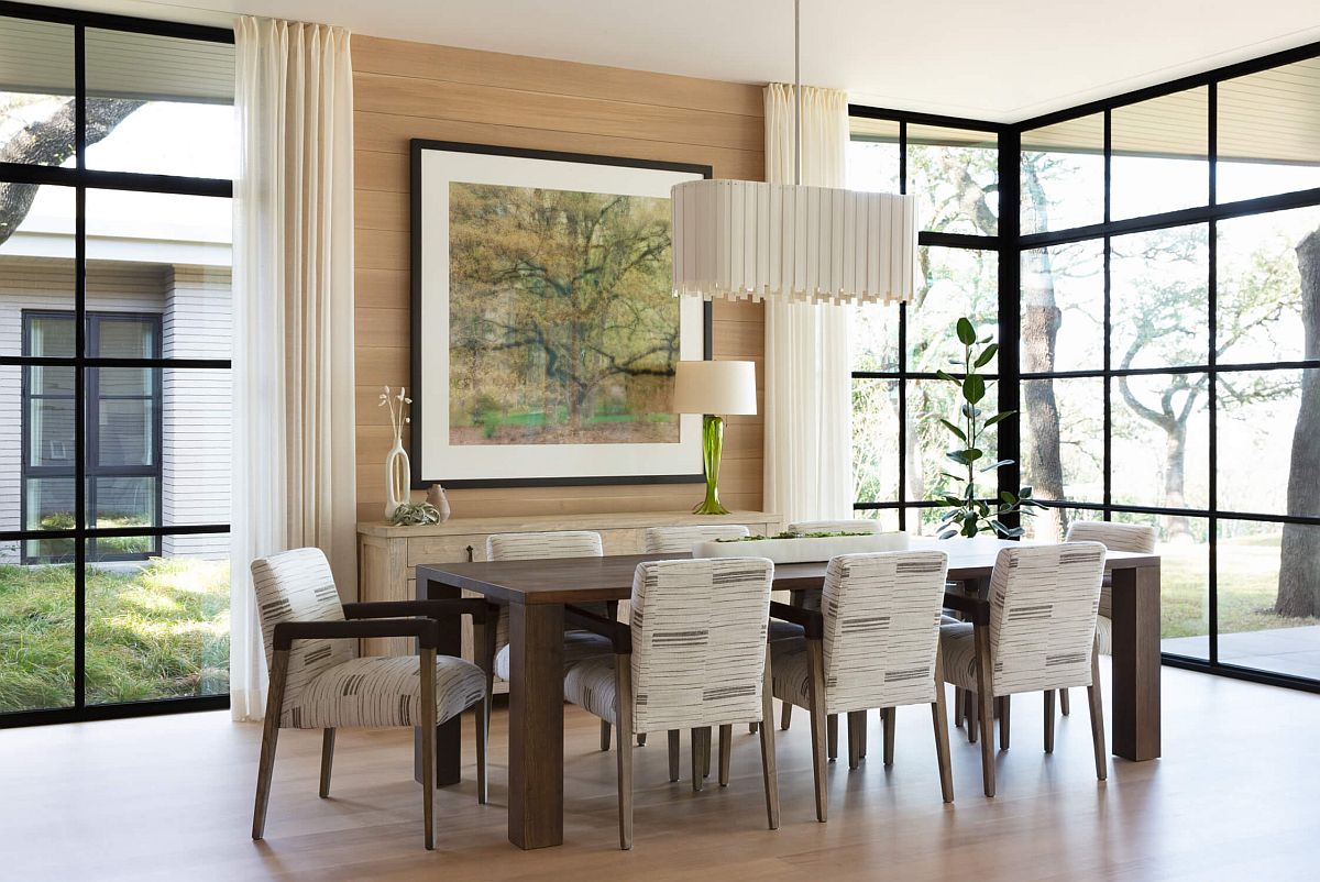
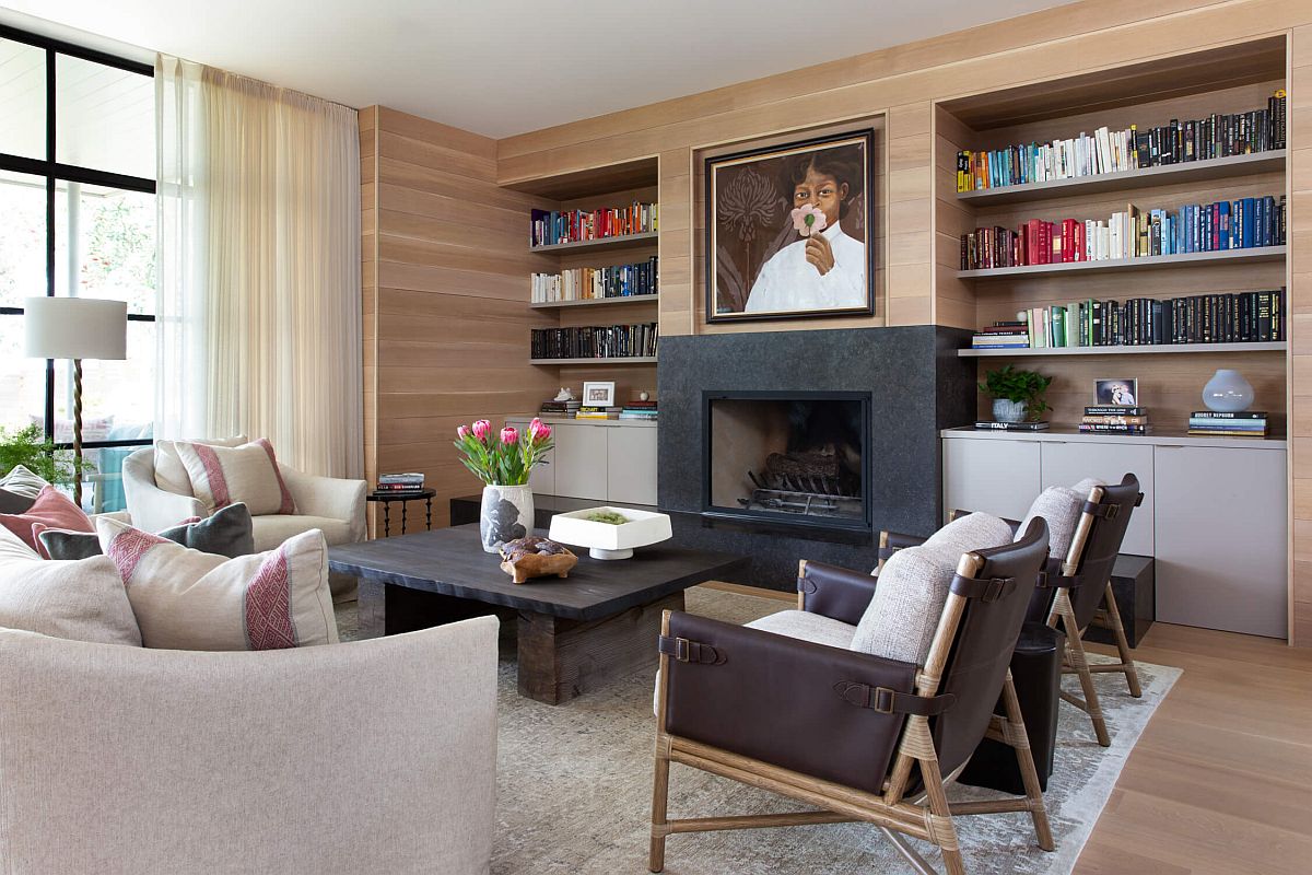
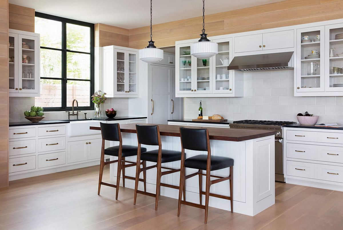
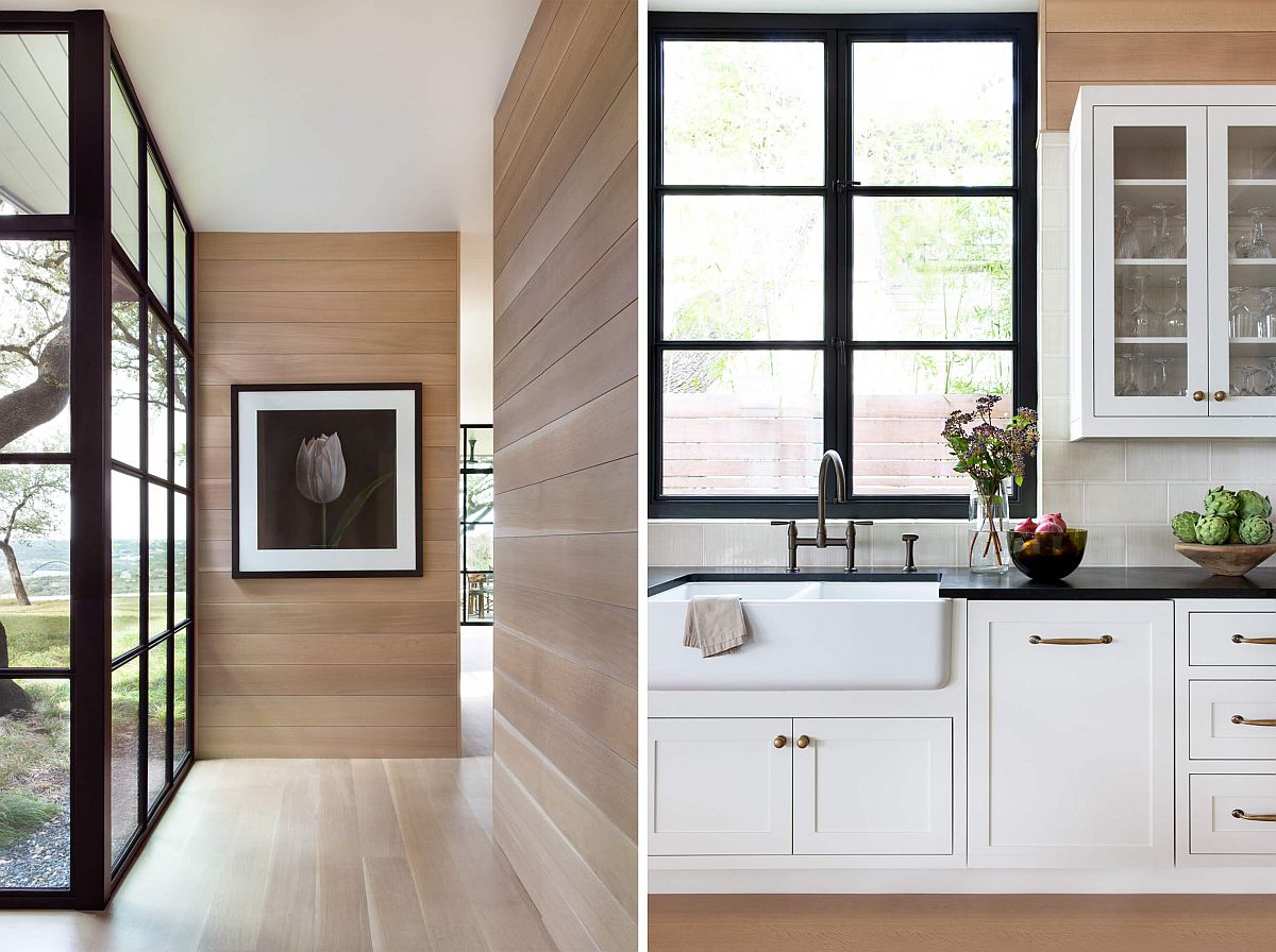
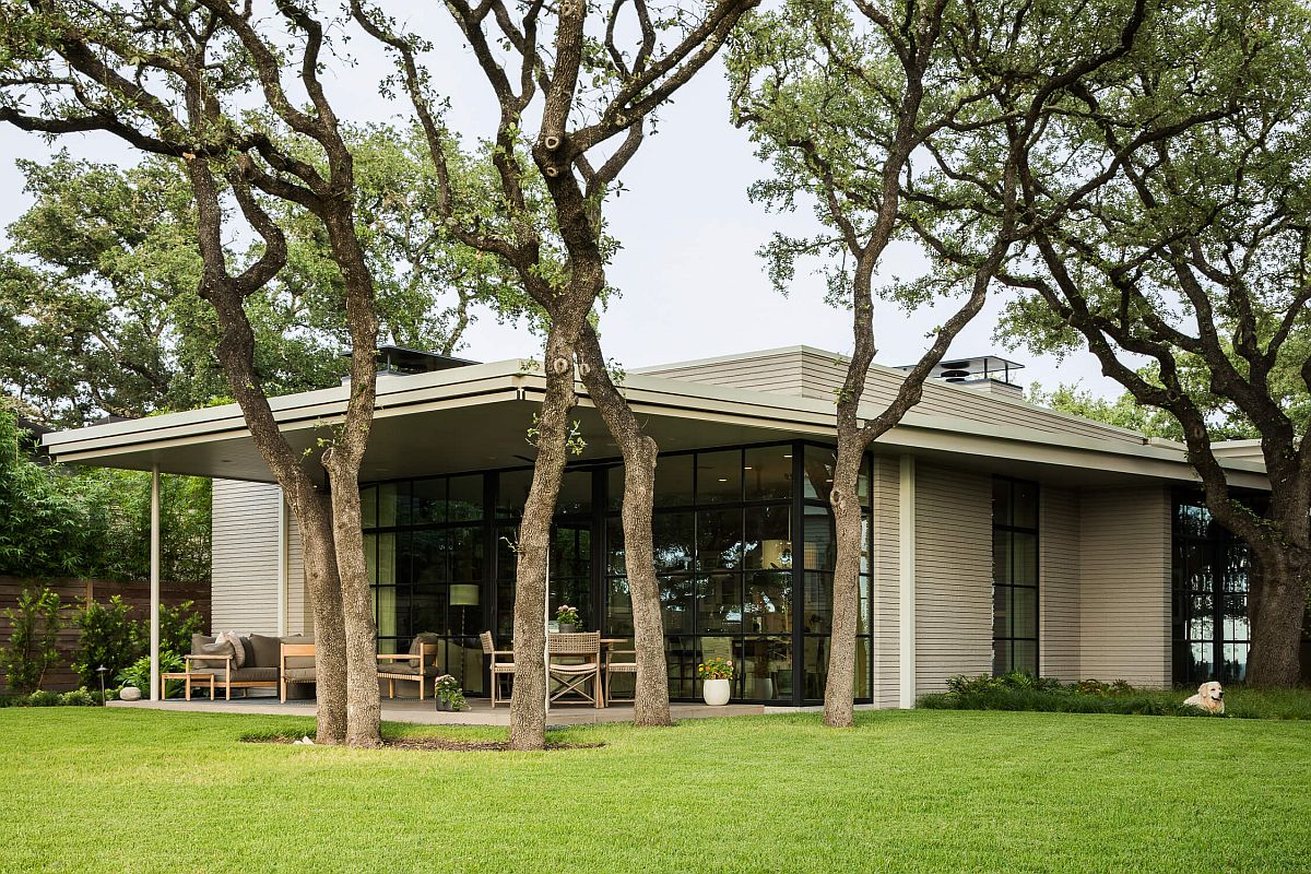
A historic mid-century home built by Howard R. Barr in the 1950’s, the Ridge Oak Residence in Austin, Texas was given a modern and more spacious makeover by Clayton & Little. It is the street façade of the house that has been largely untouched with the rear extension and the interior adding freshness to the aging residence. Maintaining original design aesthetics of the house, its new interior feels contemporary and classic at the same time with oak shiplap wrapping ushering in warmth to the living space, kitchen and dining area. The total living area of the home was extended from 2,176 square feet to 3,696 square feet with a new generous living area, kitchen, dining area and guest spaces completely revamping the floor plan.

Root system of existing flora on the site was preserved while extending the house


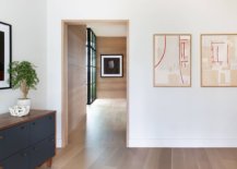
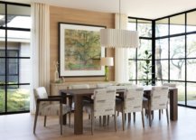
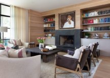
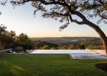
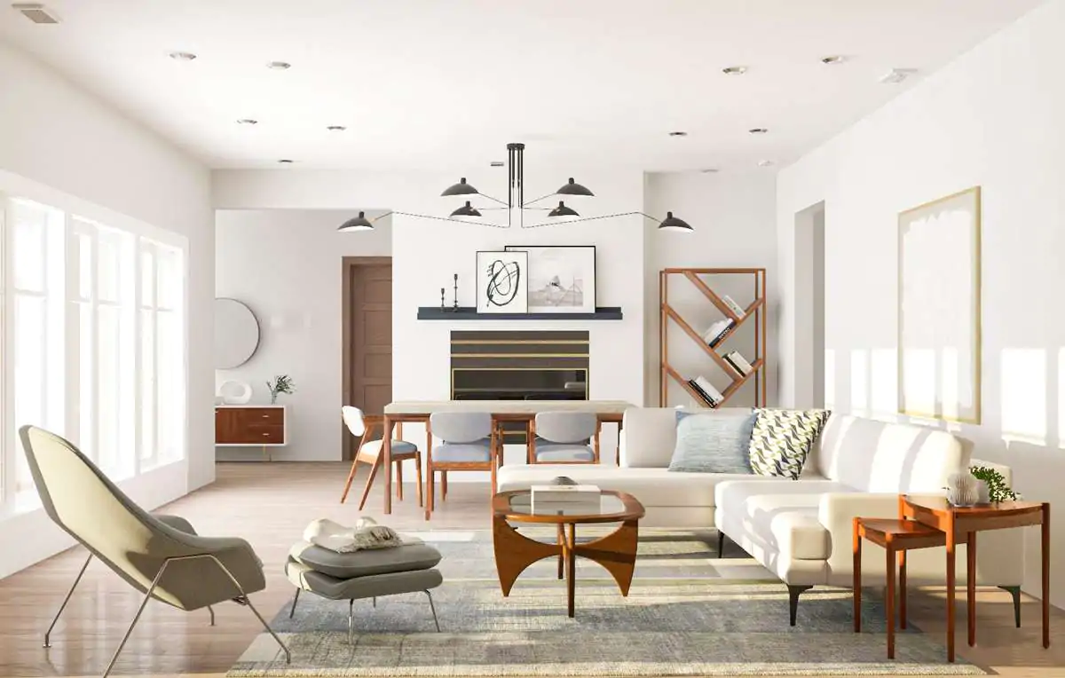
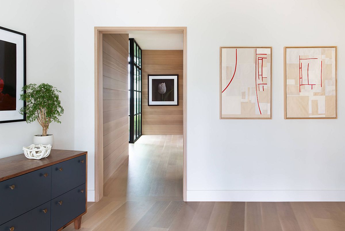
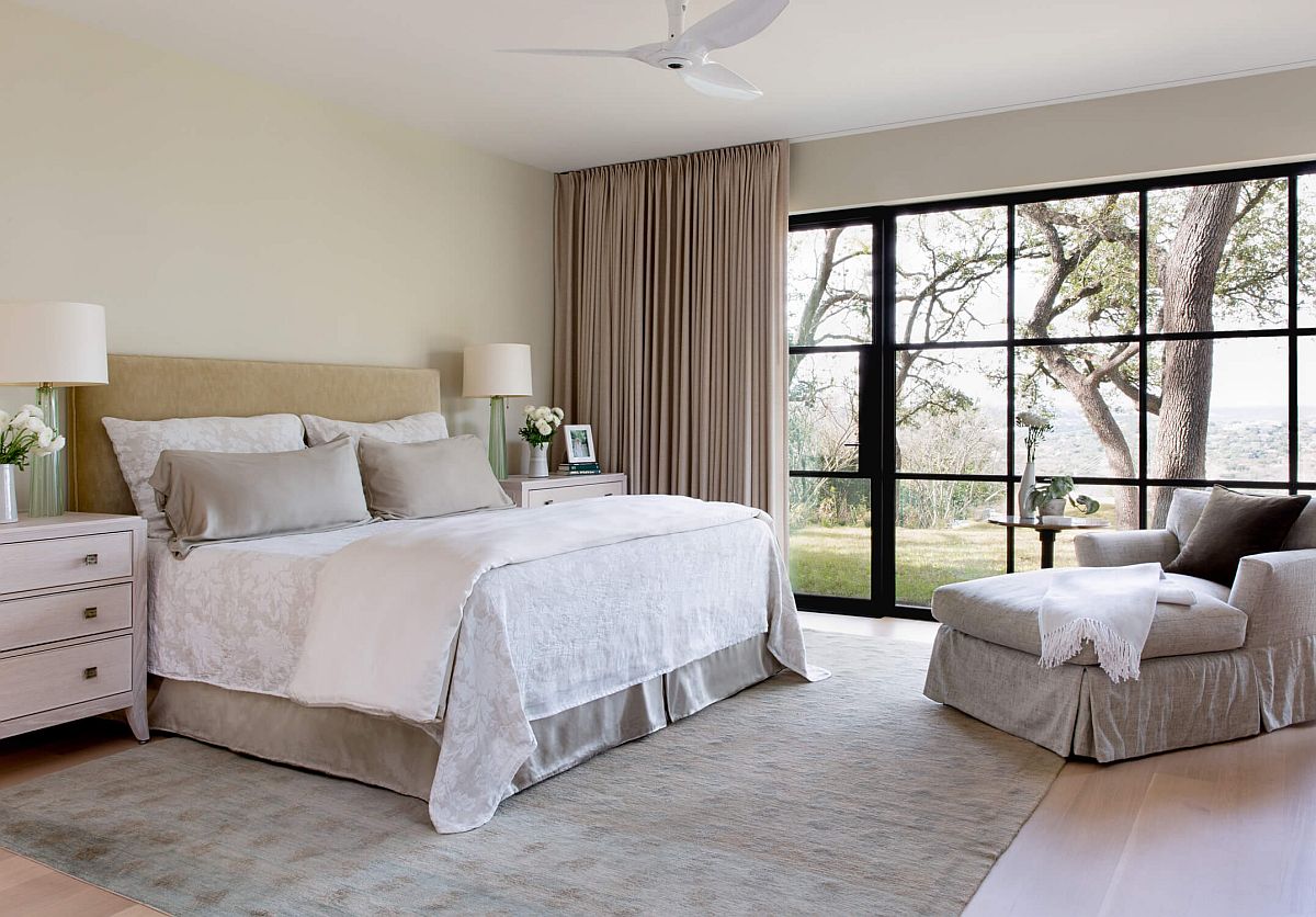
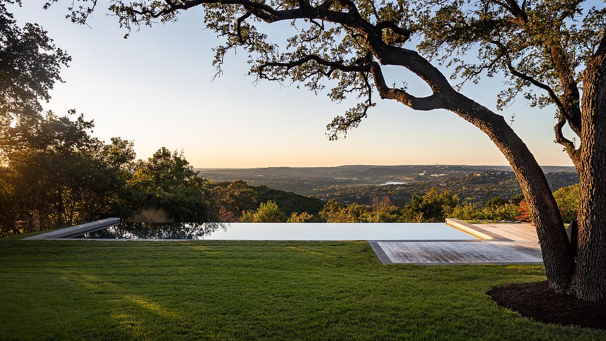
Inside the living area, beige, neutral color and contemporary décor create a relaxing and contemporary mood even a large, framed glass windows connect the interior with the outdoors. Design of the house and the extension also take into account root system of existing oak trees on the lot and also ensure that nature and modernity find space next to one another. In the bedrooms, it is a neutral color scheme that sets the mood with the scenery outside providing a dynamic backdrop. A perfect makeover that combines different eras! [Photography: Molly Culver / Jake Holt]

Ridge Oak Residence in Austin with a historic street facade
Spacious and open new interiors of the Austin home with oak and white backdrop
Black-framed glass windows connect the large dining room with the landscape outside
Charming woodsy walls, lovely sue of beige and a large bookshelf create this wonderful living area
Closer look at the ingenious lighting fixtures used inside the Texas home
Dark framed glass windows turn the tree outside into a work of art that changes with changing seasons!

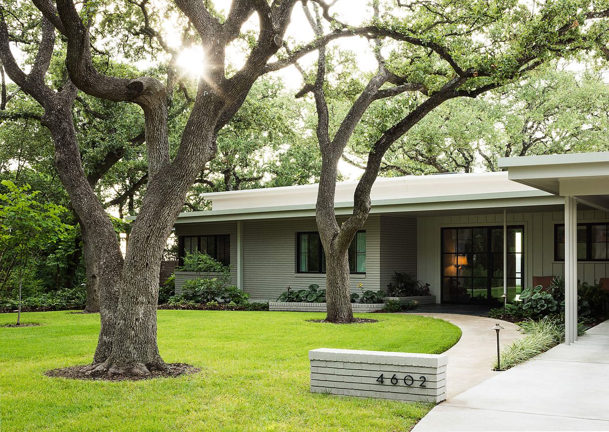
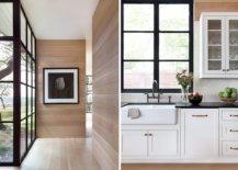
Clayton & Little took care to respect Barr’s original design by maintaining the brick, wood siding, and punched opening proportions at the front façade. The addition maintains 10 foot ceilings, unusual and innovative in 1950, along with the thin roof profile…

Decorating the bedroom with neutrals even as the oak tree outside adds contrast and color
Large modern kitchen in white and wood feels just inviting!
Oak shiplap wrapping in the main interior gives it warm and elegant modern style
Floor-to-ceiling steel windows connect the new interior with the large rear garden and the oak tree outside
Infinity edge pool and view of Austin’s iconic Pennybacker Bridge at the Ridge Oak Residence

You’re reading Historic Mid-Century Modern Home in Austin Gets a Sensible, Stylish New Extension, originally posted on Decoist. If you enjoyed this post, be sure to follow Decoist on Twitter, Facebook and Pinterest.

Similar Posts

  • Maullin Lodge

    This lodge is a 120m2 house located in a rural scene in a southern region of Chile. The brief was to design a house with two bedrooms and two bathrooms with a main shared space, interpreting an old small traditional southern Chilean dwelling. The challenge of the proposal was to get that traditional southern look, which implies very opaque facades, but with a full translucent side where the landscape and light can get inside the building, creating its own private world. The house is placed between a forest of native trees, giving its back to the main street. So, the house is oriented to the north and west to get the most of sunlight, which this south down is much appreciated. The concept of the design is organized based on 3 contrast between old and new:
    1- Removing non-structural walls and floors: the main structural shape and volume are maintained the same as the old traditional house, but the interior is liberated from any non-structural dividing element, which helped to create a clean and continuous space.
    2- Concentrating the apertures: The main source of light is the north façade, keeping the other free opaque as a traditional southern house would have, so the proportion of void and mass was not lost.
    3- Material contrast: Big floor to ceiling windows in contrast to recycled traditional timber shingles, an evident contrast between old and new. The distribution of the house is developed in an almost square plan, divided into three volumes:
    The main one has the public areas of the house: kitchen, dining room, sitting room and mezzanine.
    The east one, the widest, has sleeping rooms and bathrooms with the main access of the house.
    And the west one is 1.5m wide acting as a corridor and informal dining room adjacent to the public areas of the main volume. The mezzanine is an opportunity to use the roof space, with a lot of light and natural heating, having control over the main space.

  • Clerkenwell Close

    15 Clerkenwell Close is a mixed-use six storey building with a stone facade. Architect: Amin Taha Architects. Photography: Agnese Sanvito.