8 Postmodern Buildings That Proclaim “Less Is a Bore”

From a cat-shaped kindergarten to a robot-like skyscraper, these postmodern buildings have a hearty sense of humor.

“Less is a bore,” quipped American architect Robert Venturi in answer to Mies van der Rohe’s famous epigram. Venturi’s pronouncement is also the subtitle of a new book from Phaidon, Postmodern Architecture, a collection of more than 200 postmodern buildings the world over that wield color, ornament, and form in disarming, delightful ways. Below, we serve up our favorite examples that champion maximalism.

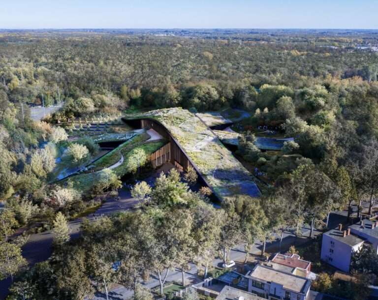
Studio Mutt: The Ordnance Pavilion, The Lake District, Cumbria, England, UK, 2018.

© Studio MUTT / Photograph by Steven Barber

I am for richness of meaning rather than clarity of meaning; for the implicit function as well as the explicit function. I prefer “both—and” to “either—or,” black and white, and sometimes gray, to black or white. A valid architecture evokes many levels of meaning and combinations of focus; its space and its elements become readable and workable in several ways at once.

—Robert Venturi

Camille Walala: Industry City Mural, Brooklyn, New York, USA, 2018.

© industry City

Kengo Kuma: M2 Building, Tokyo, Japan, 1991. 

© wakiiii

See the full story on Dwell.com: 8 Postmodern Buildings That Proclaim “Less Is a Bore”
Related stories:

  • In Living Color: 6 Tiny Homes for Every Hue of the Rainbow
  • 5 Fantastic Home Renovations in California That Cost Less Than $200K
  • Take a Peek at These 30 Architects’ Private Homes

Similar Posts

  • San Antonio House

    The trapezoidal tracing of the property is what defined the construction of this house into three clearly settled volumes. Vegetation also plays a protagonist role in the design of this house, both outdoors and indoors. The exterior trees enclose the house generating distinct tons of shades and colours during the different seasons of the year. Within the interior, the unruly green vegetation, contrasts with the stone floors and solid walls, reaching a perfect sense of balance. The entrance, a double height lobby that creates contrasting sensations and distinct visual ending points originated by water mirrors, light shafts, a tree and a staircase. The walls that shape this area, divide the spaces into private and public areas. The ground floor, is organized into two blocks each with a different purpose: The left side, is a white solid cube that integrates the study and the master bedroom and is separated from the other block by a water mirror and a yard that generates the desired privacy, peace and tranquility. The right side, the social area, is a rectangle closed to the west by a rigid wall and opened towards the interior of the house through large floor to ceiling glass walls, giving sober transparency to the yard with views to the garden and the central courtyard. The different angles within the construction achieve visual ending points with great character, as well as, enhancing the sensations provoked by the pure whites that evolve into mixed tones as the day and the seasons go by.

  • Easter Decor Ideas for Design Lovers

    Easter is around the corner, and the spring collections have been revealed! There are so many beautiful color palettes to celebrate this time of year, and Easter gives us a chance to enjoy the wonder of spring while spending time with the people we care about. Design lovers will be happy to know that there’s […]

    You’re reading Easter Decor Ideas for Design Lovers, originally posted on Decoist. If you enjoyed this post, be sure to follow Decoist on Twitter, Facebook and Pinterest.