After Los Angeles native Aaron Leshtz earned his degree in architecture from the University of Southern California, he accepted a position at Studio Sofield in New York City. It was more than a job, but a pivotal period that left a lasting impression. “Stylistically it was very different from what I had done before or even studied in school,” says Leshtz. “The work was varied, thoughtful, and always emphasized craft and materiality over anything else.”
Under the mentorship of world-class designers who provided an array of professional experiences, Leshtz learned the importance of detail, and gained an invaluable understanding of the difference between style and quality.

Aaron Leshtz of AAHA Studio Photo: Trina Severson
In 2016, Leshtz and his wife Harper Halprin founded AAHA Studio, noted for a more personal, concierge-style approach. The duo wholeheartedly offers guidance and support during each phase of a project. Not only do they realize each unique vision, they treat clients like an extension of their own family.
Always appreciative of woodwork, Leshtz savors the rare occasions he is able to create objects and furniture by hand. It’s not always easy with a packed schedule, filled with soccer practices to attend and dinners to prepare. The architect describes his four kids as built-in “off” switches who help him stay grounded. They remind him to switch gears and to disconnect from his ever-present devices, at least for a few hours a day.
In his career, like life, Leshtz relies on collaboration to ensure the best possible outcome. “Architecture is not a solo endeavor,” he notes. “There are so many parties involved in getting even a simple home designed, engineered, constructed, and furnished. When you have a team in place that has a shared goal, and everyone is rowing in the same direction, it’s incredibly fulfilling.”
Today, Aaron Leshtz joins us for Friday Five!
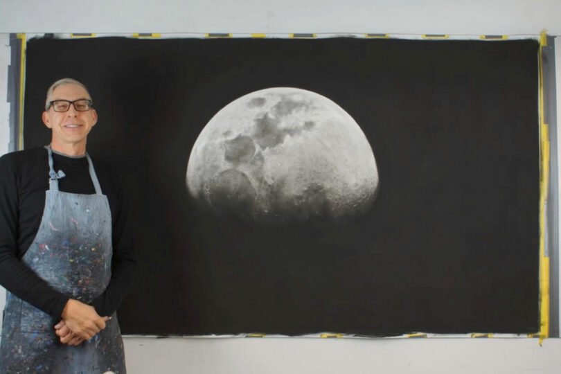
Photo: Courtesy Eric Nash
A few years ago, Harper and I were wandering a gallery in Palm Springs and came across this charcoal piece by Eric Nash. We were immediately struck by the size of the piece and the deep richness of the blacks. At first glance, it seems quite simple but the closer you get, the more detail emerges, and the hand of the artist becomes clear. I love the idea of marking a moment in time (each piece in the series is the view of the moon from a place and time) with something as omnipresent as the moon. It’s also remarkable to think about the diligence and patience pieces like this take to create. I’m still eagerly waiting for one of the Moon Series to become available…
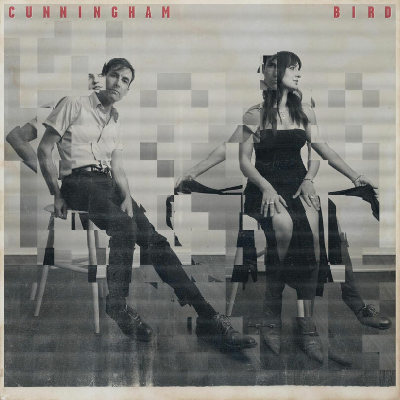
Photo: Aaron Leshtz
I’ve been a fan of Andrew Bird and his unique and truly delightful music since college. He’s a prolific collaborator and his most recent endeavor is nothing short of extraordinary. It’s a front-to-back cover of the out-of-print Buckingham Nicks album that pre-dated Fleetwood Mac. Trading vocals and guitars with the folk singer Madison Cunningham, they reinvent the album in a truly dramatic way that has been on heavy repeat in my house since it was released.
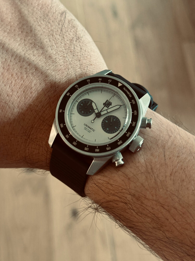
Photo: Aaron Leshtz
I happen to run in a circle of watch nerds and came across Unimatic Watches through a friend. They are modern watchmakers out of Milan founded by two friends who studied design at the Politecnico (where we coincidentally took classes during our year abroad). Each timepiece has a beautiful simplicity to it without being bland or boring. They have a satisfying weight and heft to them that feels incredibly well crafted. Their classic collection is stellar and you can’t go wrong with the UC3 chronometer, but it’s their limited edition collaborations that they really have some fun with.

Photo: Aaron Leshtz
4. Dodger Stadium
Growing up in Los Angeles, Dodger games and visits to Dodger Stadium are a staple of childhood. Once you get over the traffic apocalypse that it takes to get there, you’re met with gorgeous views from all sides. At certain times of the evening, the sunsets over and through the accordion-style roof are just perfect. The building has undergone many renovations over the years, but the park still has maintained the slightly-googie, mid-century architecture. If you’re fortunate enough to find yourself there (rooting for the Dodgers of course), take a peek at some of the concrete columns for the beautifully hand-painted wayfinding signage denoting each seating section.
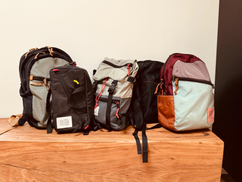
Photo: Aaron Leshtz
I have a real weakness for a good bag. Topo Designs is a bag and apparel company out of Colorado that makes really well constructed backpacks, travel bags, and other outdoor accessories. I’ve used their backpacks as my daily carry for years and absolutely love them. There are lots of fun colorways and practical shapes. I’m always looking for an excuse to buy another one – but they hold up so well that you never need one. We also used one as our diaper bag when our kids were younger and my oldest daughter uses one for school now as well – We’re a fully indoctrinated Topo family.
Works by Aaron Leshtz and AAHA Studio:
Rendering: Courtesy of AAHA Studio
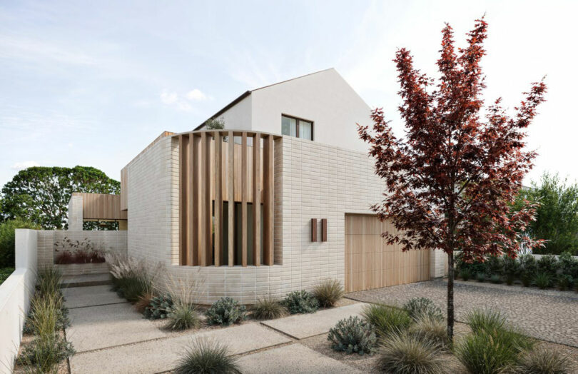
Case Study 2.0 – The Courtyard House
Born from the devastation of the Palisades fires, Case Study 2.0 reimagines post-disaster housing with purpose, resilience, and beauty. Inspired by the original Case Study program, this initiative blends fire-resistant design, sustainable practices, and efficient construction to help families rebuild faster and smarter. The Courtyard House challenges conventional lot layouts by introducing a flexible, C-shaped plan that orients all ground-floor rooms around a central outdoor space. This design not only enhances indoor-outdoor living – a hallmark of Southern California life – but also increases defensible space to mitigate fire risk. Prefabricated elements like CLT panels and open-web trusses further streamline construction, lowering costs and build time. Designed for evolving families and communities, the Courtyard House offers a modern, adaptable home rooted in resilience and connection.
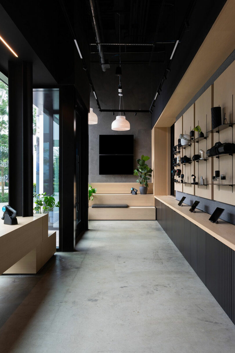
Photo: Amy Bartlam
Therabody Reset, Manhattan Beach, CA
The retail and waiting lounge for Therabody Reset. Custom millwork and retail displays line the glass façade giving the passing public a view of the product and service offerings.
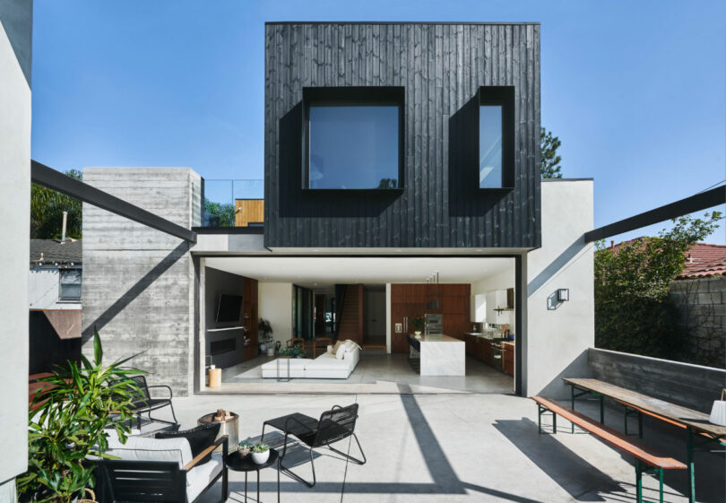
Photo: Liz Carababas
Kansas Avenue Residence, Santa Monica, CA
A ground-up residence for a family of five in Santa Monica. The façade is clad with thermally-modified ash with a charred finish. A 22’ La Cantina door pockets neatly away into the poured concrete pillar.
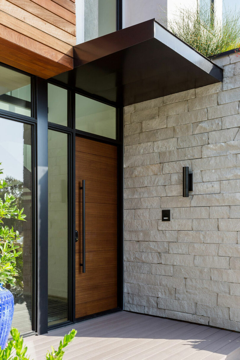
Photo: Amy Bartlam
Pickford Residence, Culver City, CA
The contrast of materials at the entryway for the new, ground-up residence of a growing family. The Western Windows entry system abuts the corner of the guest room clad in Heartland split-face stone. An ipe-adorned reading nook hangs above.
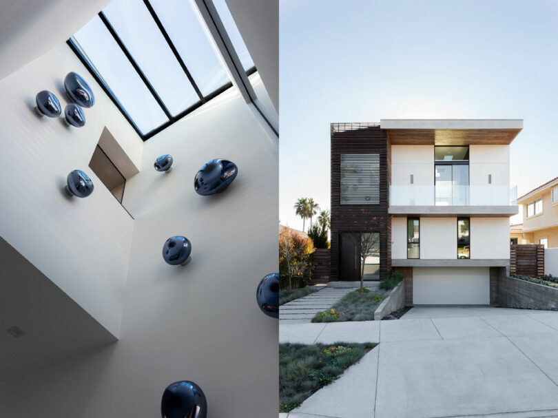
Photo: Amy Bartlam
Lucia Residence, Redondo Beach, CA
With sweeping views of the coast, the house is organized as an upside-down floor plan with the main living and gathering spaces on the third floor. As you enter, a full-height atrium dotted with sculptural Tom Dixon Melt sconces draws the gaze up, giving a hint at the voluminous spaces to come. In the evening, the illuminated fixtures are visible through the wood louvered façade, which creates further intrigue and interest from the street.

