SHAPES OF INEQUALITIES at triennale milano
At first glance, the 16 visuals that make up Shapes of Inequalities—a new installation by the Italian information designer Federica Fragapane—don’t look like data. There are no bar graphs, no line charts, no axis labels. Instead, organic shapes unfurl across white space, like sea creatures or windblown petals. Their softness is deceptive. Installed under the overarching theme Inequalities at the 24th International Exhibition at Triennale Milano, the project translates hard, often brutal realities—economic injustice, climate crisis, gender-based violence—into a visual language that is both scientific and sensitive. It also formed the basis for a public talk Fragapane gave during the Art for Tomorrow conference, hosted in conjunction with the Triennale’s opening. In a conversation with designboom’s editor-in-chief, Sofia Lekka Angelopoulou, Fragapane discussed the politics of visual storytelling and the ethical weight of representing human experience through data.
‘I often say that I see my job as an alternative version of a photographer: I am photographing angles of reality,’ Fragapane says during an interview with designboom. ‘I strive to capture portions of them through my work.’ That framing—of data designer as documentarian—sits at the heart of her practice. Fragapane has built a career working with large institutions like the United Nations, the European Union, the World Health Organization, and Google, while also producing deeply personal, research-based projects on topics like migration, education access, and war. Her work now resides in the permanent collection of the Museum of Modern Art in New York. She operates somewhere between precision and poetics, applying her training in communication design to numbers that often resist simplification. Her aim isn’t to flatten complexity—it’s to give it form. ‘For me it’s important to reiterate two aspects: first of all, how data itself is not a neutral entity dropped from above, but the product of research and human actions that inevitably leave a trace, whether visible or intentional,’ she explains. ‘And so, of course, does the visualization process.’

Federica Fragapane’s Shapes of Inequalities | image by Alessandro Saletta and Agnese Bedini – DSL Studio © Triennale Milano
VISUALIZING HARD FACTS THROUGH SOFT FORMS
For her Shapes of Inequalities project at Triennale Milano, Federica Fragapane spent months researching ten dimensions of global disparity, including access to health care, educational gaps, racial and gender bias, and climate-related displacement. Each dataset was shaped into a visual narrative—abstract, non-linear, and, in some cases, deeply intimate. ‘Some of the subjects visualized in the exhibition touch me or have touched me personally; others are far from my own experience, and I tried to observe them and give them a shape, conscious of my privileged point of view,’ she tells designboom.
The results are not didactic, they are contemplative, even tender. The color palette—muted reds, soft greens, cloudy purples—evokes the natural world more than the digital one. It’s intentional. ‘I often choose this organic approach when I work with data that has a living presence,’ Fragapane says. ‘It’s my way of paying homage to those lives and trying to convey that pulsating presence through form.’ This design ethos sets her apart from many working in the field of data visualization, which tends to privilege clarity, efficiency, and a particular kind of minimalism. Fragapane’s images, by contrast, invite readers to slow down. Their beauty isn’t an accessory—it’s a method. ‘Working with care on the aesthetics of my works is a way to invite people in,’ she explains. ‘A way to encourage them to look closely and read the stories I’m trying to tell through data.’

a series of 16 data visualizations | image by Alessandro Saletta and Agnese Bedini – DSL Studio © Triennale Milano
At a time when data is everywhere—weaponized on social media, simplified into clickbait, or buried in impenetrable PDFs—Fragapane’s work insists that data can also be gentle. Not less rigorous, but more empathetic. ‘I try to use what I know how to do to talk about topics I care about—that’s an extremely condensed way to describe the reasons behind some of my works,’ she notes. ‘I’m glad when others share them, use them in turn to highlight issues they care about, or when I see people discovering something new through my projects, even if those discoveries make them angry, just as they made me.’ In that way, Shapes of Inequalities becomes not just a series of visualizations, but an act of translation—and of witnessing. It asks viewers to step inside statistics not as distant observers, but as participants. The data, as Fragapane insists, is not abstract, it is alive. Read our conversation with Federica Fragapane in full below.
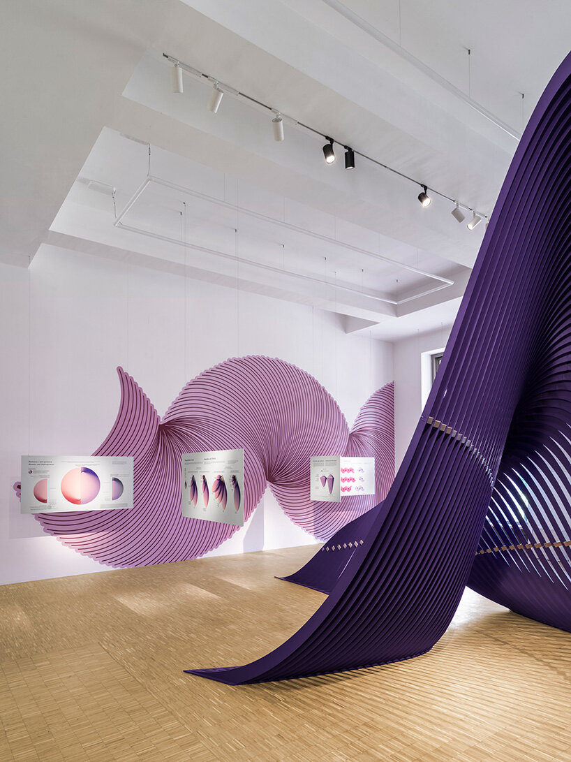
distilling vast datasets into images | image by Alessandro Saletta and Agnese Bedini – DSL Studio © Triennale Milano
interview with Federica Fragapane
designboom (DB): Your works are included in the permanent collection of MoMA, while you have collaborated with Google, the UN, the World Health Organization, and many more. Can you walk us through your background and practice?
Federica Fragapane (FF): I work as an independent data visualization designer. This is a discipline I first encountered during my studies. I studied Communication Design at Milan Polytechnic, and I have been freelancing since 2015. What attracted me deeply at the time was the possibility of using visual elements to give a shape to information and make it more visible, and this is still the main aspect I’m interested in.
I often say that I see my job as an alternative version of a photographer: I am photographing angles of reality because I view the topics I explore as three-dimensional, complex, and irregular shapes, and I strive to capture portions of them through my work.
My presence and intervention are unavoidable, from the selection of data—the angles—to the forms in which I represent them. For me it’s important to reiterate two aspects: first of all, how data itself is not a neutral entity dropped from above, but the product of research and human actions that inevitably leave a trace, whether visible or intentional. And so, of course, does the visualization process. For me it’s very important to assert my presence and acknowledge that each drawing, while created with care and great attention to the accuracy of the information and sources, is also a reflection of my personal history.
I work with both complex data and very simple numbers. For example, one of my pieces acquired by MoMA tells the story of space waste: the visualization shows space debris classified by distance from Earth and by object type, and it’s relatively complex. But I also worked with very simple data, like the number of days since the Taliban banned teenage girls from school in Afghanistan and the death toll in Gaza.