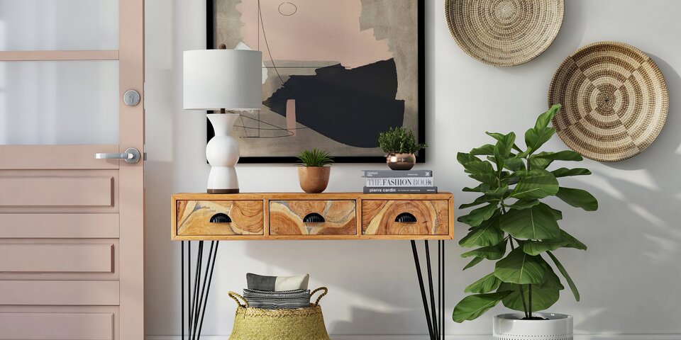
An entryway table can be both practical and stylish. A welcoming furnishing with the power to set the design story for your home, this piece is also a place where you can stash keys, mail and other essentials. At the same time, avoiding a cluttered look is of utmost importance. Plants, artwork, decorative bowls and other objets d’art are popular items to display on your entryway table. Keep reading for endless styling possibilities, helpful solutions and a slew of creative ideas… [image below from AllModern]
Small Entryway Tables
No entryway table is too small to style. Even if you have a narrow entry to your home, consider opting for a small table that can make a big statement. Below we see Serena & Lily’s Blake Raffia Console, placed flush against the wall to maximize space. Fresh greenery and an artful wooden bowl are just two of the items on its handy surface.

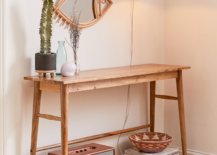
If you’re working with a small table, less is often more. One vase of flowers and a tray for holding essentials such as sunglasses may be all you need to bring the piece to life. Add a mirror overhead to complete the vignette, as shown below with Room & Board’s Hudson Console Table:
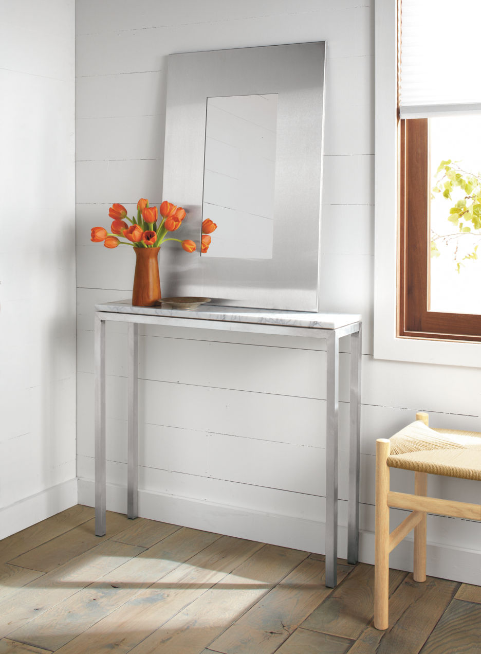
For a bigger impact, opt for dramatic pieces. A mirror with a wide frame and a vase filled with overflowing blooms that convey a sense of movement are two ways to make the most of the surface. Below we see tulips for the win, perched atop Room & Board’s Portica Console Table:
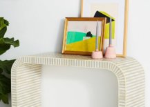
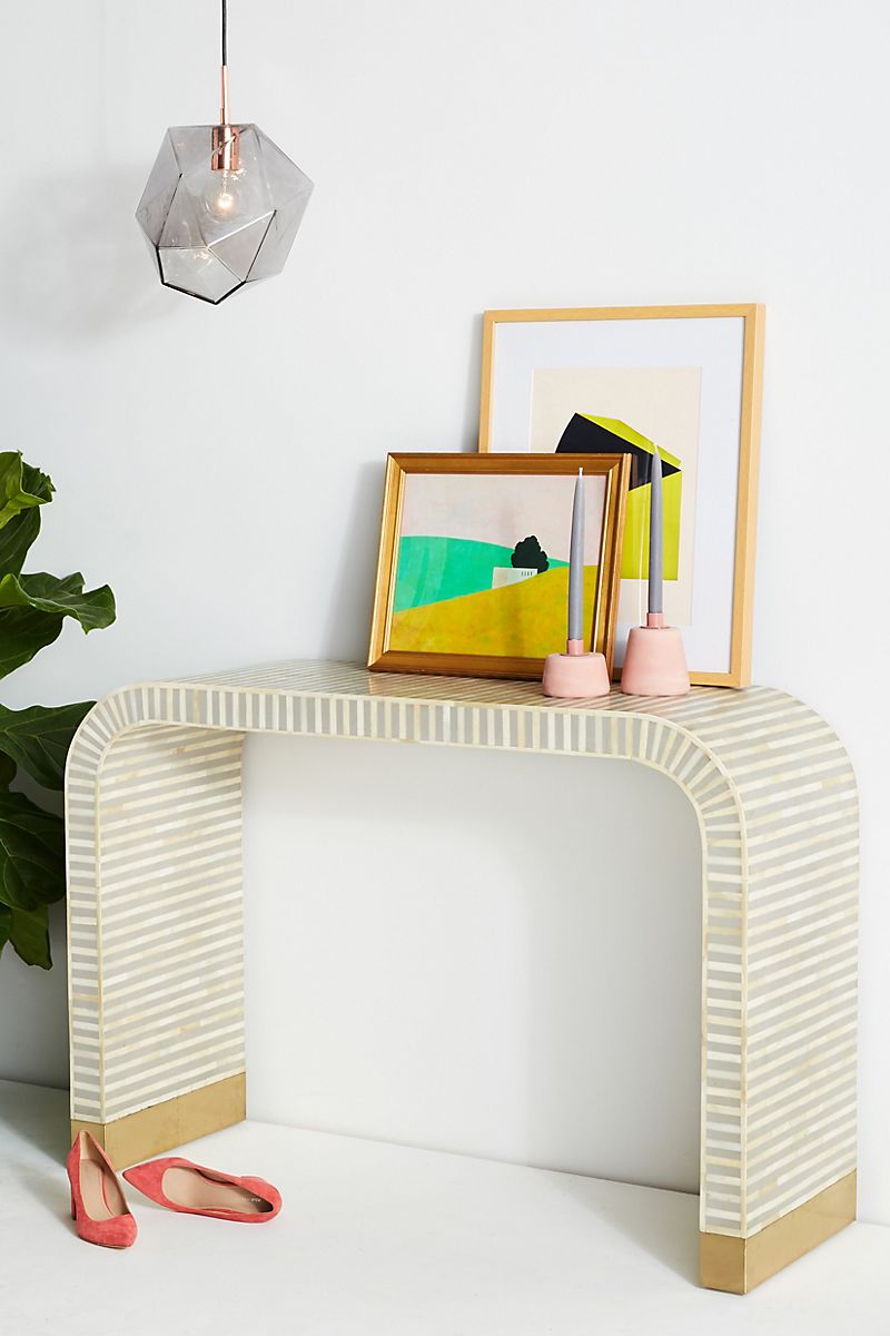
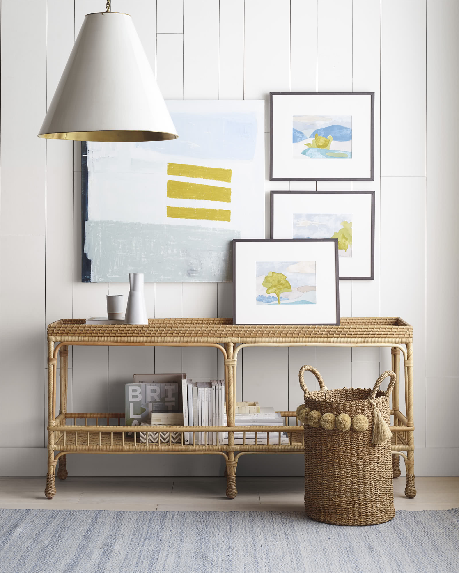
Turn your tabletop into a display space for an artful vignette. A couple of paintings or prints leaning against the wall can set the stage for a few decorative smalls. Bonus points if overhead lighting adds height to the arrangement. Anthropologie’s Waterfall Inlay Console Table comes to life with a few thoughtfully curated pieces:
Asymmetry and Balance
When it comes to styling your entryway table, there are a few basic pointers to follow. Vary the heights of the items you display. Account for both function and beautiful design. Add interest with wall decor. Yet there’s an amazing amount of interest you can also create by using asymmetry to your advantage. When you display items off to one side, the key is creating balance with other elements, such as a well-placed wall hanging, as pictured above Urban Outfitters’ Wesley Console Table in the next featured image:
We see a similar effect achieved with wall art in the image below, featuring the Ingram Console Table from Anthropologie. Note how the colors of the artwork reflect the colors of the vase arrangement that rests on the table’s surface. Not to mention, the lamp’s curved base also mimics the design of the foliage in the art. Details such as these can take your entryway table design to the next level!
Speaking of next-level styling, less is more in the image below. The strategic spacing of interesting objects and not-too-large artwork give plenty of room for each item to shine. The opposite of predictable, this vignette is striking in its clean, asymmetrical approach. Anthropologie’s curved Nora Media Console is beautifully presented and surrounded:
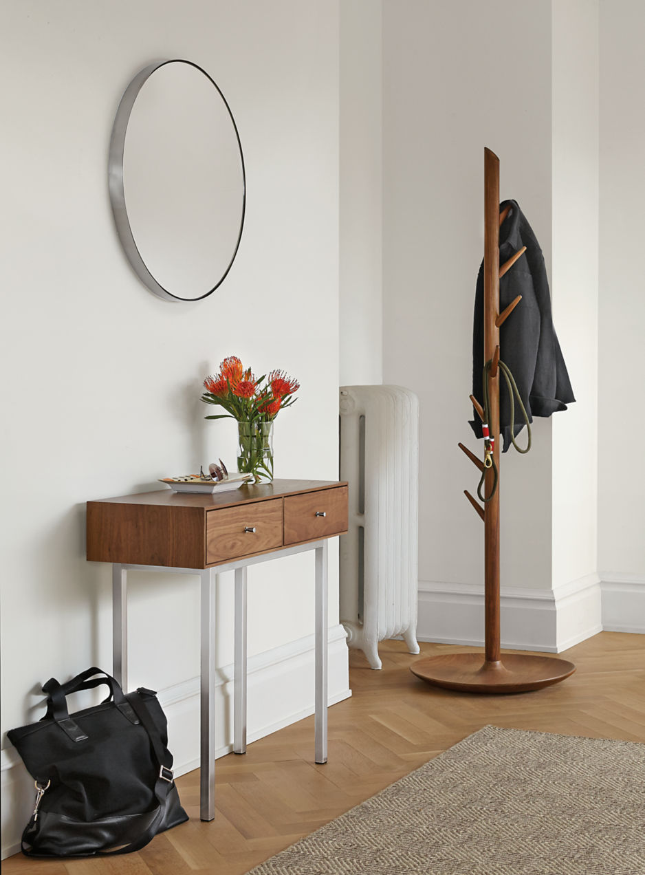
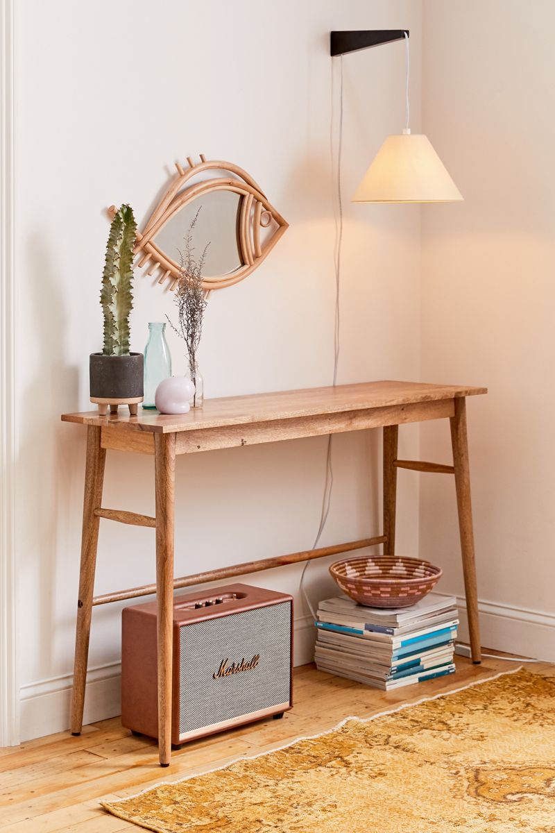
Even the mirror in this next vignette is placed to one side. Joining a cactus, a couple of glass bottles and an artful object, the mirror does anything but dominate the space, thanks to the balance achieved with lighting, as well as a stack of books down below. The look is unexpected yet grounded. Urban Outfitters’ Amelia Entryway Table is the furnishing of choice:
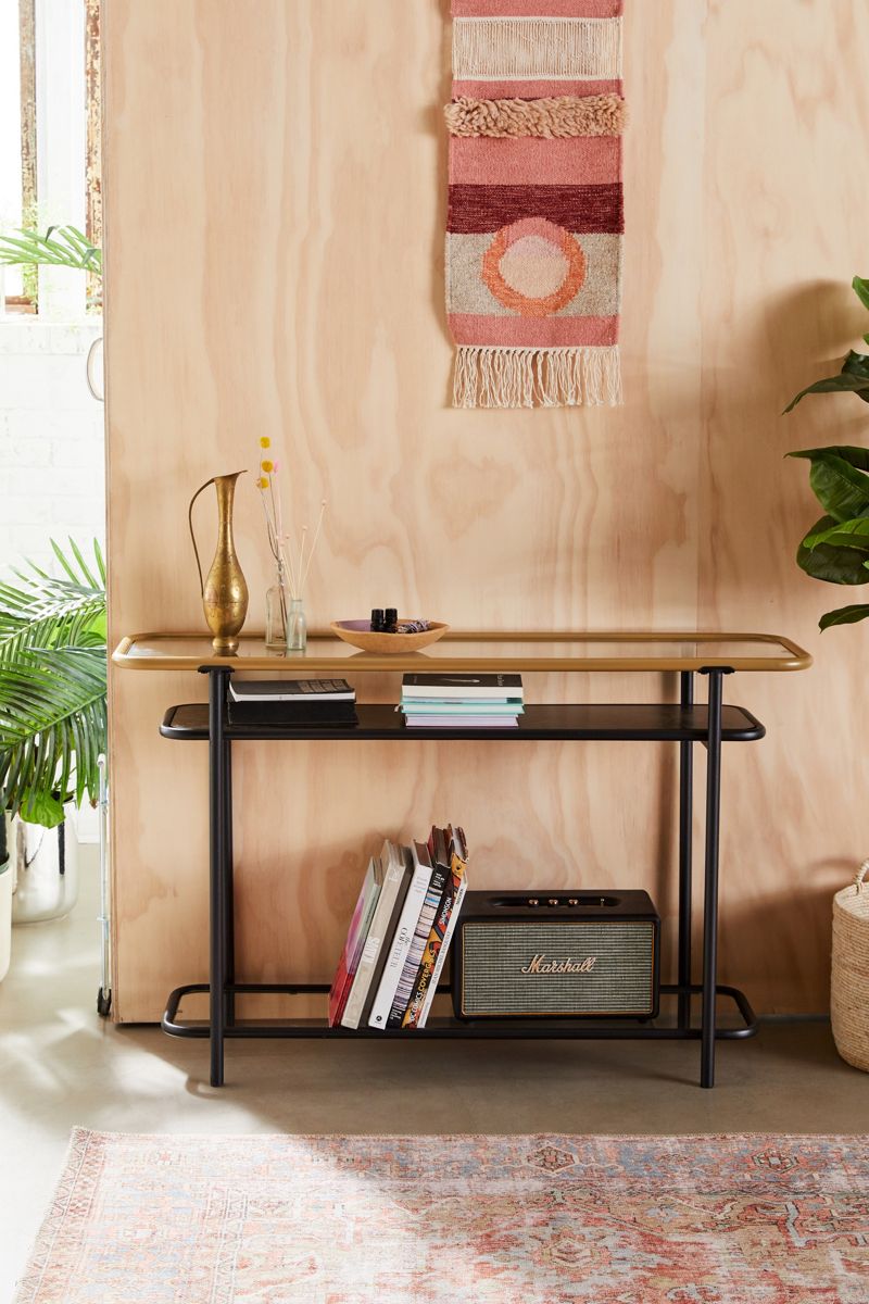
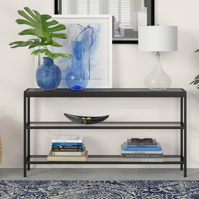
Asymmetry can even be achieved when your entryway table has multiple levels. Note how the pairing of two blue vases and blue artwork create a focal point for the top shelf. Similarly, a long bowl on the second shelf draw the eye to the left. Yet two stacks of books create a balanced feel and a sturdy bottom level. This Southall Console Table is an affordable piece available via Wayfair.
Bring It On!
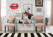
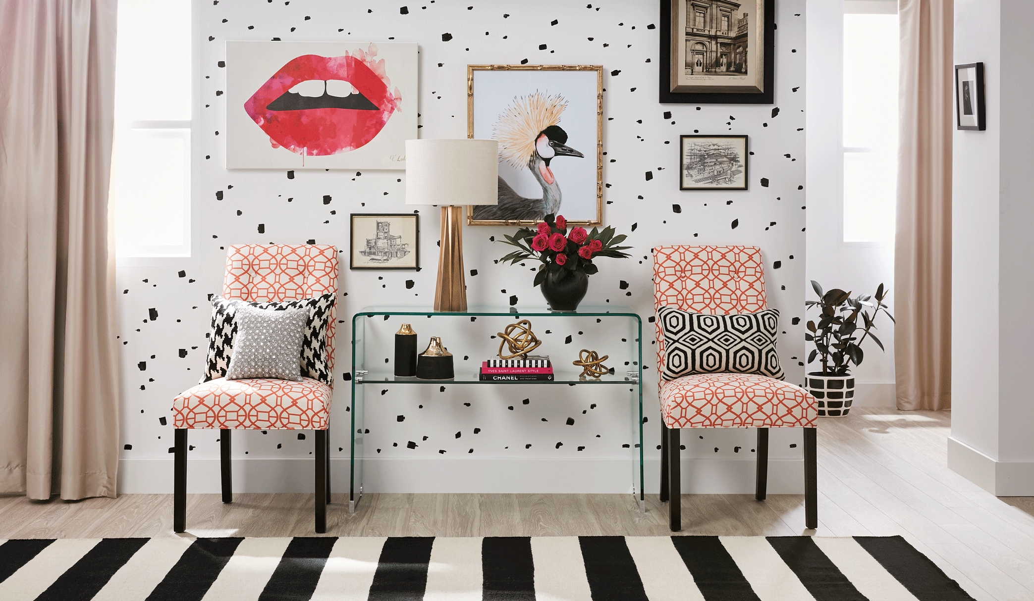
This next section of the post is all about making a big statement. Less can definitely be more, but sometimes there’s plenty of room for more-is-more design! The glam styling idea below is from Overstock, and it features a glass console table that looks anything but bulky. The see-through style of the pieces leaves plenty of room for gold accents to shine. A fun collection of artwork adds visual interest, while a pair of comfy chairs on each side of the tables creates a luxe look. The result: balanced design with a big dose of personality!
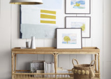
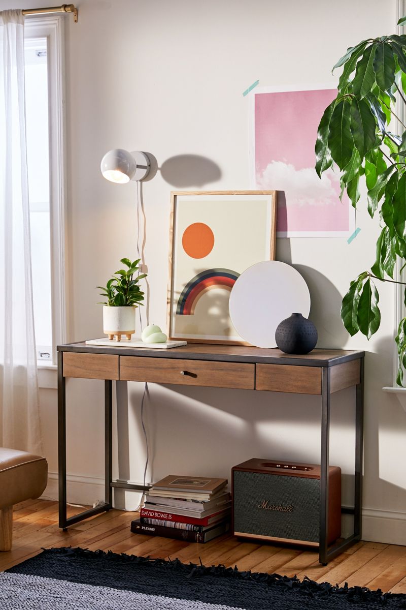
Another “more-is-more” approach involves curating a wide variety of items without overwhelming the space with them. Framed art, a round mirror, wall-mounted lighting, a potted plant, a black vase, and poster art taped to the wall are among the items on display with Urban Outfitters’ Mason Entryway Table below. Yet common motifs such as round forms (in the art, lighting, mirror, and vase) create a cohesive theme, resulting in an intentional rather than a cluttered feel.
You can also limit your palette to create a clean feel. In this next image featuring Serena & Lily’s South Seas Console, the blues and greens of the artwork combine with a neutral color set that includes lots of white, as well as the natural tones of the woven pieces. Note the helpful use of a storage basket, which is a great way to wrangle clutter in your home’s entry:
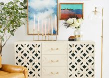
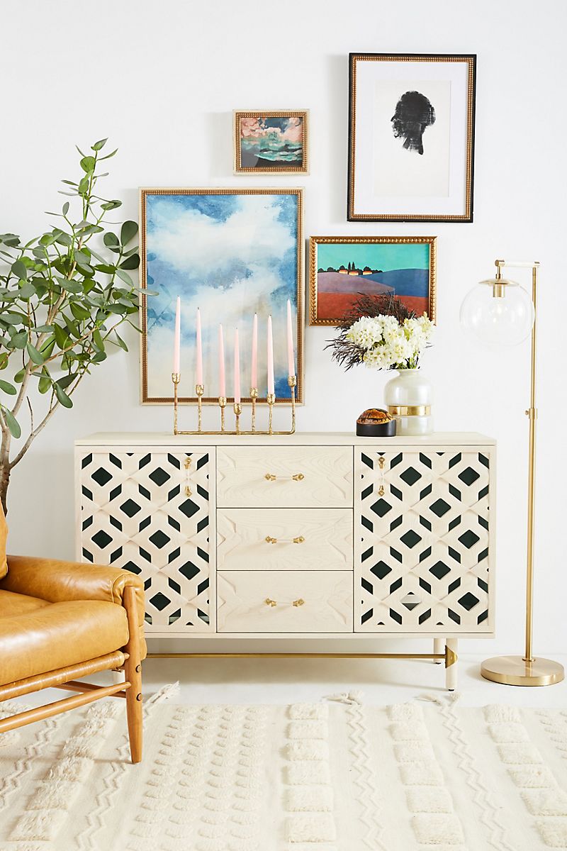
For a bold effect, use wall space to your advantage. Rather than piling the surface of Anthropologie’s Carroway Storage Console with a myriad of objects, three substantial pieces are chosen. The rest of this design statement is created with beautifully framed wall art. The look is eclectic and substantial:
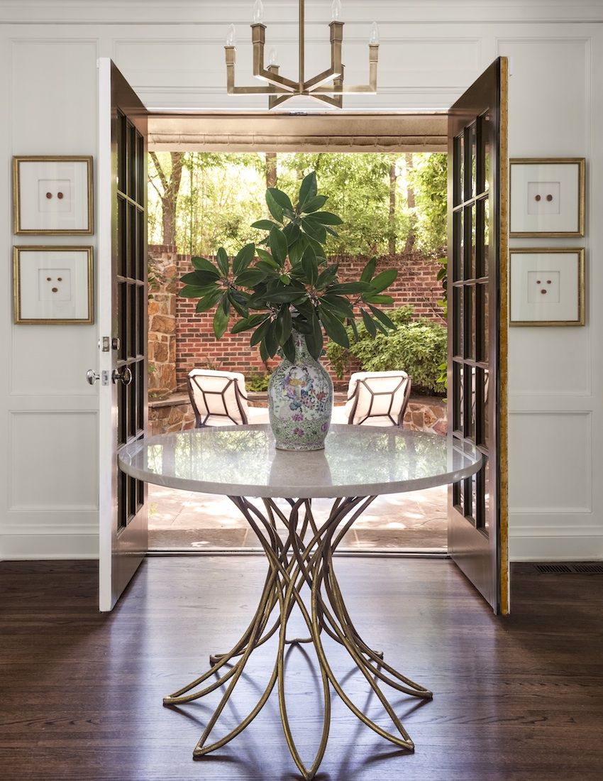
In closing, whether you opt for a sparse look or a full look for your entryway table styling project, keep in mind that there’s no one right way to get the job done. For that matter, there’s no ideal table shape. The round table below proves that choosing the best table for your space is all that matters. How you creatively enhance it is your choice. Avoiding clutter and adding variety through height, color, texture and form can also be helpful. [photo below via Collins Interiors]
Thanks for reading, and happy styling!
You’re reading How to Style an Entryway Table, originally posted on Decoist. If you enjoyed this post, be sure to follow Decoist on Twitter, Facebook and Pinterest.