It is often said the best design goes unnoticed, but that’s not entirely true of the Crossfold Loft by interdisciplinary design studio Kalos Eidos. Helmed by architect Ryan Thomas – who is also a founding member of the feminist collective WIP Collaborative and Co-Chair of AIANY New Practices Committee – her solution to a client’s compact space in Brooklyn, New York, is more compelling than any midtown urban development that mistakes novel installations for public art or glossy towers for a solution to the housing crisis.

View from entryway into a living room. The kitchen’s footprint was expanded to include an elongated island that acts as the visual and functional hub of the space, with a freestanding counter surface large enough to work for dining and entertaining guests.
Compact is King
The versatile space-planning and minimal interventions executed with surgical precision in the 900-square-foot home allow this structure to maintain multiple identities – currently a two-bedroom unit with ensuites, respectively, convertible to a one bedroom – while integrating custom storage and enough horizontal planes to display a collection of personal artifacts. “The strategy for this project was to mine the floor plan for small-scale opportunities to capture space, increasing the capacity for storage through a cumulation of small gains in depth and surface area, while leaving the floor area open for essential furniture elements,” Thomas says.
Interior renovations echo the shared ethos of Kalos Eidos and the creative owner for whom the refreshed residence is recalibrated to adjust flow, functional use, and visual connection. Without radically altering the layout of room partitions, Thomas is able to create a substantial entryway that gives the illusion of opening up with a vastness to the primary quarters. The kitchen is further delineated by a soffit, gently marking program while pushing inhabitants on and through to the living room proper. Multiple layers of millwork meander along the perimeter, mitigating the existing quirks between fenestration, physical subdivisions, and home furnishings, which is especially helpful in resolving layout issues with limited real estate.

Millwork pieces operate in conjunction with one another as a critical layer to synthesize the overall space, helping to soften corners and edges, interlock and overlap function, and visually orient from zone to zone.
Dabbling in the Dark Side
The main volume is punctuated with dramatic elements in a way that provides balance and anchors the space rather than weighing it down. The central island and corresponding cooking surfaces incorporate a mixture of many textures including fluting, marbling, and matte finishes. These things combined create graphic clarity and a background to better articulate bright objects and collectibles displayed in the foreground. “Once we landed on a kitchen color scheme, which ended up centering around matte black tile and cabinet fronts, with a dark green-black soapstone countertop, the client had the idea to use terracotta colored grout at the tile backsplash,” Thomas notes. “It’s a subtle detail given the slender dimension of a grout line, but it was such a great thought and really adds a surprising layer of warmth and nuance that is both playful and sophisticated, bold and refined.”

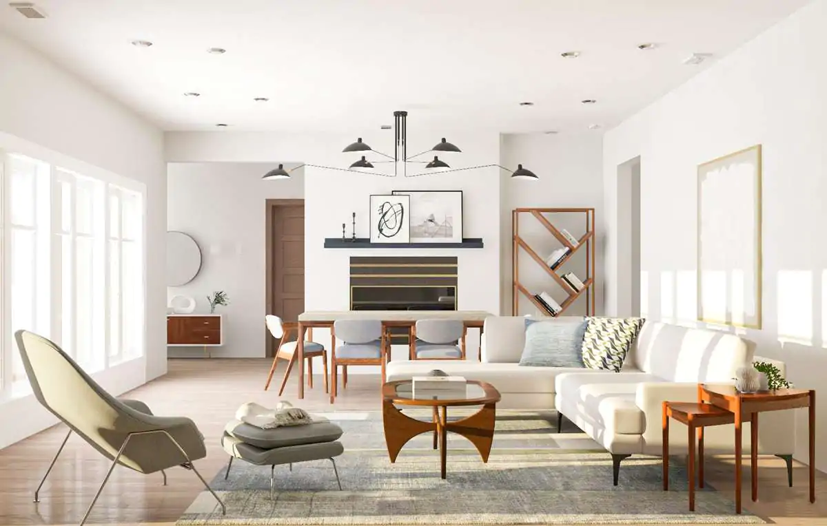
Crossfold Loft’s primary living and lounge area

The lounge area integrates furnishings amid the large, full-height glazing of the space by introducing new sectional sofa pieces, a minimal, floating storage credenza, and a video projector above.
Leaning Into the Fold
Site conditions encourage the use of a diagonal parti through architectural gestures suggested by the building as if to say “this way.” Portions of the wall that once jogged in-and-out inconsistently now clearly divide the living space from the private bedroom and ensuite. And what started as the default resultant of a dimensional offset now becomes the driving force orchestrating the experience. “Acting as a kind of cross-fold seam for the activity of the main living area, this new threshold serves to visually and spatially link the space of a second bedroom,” Thomas adds. Like one of the Gestalt principles that underpins visual communication, the resolved vertical plane creates a line of continuation that engages visitors from the moment of entry.

The custom arched millwork bookcase and passageway make use of a generous threshold.

The dining and workspace are beyond the arched threshold. Select functional objects like a ceramic sculptural table by artist Liz Hopkins, a pair of vintage sunflower yellow reading lamps, and a set of vintage oak dining chairs from the client were starting points for determining the specific color choices for elements in each area of the apartment.

Soft seating in the dining and workspace

Shelving in the dining and workspace
The Power of the Arch
Punctuating the axis is an arched form – half shelving, half threshold – designed as a bookcase you can seemingly step through continuing to build on the apartment’s dichotomy is the contrast created by the solid-void, the light-dark.The idea first emerged during the interactive process thinking through opportunities the mass could yield. “It helps dissolve the fold’s flatness while adding some depth and materiality to a portion of the floor plan that is predominantly used only for circulation and passage through the different zones of the apartment.” Traying in and around the fanciful doorway makes the transition through it feel kaleidoscopic in motion, especially when the shelving is decorated with a variety of colorful paraphernalia.

The backside of the custom archway looks into the kitchen from the dining and workspace.

A view into the bedroom

Select functional objects like a ceramic sculptural table by artist Liz Hopkins, a pair of vintage sunflower yellow reading lamps, and a set of vintage oak dining chairs from the client were starting points for determining the specific color choices for elements in each area of the apartment.
Moving Forward
Meaningful architecture isn’t about grand gestures in the urban fabric or homogenous new builds. The most impactful works an architect can contribute to society are those imbued with personality derived from the client, and in doing so, help homes, buildings, and neighborhoods celebrate their local language. “As an approach we strive for in our process is to center ideation less around problem-solving a laundry list of isolated issues, but rather to set up a framework of critical values and priorities to be synthesized in the final design,” Thomas says. “The result necessarily relies on architectural and spatial thinking, but also on the composition of objects, materials and other elements that are folded into the space to help it become coherent and usable for living.”

An architectural floor plan for the Crossfold Loft
Deep captions courtesy of Kalos Eidos; Photography by Steve Freihon .