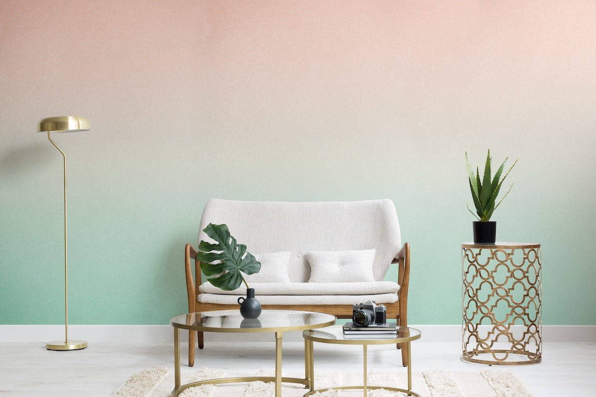
While the ombre hair trend has been on our radar since the early 2000s, ombre didn’t make a huge splash in the interior design realm until after 2010. At the time ombre design burst onto the scene, it opened the floodgates to a range of gradient-inspired concepts and products. From accent walls that showcase a light-to-dark shade progression of one hue, to textiles that have more of a dip-dyed look, the possibilities are endless and exciting. Is ombre here to stay? We predict yes. It may not be making as many headline these days, but gradients never go out of style. Keep reading for our favorite ombre products and design ideas for spaces of any size… [image/wallpaper below from MuralsWallpaper]


Ombre Backdrops
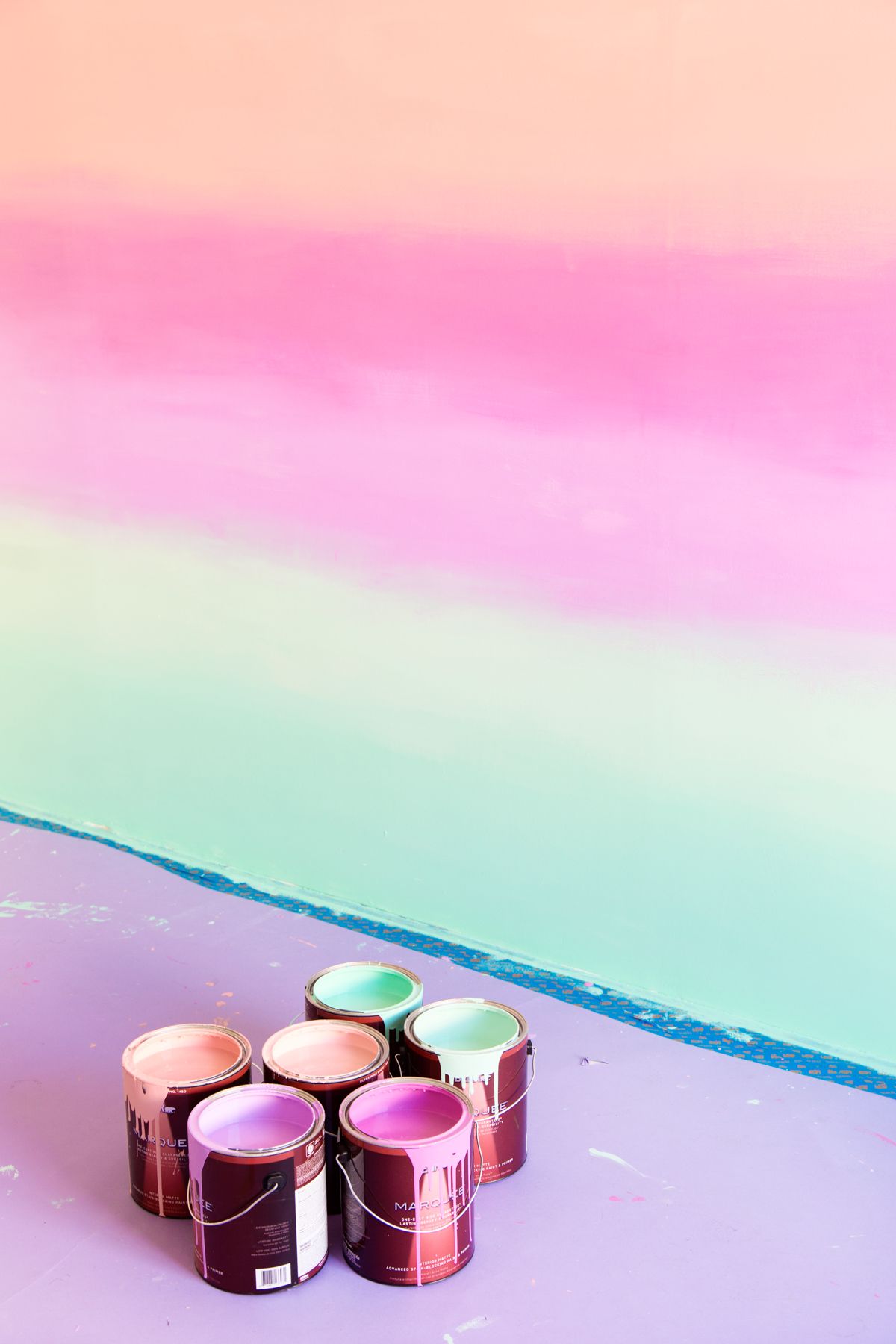
At the peak of the ombre trend, designers, retailers and design bloggers fully embraced the look in a big way. Ombre accent wall tutorials abounded, ranging from distinct stripes with clear color separations to a more blended and dreamy look, as shown below with this candy-colored wall from Studio DIY. Check out the full tutorial here.
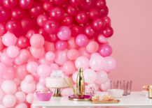
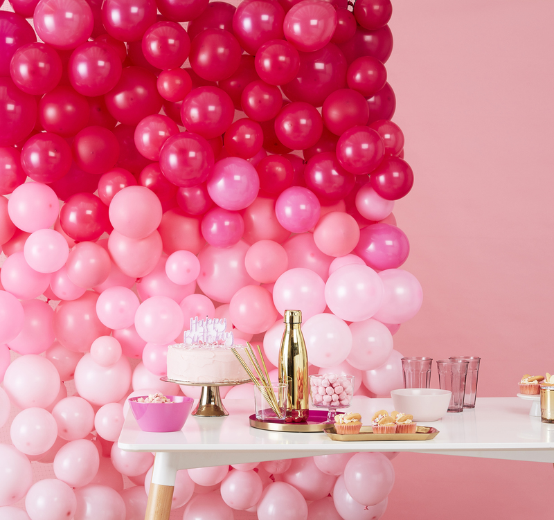
If you don’t feel quite ready to take the ombre plunge on a large-scale painting project, you can always dabble in the design for your next party. Ginger Ray offers an ombre balloon wall kit, plus you can watch a brief, fun and helpful tutorial video that shows how to put it all together. It’s hard to imagine a party table that wouldn’t look stellar with a backdrop like this at the ready:
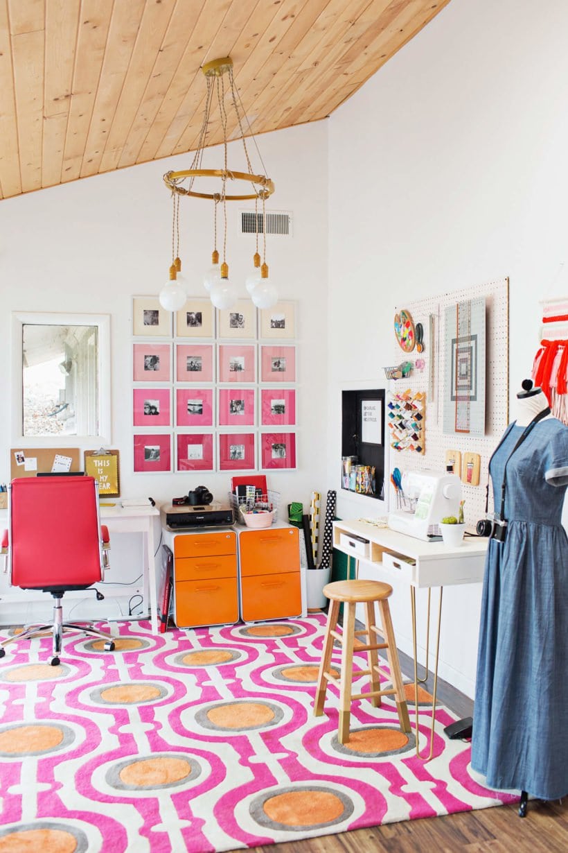
Another way to bring ombre style to your interior is by creating an ombre gallery wall. This design feature works well in big and small interiors alike. For smaller spaces, it can take on an accent wall-level project, while in rooms with high ceilings, it’s more of a focal point than an epic installation. You can also alter the size of the grouping, depending on the number and size of frames you choose. Regardless, when you create lines of photos with mats that get one shade darker in each row, you can achieve a gradient of color while displaying meaningful pictures at the same time. See how A Beautiful Mess blogger Emma Chapman added interest to her home office in this helpful tutorial.
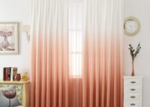
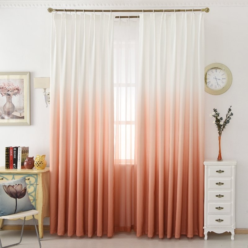
Anyone else noticing a pink trend here?! That’s no surprise, given how popular pink and peach hues have been in recent years. Another functional way to display a big dose of ombre style: curtains! The coral and white ombre curtains below progress from white to peach to a beautiful peachy coral at the bottom of the fabric. Whether you keep the curtains open or closed, you have an instant gradient of style that’s as delicate as it is stunning. You can purchase them via Curtain Linen.
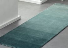
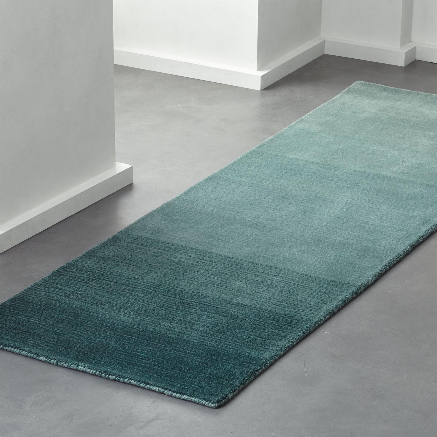
Bring ombre style from the wall to the floor with this Ombre Deep Teal Runner from CB2. Hand-loomed from New Zealand wool, this piece is soft as well as colorful. Due to the soothing tones in the rug, it makes a serene statement without taking over your space. A few steps above your typical runner, don’t you think?!:
Small Statements
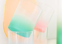
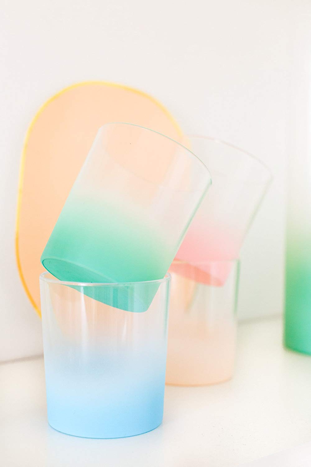
We now move from big ombre style to smaller-scale statements that are no less alluring. Because even the most petite of ombre statements have the power to make a strong impact. This is good news for residents of small spaces, or those who take a less-is-more approach to design. Bring on the drinkware that’s beautiful enough to display when not in use! Sugar & Cloth founder Ashley Rose designed the Ombre Plastic Pitcher & Tumbler Set below (the cups are pictured). Available on Amazon, this set is the epitome of modern ombre style, complete with a dreamy wash of color on each receptacle:
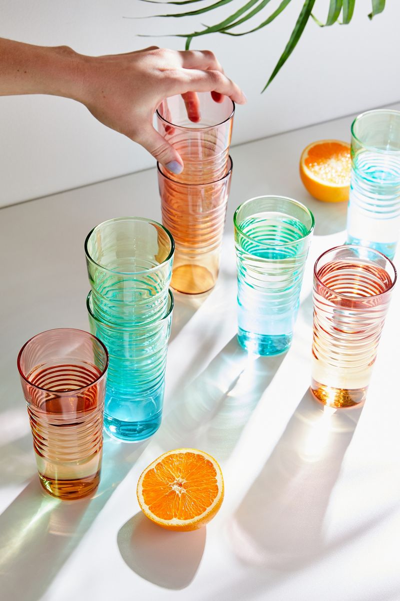
These MoMA Ombre Milk Glasses are available at Urban Outfitters and sold in sets of 4. Choose an orange or green palette for your bundle, or better yet, order one set of each for a total of 8 glasses. Perfect for your next dinner party or casual fete, these glasses also have the power to add a burst of sunshine to your morning serving of orange juice. A ridged design creates plenty of personality. Not that any extra flair is needed for these bright beauties!
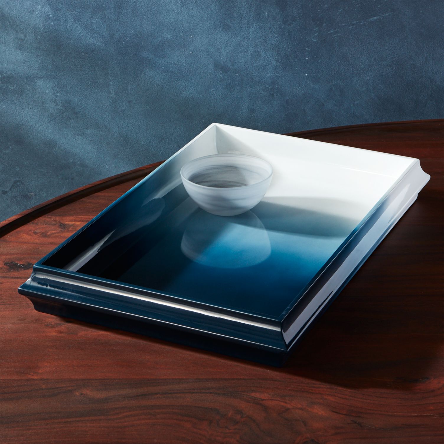
Indigo blue reigns on this Fedo Ombre Blue Lacquer Tray from CB2. Designer Ross Cassidy created this distinctive piece to be both functional and eye-catching. A sophisticated approach to the ombre trend, the tray has the power to take center stage in your home, and it makes a beautiful gift as well:
Ombre Goes Earthy
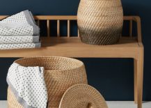
What’s next for the ombre trend? While early renditions of the look involved candy colors, bit “gotcha” statements, and a subtle progression of color, the new ombre continues to evolve. For one thing, it’s taken an earthy turn, with vibrant color being giving way to woven textures and natural tones. You can see the result on Anthropologie’s Handwoven Ombre Basket, shown below.
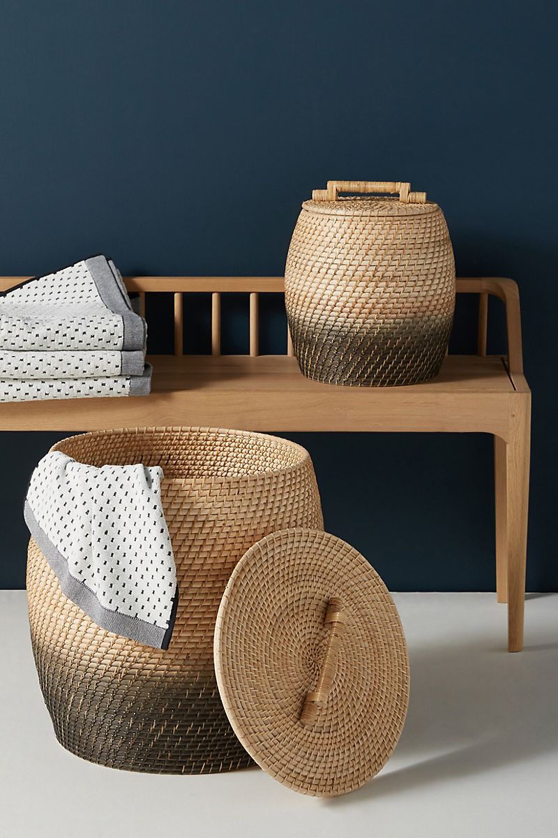
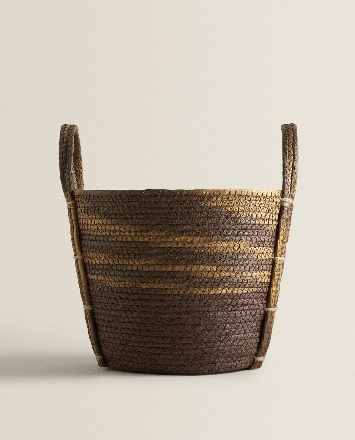
You may also start noticing that the term “ombre” is used to describe a range of looks, from the dip-dyed effect above (like the item was literally dipped in a vat of paint), to the fade-in-and-out look of Zara Home’s Ombre Effect Basket. Ombre no longer has to mean a gradual progression of tones, laid out in stripes. If the ombre trend is around for the long haul, it will evolve over time, much like the creators who design the products.
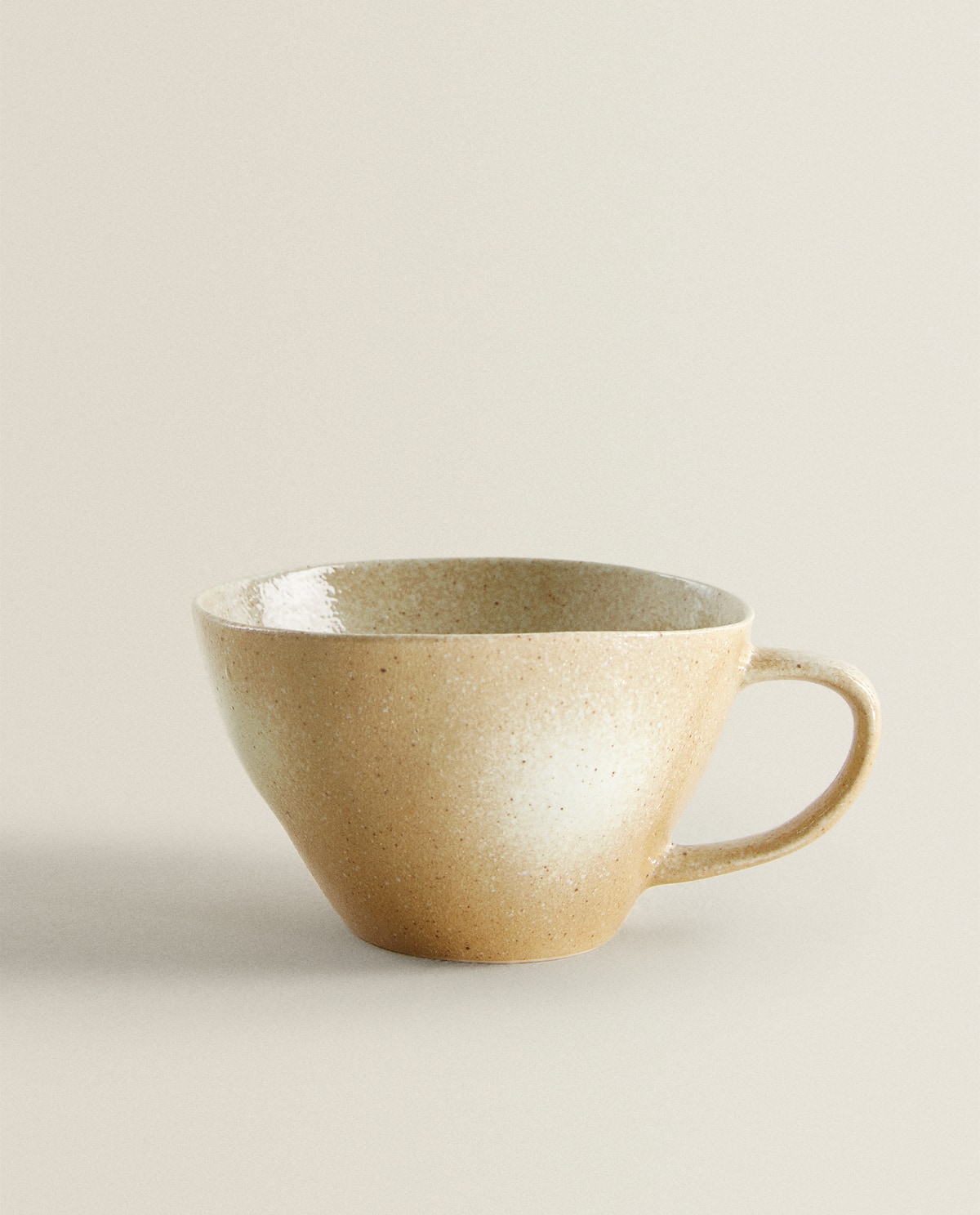
Also from Zara Home: this Ombre Textured Mug. Stoneware and creamy tones combine to form a piece that looks as if it were made to hold a warm, comforting serving of coffee:
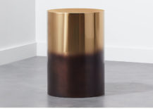
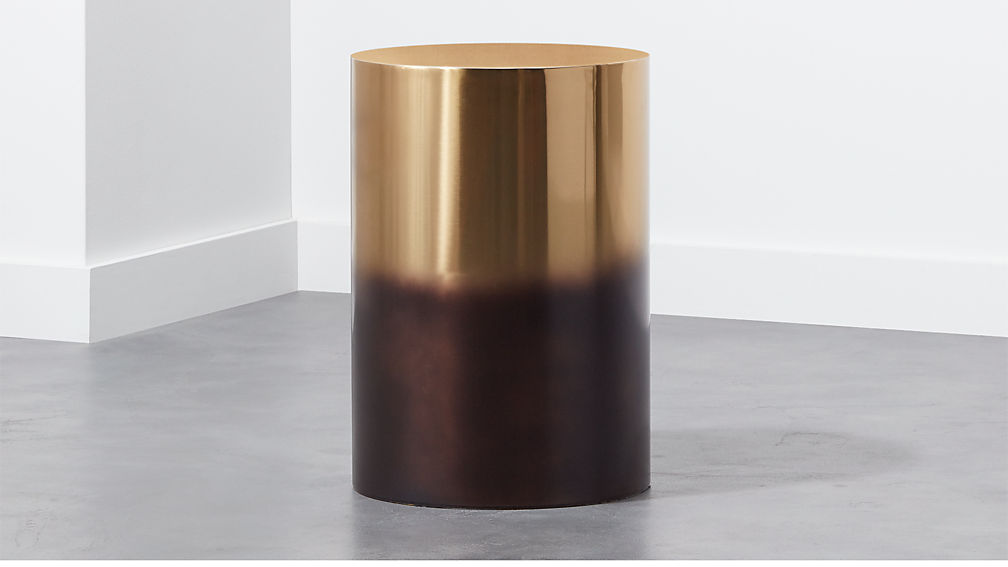
Earth tones go glam in CB2’s Winston Ombre Side Table. Stainless steel is given a gold electroplated finish, along with a tinted lacquer in deep bronze. A matte dark base progresses to a shining, metallic top in this showstopper:
We hope today’s post has acquainted you with the ever-changing look of ombre design. It’s fun to follow a trend that’s been years in the making, and it’s also exciting to anticipate what’s next as the design community continues to embrace all things ombre. Thanks for reading!
You’re reading Ombre Design Ideas for Big and Small Spaces, originally posted on Decoist. If you enjoyed this post, be sure to follow Decoist on Twitter, Facebook and Pinterest.


