| |

Peach Fuzz 2024: Pantone Colour of the Year in Interior Design

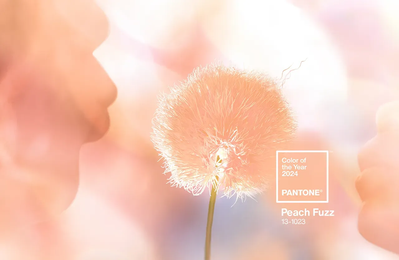
Hot off the press and causing a stir in the design world, the Pantone Colour of the Year for 2024 has just been unveiled, introducing a hue set to redefine our spaces with unprecedented warmth and tenderness. Get ready to be wowed!

See also: 2024 LIVING ROOM IDEAS: STYLE UNLEASHED

Peach Fuzz 2024: Pantone Colour of the Year in Interior DesignPeach Fuzz 2024: Pantone Colour of the Year in Interior Design
Pantone

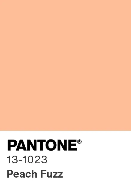
PANTONE 13-1023 Peach Fuzz is a silky delicate peach tone that conveys our universal need for closeness and connection. According to Leatrice Eiseman, Executive Director of the Pantone Colour InstituteTM, Peach Fuzz is a colour “radiant with warmth and modern elegance, resonating with compassion and effortlessly bridging the youthful with the timeless.”

The Essence of Peach Fuzz

Peach Fuzz 2024: Pantone Colour of the Year in Interior DesignPeach Fuzz 2024: Pantone Colour of the Year in Interior Design
Pantone

Peach Fuzz is more than a colour; it’s an embrace – a velvety, gentle hue that nourishes the heart, mind, and body. Subtly sensual, this passionate peach tone conveys a message of care, sharing, cooperation, and collaboration. It promotes a sense of unity or a time of stillness – a sanctuary for the soul.

A Palette for Progress

Peach Fuzz 2024: Pantone Colour of the Year in Interior DesignPeach Fuzz 2024: Pantone Colour of the Year in Interior Design

Peach Fuzz was chosen to represent our increased need for nurturing, understanding, and compassion in the midst of a changing world. The colour relates to the significance of nurturing our inner selves and finding moments of rest, creativity, and human connection as we traverse the difficulties of modern life. It indicates a shift in priorities towards health and happiness, as well as cherishing the warmth and comfort of our relationships.

Get the Look

Peach Fuzz 2024: Pantone Colour of the Year in Interior DesignPeach Fuzz 2024: Pantone Colour of the Year in Interior Design
Valencia Rug by Rug’Society

Using PANTONE 13-1023 Peach Fuzz in interior spaces creates a friendly atmosphere and generates emotions of pleasant warmth. Peach Fuzz adds a soothing presence to our most personalised areas, whether it’s painted on a wall, incorporated into home décor, or used as an accent within a pattern.

Cosy and Warm Atmosphere

Peach Fuzz 2024: Pantone Colour of the Year in Interior DesignPeach Fuzz 2024: Pantone Colour of the Year in Interior Design

Peach Fuzz adds a sense of cosiness and warmth to any room, providing an inviting atmosphere. Consider utilising it in living rooms, bedrooms, or meeting areas to create a sense of comfort and community.

Soft and Sensuous Touch

Peach Fuzz 2024: Pantone Colour of the Year in Interior DesignPeach Fuzz 2024: Pantone Colour of the Year in Interior Design

Peach Fuzz’s softness makes it an excellent choice for soft furnishings such as cushions, blankets, rugs, and upholstery. Its silky texture and soft colour add to a sensual and relaxing ambiance.

Tranquil Sanctuary

Peach Fuzz 2024: Pantone Colour of the Year in Interior DesignPeach Fuzz 2024: Pantone Colour of the Year in Interior Design

In spaces dedicated to relaxation and rejuvenation, such as bedrooms or reading nooks, Peach Fuzz provides a calming backdrop. It offers a tranquil sanctuary for unwinding and embracing moments of solitude.

Peach Fuzz 2024: Pantone Colour of the Year in Interior DesignPeach Fuzz 2024: Pantone Colour of the Year in Interior Design

Get the Look

Peach Fuzz 2024: Pantone Colour of the Year in Interior DesignPeach Fuzz 2024: Pantone Colour of the Year in Interior Design
Oka Bold Armchair

Accentuating with Peach Fuzz

Peach Fuzz 2024: Pantone Colour of the Year in Interior DesignPeach Fuzz 2024: Pantone Colour of the Year in Interior Design

Use Peach Fuzz as an accent colour in walls, furniture, artwork, or accessories for a modern touch. Its modern elegance adds a refined yet whimsical sense to the whole design.

How Does Pantone Select the Colour of the Year?

Have you ever wondered how Pantone chooses the Colour of the Year? Laurie Pressman, Vice President of the Pantone Colour Institute, explains the complex procedure. The global team of colour experts searches the globe for inspiration from many industries such as entertainment, art, fashion, and technology. The selection is the result of trend analysis and macro-level colour trend forecasts, and it captures the mood and attitude of customers around the world.

Peach Fuzz 2024: Pantone Colour of the Year in Interior DesignPeach Fuzz 2024: Pantone Colour of the Year in Interior Design

PANTONE 13-1023 Peach Fuzz, which will take centre stage in 2024, asks us to embrace the warmth, compassion, and connectivity that it represents. This velvety mild peach offers a versatile canvas for designing places that represent our time’s values—nurturing, calm, and unquestionably elegant. Allow Peach Fuzz to work its magic in your living areas, creating a refuge that reflects the spirit of the season and beyond.

See also: CREATING A FESTIVE WONDERLAND: Unveiling the Magic of Christmas Decor

What did you think about this article on Peach Fuzz 2024: Pantone Colour of the Year in Interior Design? Stay updated with the best news about trends, interior design trends, and furniture high-end brands, sign up for our Newsletter and receive it in your email – free of charge, the latest and the most exclusive content from BRABBU Blog. Follow us on Pinterest, Instagram, Facebook and Linkedin!

Peach Fuzz 2024: Pantone Colour of the Year in Interior DesignPeach Fuzz 2024: Pantone Colour of the Year in Interior Design

Similar Posts

  • Dark, Dashing and Full of Surprises: Ravishing Artist’s Apartment in Kyiv

    Modern apartment are spaces that are often filled with neutral hues and you have a curated blend of color and style in here. Most often it is white, light grays and beige that fashion the backdrop and there is no shortage of bright hues in here as well. But this Artist’s Apartment in Kyiv, Ukraine […]

    You’re reading Dark, Dashing and Full of Surprises: Ravishing Artist’s Apartment in Kyiv, originally posted on Decoist. If you enjoyed this post, be sure to follow Decoist on Twitter, Facebook and Pinterest.

  • House LV1 (house nanchi 1 y 2)

    CASA LV1 (casa nanchi 1 y 2)
    BRIEF DESCRIPTION OF THE CONSTRUCTION
    The Casa LV1 (casa nanchi 1 and 2), is a multi-familiar conformed by two houses constructed in the same land, the main material used for its construction was white striated concrete.
    DESCRIPTIVE MEMORY
    The Casa LV1 (casa nanchi 1 and 2) is a complex of two houses designed for a family an elderly couple, their young daughter and their granddaughter. Each house has the necessary privacy for each development, with the interrelationship and coexistence of the family; they are located in an irregular diamond-shaped land of approximately 250m2, a gradient over 10% with a view to the southeast.
    The Casa nanchi 1, on its main floor has: living room, dinning room, kitchen, bathroom, main bedroom with closet and its own bathroom, this floor is directly connected with the service area; the lower floor has a hall, two bedrooms with closet and its own bathroom; the upper floor has a roofed recreation room and a garden terrace. All the floors are connected by a stair, and has a parking lot. The total constructed surface is of 160 m2.
    The Casa nanchi 2 has on its main floor: living room, dining room, kitchen, bathroom and service area; on the upper floor it has: main bedroom with closet and its own bathroom, an additional bedroom with closet, a little play room and a bathroom; on the lower floor, where the entrance is, has: two parking lots and an exterior stair which is connected to the other floors. The total constructed surface of the house is 145 m2 excluding parking lots.
    Both houses share main entrance, service yard, green spaces and services.
    The houses are named after the nanchi tree (byrosonimacrassifolia) that is located in that land; it was respected and the project was adapted around it, to make it a natural decoration for the dinning room of the Casa nanchi 1. This house was designed for an elderly couple and it has a terrace in the upper floor, which is a recreational and relaxing space with a view of the surroundings to enjoy with the company of family, friends and guests. It has a double-height space which allows the development of the tree.
    The design of the Casa nanchi 2, which was designed for the daughter and granddaughter of the family, is inspired in the Brno chair, designed by the architect Ludwig Mies van ser Rohe, which not only allows a large volume, but also an efficient and free structural principle because with this solution is obtained an overhang of 4.85 m with a support of 2.85 m, generating a space without any support under the construction.
    The concept of the houses is derogates no only from the connection (interior-familiar, exterior-landscape), but also from the visual freedom that people perceive before entering in the house and also in the interior of them. This is fulfilled by the volumetric integration that defined the spaces of each house, both prisms have specific substractions that allow a formal integration of the two elements; in the Casa nanchi 1 the terrace is subtracted and in the Casa nanchi 2 the parking area is subtracted, transforming both elements without losing its integrity.
    The connection of both houses is so important that is not only achieved materially with the union of the two architectonic objects from the common entrance, connotating the link of the family, but also with the landscape, through the transparency in the facade of the two houses, which creates a visual freedom for the inhabitants. This gives a greater illumination of the spaces, producing a feeling of spaciousness and allows the air circulation due to the large windows that are handled by the users.
    The material, white striated exposed concrete and stone dust of the region, recalls the honesty of the materials, this simplicity benefits the environment, because it doesn’t use coatings in walls, fooors or roofs, contributing the less possible to the pollution. The exposed finishes means less production, transportation and utilization of pollutant materials. As said before, the free circulation of air allows a constant cleaning of the interior air which allows a natural regulation of the temperature, achieving termic comfort for the users and reducing the use of electronic devices that cools artificially the place. Besides, the same large windows avoid the unnecessary use of artificial illumination during the day allowing the entrance of sunlight in the morning.