Spacious Contemporary-Minimal Office in San Francisco Feels Casual and Classy

We have always admired the way in which modern home office have evolved from the decades of the boring cubicles to spaces that feel fun-filled and stimulating. The trend has been truly revolutionary at times with smart offices now seeming more and more like contemporary homes with extended work areas. The Patreon Office designed by Gensler is one such gorgeous creation in San Francisco that combines creativity with relaxing panache and plenty of modernity. Started in 2013, Patreon brings together artists, musicians and creative folk from different backdrop. Its latest headquarters is the perfect hub for all the bustling activity.
New Office of Patreon in San Francisco designed by Gensler

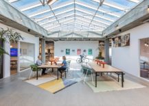
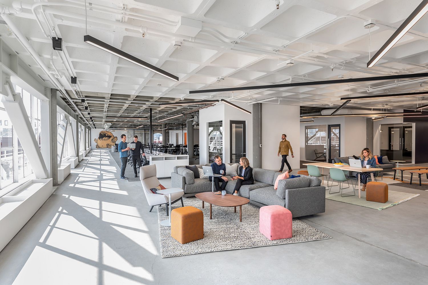
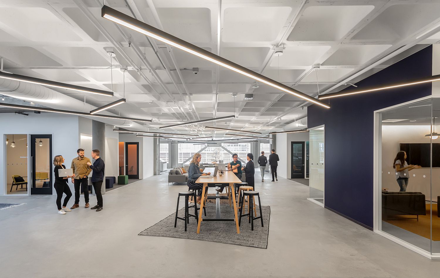
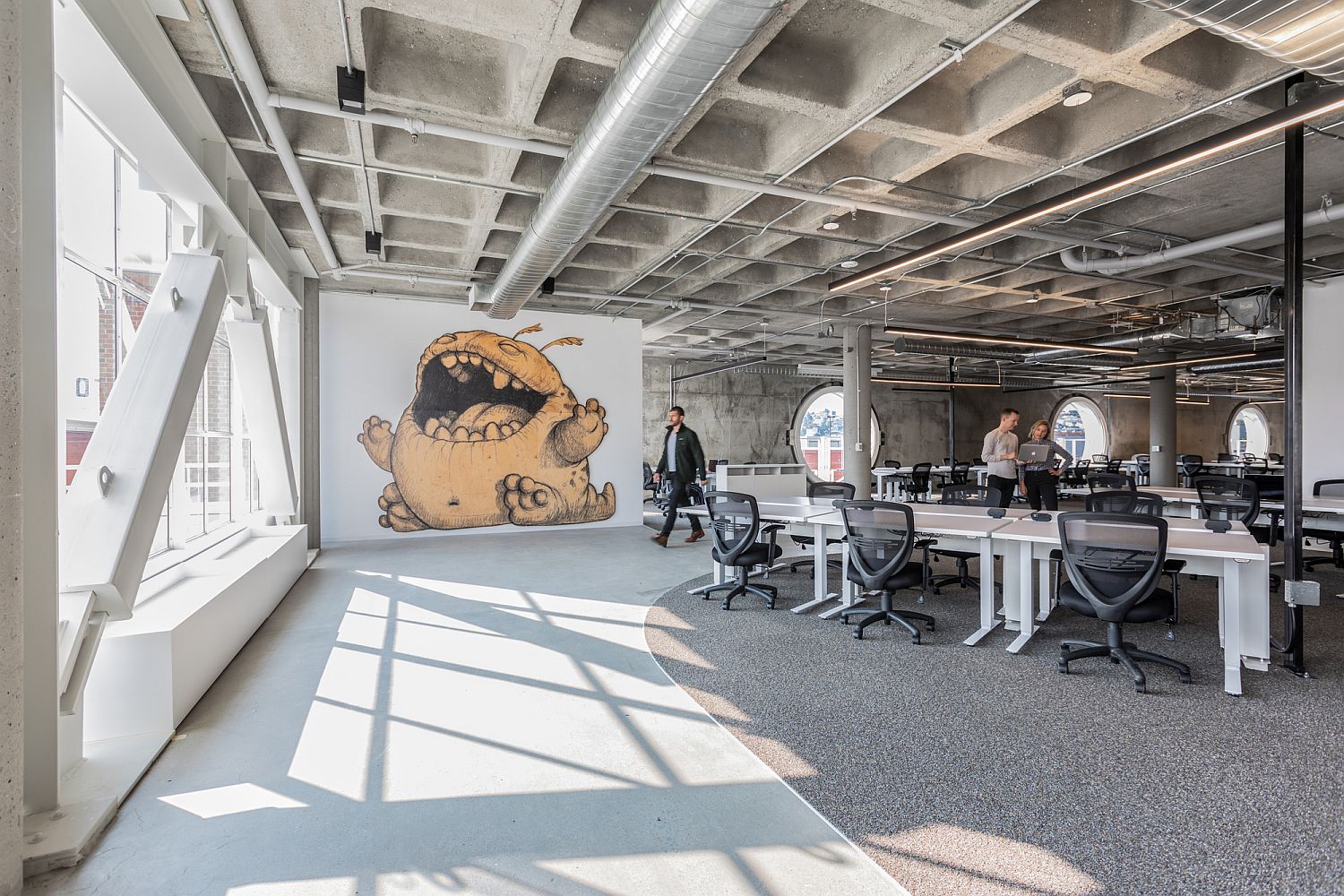
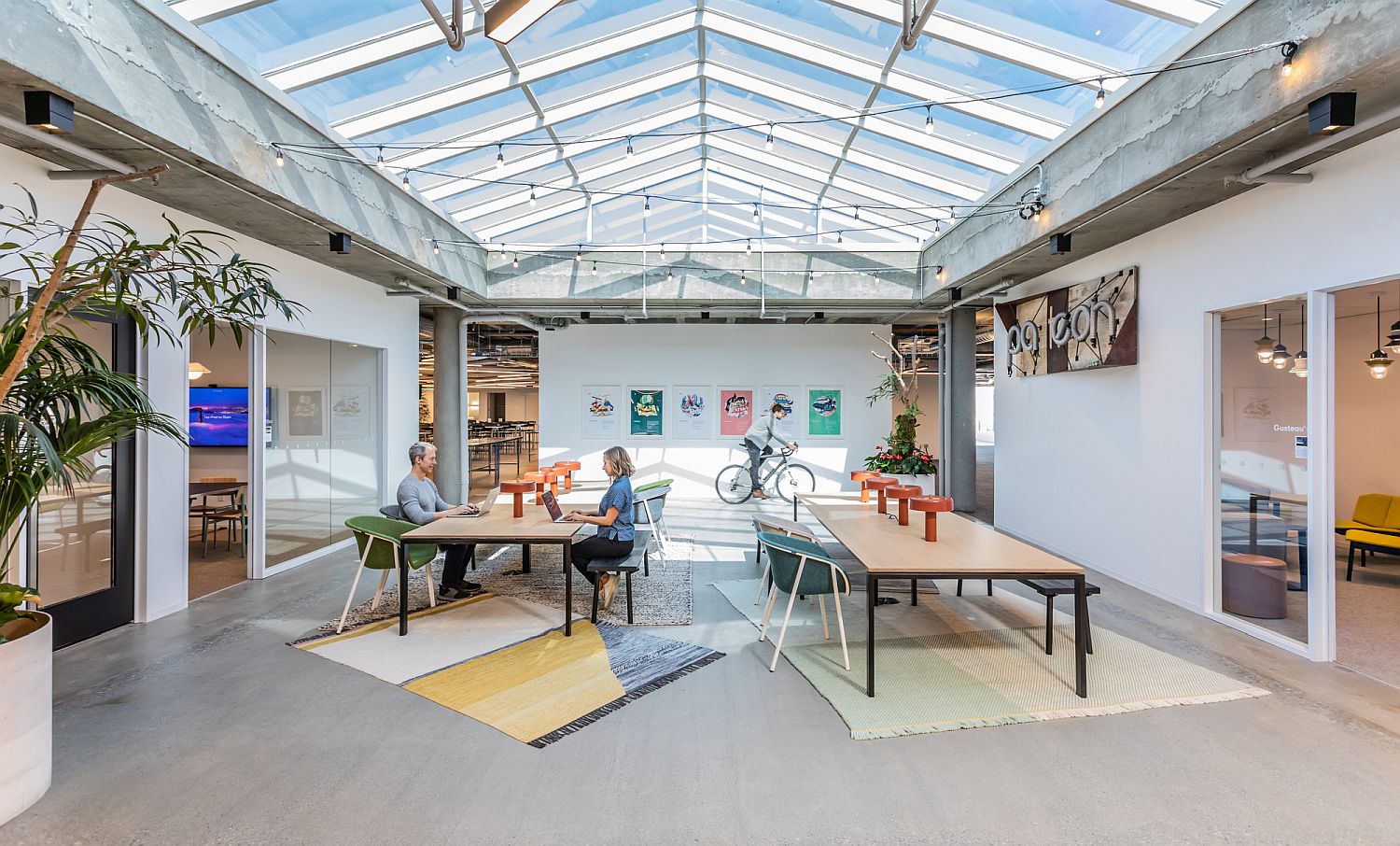
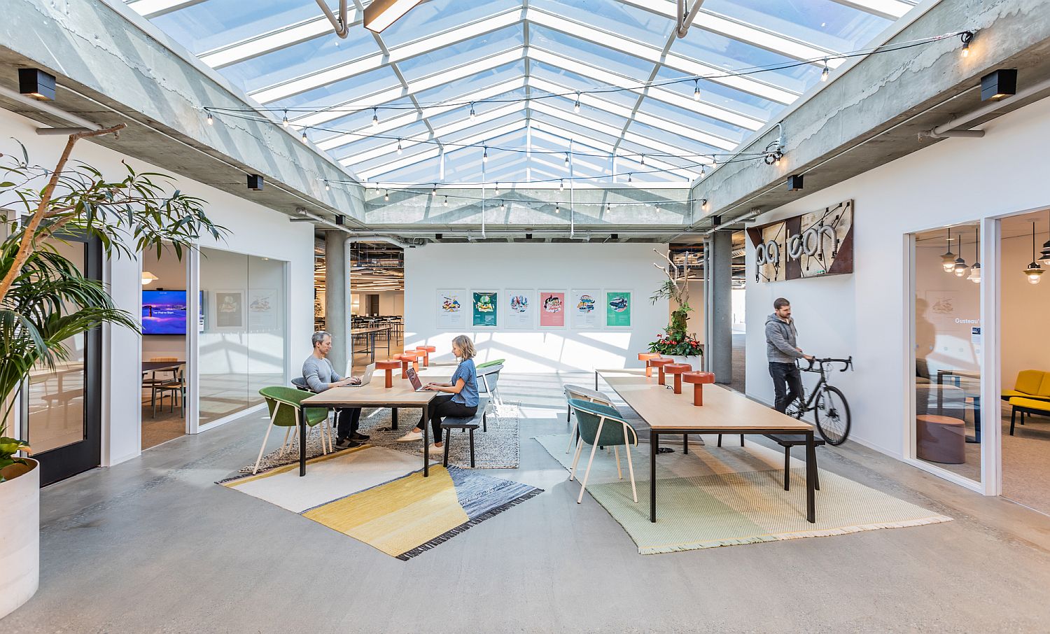
The smart design of the new office occupying a space of 41,000 square feet blends a dash of industrial style with contemporary finishes and a neutral color scheme. The central work area feels like a spacious, open living room of a modern house and a vaulted ceiling with glass panes brings in plenty of natural light. Smaller, more secure workspaces with pops of colors, recording studios and other artistic areas have been combined efficiently in here and one zone flows into the next. The entire Patreon headquarters feels like a sophisticated hub that brings together and nurtures a community of artists. [Photography: Emily Hagopian]

RELATED: Eco-Friendly Cabin Design: Tiny Retreat in the Hills Offers a Cozy Green Escape
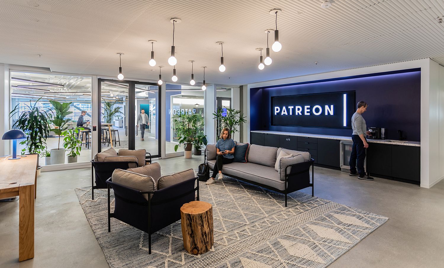
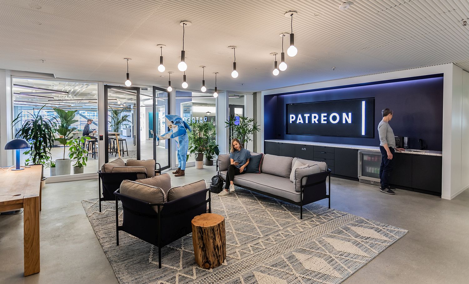
Entrance of the spacious Patreon Office in San Francisco
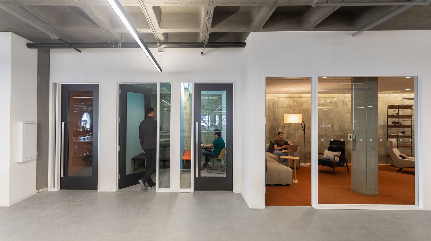
Glass walls connect the private workspace with the larger workzone
Living room vibe of the office in San Francisco that promotes creative arts
Minimal and uncomplicated aesthetics of the Patreon Office by Gensler
Modern industrial office space in San Francisco
Open design of the vaulted roof in glass brings in ample ventilation

The Gensler team, fully engaging with Patreon’s passion and mission, created an environment that fits the company’s needs, supports their community, and demonstrates their new status as a mature organization. The entire space reflects Patreon’s focus on community, with distinct “neighborhood” aesthetics to provide a variety of moods, lighting, and levels of energy.

RELATED: Tiny Cabin in the Woods Charms with Dark Exterior and Versatile Design
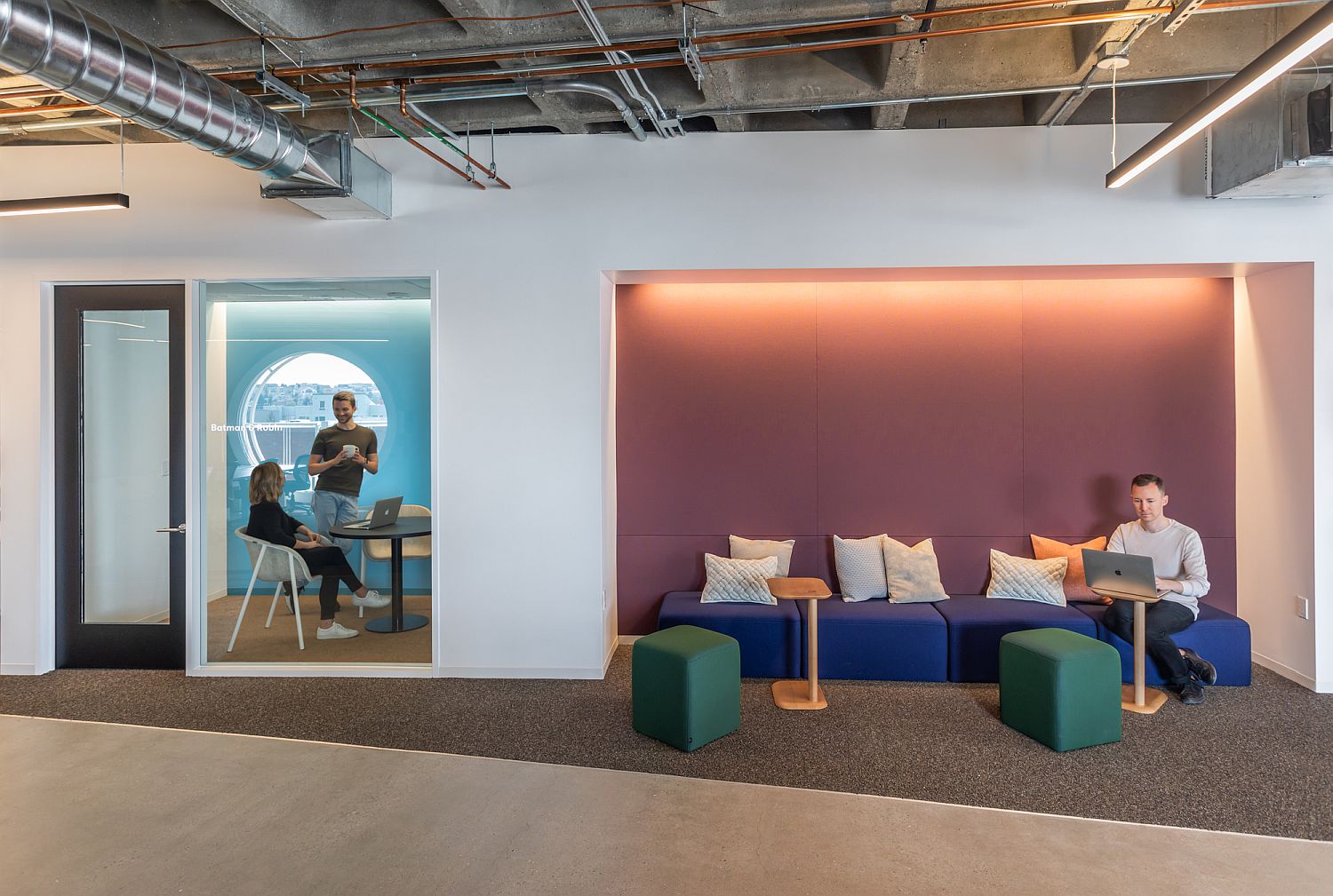
Private and relaxing workspaces inside the large office area
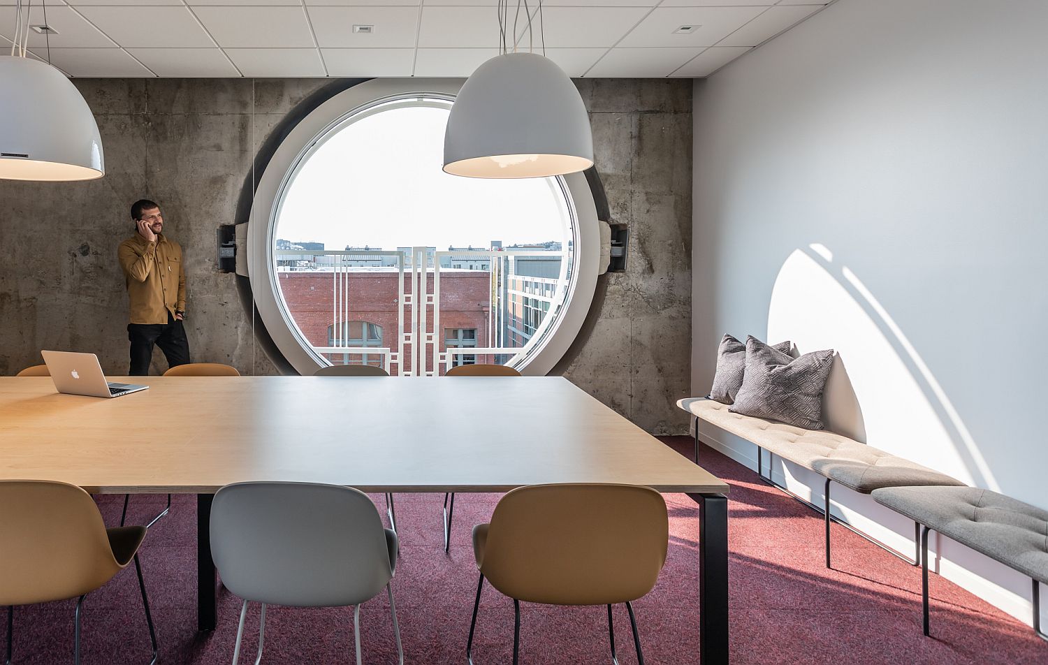
Circular windows and concrete walls inside the modern minimal office
Contemporary design of Patrean Office in San Francisco
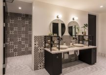
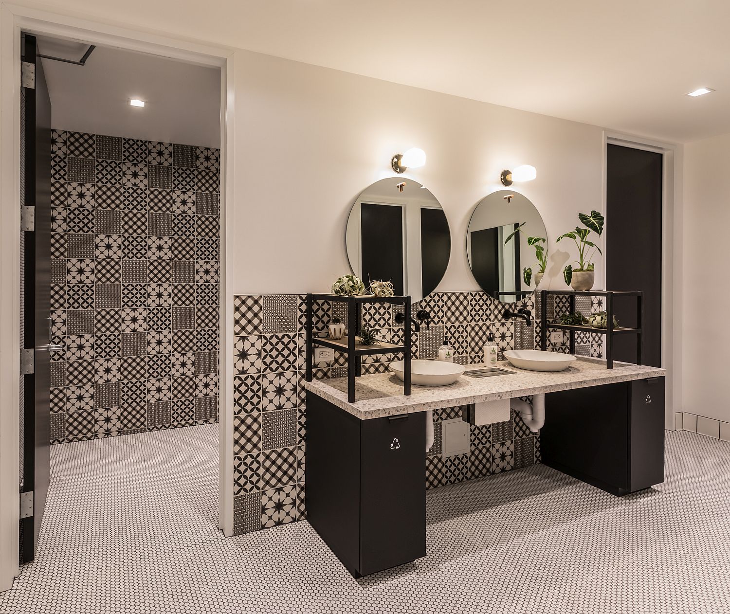
Bathrooms in black and white at the Patreon Office

You’re reading Spacious Contemporary-Minimal Office in San Francisco Feels Casual and Classy, originally posted on Decoist. If you enjoyed this post, be sure to follow Decoist on Twitter, Facebook and Pinterest.

Similar Posts

  • House LV1 (house nanchi 1 y 2)

    CASA LV1 (casa nanchi 1 y 2)
    BRIEF DESCRIPTION OF THE CONSTRUCTION
    The Casa LV1 (casa nanchi 1 and 2), is a multi-familiar conformed by two houses constructed in the same land, the main material used for its construction was white striated concrete.
    DESCRIPTIVE MEMORY
    The Casa LV1 (casa nanchi 1 and 2) is a complex of two houses designed for a family an elderly couple, their young daughter and their granddaughter. Each house has the necessary privacy for each development, with the interrelationship and coexistence of the family; they are located in an irregular diamond-shaped land of approximately 250m2, a gradient over 10% with a view to the southeast.
    The Casa nanchi 1, on its main floor has: living room, dinning room, kitchen, bathroom, main bedroom with closet and its own bathroom, this floor is directly connected with the service area; the lower floor has a hall, two bedrooms with closet and its own bathroom; the upper floor has a roofed recreation room and a garden terrace. All the floors are connected by a stair, and has a parking lot. The total constructed surface is of 160 m2.
    The Casa nanchi 2 has on its main floor: living room, dining room, kitchen, bathroom and service area; on the upper floor it has: main bedroom with closet and its own bathroom, an additional bedroom with closet, a little play room and a bathroom; on the lower floor, where the entrance is, has: two parking lots and an exterior stair which is connected to the other floors. The total constructed surface of the house is 145 m2 excluding parking lots.
    Both houses share main entrance, service yard, green spaces and services.
    The houses are named after the nanchi tree (byrosonimacrassifolia) that is located in that land; it was respected and the project was adapted around it, to make it a natural decoration for the dinning room of the Casa nanchi 1. This house was designed for an elderly couple and it has a terrace in the upper floor, which is a recreational and relaxing space with a view of the surroundings to enjoy with the company of family, friends and guests. It has a double-height space which allows the development of the tree.
    The design of the Casa nanchi 2, which was designed for the daughter and granddaughter of the family, is inspired in the Brno chair, designed by the architect Ludwig Mies van ser Rohe, which not only allows a large volume, but also an efficient and free structural principle because with this solution is obtained an overhang of 4.85 m with a support of 2.85 m, generating a space without any support under the construction.
    The concept of the houses is derogates no only from the connection (interior-familiar, exterior-landscape), but also from the visual freedom that people perceive before entering in the house and also in the interior of them. This is fulfilled by the volumetric integration that defined the spaces of each house, both prisms have specific substractions that allow a formal integration of the two elements; in the Casa nanchi 1 the terrace is subtracted and in the Casa nanchi 2 the parking area is subtracted, transforming both elements without losing its integrity.
    The connection of both houses is so important that is not only achieved materially with the union of the two architectonic objects from the common entrance, connotating the link of the family, but also with the landscape, through the transparency in the facade of the two houses, which creates a visual freedom for the inhabitants. This gives a greater illumination of the spaces, producing a feeling of spaciousness and allows the air circulation due to the large windows that are handled by the users.
    The material, white striated exposed concrete and stone dust of the region, recalls the honesty of the materials, this simplicity benefits the environment, because it doesn’t use coatings in walls, fooors or roofs, contributing the less possible to the pollution. The exposed finishes means less production, transportation and utilization of pollutant materials. As said before, the free circulation of air allows a constant cleaning of the interior air which allows a natural regulation of the temperature, achieving termic comfort for the users and reducing the use of electronic devices that cools artificially the place. Besides, the same large windows avoid the unnecessary use of artificial illumination during the day allowing the entrance of sunlight in the morning.

  • Rain of Gold: Stunning Jewelry Store Enchants in Breathtaking Black and Gold

    The culture of large retail chains across the world has seen commercial design take a more monotonous trend in the last few years. While a similar store design of the brand does give customers a sense of familiarity and encourages brand loyalty, it does significantly cut back on what architects can do with a store […]

    You’re reading Rain of Gold: Stunning Jewelry Store Enchants in Breathtaking Black and Gold, originally posted on Decoist. If you enjoyed this post, be sure to follow Decoist on Twitter, Facebook and Pinterest.
  • Creating an Edible Garden That is Functional and Stylish

    The shift towards a healthier and greener lifestyle is something pretty discernible in folk across the planet. Everyone has their own recipe in this regard. Some prefer to go vegan while others only wish to consumer ‘organic’ food. It can still get complicated at times and it becomes harder and harder to trust the label. […]

    You’re reading Creating an Edible Garden That is Functional and Stylish, originally posted on Decoist. If you enjoyed this post, be sure to follow Decoist on Twitter, Facebook and Pinterest.