Your front door has the power to set the tone for your home’s interior, telling the color story for your space. A case in point: If you have rooms with walls painted shades of green and blue, a deep teal front door could be a wonderful option. Yet there’s more to front doors than color. Choosing a style that beautifully complements the exterior of your home can be an instant upgrade. For example, a Midcentury-style door in a bold color can reinforce the fun and colorful elements of the time period in which a house was built, while steel and glass create a timeless modern feel. [doors below by Portella]
Today we’re shining the spotlight on the top trends for front doors, from fleeting trends to trends will never go out of style. Whether you revel in the here and now or your style is a bit more traditional, you’ll enjoy the design inspiration in the images that follow.
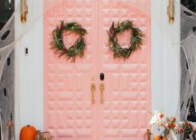
Paint It Pink
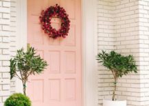
Design bloggers love a pink front door! That’s why all of the photos in this first section of the post feature the front doors of top design bloggers. Millennial Pink has been going strong for a few years, and this peachy-pink hue definitely has staying power. While its huge popularity may fade as people begin to associate it with a specific time in recent design history, there’s something universally appealing and warm about a blush-y color with the power to accommodate a range of looks. Below we see the front door of Sugar & Cloth founder Ashley Rose. The door is painted “Peach Mimosa” by Behr, and this especially peachy take on Millennial Pink is refreshingly irresistible:
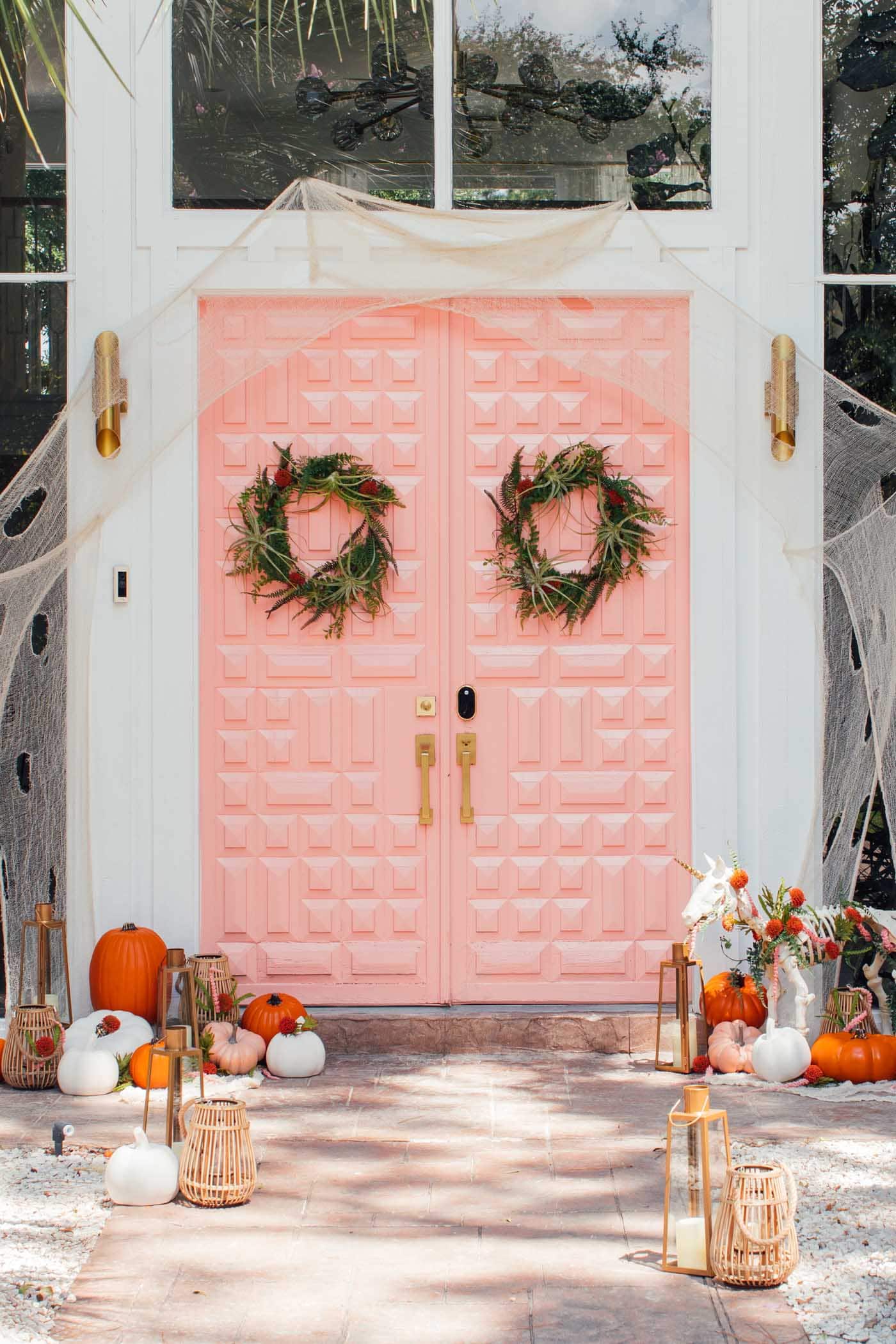
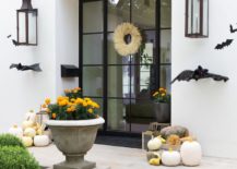
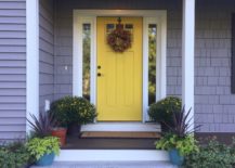
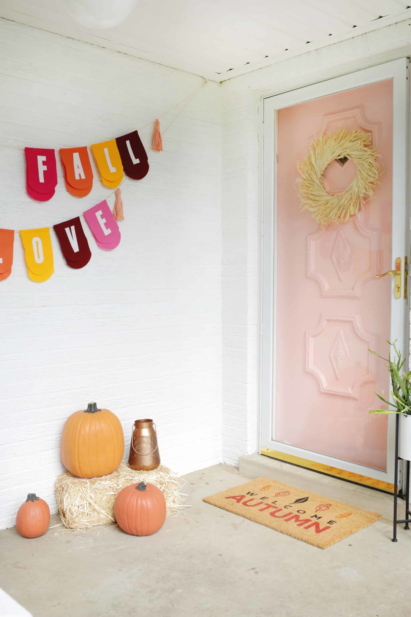
You’ll notice that several of the photos today’s feature doors decked out in seasonal decor. After all, these are the times when front door decor is featured on design blogs! Check out how beautifully pink front doors complement seasonal color schemes, such as the oranges of fall, or the green of the winter holidays. Next up: the pink front door of A Beautiful Mess founder Elsie Larson. The color of choice is Noble Blush by Behr:
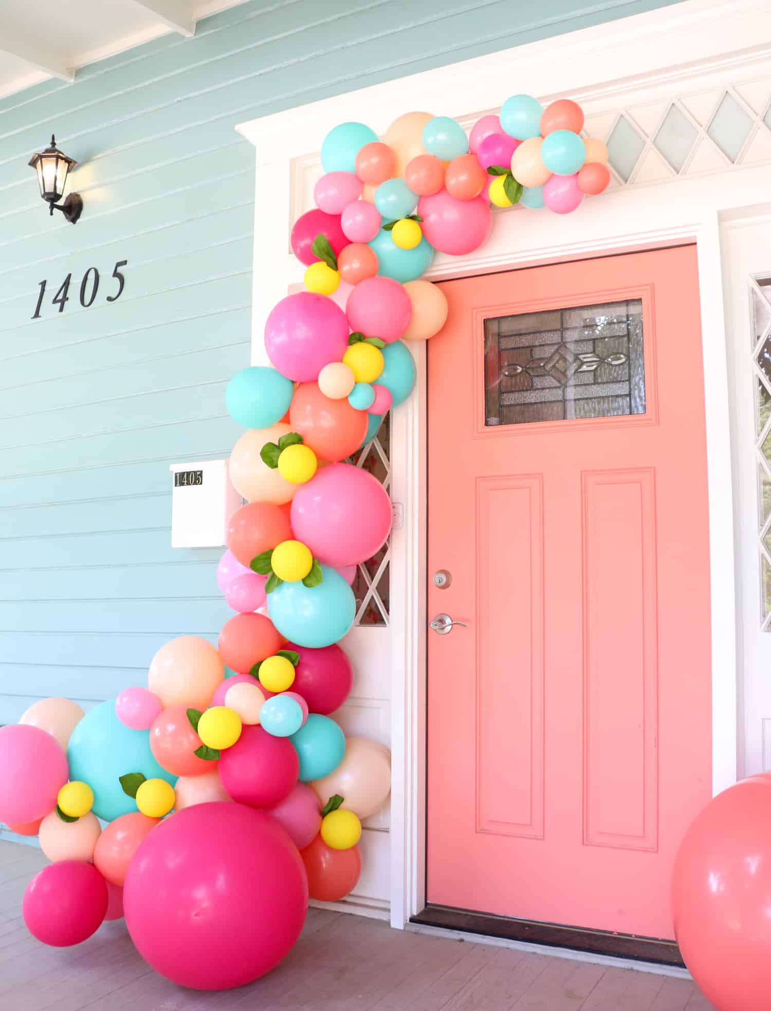
Coral pink really shines against the blue of this lovely home, and the balloon garland makes it clear that a festive fete is in the works. When it comes to pink front doors, do you prefer the peachiest of the pinks, something coral, or a more traditional soft pink? [door featured at A Beautiful Mess]
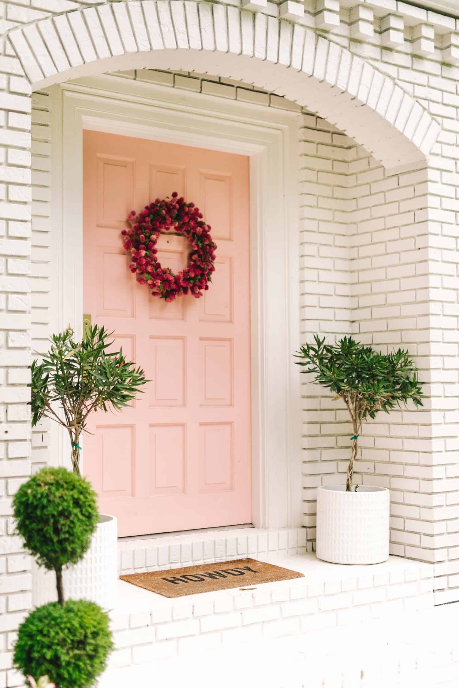
A lovely pink hue is featured on the front door of A Beautiful Mess and The Band Wife blogger Laura Gummerman. Once again, we see seasonal decor on display, proving the versatility of pink. [featured at A Beautiful Mess]
If you’re planning to paint your front door, be sure to check out our post on helpful front door painting tips!
Steel the Show
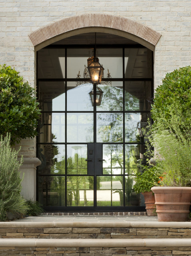
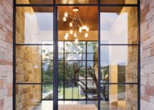
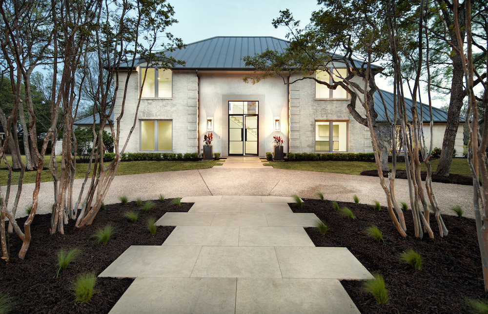
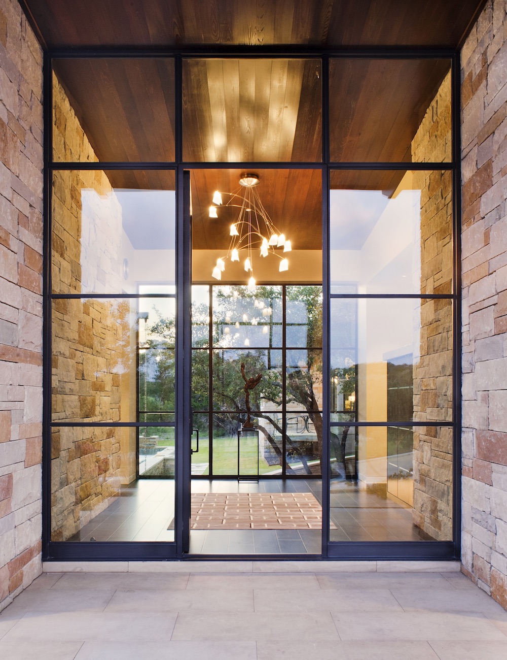
Why go with steel for your front door? There’s something about glass and steel that’s undeniably modern, but in a classic way. Plus, the durability of steel is hard to ignore, and the way these glass and steel creations can be scaled up makes for a grand entrance with a true wow factor. Below we see the steel door of blogger and lifestyle expert Camille Styles.
When French doors are involved, it’s hard not to stare. The double-door effect is nothing short of stunning. French doors by Rehme Steel Windows & Doors are featured in the next image:
Also from Rehme Steel Windows & Doors, the single door below is surrounded by windows, creating a truly grand entrance. As you can see, glass and steel doors are often surrounded by windows on at least one side, putting beautiful craftsmanship on display while reinforcing timeless modern style.
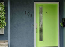
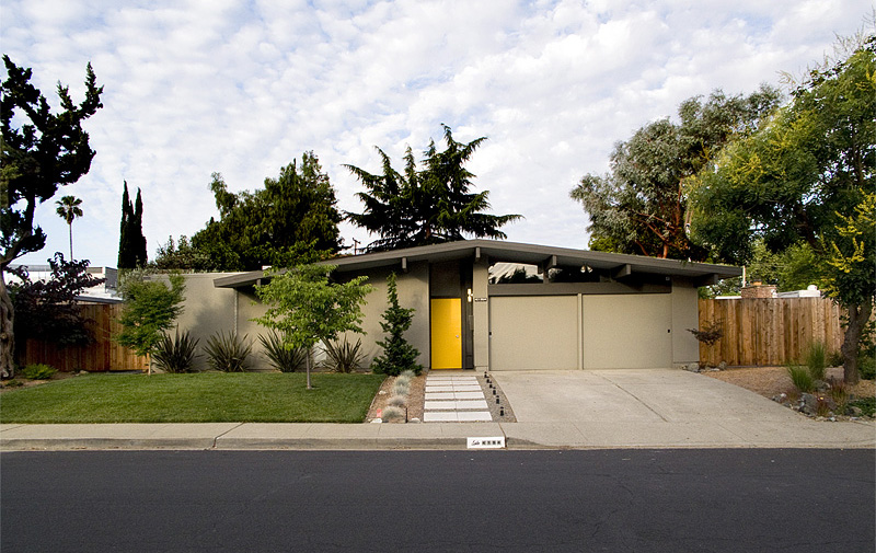
Make It Mid-century
Mid-century-style doors have gained popularity as homeowners have increasingly purchased and restored mid-century modern homes! Front doors from this time period are often in need of a major upgrade, if they’ve managed to survive decades of wear and tear. It’s not uncommon to find new doors with mid-century modern style in a range of bright colors, including turquoise, orange and lime green. Below we see one of Therma-Tru’s popular Pulse Doors (featured at All-Weather):
Another Pulse door with horizontal cutouts can be found in the next image. Cutouts are a popular feature on doors that capture mid-century flair and design. Embracing the lines, as well as the color, is a bold choice with a big payoff:
This vivid yellow door featured at Redneck Modern shows just how striking a colorful front door can be on a mid-century home. There’s something about the juxtaposition of clean-lined architecture and radiant color that can’t be denied:
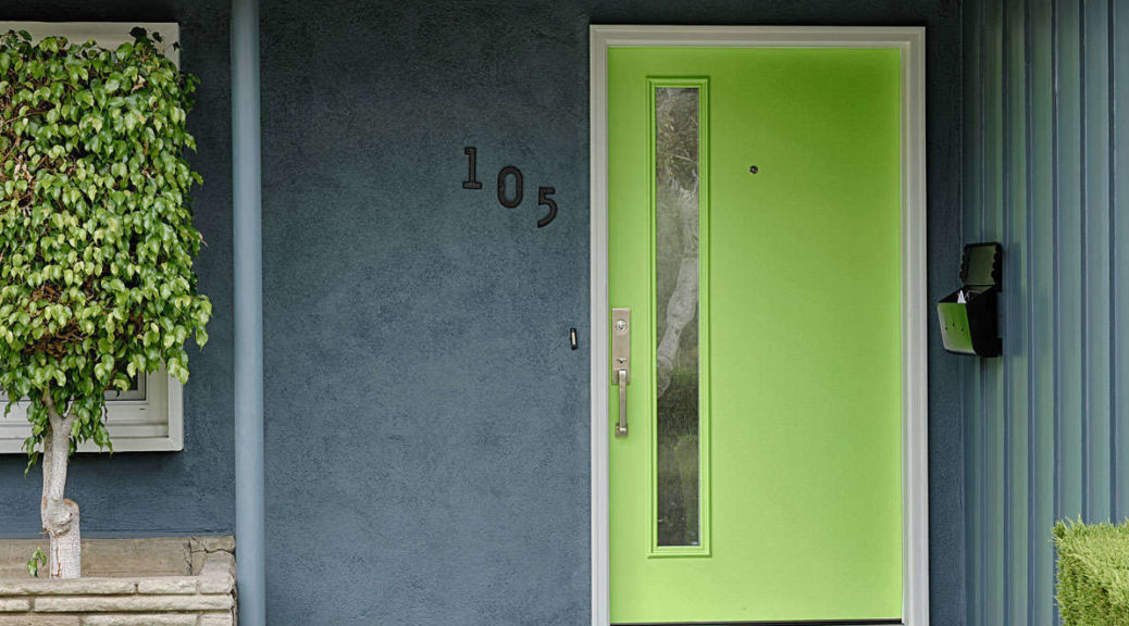
Create a Pop of Color
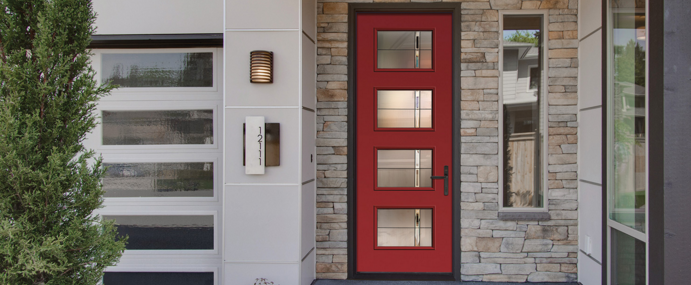
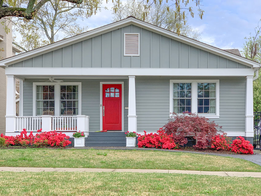
We end today’s post by celebrating the power of a painted door. A fresh coat of paint on an old door can do wonders in upgrading the exterior of your home. Three of the most popular timeless paint colors are red, blue and yellow. Let’s hear it for primary hues! Here’s one of each to inspire you in your front door endeavors, starting with the boldness of a red, featured at Maria Killam:
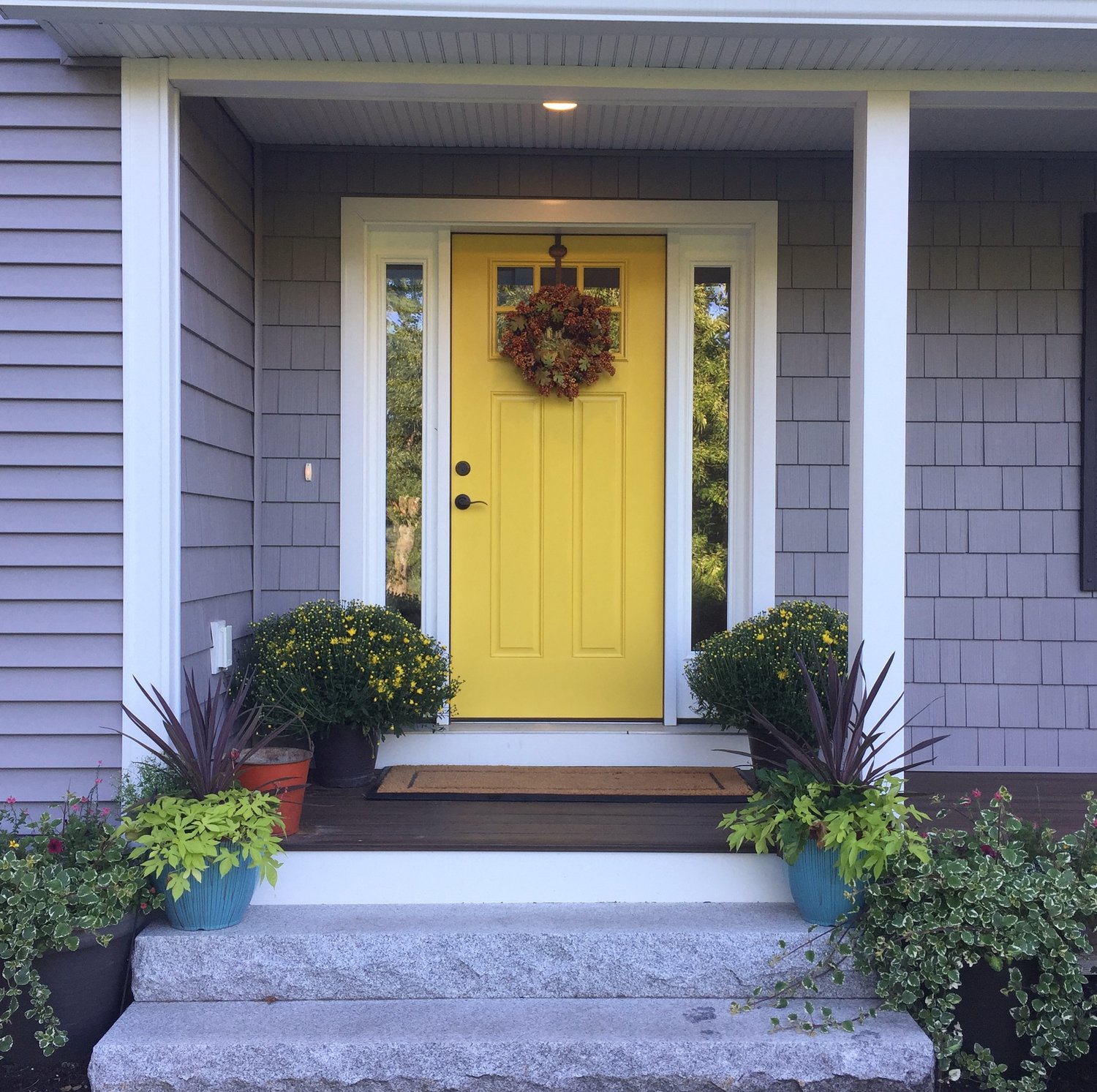
Valspar Dijon is the color of choice for this yellow door featured at Painted Orange:
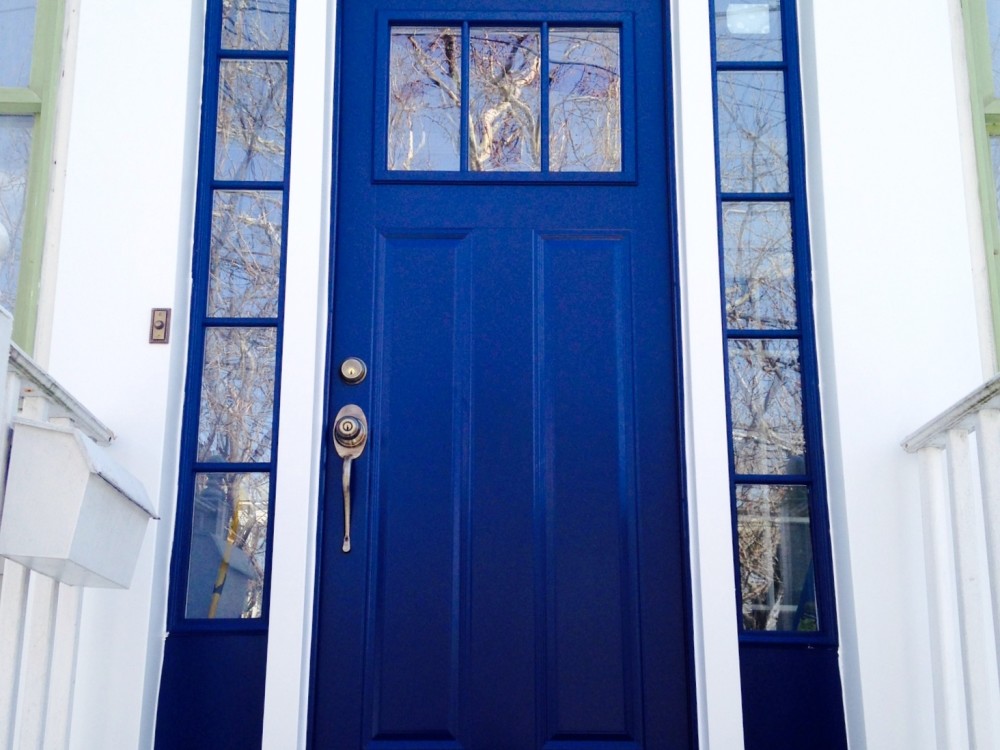
Last but not least, there’s blue. Turquoise has been a very popular choice in recent years, but there’s something about cobalt front doors that will always be dreamy and stately. The door below highlight a project by Statwood:
When it comes to front doors, do you prefer a painted look, or do you enjoy the clean, modern feel of steel and glass doors? Whether you’re ordering a custom door for your home or you’re doing a quick weekend makeover that involves a can of paint, we hope today’s post has opened the door to some amazing options. Don’t forget to flank your new door with a couple of potted plants for an entrance that really sings. Thanks for reading!
You’re reading The Top Trends in Front Doors, originally posted on Decoist. If you enjoyed this post, be sure to follow Decoist on Twitter, Facebook and Pinterest.