A Narrow Victorian in Toronto Gets a Mullet Makeover

Traditional in the front, modern in the back, this historic home ushers light in through a 14-foot glass wall.
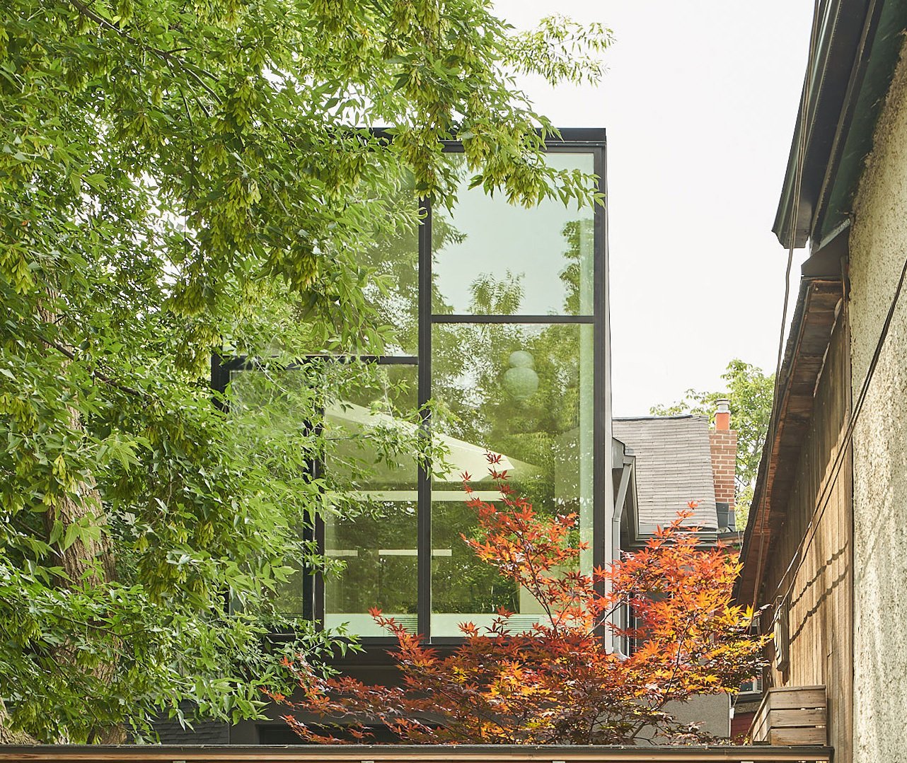
Capping off the second floor is a 14-foot-tall glazed window wall, a dramatic scale change from the original Victorian interior.

For a number of years, the small family residing in a coveted, West End Victorian in Toronto was content with their home. Over time, though, they began to crave modern, fluid, light-drenched living spaces, a departure from the dark confines of their more-than-a-century-old house. Through an innovative extension, local architecture firm Williamson Williamson made it possible, allowing them to simultaneously revel in freeing, open layouts and appreciate the abode’s rich heritage. 
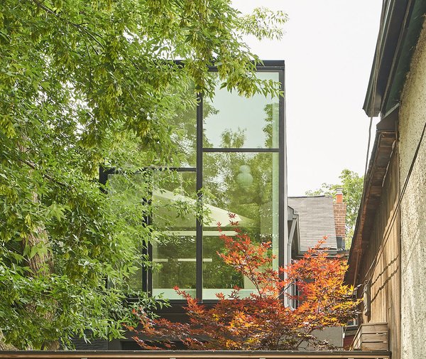
Capping off the second floor is a 14-foot-tall glazed window wall, a dramatic scale change from the original Victorian interior.

Capping off the second floor is a 14-foot-tall glazed window wall, a dramatic scale change from the original Victorian interior.

Doublespace Photography

“What they found out living in a skinny Toronto Victorian is that there were never enough rooms for what they needed to do,” says principal Betsy Williamson. “We didn’t give them extra space by adding a huge room on each floor. We took the existing spaces on the back of the house and added a bit of square footage to each one and then transformed them for a contemporary feeling.” 
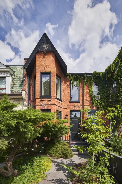
The modern extension in back belies the historic brick facade.

The modern extension in back belies the historic brick facade.

Doublespace Photography

Most often, additions to the back of Victorians are relegated to the lower level. Williamson Williamson did enlarge the 655-square-foot ground floor by 126 square feet in the form of a family room which looks onto the kitchen and offers direct access to a deck just beyond. But the 612-square-foot upstairs was also plumped up by 152 square feet, and that fully glazed room strikingly projects over the solid base below. From behind there is a sense that the additions, both wrapped simply in gray stucco, are at once grounded and floating. 
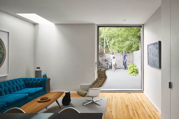
Midcentury-inspired seating adds color in the family room, which leads to the deck in back.

Midcentury-inspired seating adds color in the family room, which leads to the deck in back.

Doublespace Photography

See the full story on Dwell.com: A Narrow Victorian in Toronto Gets a Mullet Makeover
Similar Posts

  • San Antonio House

    The trapezoidal tracing of the property is what defined the construction of this house into three clearly settled volumes. Vegetation also plays a protagonist role in the design of this house, both outdoors and indoors. The exterior trees enclose the house generating distinct tons of shades and colours during the different seasons of the year. Within the interior, the unruly green vegetation, contrasts with the stone floors and solid walls, reaching a perfect sense of balance. The entrance, a double height lobby that creates contrasting sensations and distinct visual ending points originated by water mirrors, light shafts, a tree and a staircase. The walls that shape this area, divide the spaces into private and public areas. The ground floor, is organized into two blocks each with a different purpose: The left side, is a white solid cube that integrates the study and the master bedroom and is separated from the other block by a water mirror and a yard that generates the desired privacy, peace and tranquility. The right side, the social area, is a rectangle closed to the west by a rigid wall and opened towards the interior of the house through large floor to ceiling glass walls, giving sober transparency to the yard with views to the garden and the central courtyard. The different angles within the construction achieve visual ending points with great character, as well as, enhancing the sensations provoked by the pure whites that evolve into mixed tones as the day and the seasons go by.