Before & After: A Seattle Midcentury Shakes Off a Wacky Addition

SHED Architecture + Design fashions a more coherent layout for a Seward Park home with refreshing lake views.
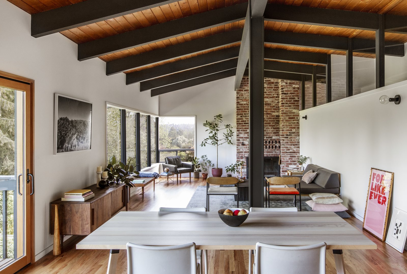
The original fireplace was kept, as was the interior clerestory windows that divide the main living area from the hall and master suite. The floors were replaced with red oak to align with preserved red oak flooring in the bedroom.

When the owners of this 1961 midcentury in Seattle’s Seward Park were first considering buying the property, they toured it with SHED Architecture + Design to ensure that the purchase would be a good investment. On the walk-through, the architects could tell that the home, originally designed by Pacific Northwest architect George Lucker, had good bones, despite some anomalies in the existing layout. 

As architect Prentis Hale remembers, “My initial impression was that it was quite a beautiful house that had a really bad addition. A sunroom was placed on the water side of the house, and in a very funky manner.” 

Before: Exterior Entry
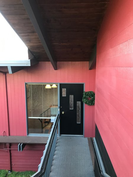
Before: The 1961 house in the Seward Park neighborhood had been originally designed by architect George Lucker.

Before: The 1961 house in the Seward Park neighborhood had been originally designed by architect George Lucker.

Photo: SHED Architecture + Design

After: Exterior Entry
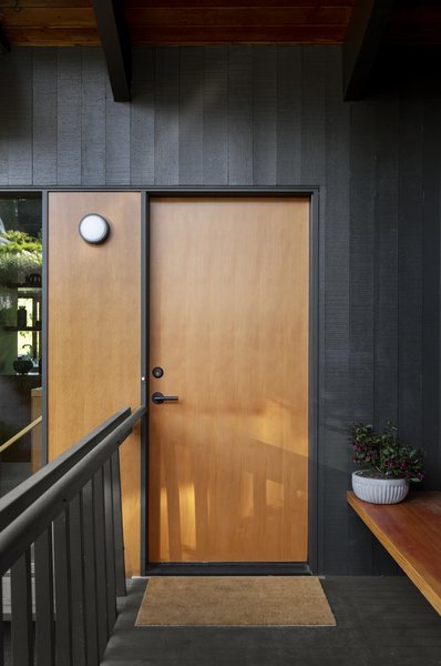
In the remodel, the façade was touched up, the front door replaced, and an entry bench installed.

In the remodel, the façade was touched up, the front door replaced, and an entry bench installed. 

Photo: Rafael Soldi

The homeowners bought and remodeled the property with the goal of restoring its midcentury character and making it more adept for modern life. The firm’s ethos was a good fit for such an approach. 

“This was a house that deserved to be saved and have its life prolonged,” says Hale. “When we are working on those types of houses, we really try to do the minimal number of moves, plan wise. We don’t view it as a tabula rasa. We view it as, ‘How do we get clever and figure out how to solve multiple problems with as few insertions or deletions as we can?’”

Before: Interior Entry
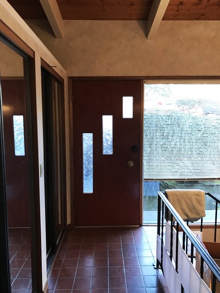
Before: Dated tile and ironwork dominated the entry before.

Before: Dated tile and ironwork dominated the entry before.

Photo: SHED Architecture + Design

See the full story on Dwell.com: Before & After: A Seattle Midcentury Shakes Off a Wacky Addition
Related stories:

  • A Family Goes Somewhere Over the Rainbow
  • An Architect’s Home in Sydney Is a Masterful Lesson in Sustainable Design
  • This Charming Wooden Barn in the Netherlands Utilizes Every Part of the Tree
Similar Posts

  • Yeronga House

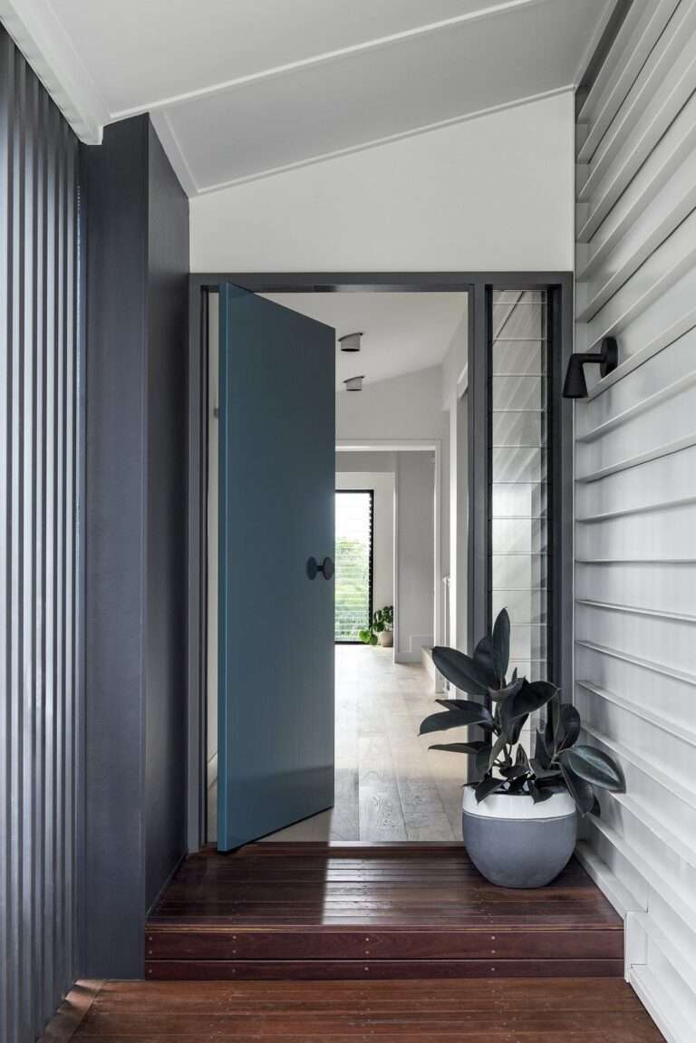
    A blank canvas to create a new family home. On this slim vacant block, perched on a Brisbane ridgeline, we were engaged to design a comfortable and homely abode with the challenge set to capture the views, traverse the sloped terrain and filter the bright sunlight. We achieved this by creating a contemporary spin on the historic Queenslander whilst layering the spaces with this multi-levelled home. The heart of the home, the Kitchen and Living areas, are positioned on the middle layer and both sleep and play zones are separated out on their own floors. Everyone in the family has their place for retreat. At every opportunity there is an opening to bring light and air into the home. Vistas to the city are harnessed, and views to the neighbours are screened with the use of dense battening. Complex planning requirements meant that the home should be contained within a set envelope. This led to opportunities to create varying floor levels and introduce pitched ceilings which provide internal volume without excessive height or overwhelm to the home’s surrounds.

  • SO House

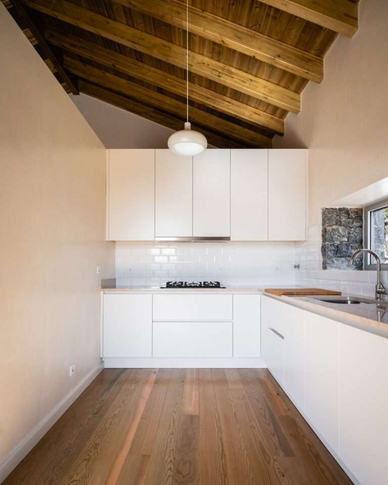
    REVEALING THE EVIDENCE Confrontation with the reality of these ruins was always a confrontation seeped in memories. Memories
    of a place where the raw matter it is constituted of – the rock, the valley and the mountain – shows evident expression, provoking a game of fine balance between place, matter, light and shadow. We found light that dripped down the stone walls defining spaces separated only by rows of stacked rock. In each fissure, in each wrinkle, a soft balance between light and shadow. Standing before this scenery, the exercise consisted in finding the most natural way to connect ruins and spaces, simultaneously defining future possibilities for links between the interior and the exterior. Where decisions were concerned, we chose to rehabilitate pre-existing volumes and introduce a new connecting element. The answer is given by the almost immediate decision to join together the pre-existing elements. This
    gesture, deeply connected to the terrain along the pendente – connects the two sections facing west,
    forming an exterior courtyard adorned with a centenary olive tree. This project builds a space that runs through the ruins, uniting them and revealing the obvious functional relationship between the house’s programmatic areas, simultaneously differentiating the possibilities for inhabiting the exterior space. It expresses its temporality through the antagonism of matter in its relationship with pre-existing elements.

  • 11th St Residence

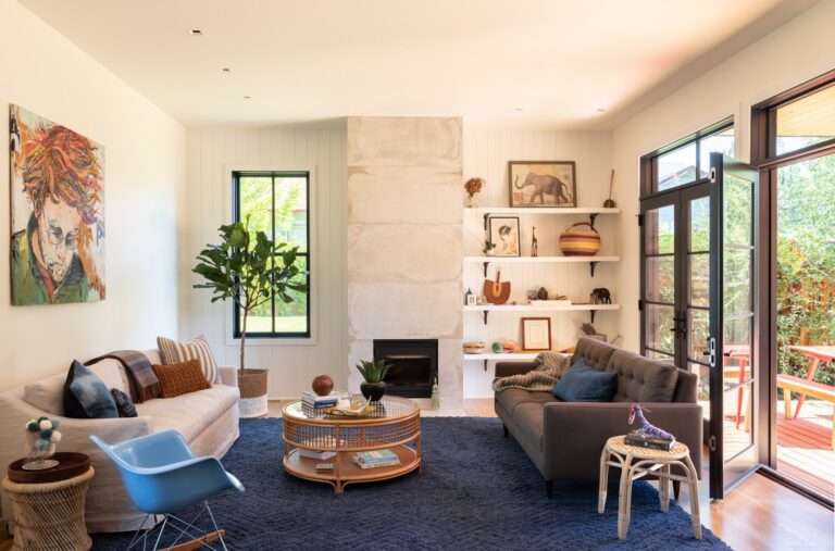
    Situated on a triple-lot in Boulder’s Newlands neighborhood, this 3200 SF home was designed for a young couple looking to start a family and develop a property well-positioned for future resale in the Boulder real estate market. Our challenge was to preserve as much of the yard as possible while creating a 4BR, 3.5BA home that grouped master suite and kids’ bedrooms on a single floor, and accommodated a private guest suite, ample living areas, open kitchen, and detached garage with small studio space above. The gabled-roof design and divided light windows nod to the vernacular of adjacent properties while charred and stained cypress siding offers a distinctly contemporary tone. A long, horizontal volume stretches across the front perimeter of the property, concealing the large outdoor space behind. The design relies on standard wood framing to optimize budget without compromising form, and allows owners ample room to both grow their family and enjoy a fluid connection between indoor and outdoor areas.