Giving that Nursery a Fresh Look: Top Nursery Shaping Trends of the Season

You might not always pay much attention towards redoing the bedroom or even when you are planning for a new one in your home. But it is important that the nursery you create for your little one is smart in its design, gets the basic things right and is safe for both the kid and the mother. It needs to be a room with the right temperature and ventilation. There are plenty of things beyond just aesthetics that you need to consider before choosing the right look for the nursery. But once you have those things sorted, it does not hurt to get the visual aspect of things spot on as well!

Smart rug in shades of purple, violet and yellow with hexagonal pattern for the kids’ room [From: Carmen Parker Styling]


Despite your little one being far too young to notice, you will be surprised to know that science tells us that using the right colors in the nursery plays a major role in their development. Keep the nursery far too dull and they are bound to get bored quickly while using too much of bright color in the nursery can over-stimulate their brains and leave them restless. A balance between both these elements is the key inside the nursery and that is what we get as we take a look at the top trends shaping nurseries this season –

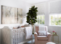
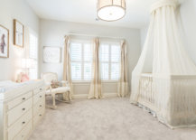
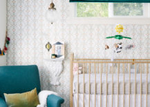
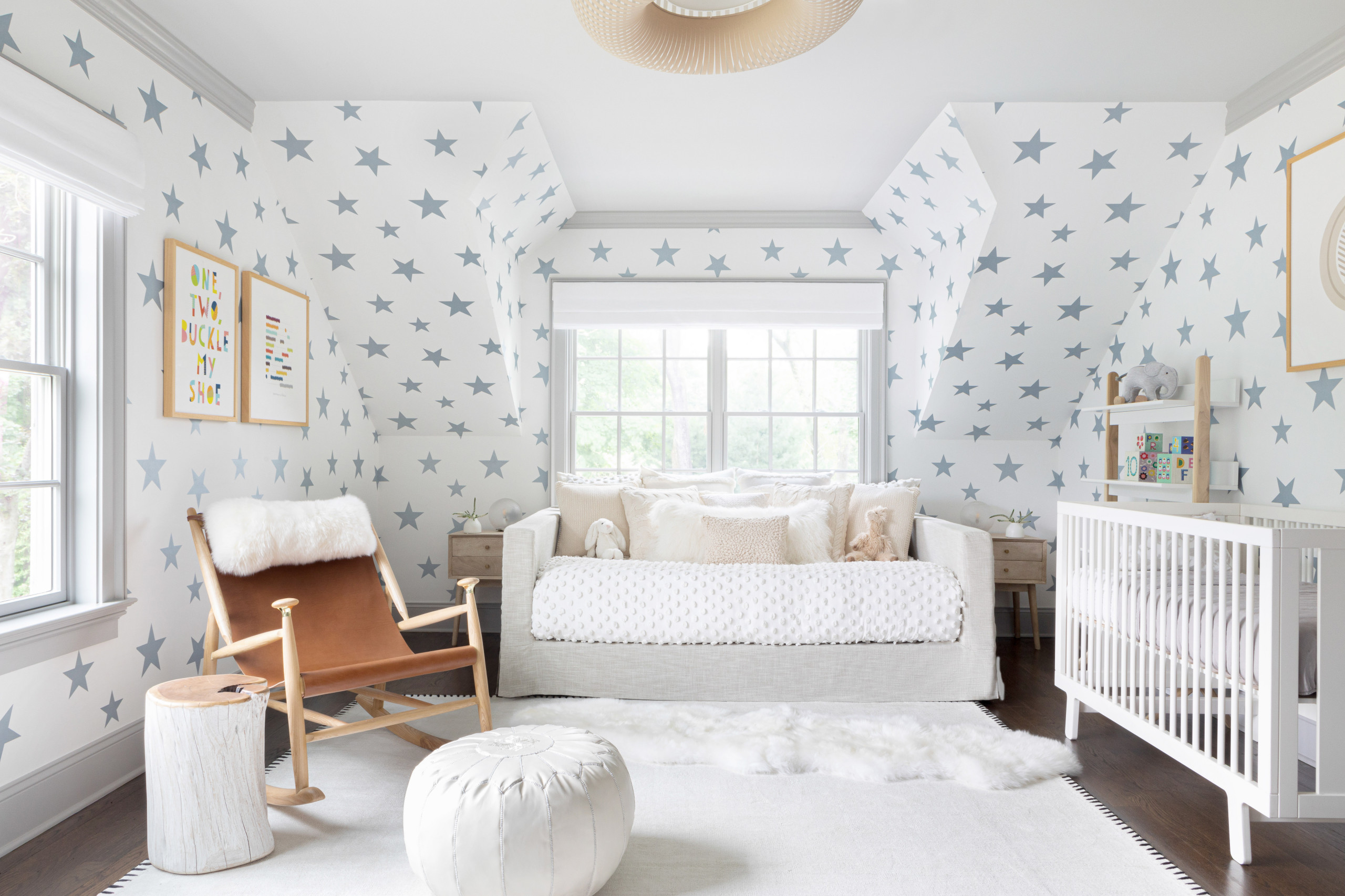
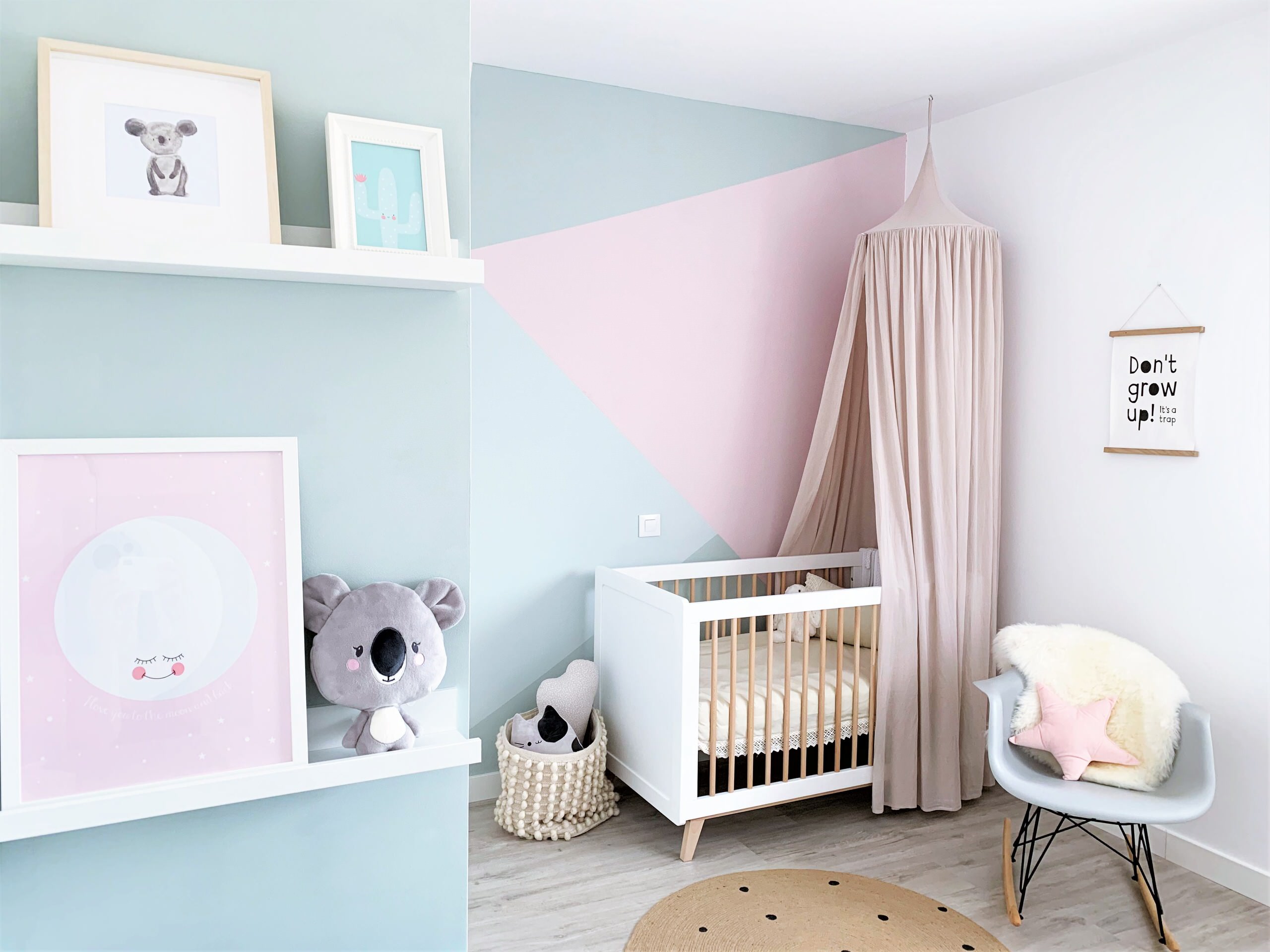
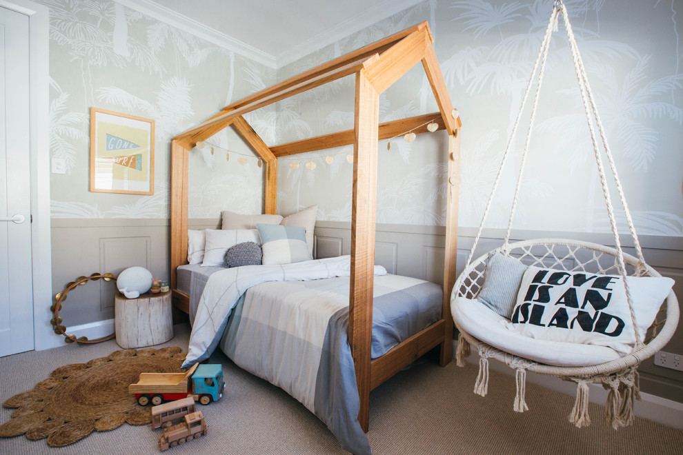
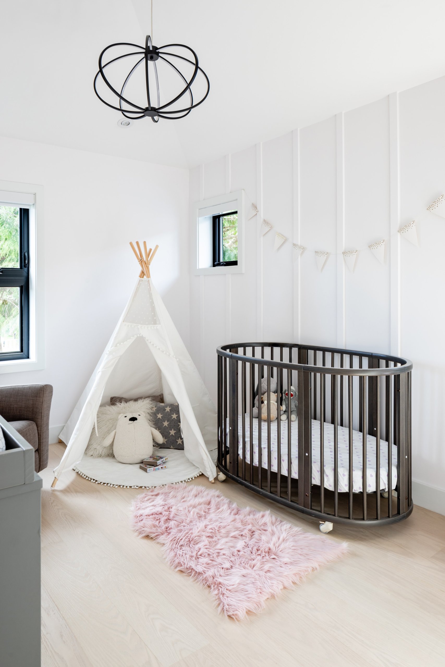
Serenity is the Chosen Mantra

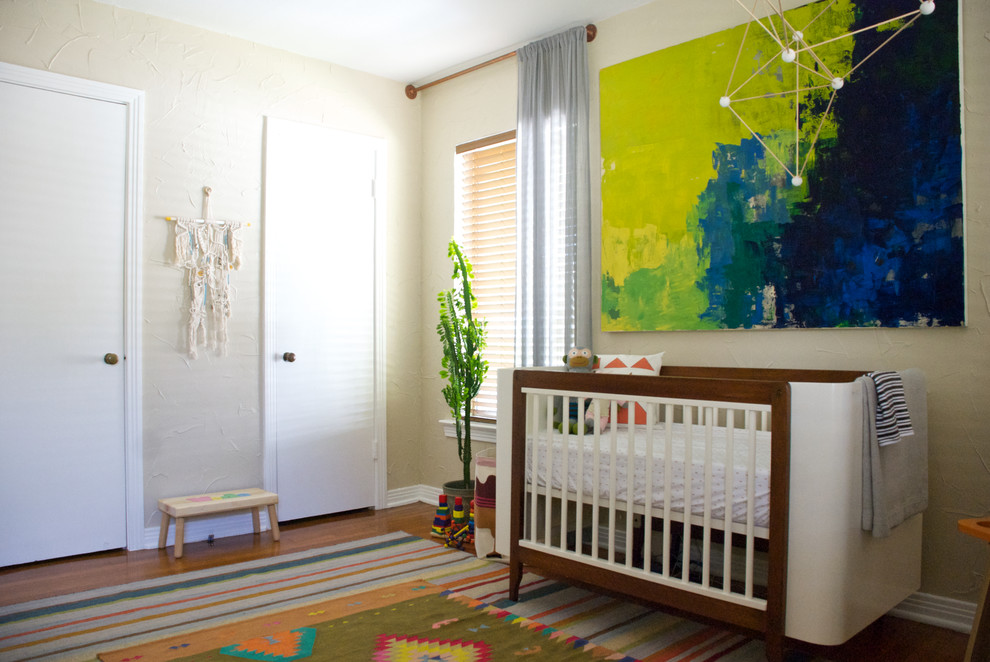
We always prefer a nursery that has a neutral backdrop and presents a picture of serenity. This allows you to add colors easily to the blank canvas and with a dash of gray and wooden accents you can turn the space into a classy setting that also serves as guestroom. Using light pastels is a trend in every room of the house and this is something that works beautifully in the nursery as well irrespective of whether it is for a baby boy or girl. Keep things uncomplicated and clutter-free for the best look.

Contemporary nursery of New York home with a unique star-filled backdrop [From: Chango & Co.]
Indoor plants bring freshness to the nursery in white
Sense of serenity in design is an idea you can embrace in the nursery as well [From: Classica Homes]
Blocks of pastel pink and blue make a big difference to the backdrop of this modern nursery
Combining a hint of color with a serene backdrop in the modern nursery [From: Studio Palomino]

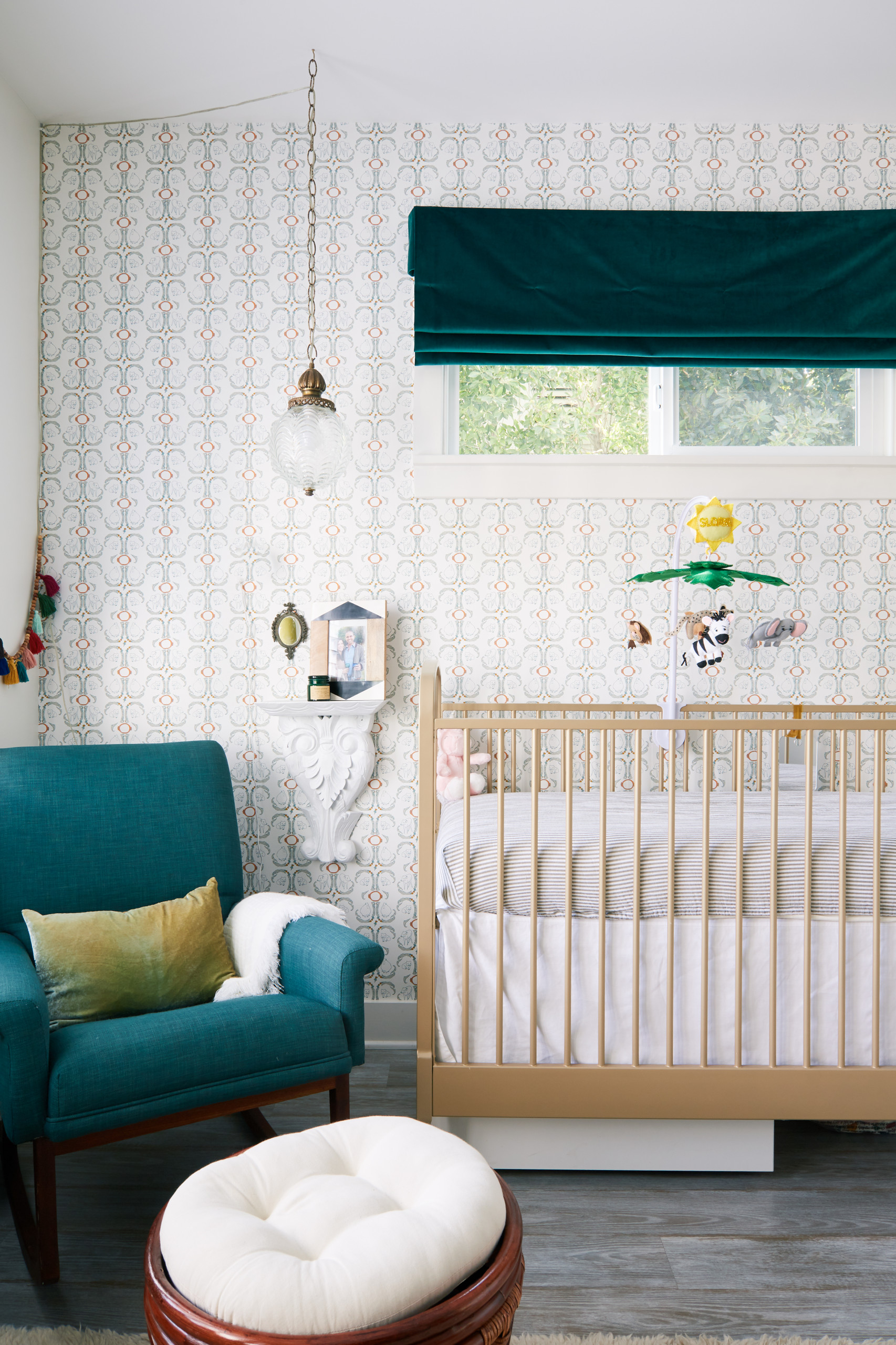
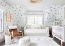
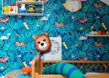
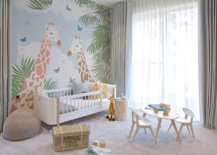
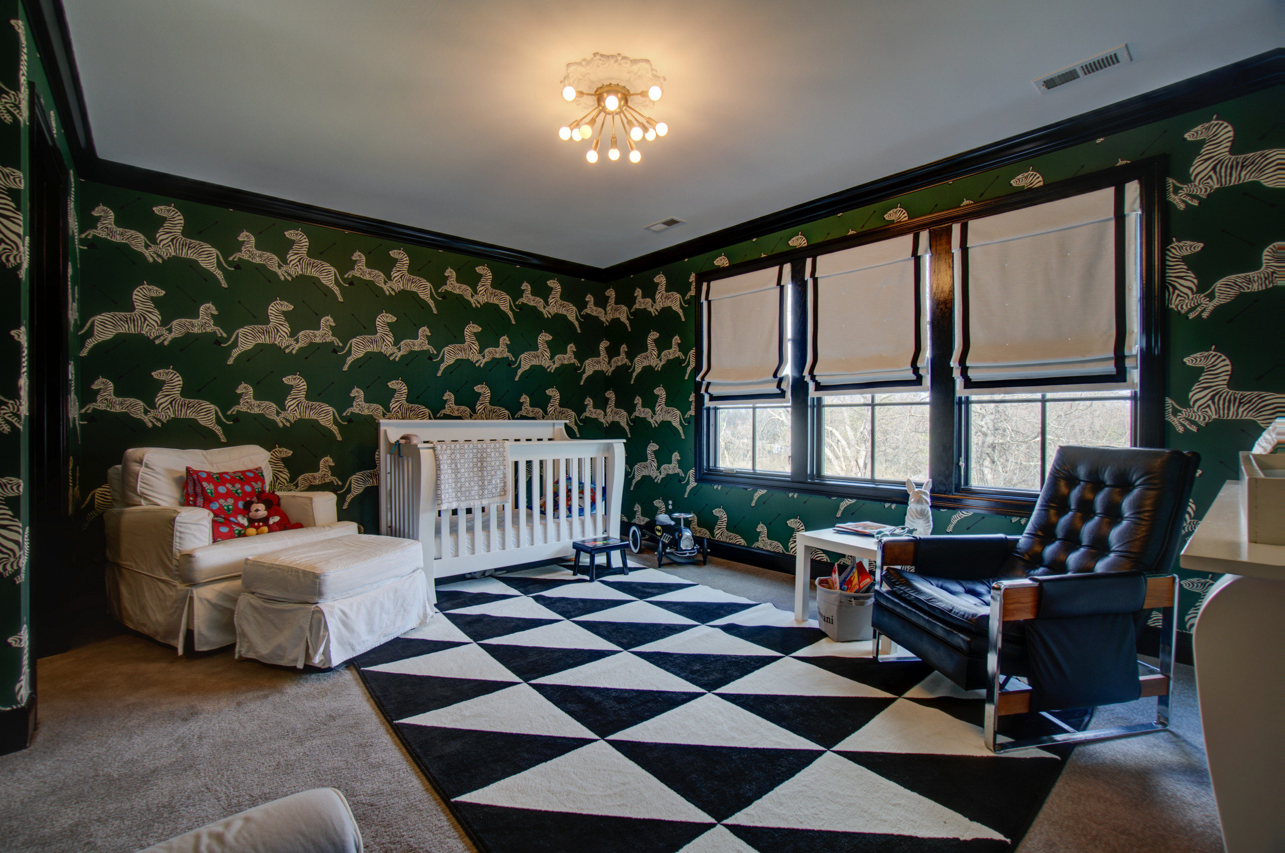
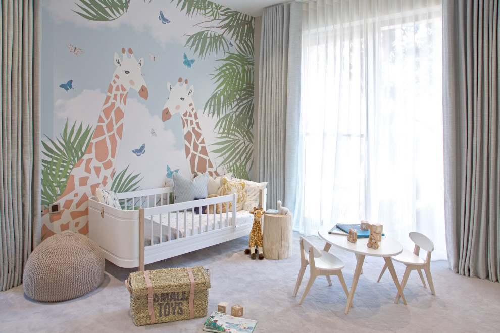
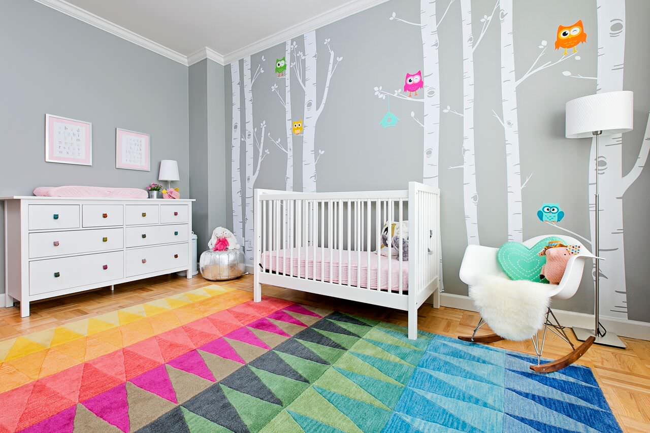
Wallpaper with Animal Prints

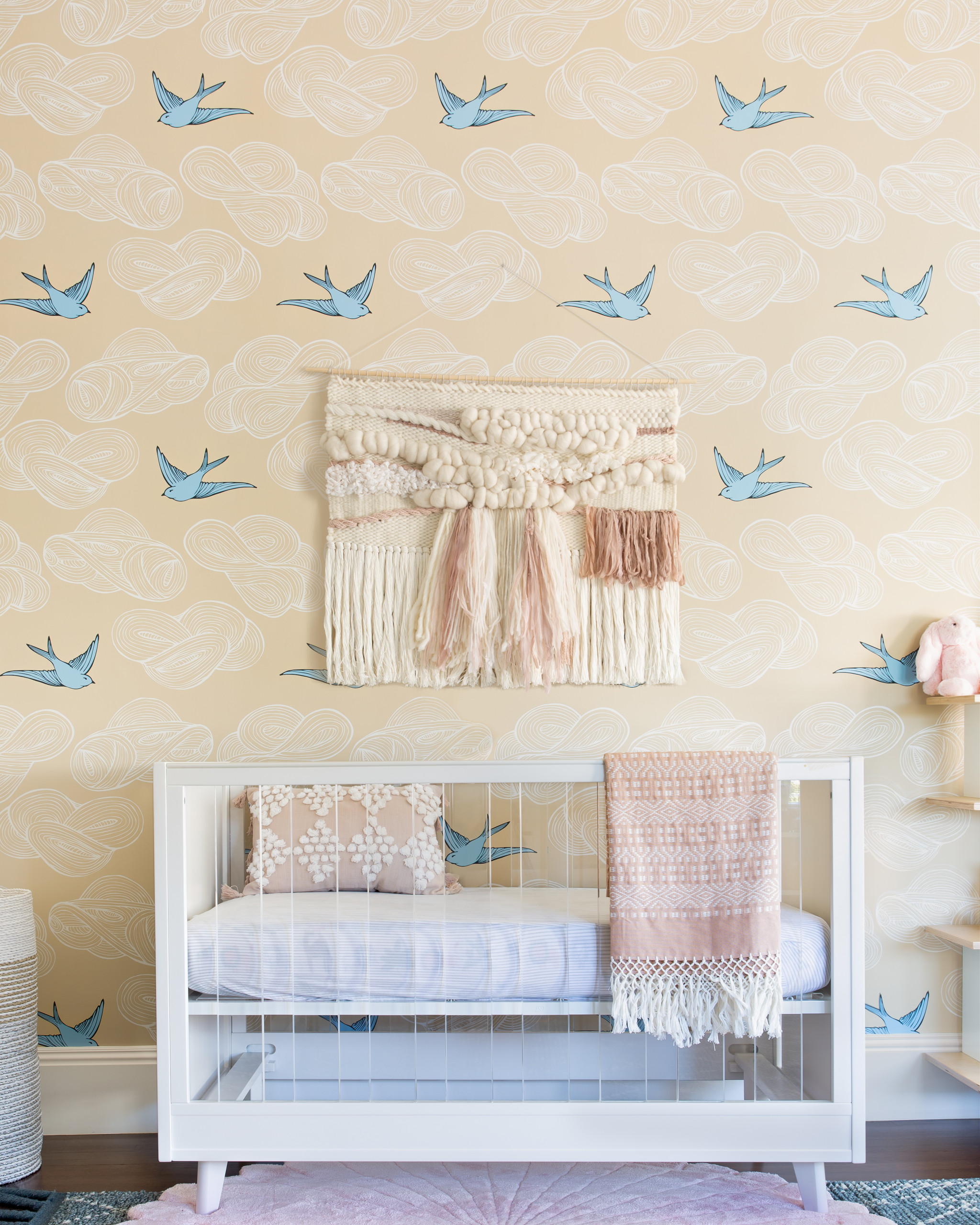
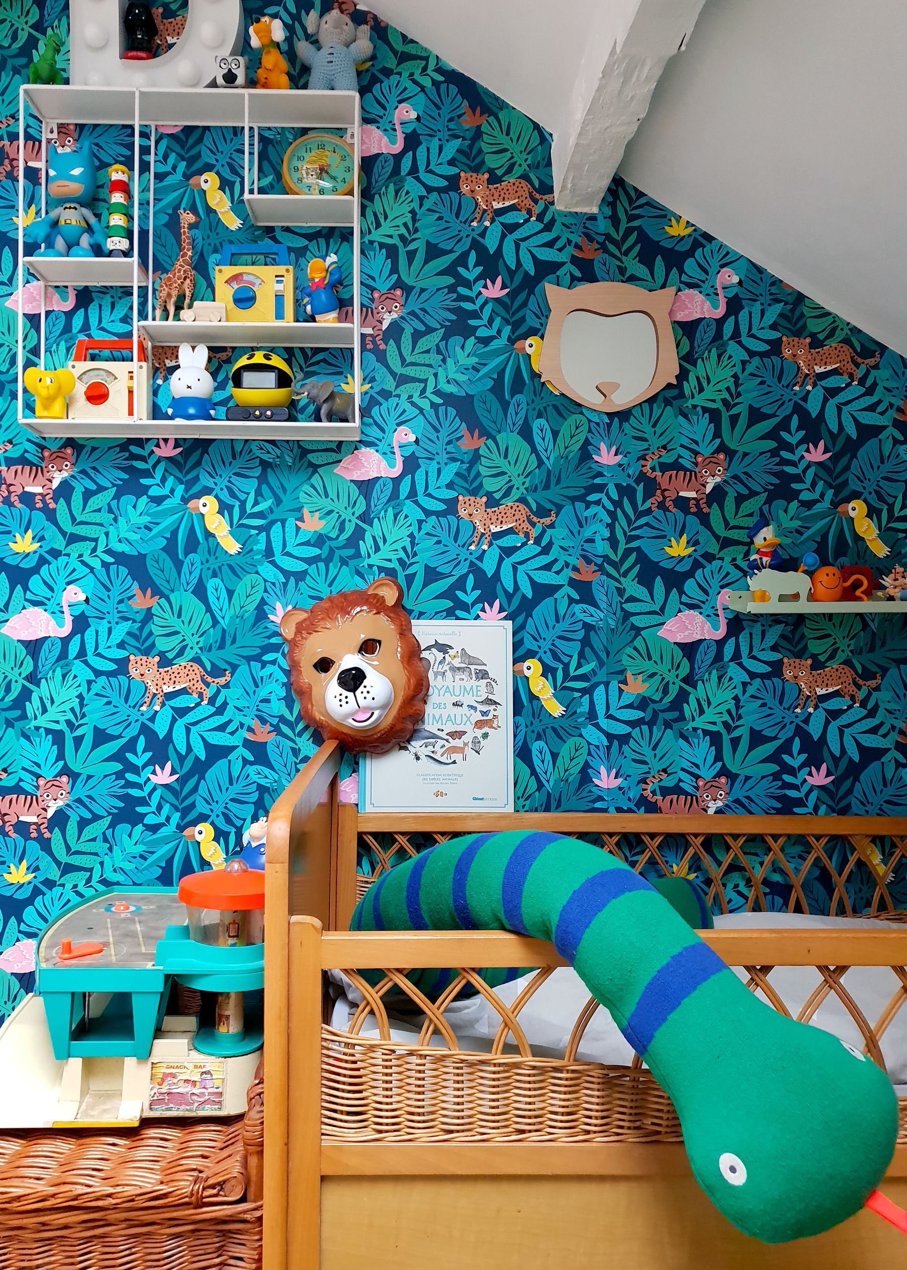
A popular choice these days in the kids’ room as well as in the adult bedrooms is the wallpaper with natural and animal prints. This is an idea that comes alive even more in the nursery where the wallpaper in animal prints allows you to create a beautiful accent wall with ease. Color here is optional and you can choose between either a wallpaper that is bright and brilliant or one that comes in neutral hues even as it carries gorgeous animal prints.

Gorgeous wallpaper in green with pattern that adds cheer to the lovely nursery [From: NJL Custom Homes]
Wallpaper brings a hint of tropical charm to the modern nursery with ample natural light [From: James Robinson Photography]
A popular wallpaper choice with bird print for the smart modern nursery [From: Regan Baker Design]
Colorful wallpaper in dark blue with animal motifs for the dashing nursery in Paris home [From: Catherine Zarrabian]
Finding the right nature-centric wallpaper for the nursery in white

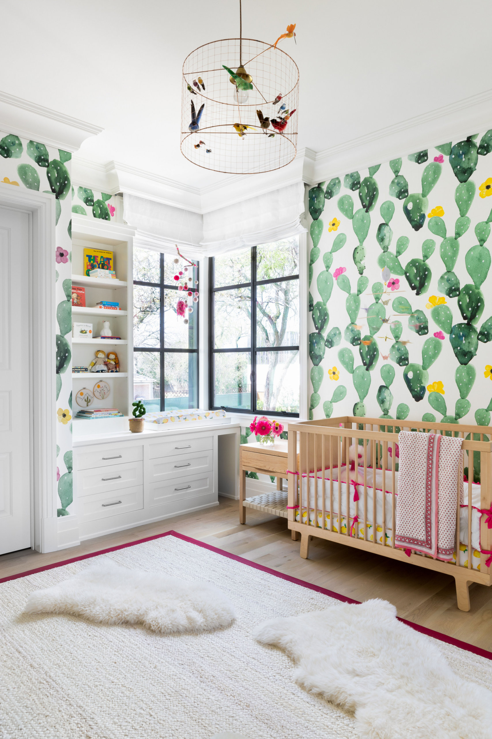
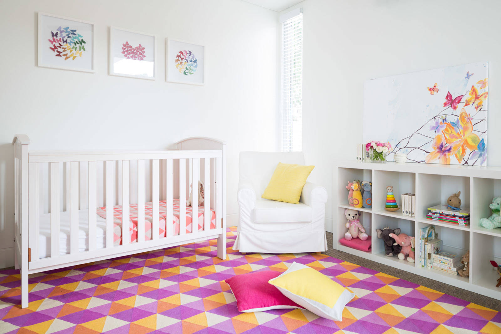
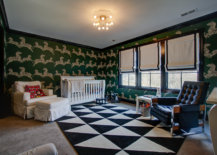
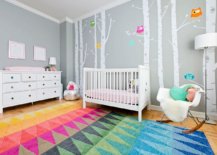
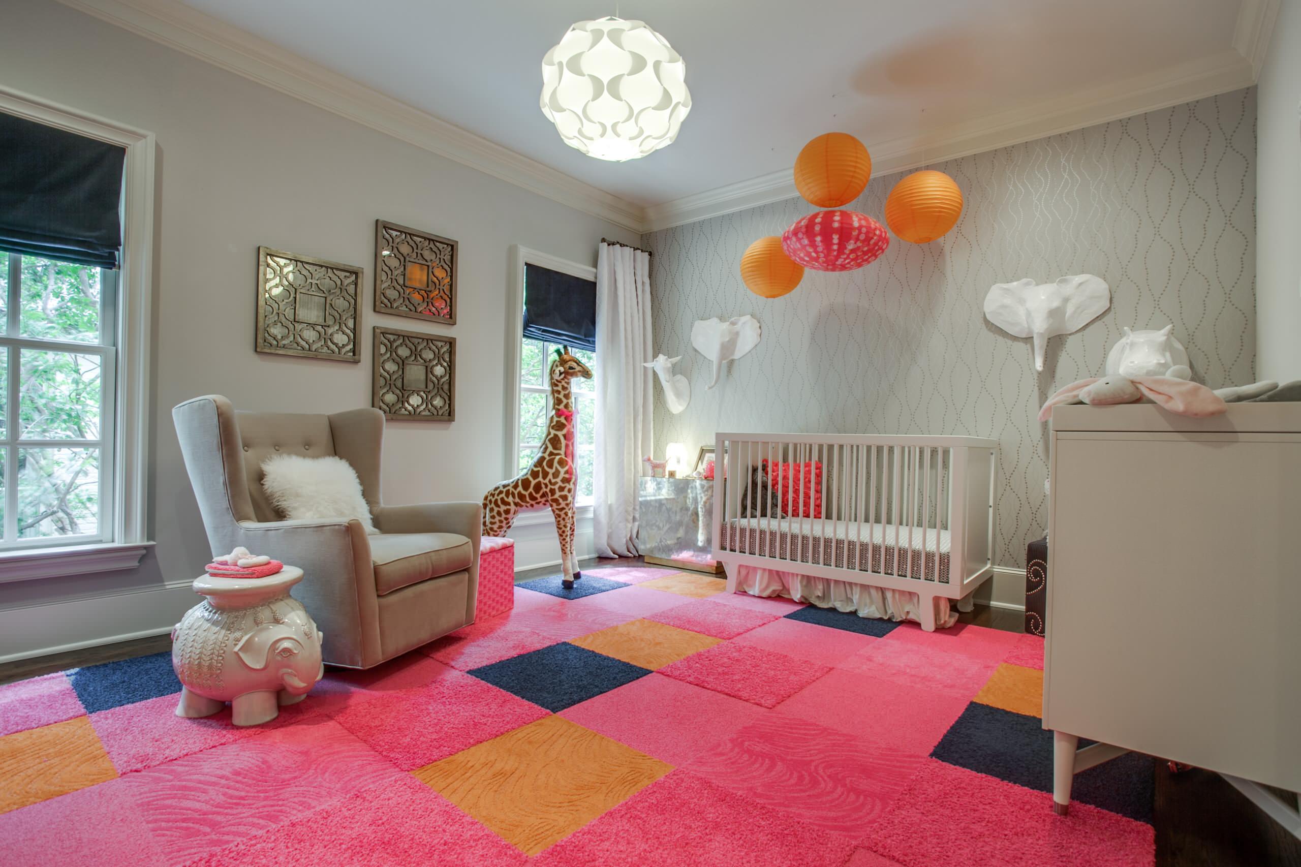
Use the Rug for Color and Comfort

Adding bright pops of color to the neutral nursery does not have to be an expensive affair. You can use a variety of ways to get this done, but the most popular one among them all this season is the colorful area rug. The smart rug can bring in both color and pattern with ease and you will not have to splurge a fortune on this little makeover idea. The moment you feel the rug is overstaying its welcome, just move it out for a trendier option.
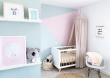
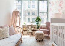
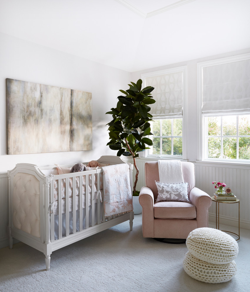
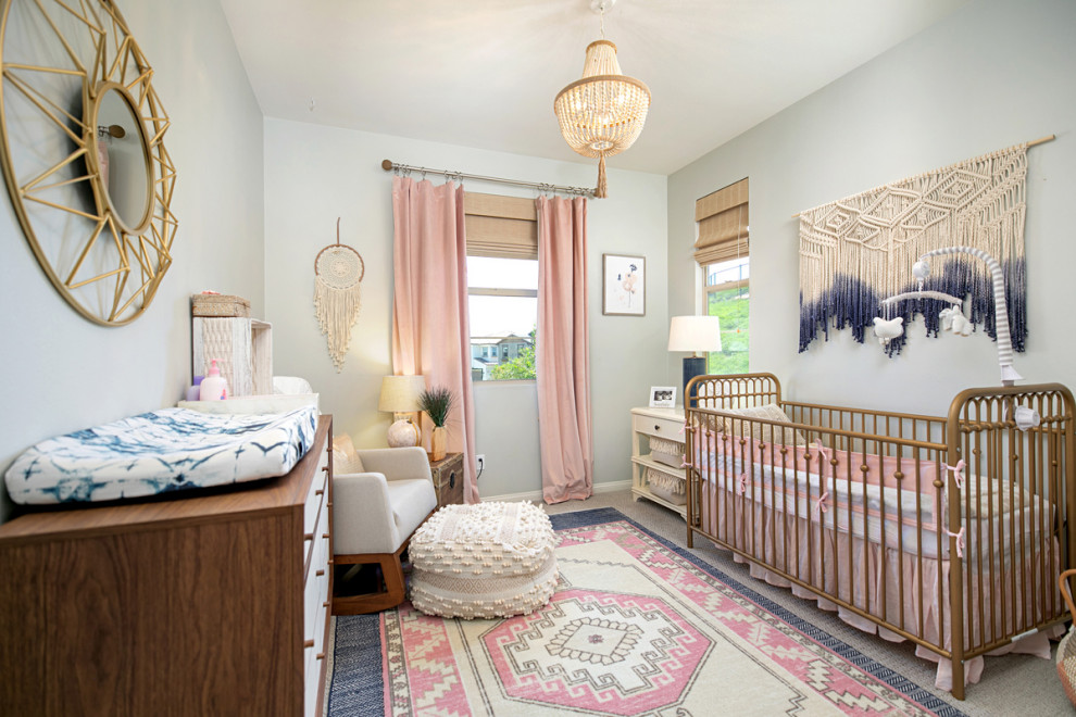
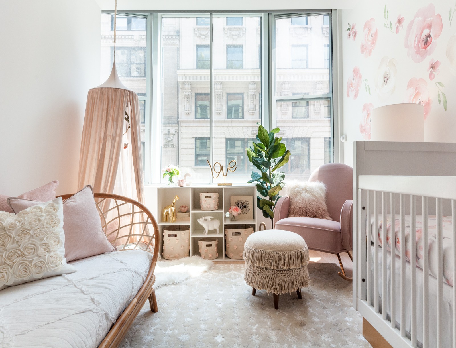
Fun rug brings pattern and color to the stylish kids’ nursery
Patchwork style floor replaces the classic rug in this gorgeous girls’ nursery [From: Blu Sky Living]
Use colors in the rug that accentuate the colors already used in the nursery
Brilliant multi-colored rug for the modern nursery with walls in gray [From: YDC design]

Chic and Feminine

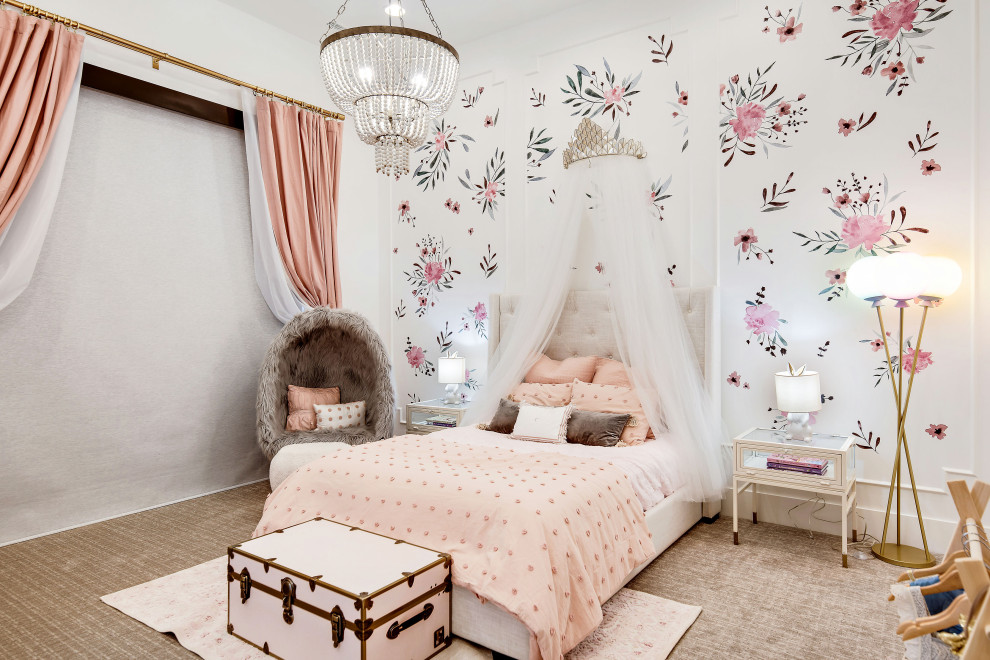
Even in the boys’ nursery, do not hesitate to use colors that are a touch feminine and style that veers more towards softer shades and flowery overtones. Of course, this is a style that looks much better in the girls’ nursery and combining whites and light grays with pastel pinks and gentle blues is the perfect way to complete these elegant spaces. Soft fabrics and indoor plants can complete this delightful space.

Flowers, pastel pink and whole lot of white are perfect for the modern girls’ nursery
Get creative with the bed frame and other decor in the neutral nursery in white and wood [From: CSR Gyprock]
Stylish shabby chic girls’ nursery with Scandinavian style and ample natural light [From: Asanti Homes]
A balance between feminine appeal and modernity in the stylish nursery
Fabulous shabby chic nursery with pastel pink touches and lovely natural lighting [From: Curated Nest]

You’re reading Giving that Nursery a Fresh Look: Top Nursery Shaping Trends of the Season, originally posted on Decoist. If you enjoyed this post, be sure to follow Decoist on Twitter, Facebook and Pinterest.

Similar Posts

  • Three Garden House

    Project: Residential House Architect: Taller de Diseño Exterior y Arquitectura René Caro Jesús López Collaborators: José Antonio Díaz, Karen Oaxaca Tanamachi, Daniel Rivas , Jorge Carrillo Photography: Lorena Darquea
    Area: 240 m2
    Location: Zapopan, Jalisco
    Project date: 2018
    Construction date: 2018-2019 The renovation and extension of this hermetic and rigorous house to transform it into a place of contemplation and enjoyment of the landscape had, as a guiding principle, the idea of the garden as scenario.The activities that were already happening in the house, as well as those new added to the architectural program have been organized and oriented looking for a more intimate relation from the inside outwards. Three gardens, three scenarios, three expressions. We have designed a grid of full and empty spaces, where to contemplate, wander around and just be part of them, is equally enjoyable, creating a fusion between the being and dwelling. We have chosen neutral materiality and geometry for the corridors, terraces, and indoor spaces, to enhance the presence of the Three Gardens.

  • Home Cleaning Tips during Coronavirus Pandemic

    If you are starting each day with more gloom and news about the further spread of coronavirus and how the pandemic is engulfing the entire planet, then we completely understand your trepidation. A silver lining amidst the giant dark cloud hanging above us is how China seems to be back on its way to normalcy […]

    You’re reading Home Cleaning Tips during Coronavirus Pandemic, originally posted on Decoist. If you enjoyed this post, be sure to follow Decoist on Twitter, Facebook and Pinterest.

  • Maullin Lodge

    This lodge is a 120m2 house located in a rural scene in a southern region of Chile. The brief was to design a house with two bedrooms and two bathrooms with a main shared space, interpreting an old small traditional southern Chilean dwelling. The challenge of the proposal was to get that traditional southern look, which implies very opaque facades, but with a full translucent side where the landscape and light can get inside the building, creating its own private world. The house is placed between a forest of native trees, giving its back to the main street. So, the house is oriented to the north and west to get the most of sunlight, which this south down is much appreciated. The concept of the design is organized based on 3 contrast between old and new:
    1- Removing non-structural walls and floors: the main structural shape and volume are maintained the same as the old traditional house, but the interior is liberated from any non-structural dividing element, which helped to create a clean and continuous space.
    2- Concentrating the apertures: The main source of light is the north façade, keeping the other free opaque as a traditional southern house would have, so the proportion of void and mass was not lost.
    3- Material contrast: Big floor to ceiling windows in contrast to recycled traditional timber shingles, an evident contrast between old and new. The distribution of the house is developed in an almost square plan, divided into three volumes:
    The main one has the public areas of the house: kitchen, dining room, sitting room and mezzanine.
    The east one, the widest, has sleeping rooms and bathrooms with the main access of the house.
    And the west one is 1.5m wide acting as a corridor and informal dining room adjacent to the public areas of the main volume. The mezzanine is an opportunity to use the roof space, with a lot of light and natural heating, having control over the main space.