Aethos Ericeira Hotel / Pedra Silva Arquitectos
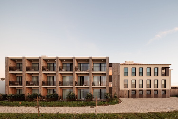
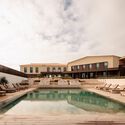
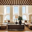


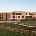
Text description provided by the architects. Aethos Ericeira is a boutique hotel located in Ericeira, a picturesque village on the west coast of Portugal.
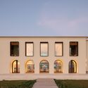
The property, perched on a cliff near Calada Beach, is characterised by its natural surroundings and beautiful views of the Atlantic Ocean. The existing building, lacking identity, displayed a disjointed appearance marked by a variety of architectural styles and a confusing combination of traditional and modern elements.
 © Francisco Nogueira
The starting point for the refurbishment of the project emerged from a detailed analysis of the existing building and definition of areas for development within the context of construction regulations. This approach aimed to embrace and promote interaction with the natural surroundings, all while honouring the building’s historical significance by safeguarding its core character and amplifying its innate beauty. Establishing a fresh identity required a deliberate distinction between the past and the present.
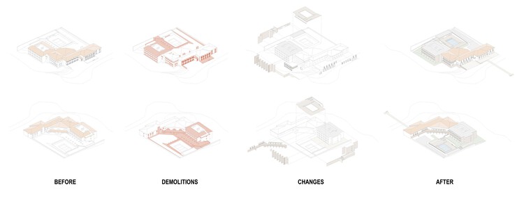
The existing building is divided into three volumes, corresponding to distinct construction phases.
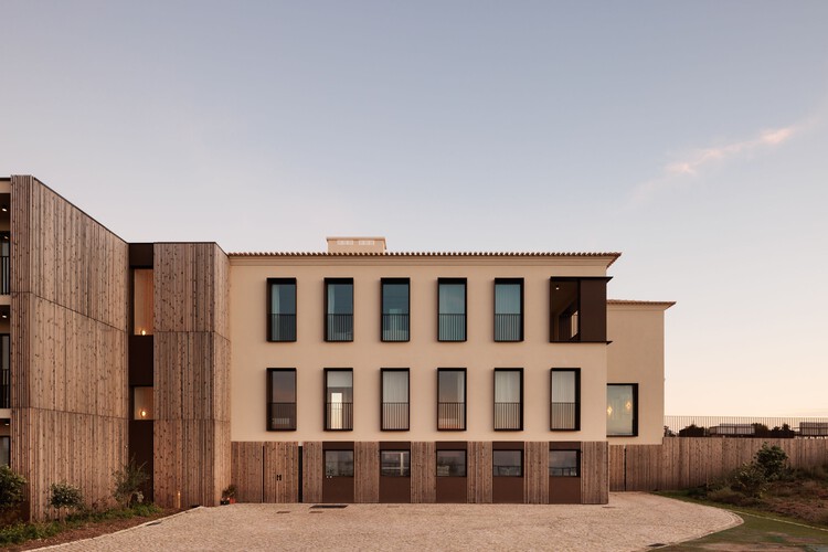
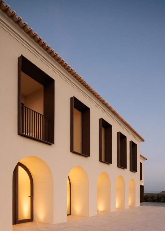
Within the sections of the building defined by conventional construction, the primary features earmarked for preservation were the light-coloured facades and sloped tiled roof, ensuring their appearance remained faithful to their original design.
 © Francisco Nogueira
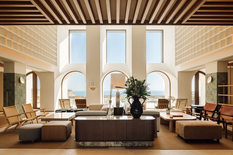
The ground floor of the western part of the building houses a variety of social areas: multipurpose room, main entrance, restaurant, and bar. These spaces stand out for their visual access to the seascape and large outdoor seating area. In contrast to the heavy and traditional spatial organization, these rooms were re-arranged following the logic of open plan.
The main entrance is noticeable for its spaciousness and interior-exterior dialogue, resulting from the double-height ceiling and presence of windows distributed along the facade, providing visitors with a memorable entrance experience.
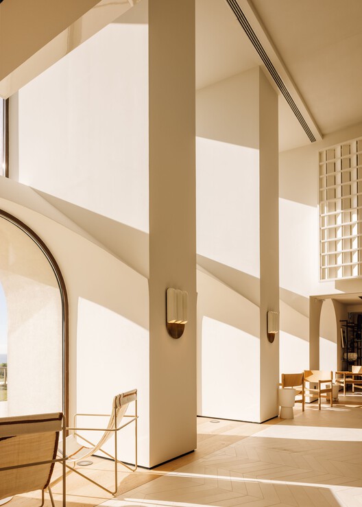
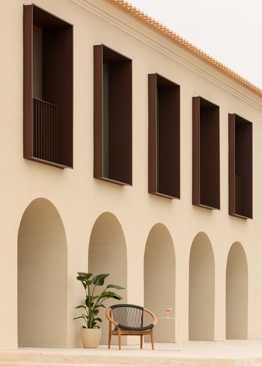
The arches adorning the seaside-facing facade underwent a redesign that meticulously considered their proportions, depth, and bulk. This thoughtful transformation aimed to optimize the panorama’s visual engagement, provide effective shielding against direct sunlight, and elevate the spatial ambiance by seamlessly incorporating interplays of light and shadow within the architectural framework.
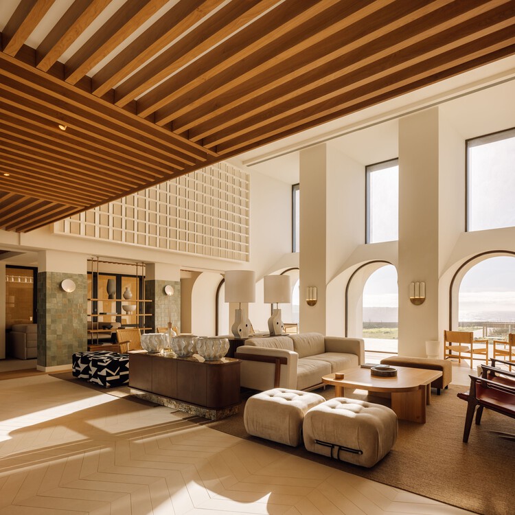
Large windows replace the small traditional ones providing a contemporary visual identity created with metal frames outlining the openings and extending beyond the plane of the facade.
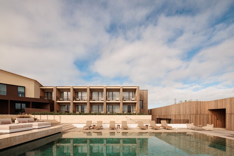
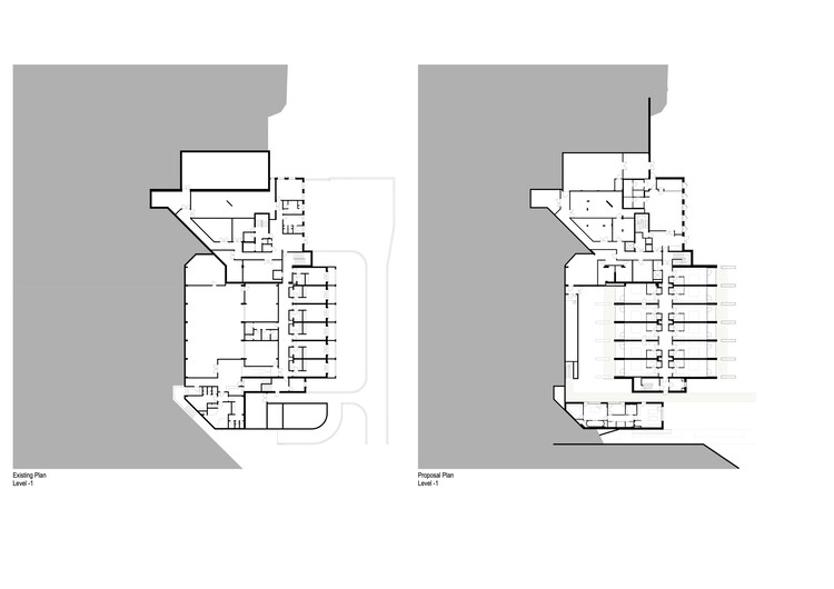
The demolition of a portion of the basement in the third volume resulted in a garden that allowed the integration of additional rooms and Spa. The gym facilities were seamlessly incorporated into a compact space situated on the ground level, adjacent to the pool.
 © Francisco Nogueira
 Section A
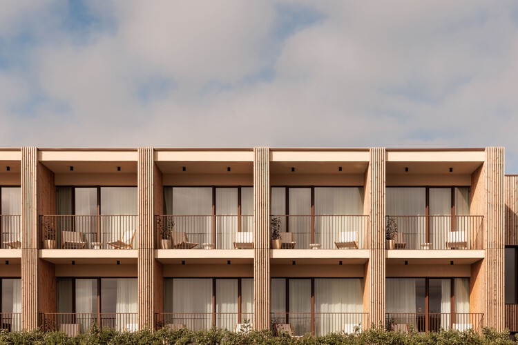
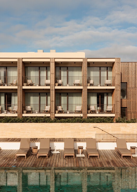
With the objective to integrate the third volume with the architectural surroundings and the natural landscape and simultaneously achieve a distinct modern aesthetic, sloped tiled roofs were removed, while balconies were revamped. This intentional transformation emphasized the facades’ shape and dimension. In terms of facade materials, contrasts of colour and weight were created using dark brown matte metal elements, light-coloured paint applied to the walls, and wooden elements.
On the exterior, various interconnected seating areas promote interaction with the natural surroundings. In the pool area, which was originally semi-buried, multiple levels were created to seamlessly blend elevation disparities, resulting in a more expansive and open ambiance.
