Local architecture studio Dílna has extended the art department at Masaryk University in Brno, Czech Republic, creating a minimalist stack of studios that were designed to look “more like a modern art gallery than a traditional educational facility”.
Designed for the university’s Faculty of Education, the 300-square-metre building adds new workshop and studio facilities directly alongside the faculty’s neoclassical main building.
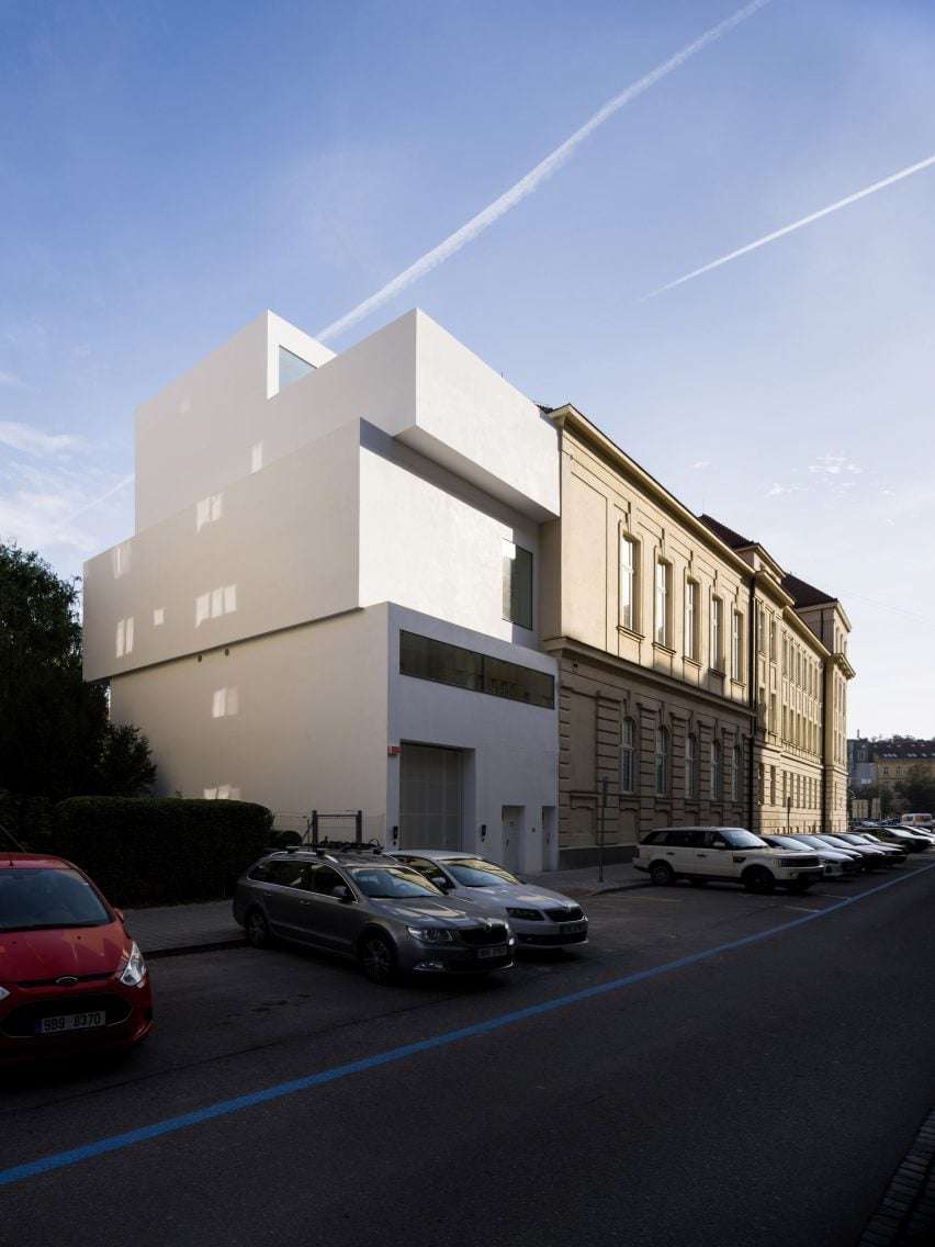
Dílna designed the new building to be a “practical and utilitarian” contrast to this existing historic building, with a minimal, white-plastered exterior that mirrors the white cube-style studio spaces within.
“The challenge was to design a building that deviates from traditional university building standards, while outwardly reflecting its artistic focus,” Dílna founder Michal Palaščak told Dezeen.
“Our aim was to highlight the creation of something new in the district, while deliberately choosing not to imitate the form of the neighbouring historic building,” he added.
“[It] feels more like a modern art gallery than a traditional educational facility, standing out in the street space and engaging in a compelling dialogue between the neoclassical architecture of the surrounding buildings and its own generous, orthogonal shapes.”
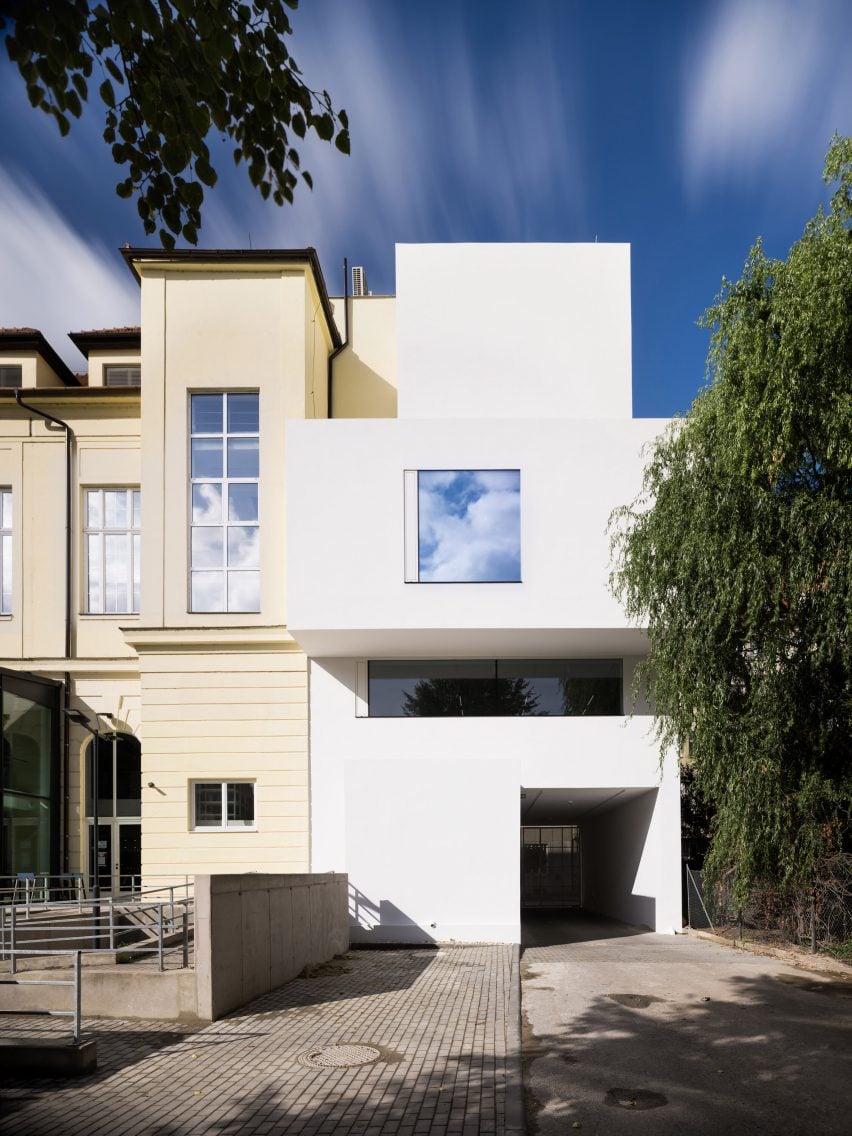
Loosely corresponding to the floor levels of the adjacent building, the studios are organised across four storeys housed within three distinct rectilinear blocks, which have been pushed and pulled slightly to articulate the building’s facades.
Space for the studios themselves was maximised by connecting to existing circulation at the northern end of the adjacent historic building, which includes a recently added lift.
 Thomas Phifer uses white concrete to create boxy Museum of Modern Art in Warsaw
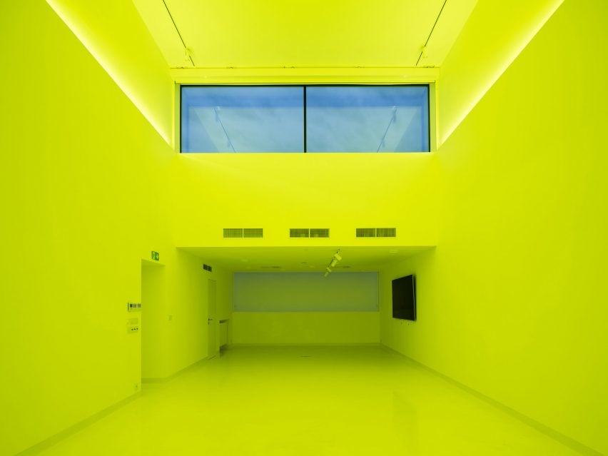
A double-height multimedia studio occupies the top floor, illuminated by a set-back, high-level window and featuring colour-changing lighting built into its walls.
On the floors below, a painting studio is illuminated by a large, square window framing the trees behind the site, and workshops for cutting, drilling and welding overlook the street through a ribbon window.
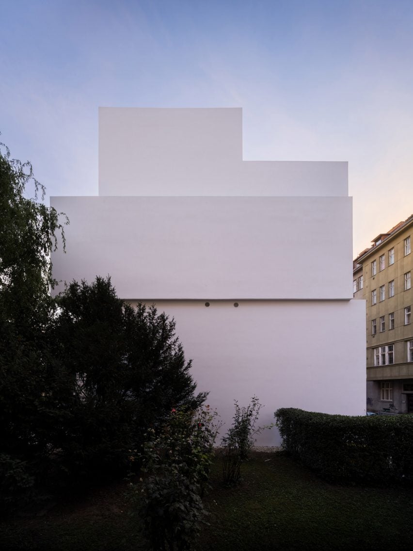
The building’s “monolithic” structure of reinforced concrete has been finished internally with an epoxy coating and white paint, with the areas of glazing left largely frameless to maximise the feeling of space and light.
“The goal was to maximise the available space, so we made it as large as possible,” Palaščak explained.
“We were also limited by the neighbouring apartment building which we could not overshadow. This limit we turned to our advantage, creating clean sculptural gestures,” he added.
Based in Brno, Dílna was founded by Palaščak in 2015.
Other projects in Brno recently featured on Dezeen include a steel-framed pavilion by Chybik + Kristof at the historic Mendel Museum and a compact ice-cream shop.
The photography is by Studio Flusser.

