Villa ABC / Objekt Architecten



-
Area Area of this architecture project
Area: 162 m² -
Year Completion year of this architecture project
Year: 2023 -
Photographs -
Manufacturers Brands with products used in this architecture projectManufacturers: Boss paints, Daikin, Sapa, Stone
-
Lead Architects: Niels Van der Straeten, Dries Van Nieuwenbergh, Mahir Yavas
Text description provided by the architects. For our clients in Lebbeke, we set to work on their existing homes. The layout of the house needed to be rethought to improve its circulation. With 2 teenagers growing up, there was also the need for more space and a new, practical bathroom.
 © Ypsilon Business Photography
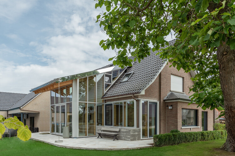
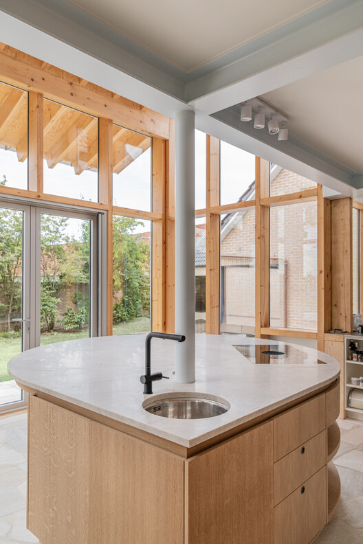
The main intervention became the demolition of the existing volume at the back of the house. Instead, a new volume was added, including a new rooftop dormer. This intervention increased the useful floor area on the ground floor as well as on the first floor. The entire rear façade is made up of glass sections for maximum connection with the garden.
 Plan – Ground floor
 Plan – 1st floor
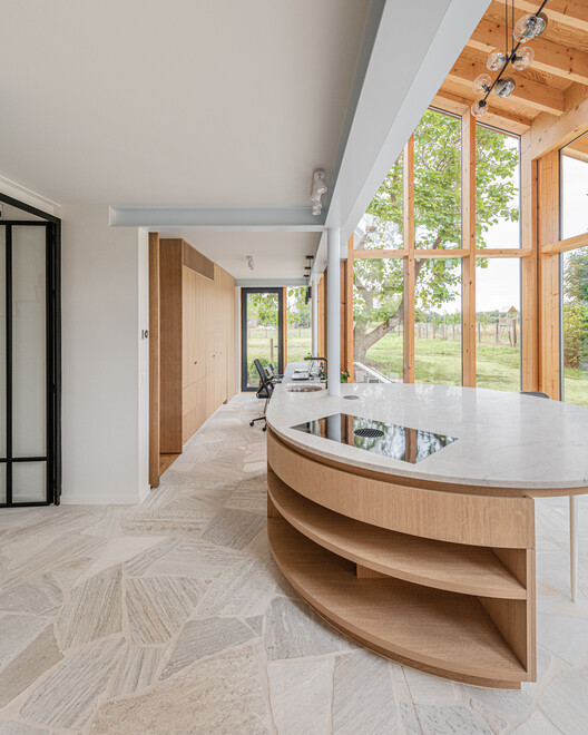
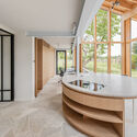
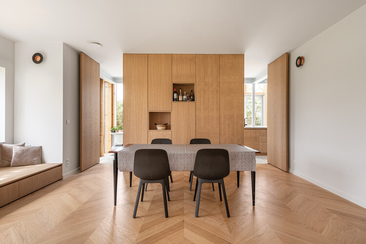
A teardrop-shaped kitchen island was placed centrally in the kitchen, a place where one can cook and enjoy. The dining area and seating area switched places so that the dining area is in direct contact with the kitchen, and this is through two doors hidden in the kitchen wall.
 © Ypsilon Business Photography
 © Ypsilon Business Photography
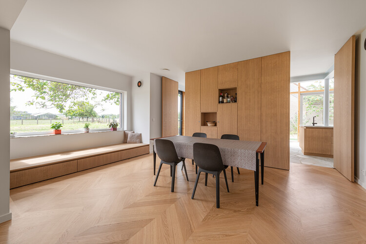
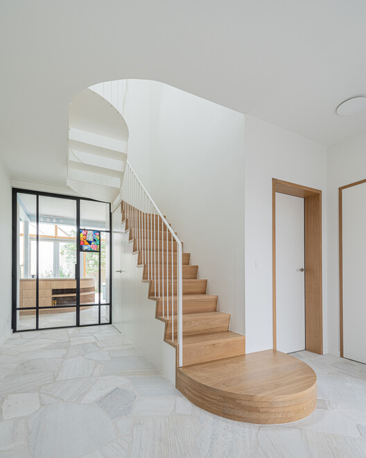
In the dining area, the existing bay window was furnished with a bench, a place where residents can retreat to enjoy the surrounding meadows and the old catalpa in the garden. Both the floor in this room and the seating area on the street side were covered with a beautiful parquet floor, installed in a herringbone pattern. The other rooms on the ground floor were given a rougher flagstone as flooring, which also continues on the adjoining terraces to the front and rear. In addition, the stairwell was also redesigned to accommodate a more ergonomic staircase in the house.
 © Ypsilon Business Photography
 © Ypsilon Business Photography
The renovated dormer houses a new, more spacious bathroom on the first floor. Through the clever placement of the windows, this space has both sufficient privacy and daylight. Furthermore, the number of bedrooms was not touched, but rearranging the floor created an extra office space and a separate toilet.
Energetically, the house also received an update. Old techniques gave way to new, energy-friendly options. For instance, a heat pump was chosen in combination with underfloor heating and air conditioning. For the exterior joinery, high-quality aluminum windows were chosen that comply with current EPB regulations. In addition, a ventilation system D was chosen where the supply and return of air is fully mechanical. The house retained its original character but was given a contemporary look thanks to the new volume at the back. The new exterior joinery was given two colors.
The fixed panels of the new volume are finished in anodized aluminum. The opening parts and windows of the existing house were given a contrasting dark blue color, a nod to the original exterior joinery. Outside, the façade engineering is refined by a stripped-down structural design with the roof structure kept visible. The joinery is structural and the lower, full sections of the walls have been replaced by a flower planter on one side and a bench in concrete on the other.
The interventions carried out ensure that the house has evolved along with the residents’ needs. They enhance the quality of life and make the kitchen the heart of the house, which is not only functional but also a place where the residents can enjoy the beautiful views and each other.
