Traditional in the front, modern in the back, this historic home ushers light in through a 14-foot glass wall.

For a number of years, the small family residing in a coveted, West End Victorian in Toronto was content with their home. Over time, though, they began to crave modern, fluid, light-drenched living spaces, a departure from the dark confines of their more-than-a-century-old house. Through an innovative extension, local architecture firm Williamson Williamson made it possible, allowing them to simultaneously revel in freeing, open layouts and appreciate the abode’s rich heritage.

Capping off the second floor is a 14-foot-tall glazed window wall, a dramatic scale change from the original Victorian interior.
Doublespace Photography
“What they found out living in a skinny Toronto Victorian is that there were never enough rooms for what they needed to do,” says principal Betsy Williamson. “We didn’t give them extra space by adding a huge room on each floor. We took the existing spaces on the back of the house and added a bit of square footage to each one and then transformed them for a contemporary feeling.”

The modern extension in back belies the historic brick facade.
Doublespace Photography
Most often, additions to the back of Victorians are relegated to the lower level. Williamson Williamson did enlarge the 655-square-foot ground floor by 126 square feet in the form of a family room which looks onto the kitchen and offers direct access to a deck just beyond. But the 612-square-foot upstairs was also plumped up by 152 square feet, and that fully glazed room strikingly projects over the solid base below. From behind there is a sense that the additions, both wrapped simply in gray stucco, are at once grounded and floating.

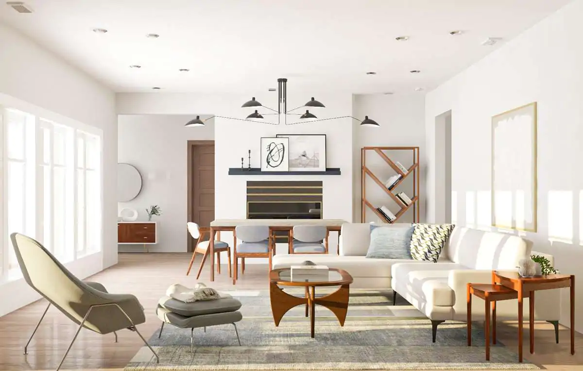
Midcentury-inspired seating adds color in the family room, which leads to the deck in back.
Doublespace Photography
See the full story on Dwell.com: A Narrow Victorian in Toronto Gets a Mullet Makeover