An adventurous couple’s renovated home in Twin Peaks features a tiered garden, an outdoor spa, and a meditative alcove.
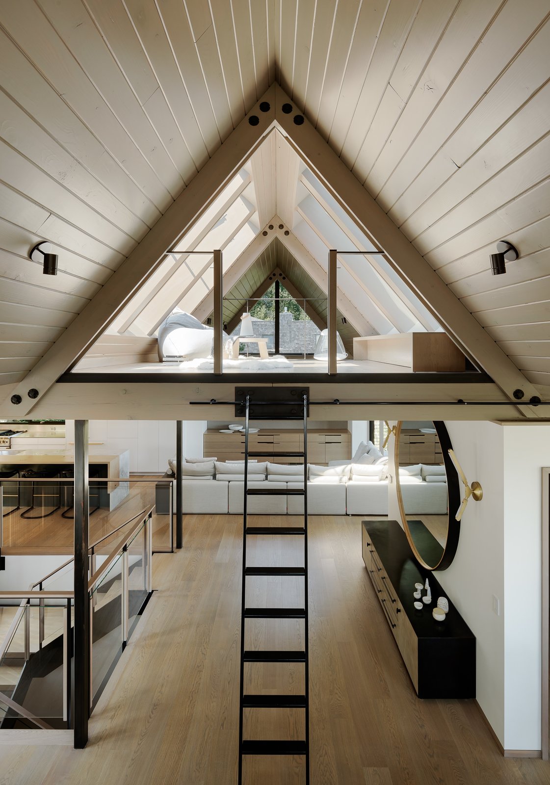
Originally built in 1964 by architect Albert Lanier, this home overlooking the Mount Sutro Open Reserve in San Francisco has been renovated by Feldman Architecture for an active, yoga- and travel-loving couple. The residence features a triangular alcove, sloped gardens, and a plunge pool, channeling a Japanese ski cabin with updated materials like sleek white oak and steel.
Before: The Exterior
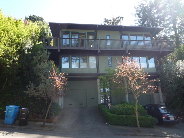
“The San Francisco Planning Department doesn’t let you do many changes to the front of a home,” says architect Lindsey Theobald, “so we decided that instead of going through the whole, long process, we would update the materials and make it clean.”
Photo by Joe Fletcher
After: The Exterior
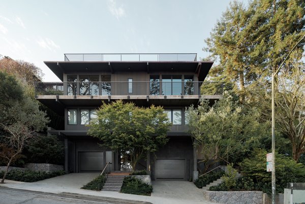
The home now has new windows, cedar siding, and an upper deck made of wood-capped steel. Theobald also plastered the bottom floor. “The exposed concrete columns had seams that wrapped around them and looked like paper towels,” she says. There was originally no front entryway, so the mason created stairs out of chiseled basalt, matching the backyard stairs and retention walls.
Photo: Joe Fletcher
“The client loved the feel of the neighborhood and wanted to maintain all she [appreciated] about the home,” says architect Lindsey Theobald. But, when it came to functionality, the homeowner wanted something that felt more open, and with a better connection to the outdoors.
“The stairs were at the center of the house, so when you arrived in the middle, you didn’t know which way to go,” says Theobald. What’s more, over time, the homeowner had begun to trip on the exposed nails. The stairs were the first to be reimagined, for both safety and better flow.
Before: The Staircase
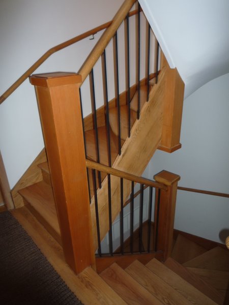
The wooden staircase was cramped, lacked natural light, and created an awkward interior layout.
Photo by Joe Fletcher
See the full story on Dwell.com: Before & After: This San Francisco Dwelling Feels Like a Japanese Ski Cabin
