|

Brick Beguiles in Retail Design for Leica’s New Manhattan Store

As hubris pushes architects and developers to new, literal heights in an effort to maximize price per square inch, pedestrian scale projects and the public realm continue to suffer. But Brooklyn-based Format Architecture Office bucks this standard practice with the unveiling of their remarkable design for the Leica Store & Gallery in Manhattan’s Meatpacking District, which transforms the formerly dilapidated building into a contemporized historical neighborhood fixture.
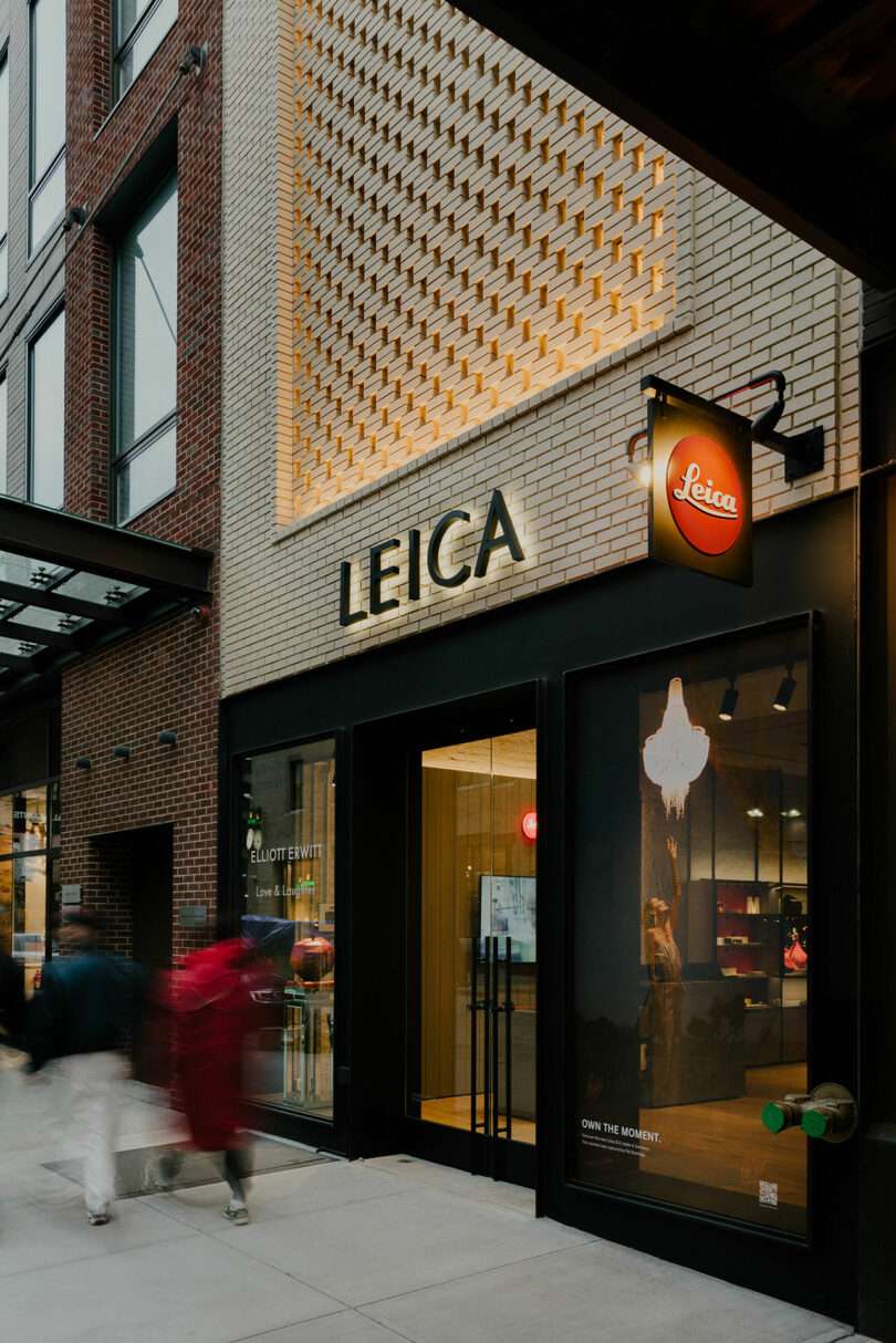
Exterior of a leica camera store at twilight with blurred figures passing by, showcasing the brand's illuminated signage and display windows.

Photo: Nick Glimenakis

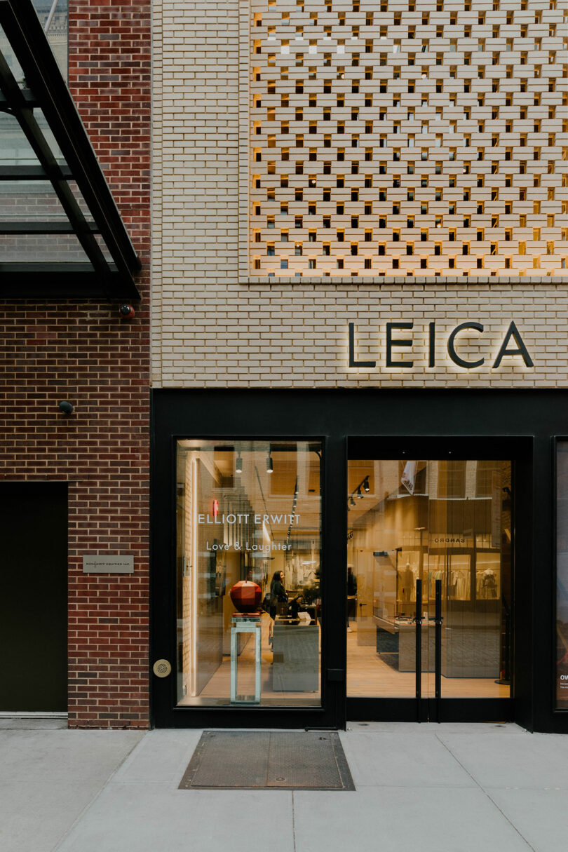
Exterior view of a leica camera store with a brick façade, displaying the elliott erwitt exhibition sign at the entrance.

Photo: Nick Glimenakis

Prior to its overhaul, the former 1950’s meat market was no place to see or be seen. And at just two stories of meager square footage with modest street frontage under 20 feet, it had fallen into disrepair. Yet those same elements, which at one point made the building fall prey to neglect, are now redeeming qualities as the structure remains one of the smallest resisting the upscaling trend. The gut-renovated space now boasts an expanded 4,000 square feet while retaining the original timber-framed ceiling in a nod to its storied past. Under new skylights, the second floor plate is cut to create a mezzanine within the generous double-height entryway, which provides greater access to natural light and sightlines between the two floors. Additional fenestration includes a steel bifold glass door that opens onto a 1,000-square-foot outdoor terrace. The edited floor plans allow for a variety of interchangeable spatial programs including gallery or exhibition, retail with corresponding points of sale, and events or entertainment.
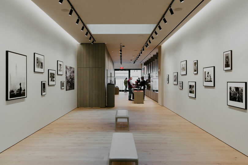
Interior of a modern art gallery displaying black and white photographs on the walls, with visitors viewing the artwork in the distance.

Photo: Nick Glimenakis

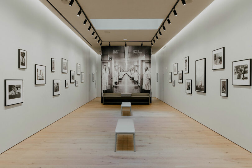
Modern art gallery interior displaying black and white photographs on white walls, with wooden floors, track lighting, and benches.

Photo: Nick Glimenakis

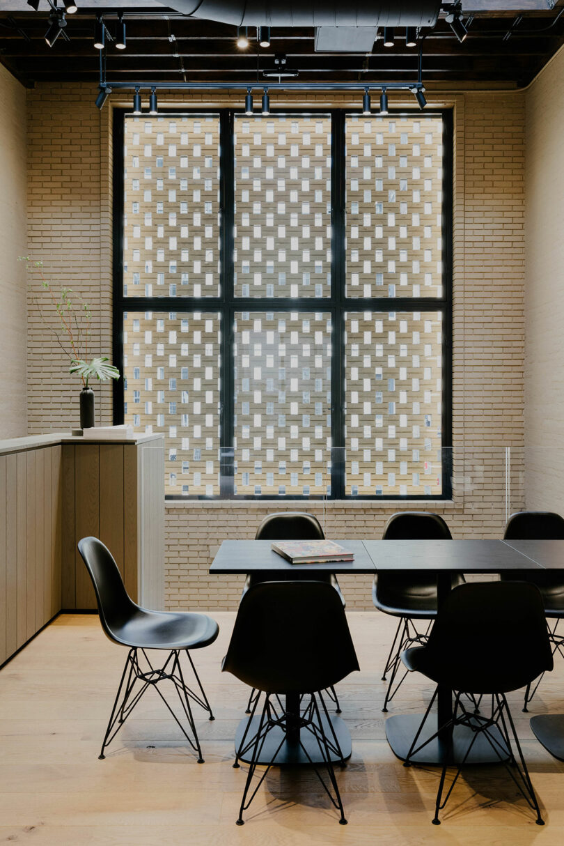
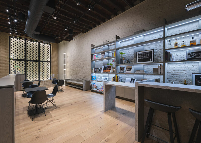
The updated storefront comprises a two-part assemblage of brick atop steel and glass. The visually permeable ground level entrance references an industrious past while a monumental, semi-porous surface captivates with its recessed brick patterning delineated by a generous frame for an effect that fully floods the front aperture with light. “The screen is a marker of this effort [for a dramatic double-height space at the front of the interior], while also acting like a rose window for the project, asserting the building’s presence on the street while simultaneously creating interesting texture and dynamic light play inside the space that is visible from both floors,” say Matthew Hettler and Andrew McGee, the duo who helm Format. The final composition is the result of meticulous planning, collaboration, and coordination with engineering and construction teams to properly execute a highly complex design that is effortlessly chic.
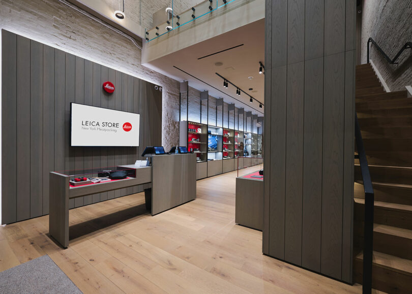
Interior of a leica store showcasing cameras and accessories on display shelves, with prominent branding and modern wooden decor.

Photo: Courtesy of Leica

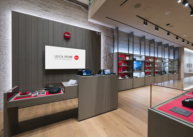
Interior of a leica camera store showing display cases with cameras and lenses, a digital screen, and a branded wall behind the counter.

Photo: Courtesy of Leica

Format offers a masterclass in navigating the delicate balance between honoring history while introducing innovation into a landmarked site – especially one with a surprising amount of decorative and traditional brickwork left unadulterated in spite of sprawling development. “We wanted to reference this while also creating something new,” they add. “The buff tone of the brick is a common color of masonry found throughout the neighborhood and another way to reconnect the project to the history of the area.”
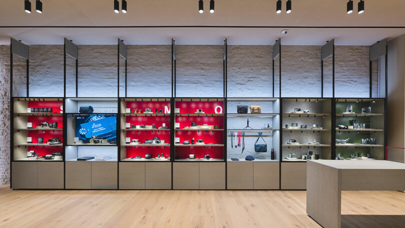
Interior of a modern store showcasing electronics with products displayed on red and grey shelves, wooden flooring, and white walls.

Photo: Courtesy of Leica

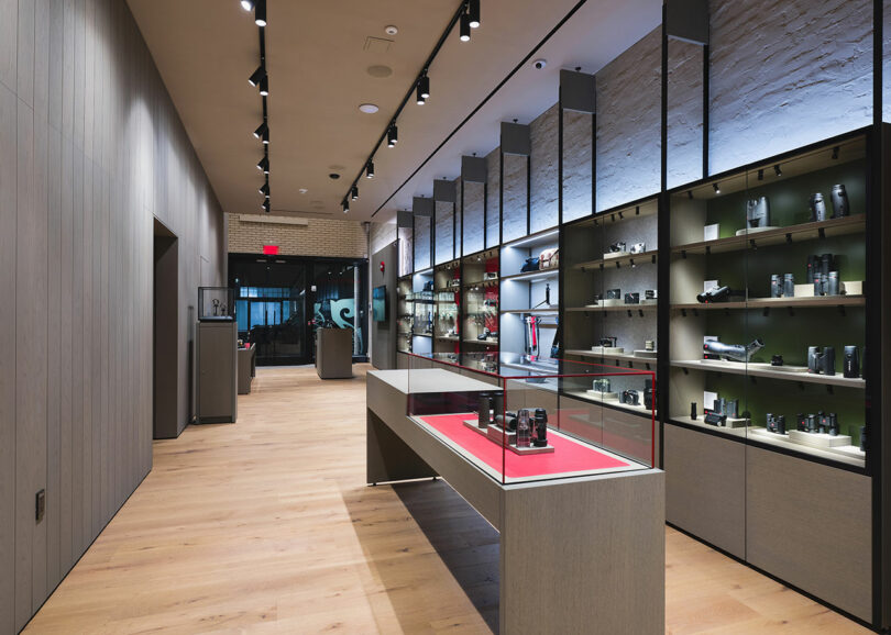
Modern retail store interior featuring sleek shelving with a variety of products, wooden floors, dim overhead lighting, and reflective surfaces.

Photo: Courtesy of Leica

But it’s their innovative use of traditional techniques that proves to be ingenious. “We were driven by an interest in keeping the logic of the screen grounded in traditional patterns of bricklaying,” they explain. “Flemish Bond, a decorative pattern that alternates between stretchers (the long side of the brick) and headers (the short side of the brick), was a productive space to explore different scales of solid and void while also maintaining a natural load path for the bricks to stack on one another.”
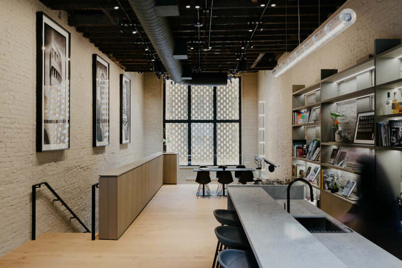
Modern office meeting room featuring a long table with black chairs, large windows with a patterned glass design, and a textured beige brick wall.

Photo: Nick Glimenakis

Modern kitchen and dining area with exposed brick walls, wooden floors, a long kitchen island, black stools, and framed artwork on the walls.

Photo: Nick Glimenakis

Provocative, beguiling, and undeniably forward thinking, this architecture presents itself as a potential solution to quell the aggressive nature of building and the industry’s tendency to treat the dated as disposable. “It is a reminder that the built environment is enriched by a variety of scales, large and small, and that overlooked or forgotten spaces can also tell a powerful story.”
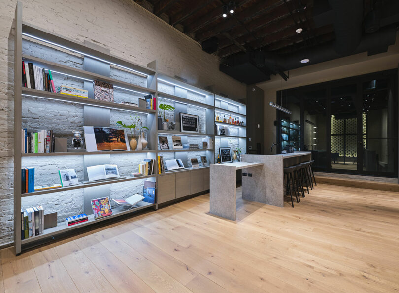
Modern café interior with bar stools, tables, and shelves stocked with books and products, featuring exposed brick and wooden floors.

Photo: Courtesy of Leica

Modern bookstore interior with shelving units displaying books and magazines, a coffee bar with stools, and exposed brick and wooden beams.

Photo: Courtesy of Leica

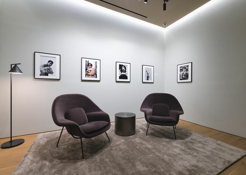
Modern art gallery interior with six framed black and white photographs on a wall, two purple chairs, a floor lamp, and a small table on a grey rug.

Photo: Courtesy of Leica

To view more of Format Architecture Office’s portfolio visit format.nyc or to shop Leica visit leica-camera.com.

Photography by Nick Glimenakis as noted with additional images courtesy of Leica.

With professional degrees in architecture and journalism, Joseph has a desire to make living beautifully accessible. His work seeks to enrich the lives of others with visual communication and storytelling through design. Previously a regular contributor to titles under the SANDOW Design Group, including Luxe and Metropolis, Joseph now serves the Design Milk team as their Managing Editor. When not practicing, he teaches visual communication, theory, and design. The New York-based writer has also contributed to exhibitions hosted by the AIA New York’s Center for Architecture and Architectural Digest, and recently published essays and collage illustrations with Proseterity, a literary publication.

Similar Posts

  • Waverley Residence

    Designed for a young couple, the 5,000 sf home and 1,700 sf back house sit on a flat 21,000 sf lot in a 1920’s Palo Alto neighborhood (a few blocks away from Steve Jobs’ residence). The architecture is a study in strong simple composition and is museum-like with its highly refined materiality and emphasis on craft. The massing defines solid and void, captures natural light, and connects the indoors with the landscape, seeking to ‘experience the outdoors from within.’ The ground floor volumes wrapped in an elongated hand-fired brick from Denmark, emphasizing the horizontality of the architecture that lays solidly on the land. Bronze-trimmed ceiling planes slide between the brick masses, and floor-to-ceiling glazed openings are captured by thin-profiled bronze frames. In contrast to the grounded brick volumes, the second floor is clad in stainless steel panels and oversized aluminum-framed windows. The lightness and openness of the second floor is nestled among the oak-tree canopies of the site. At the basement level, a wine cellar and tasting room open to a sunken landscaped courtyard. A 30ft by 10ft continuous pane of glass runs alongside the grand stairwell of floating stone steps, connecting the three levels of the house. Due to the unprecedented size of this glass in residential design, it was custom manufactured in Germany and shipped to California. This dramatic moment in the sequence of progressing through the house helps visitors feel connected to the lush landscape outside. Inside the house, materials such as a custom leather door and bronze anodized details were selected for their unique craftsman-style quality. Another custom-designed element is the steel mesh screen that wraps around to enclose the kitchen for privacy, separating this from the more public “guest hosting” areas adjacent. The steel screen slides along a track embedded into the teak slatted ceiling and disappears into the pantry when retracted. A freestanding structure set deep back into the site is a zen-like fitness/yoga studio as well as a guesthouse with a kitchenette. This dramatic stone mass opens up completely in the center to give the impression of exercising outdoors. The landscape integrates California native plant species, grasses and trees to compliment the materiality of the architecture.