Atelier Siyu adds angular volumes to workspace in Shanghai
In Shanghai’s Changning District, Atelier Siyu breathes new life into a former industrial shell with the renovation of Kaixuanfang Studio, a 760-square-meter workspace that has served as the client’s headquarters for nearly a decade. Without altering the basic layout, the design team undertakes a strategic reprogramming of the two-level interior.
The architects revamp this hybrid creative workspace, part photography studio and part office, introducing new volumes, angular geometries, and adaptive design gestures to improve circulation and help things run more smoothly. The project explores contrasts by combining logical planning with expressive design gestures, where rectilinear forms transition into dynamic alignments that frame views, connect spaces, and introduce moments of surprise.
A key intervention on the ground floor is a skewed meeting room, what Atelier Siyu calls a ‘box’, placed at a 15-degree angle within the orthogonal shell. This move sets off a ripple of indirect circulation routes and spatial overlaps that break up the previously straightforward floor plan. With dimensions of 4.2 by 7.2 meters, the box holds a 12-person conference space and acts as a spatial hinge, connecting the public-facing reception and photo studio with a series of more private functions, including a theater, sample room, and equipment storage.
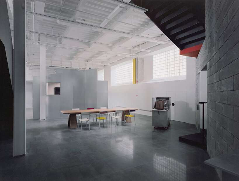
images by Chenhao, unless stated otherwise
angular staircase and brick cladding redefine the entrance
By intentionally misaligning new and existing planes, the designers at Atelier Siyu introduce a sense of motion and spatial depth. Subtle lighting interventions further amplify this layered geometry, playing off the angled surfaces to create an atmosphere that shifts throughout the day.
One of the most striking design features appears right at the entrance, where Atelier Siyu reworks the existing staircase to directly connect the entryway with the reception area. By removing and repositioning part of the stair, they improve how people move through the space and turn the stair into a standout vertical element. The area beneath it now hosts a small pantry, visually tied to the front desk and kitchen with light brick cladding laid out in angular patterns. The stair itself, painted black, framed in red steel, and set on a grey concrete base, brings a bold, industrial feel to the space. Openings between the stair and reception are carefully placed to maintain visual connections while still offering a sense of privacy.
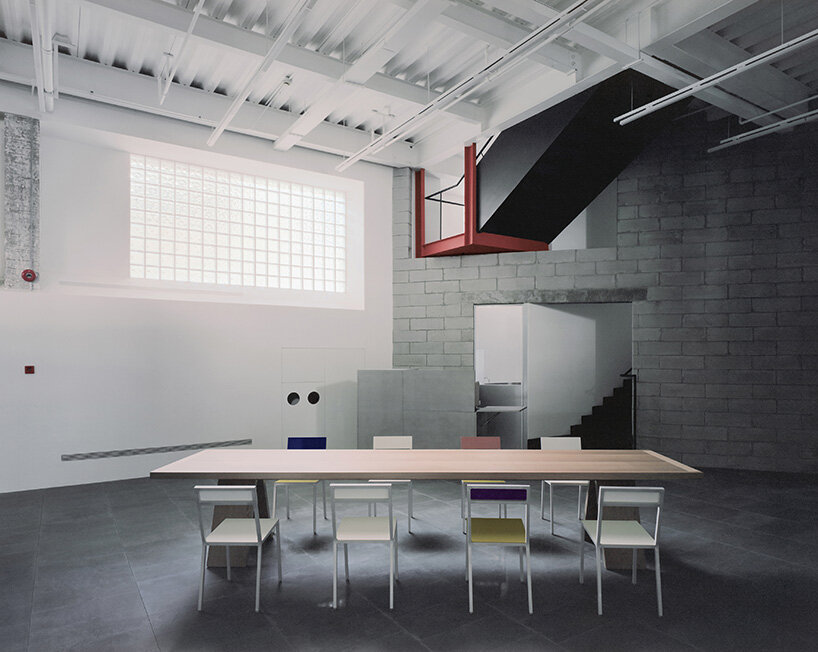
a key intervention on the ground floor is a skewed meeting room
walls that think: integrating utilities into structure
Along the window-facing wall on the first floor, the studio found a thick, 600-millimeter wall made of concrete and added steel. Instead of tearing it down or covering it up, Atelier Siyu decided to work with it in a practical way. They neatly fitted things like air conditioners, fire extinguishers, and trash bins into the wall at just the right heights, creating a smart, multi-use area that frees up floor space and helps organize the studio better. To balance light and privacy, parts of the wall are covered with glass bricks, which not only fit the building’s industrial look but also gently soften the light inside.
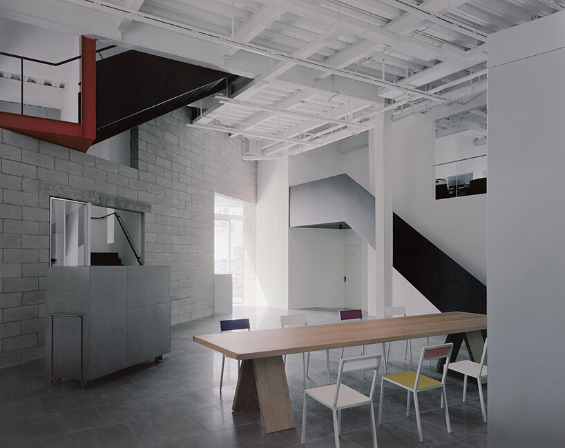
Atelier Siyu breathes new life into a former industrial shell with the renovation of Kaixuanfang Studio
navigating low ceilings with geometry and light
Upstairs, the ceiling drops to just 2.3 meters under the original beams, a challenge that the architects embraced with bold, geometric shapes. They added irregular metal structures between work areas to create clear boundaries, change how the space feels, and open up certain spots. Private offices for administration, finance, and management are enclosed with slanted glass walls that line up with these metal shapes, creating overlapping crystal-like effects that make the space feel bigger than it is.
To handle electrical wiring on the second floor, where running cables under the floor wasn’t an option, Atelier Siyu used vertical columns that quietly carry wires from the ceiling down to the desks, turning necessary infrastructure into part of the design.
The renovation of Kaixuanfang Studio turns a straightforward, practical space into a flexible, creative place to work by thinking through how people move, how light flows, and how each area is used. It’s a workspace that shapes how people navigate the space and connect with each other, thanks to angled lines, smartly placed walls, and framed views that reveal new ways of seeing the building.
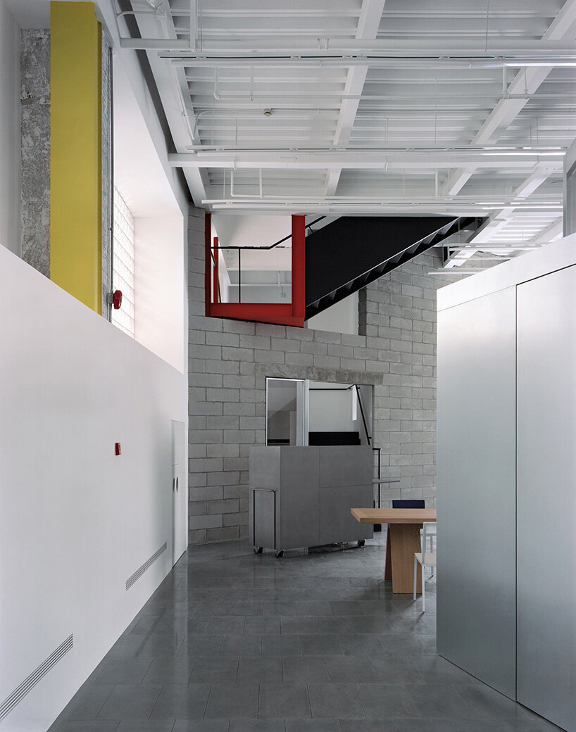
the area beneath the staircase now hosts a small pantry
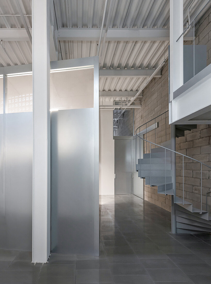
introducing new volumes, angular geometries, and adaptive design gestures | image by Atelier Siyu