This New Zealand Design Duo’s Headquarters Are as Fresh and Lighthearted as They Are

George & Willy’s signs and display systems are minimalist, functional, and playful. Same goes for their new offices in a revamped warehouse.
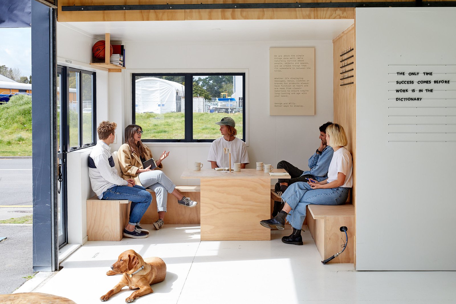
The meeting room/lunch space features several of George & Willy’s message displays.

Will McCallum and George Wilkins weren’t having much luck at outdoor craft marketplaces. They liked the items they’d been designing since their university days, and so did their friends, but sales were “meh.” So they went online, and lo and behold, they were suddenly where they’d aspired to be: in the global market.

From the start, the friends—who first met at ages 12 and 13—designed simple, functional items. “With most of our products, we thought, ‘That would be cool—I’d quite like to own one of those myself,’” says McCallum. The roster included furniture, lamps, duffel bags, an indoor swing, and a wall-mounted roller to dispense kraft paper ideal for to-do lists, menu plans, or doodles against the kitchen wall. Along the way, the paper roller really took off—it’s still their bestseller—and the pair realized if they truly wanted to make it big internationally, they’d need to focus on similarly useful, easy-to-ship items. They tailored their product line and adopted the motto “Making everyday tools great again” to describe the hip, minimalist sign and display systems that have become their specialty.
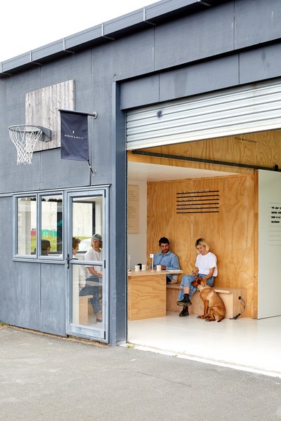
George & Willy announces itself with a flag sign that they no longer produce. The meeting room’s plywood wall has a message display system that makes use of metal rails and Scrabble- like wood tiles.
The meeting room/lunch space features several of George & Willy’s message displays.

The meeting room/lunch space features several of George & Willy’s message displays. “We don’t really have titles around here,” says co-founder George Wilkins. Even so, pup Frida is the official Head of Morale.

Photo: Simon Wilson

George Wilkins stands in front of a green chalkboard sign system that serves as a

See the full story on Dwell.com: This New Zealand Design Duo’s Headquarters Are as Fresh and Lighthearted as They Are

Similar Posts

  • Space in the Wall

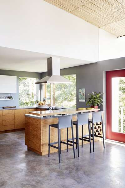
    Space in the Wall The thought process regarding the challenging tall and narrow structure centers around a space that flows through the building and functions as a light cone that allows daylight to pierce through all the way to the basement and a joint wall, made of exposed concrete in “board” configuration, divided into squares, separated from the exterior wall of the house, which is made of glass, and acts as an artistic, somewhat “Brutalistic” element the house, one half of a two-family dwelling on a 220 square meters lot, and 360 square meters built, is designed for 2 young families with 2 children each, each family has 2 floors, the first family has the ground floor (living room, kitchen, dining room and garden) and basement (bedrooms and pool). The second family has the first floor (bedrooms) and the top floor (living room, dining room and a garden balcony)
    The front of the building that faces the street is made with a combination of concrete, steel and wood. We’ve used these natural materials throughout the building. Stairs and banister from steel plates on the ground floor and a banister and counter-top with a sink out of steel grid on the first floor.
    the flooring is out of concrete, with the concrete wall “accompanying” the entire house. Wood beams in the kitchen, the ceiling, a vertical shading and the floor.
    The challenge to create a living space while using every available inch and maintaining privacy, while communicating with the residents who are design enthusiasts was completed with 2 modern villas, each with its own connection to the outside and with a unique and fashionable living space in the dense urban surrounding. Architect: Yulie Wollman
    Photography: Shai Gil