When a House Becomes Inside Out | Cut Paw Paw

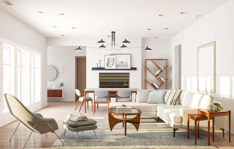
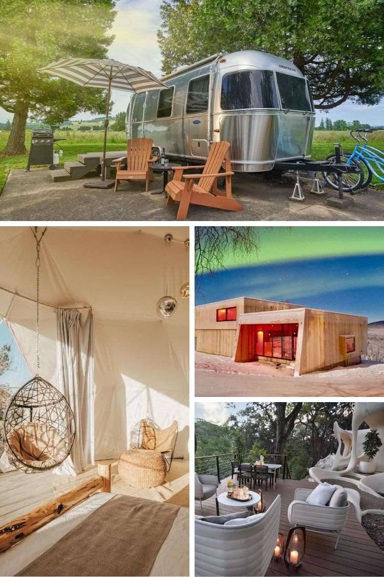
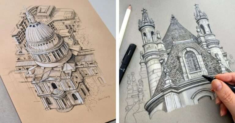
In Seddon, Victoria, Australia, a simple timber weatherboard house is re-imagined as a radical inside-out residence: Cut Paw Paw. On a 506 square-meter site, the transformation marries historic charm with bold modernity—an exposed steel frame, vast glass walls, a garden courtyard, and a white roof to cut urban heat. With sliding doors, bi-fold panels and decks, the home blurs the line between inside and out. Solar panels, double-glazed windows and passive design strategies ensure it’s not just visually daring, but environmentally smart. Cut Paw Paw challenges the conventions of renovation and shows how architecture can re-use, reveal and renew.

#architecture #renovation #sustainableliving #modernhouse #AustralianArchitecture #gardenhome #insideo-outdesign

Project facts/credits:

Architect: Austin Maynard Architects
Directors: Mark Austin and Andrew Maynard
Design Architect: Andrew Maynard
Project Architect: Mark Austin
Location: Seddon, Australia
Site area: 506m2
Floor area: 149m2
Old part of house: 69m2
New addition: 80m2 – main addition (56m2) + studio (26m2)
Completion date: March 2014
Builder: Marcus Hamilton – Mark Projects
Engineer: Maurice Farrugia and Associates
Photographs:Peter Bennetts, Tess Kelly
Similar Posts

  • Rundown Apartment from 1914 Renovated to Showcase its Rich Textural Beauty

    Most Moscow apartments that we have seen till date seem to embrace a certain posh, modern minimalist style that feels both sophisticated and purely contemporary. Yet, this gorgeous little apartment inside a building built originally in 1914 moves away from this more popular regional trend and embraces its traditional bones gleefully. The 85-square meter apartment […]

    You’re reading Rundown Apartment from 1914 Renovated to Showcase its Rich Textural Beauty, originally posted on Decoist. If you enjoyed this post, be sure to follow Decoist on Twitter, Facebook and Pinterest.

  • Stacked Cabin: Re-Imagining the Classic Cabin Vertically with Modern Refinement

    The classic cabin is one that is spread across a large area and offers comfortable family living environment that blends woodsy charm with a relaxing vibe. But the Stacked Cabin in Muscoda, Wisconsin reinterprets the classic design and alters it to suit the needs of a more modest lot that does not have too much […]

    You’re reading Stacked Cabin: Re-Imagining the Classic Cabin Vertically with Modern Refinement, originally posted on Decoist. If you enjoyed this post, be sure to follow Decoist on Twitter, Facebook and Pinterest.

  • Lirio 7

    Located in a quiet street in one of the most emblematic neighborhoods in Mexico City, this project is an intervention that has its roots on the understanding of the urban and social dynamics in Mexico City. Lirio 7 has an interesting history; as an Art Déco building, originally housed public baths during the 30s, then in the 50s became a sanatorium, and before its abandonment, it was the headquarters of a security company. Considering this conditions, we took advantage from an abandoned building without any recognized heritage value by local authorities, to restore it and offer a specific model of housing that recovers the historical value of Santa María La Ribera neighborhood. The design process is based on the concept of a central patio and its perimeter circulation, which was adapted into a new layout to create 12 new apartments where the main corridor becomes part of the home. In this type of buildings, this circulation is a public place and the challenge on making it private leads to define an enclosure that plays with the visuals. The dwellings are arranged around the patio, orienting their view to it, which is considered as a place of introspection, not so much as circulation. Concrete elements of different heights acts as planters, dampen the sound of the water from the recovered fountain and support the discourse of circulations, interposing themselves to the visuals, again to guide and give privacy to the user. Each of the houses therefore has ventilation and daylight entrance. The first and second floors have a greater free height, typical of the original construction moment, allowing a greater volume of use of spaces. The third level, from the 50s as well as the new structures implemented on deck, maintain a standard height more like that the required by current construction regulations. A perforated concrete prism, outstands from the patio’s façade, creating a visual contrast without stealing it protagonism. With a different materiality and density from the rest of the project, this volume patches the view from the outside, creating a light and shadows game towards the last apartment, and allows the user to enjoy the views.