Looking to infuse your home with personality and classic charm? This eclectic Craftsman interior combines bold, unique touches with traditional craftsmanship to create a space that’s full of life and character. Each room reflects a perfect balance of artistry and comfort, making the home truly unforgettable.
The Challenge: Craftsman Home Interior
The couple came to Decorilla looking for creative interior design direction. Their Craftsman home interior had good bones but no rhythm—just a scattered mix of mid-market furniture and lighting that never quite landed. They wanted color, cohesion, and a space that could hold both quiet evenings and the noise of guests and dogs. They expected the designer to:
- Unify the main floor without stripping the Craftsman character
- Replace all furniture except the TV and piano
- Introduce color through textiles, wall finishes, and art
- Improve lighting throughout
- Select durable, pet- and teen-friendly materials
- Reduce visual clutter without making the space feel flat
- Integrate some existing art if it fits the new scheme
Pro Tip: Wondering what look is right for your Craftsman interior? Try our Free Interior Design Style Quiz to discover your ideal style today!
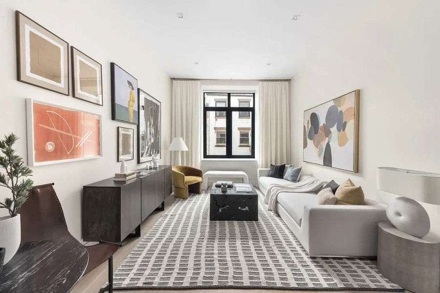
Design Inspiration: Craftsman Style House Interior
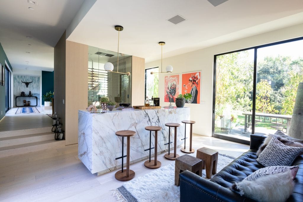
The client’s draw toward Craftsman interior design came slowly, through a pattern of eclectic design details they kept bookmarking. It was mostly about rooms that felt lived-in, where function or aesthetics didn’t cancel personality. What had been catching their eye was less a particular look, and more a kind of looseness: Craftsman home interiors where tradition met a sharp, fresh energy.
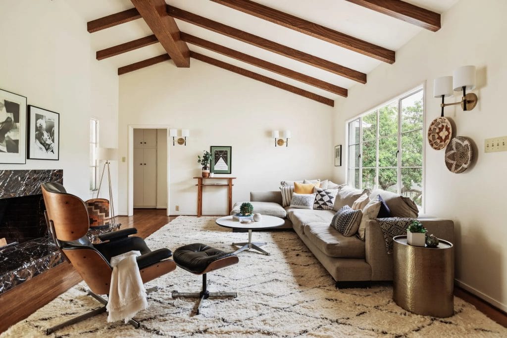
Moreover, the client wasn’t looking for minimalism, but rather an ability to absorb life without feeling overwhelmed. And there was a visible logic in their inspirational gallery selection; every choice seemed made for use, from the living room to the powder room design. Rather than chasing constant change, the Craftsman interior decor gave them a way to invest in permanence that only gets better the longer you live in it.
Initial Concepts: Finding the Right Designer
After reviewing the project goals and design brief, the Decorilla team matched the client with two designers—Erin R. and Jillian M. Each brought a distinct language to the conversation, and both offered clear, convincing interpretations of the client’s style profile.
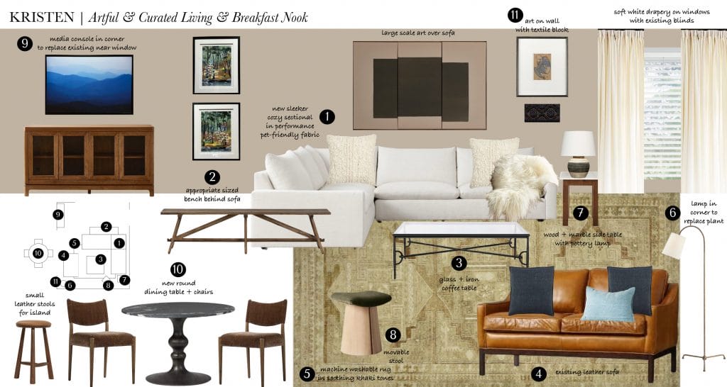
Erin R.’s moodboard leaned into soft contrasts and classic proportion. A tailored sectional in ivory, balanced by a vintage-look khaki rug, framed the living zone with quiet poise. Her use of wood—especially in the bench and side tables—echoed Craftsman interior design sensibilities, while the artwork and textured textiles added subtle complexity.
Jillian M., by contrast, constructed her scheme with more visual weight and bolder anchors. She introduced a deeper palette, using bold accents to define zones and direct movement. The layouts relied on deliberate symmetry, but the materials kept it grounded. In addition, her approach to Craftsman interior decor was less interpretive and more structural.
The plan felt tactile, ready to be used and to age well, so the client connected to this vision instinctively. They selected Jillian’s proposal to move on.
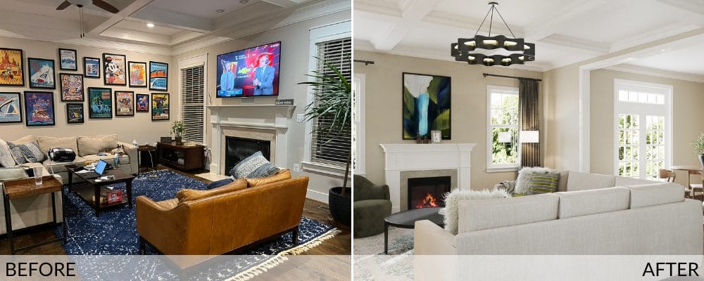
Results Revealed: Craftsman Home Interior Design
The finished spaces present a clean, edited answer to a familiar problem. Rooms with no real function and too many visual distractions now read with clarity. There’s the intention behind each gesture, and the result is balanced—not minimalist, not ornamental, but composed. More importantly, the rooms now have a rhythm. They offer a visual reason to walk in and a spatial reason to stay.
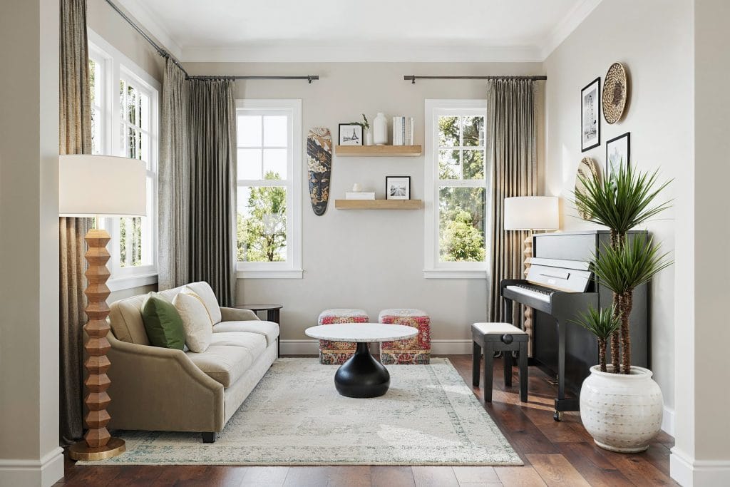
Craftsman Living Room
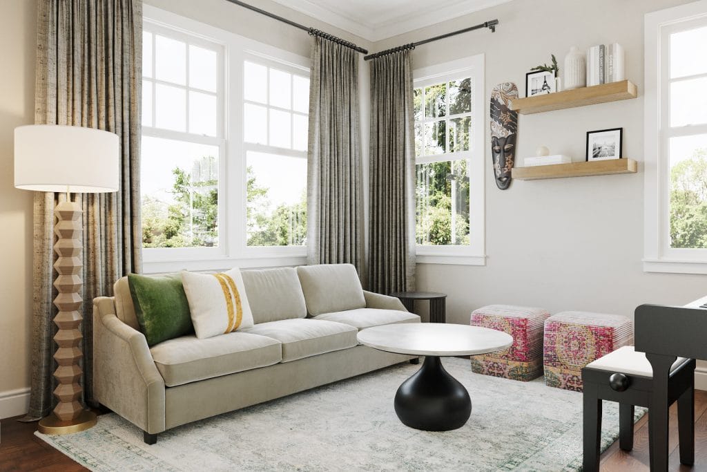
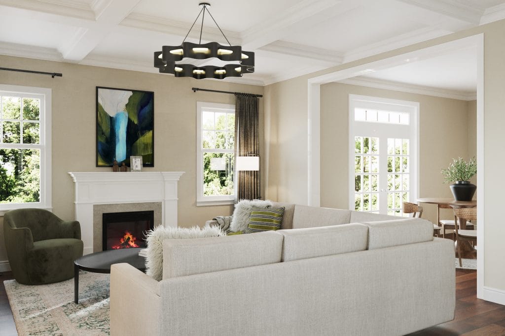
The completed craftsman living room design succeeds in both structural clarity and material coherence. It does not lean on trend, nor does it try to impress. Instead, it reframes the room as a useful space, defined by deliberate restraint. Every major element—sofa, piano, lighting, art—has been anchored to scale. There’s a consistent throughline in the color palette, subdued but layered. It softens the textures, which, in turn, helps to smooth out the architectural angles.
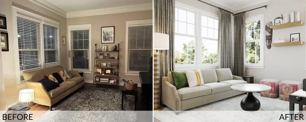
The old layout clung to the perimeter, with weighty furniture pressed up against every wall, which unintentionally made the room feel both tight and inactive. The lighting was piecemeal, and the artwork mismatched. By contrast, the new room thrives on symmetry and sightlines. Low, deliberate furnishings create visual cohesion at the midline. The result is a better sense of scale and spatial hierarchy.
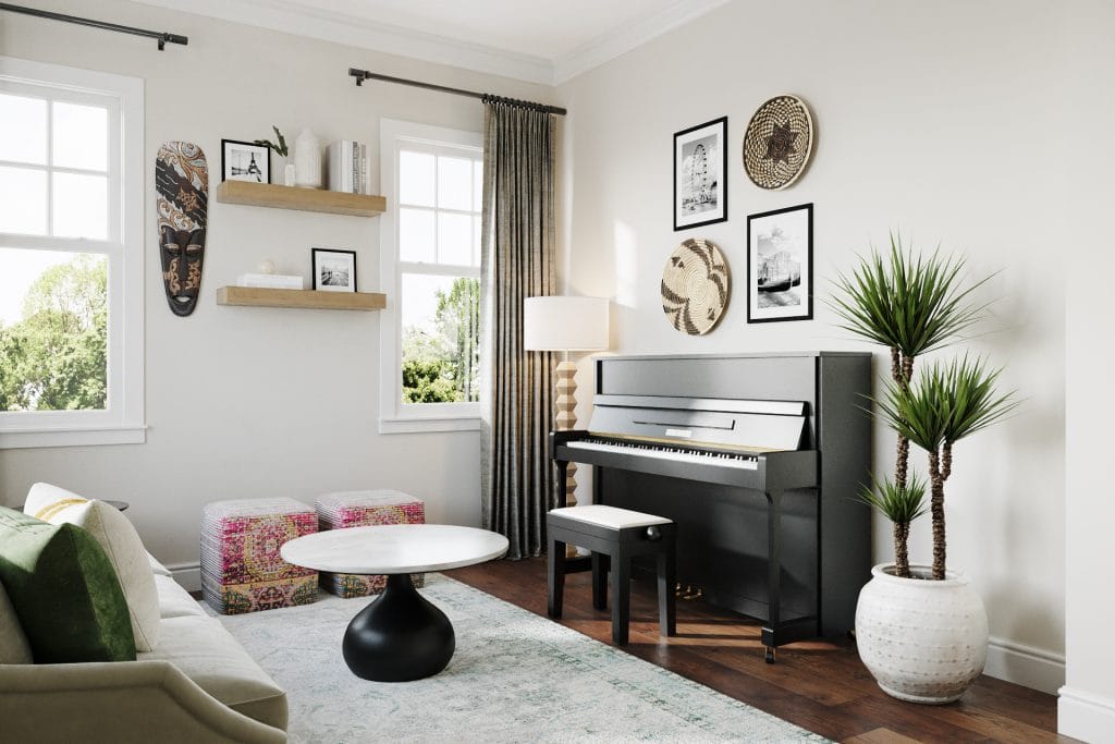
The curtains, longer and fuller than before, now act as a structural element. They add vertical heft without blocking the windows, which was especially important given the room’s orientation and morning light. Filtered through this heavier textile, daylight becomes part of the atmosphere. The rug, with its washed pattern and low contrast, also does a great deal of work: it anchors the palette, softens the acoustics, and signals a zone meant for pause.
Blending Function with Style
The seating arrangement corrects both proportion and posture. The sofa is longer, lower, and better grounded, positioned in relation to the window. A black-and-white coffee table holds the center as a functional axis. Paired with two textured poufs, the composition offers flexibility and avoids visual noise.
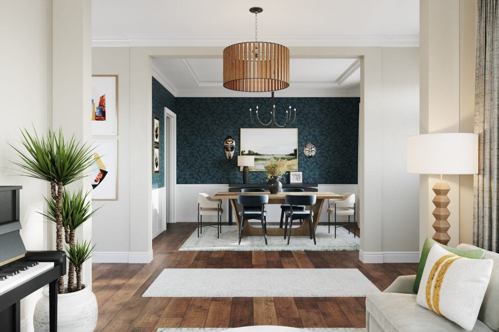
Dining Room With Craftsman Interior Decor
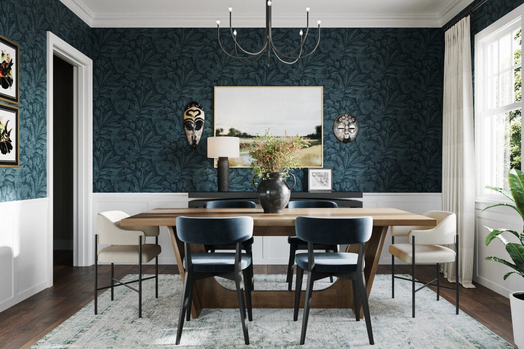
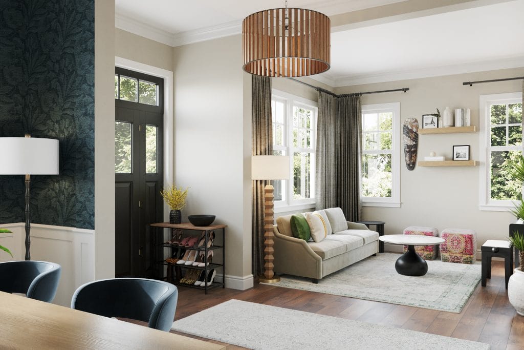
Wall treatment dominates the dining room, handled in a single move. The lower paneling is left intact, while the upper wall is wrapped in a patterned blue-green wallpaper. The texture is dense, but the print is even. It connects across corners and into thresholds without requiring an accent. The mask collection is reintegrated, placed with spacing that respects the surrounding surface. A large landscape painting is centered on the main wall, flanked by two masks, each distinct in shape but placed with even logic.
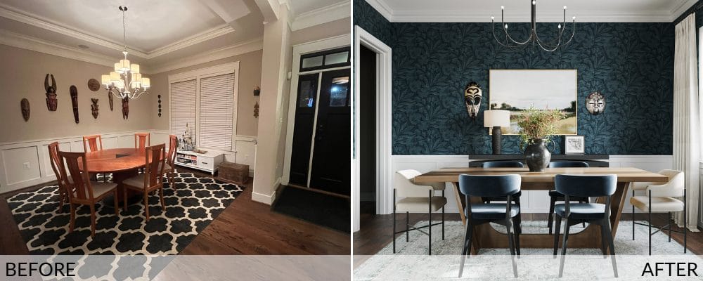
The redesign also restores the dining room’s scale. The old layout was compressed around a table that didn’t relate to the room’s proportions. The weight sat low to the ground, leaving the ceiling height unused. A larger, linear table now sets the room’s direction. Chairs are structured, consistent, and visually grounded. Together, they establish a clear footprint.
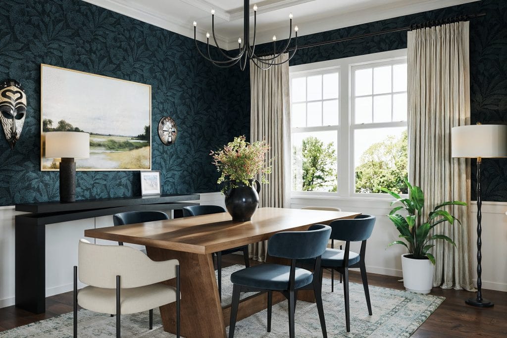
Curtains are full-height and lightly textured, installed at ceiling level and carried across the width of the window wall. A single floor lamp and potted plant complete the vertical field. Meanwhile, the lighting overhead is simplified to a black chandelier with exposed bulbs.
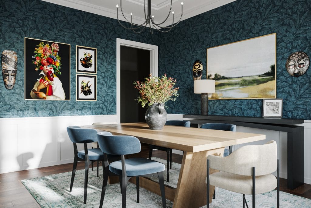
A long black console runs beneath the artwork, proportioned to match the width of the painting above and the table in front. On it, a single lamp and framed photo introduce a well-measured variation in scale and surface. Across from this wall, a smaller gallery arrangement of framed artworks and a single mask breaks up the larger wall span.
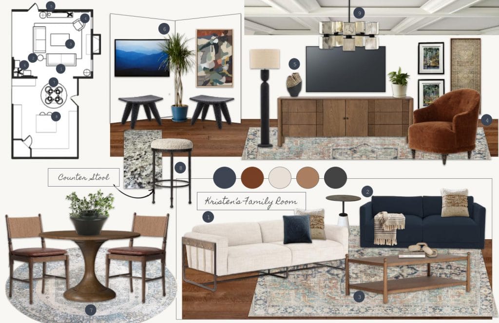
Craftsman Interior Design of a Family Room With Breakfast Nook
The revised layout clarifies the volume of the family room. The sectional moves to the center, scaled in relation to the room’s width and the position of the fireplace. It reads clean across the coffered ceiling, picking up the existing geometry without mirroring it. Seating depth and back height are kept low to preserve sightlines into the adjacent breakfast nook. The orientation prioritizes circulation and visual alignment. It’s a layout that holds the room rather than pushing into it.
The color and texture that ran wild in the original layout now shift toward quieter surfaces. Walls are painted a soft, matte neutral that works with daylight and reduces contrast. The television wall is simplified. A wooden console spans the lower register and lends weight to the screen, paired with a standing lamp and two scaled accessories.
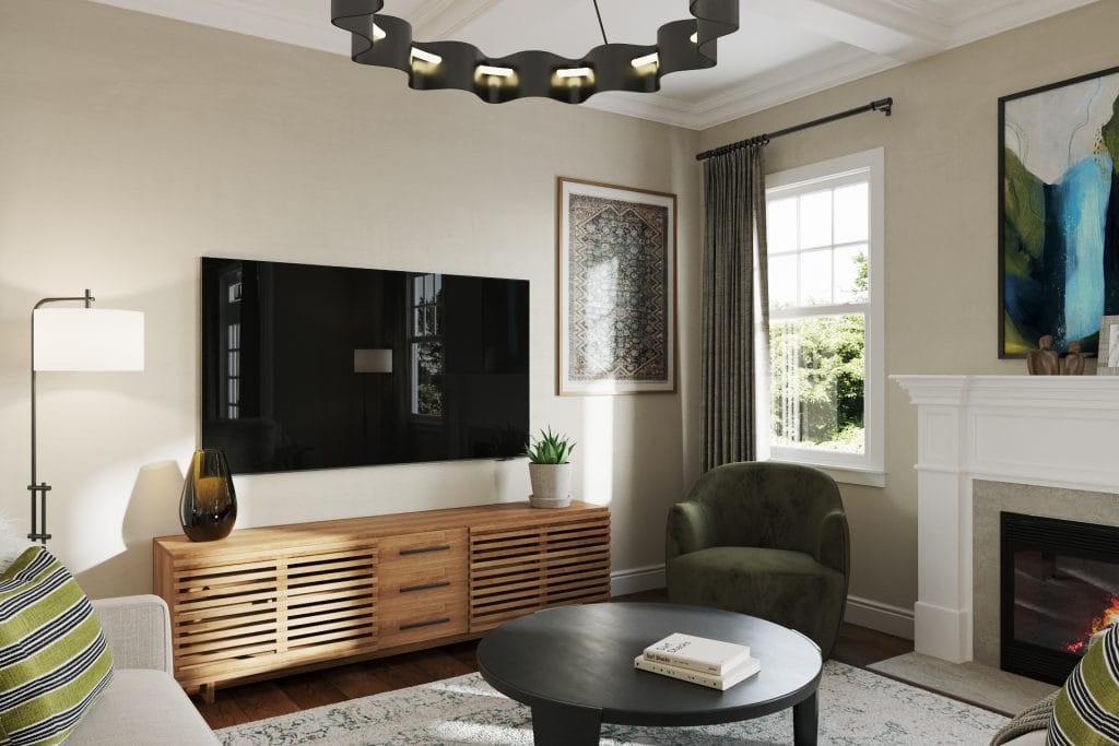
Material relationships carry most of the design work. Upholstery maintains a consistent tonal range, offset by cushions in subtle green and charcoal stripes. The accent chairs introduce a deep olive tone—soft, but distinct from the sofa, while drapery hangs ceiling to floor in a dense weave.
The ceiling fixture avoids ornament and scale inflation, using negative space to complement the coffered planes. Floor lamps repeat the same profile at either end of the space, tying lighting back to the verticals already established by the architecture.
The Breakfast Nook
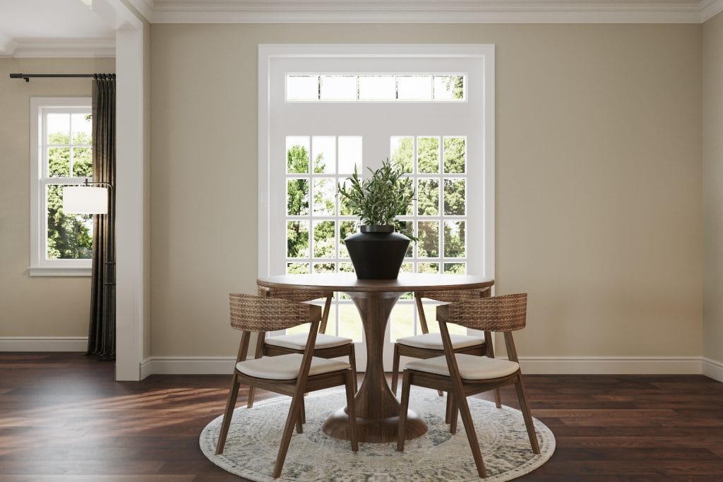
In the breakfast nook, the gesture is minimal. A round wood pedestal table and four woven chairs are placed over a soft rug, which sets the boundary. The planter at the center of the table is dark and heavy enough to sit on its own as a single accent. This area reads as a pause in the floor plan—open, legible, and unstyled. Its success lies in not competing with the family room but in extending the same sense of proportion and material continuity.
Cohesive Entryway
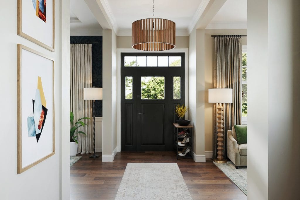
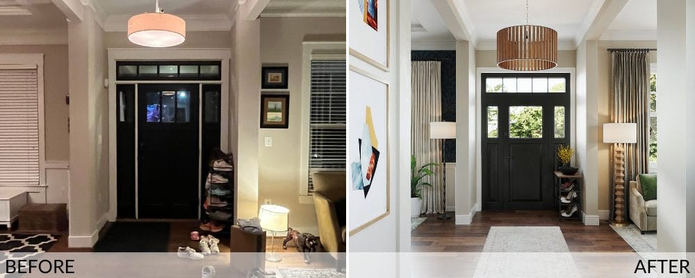
The entryway design brings this Craftsman home interior into alignment the moment the door opens. The space was previously congested—shoes exposed, furniture wedged, surfaces left floating between uses. Now it reads as part of the architecture. The Craftsman-style door remains in place, but the surrounding space around is reframed.
A rug defines the axis inward. The surrounding furniture is scaled precisely: a small wood-and-iron shoe rack, a dark bowl, a single ceramic vase. Working together, these elements establish function without disrupting the formality of the layout.
Lighting is handled with proportion. The new fixture sits wide and low, shaped in wood with vertical slats that echo the rhythm of the surrounding millwork. Its design doesn’t mirror the ceiling grid but shares its logic. It speaks directly to the principles of Craftsman interior design—natural material, exposed structure, and functional geometry. Floor lamps just beyond the threshold continue the vertical rhythm, aligning with the window mullions and drapery edges.
Framing the entry, the design leans on axial alignment. The view toward the dining room is unobstructed. Color moves in gradients—light walls, dark wood, soft textiles—allowing transitions between rooms to happen fluidly. On the floor, pale rugs run the length of the hall and into the adjacent rooms, reinforcing the eclectic house plan.
Eclectic & Energetic Powder Room
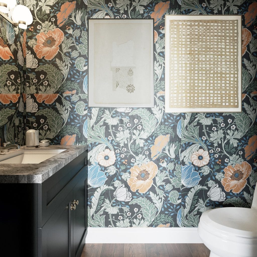
The Craftsman powder room shifts scale through surface. The footprint remains compact, but the introduction of a full-wall pattern changes the spatial reading. Wallpaper is carried from baseboard to ceiling with no break in the plane, wrapping the corners and flattening the volume. In addition, the densely layered botanical pattern brings in a subtle historical reference.
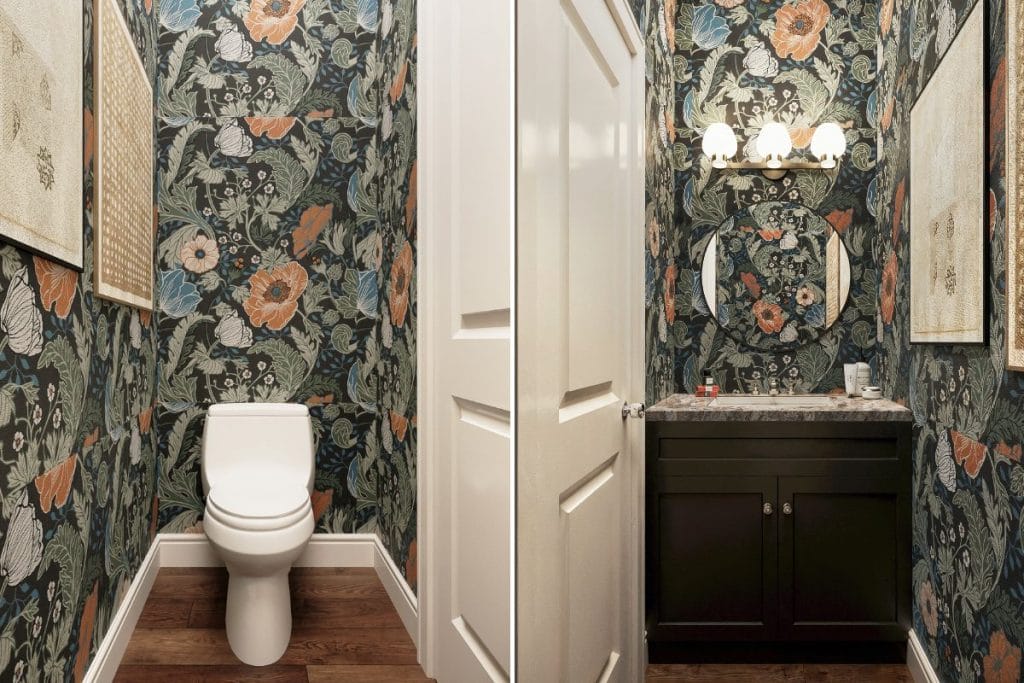
Fixtures and finishes follow the same principle. The vanity is a flat-panel design in a deep charcoal tone, matte and heavy enough to hold visual weight against the wallpaper. The stone countertop is subtly figured, while the mirror repeats the curve of the floral forms but avoids introducing a new material or finish. Lighting is placed above the mirror, spaced evenly, and shaped simply.
Artworks are quiet. Each piece sits with a margin, spaced far enough from the corners and each other to hold its ground. The palette of the art remains neutral, and no frame introduces metallic or gloss. Although more vibrant, the happy-moody powder room doesn’t depart from the rest of the house—it compresses it into a single, contained expression.
Design Details: Sourcing the Perfect Pieces
The eclectic Craftsman home interior redesign was shaped through spatial expertise and a methodical, collaborative process. Using Decorilla’s 3D visualizations, the designer translated each concept into a visual field the client could step into early on. This allowed them to understand furnishings, finishes, and layouts as a cohesive system, request adjustments, and make decisions with clarity.
Access to trade-only resources made it possible to source high-quality furniture and fixtures at prices that respected the client’s budget. That way, the design had room to grow while staying grounded in value.
As the rooms came together, the client’s satisfaction spoke clearly through their words: “Jillian, I am so impressed by all of your hard work! Will definitely work with Decorilla in the future.”
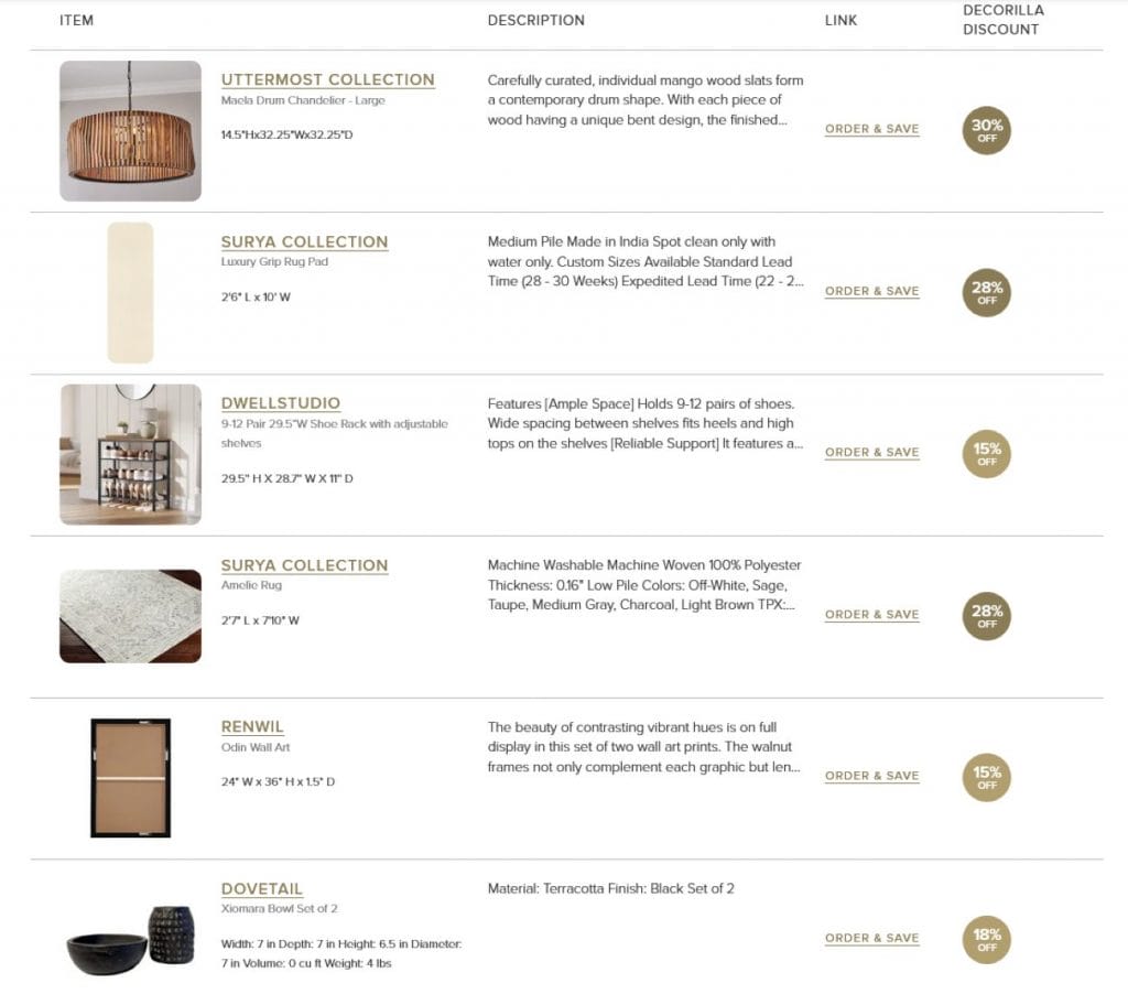
Get the Look: Craftsman Interior Design & Decor
A well-composed Craftsman home interior doesn’t need much—just the right pieces, scaled properly and made with care. This selection reflects the materials and profiles that hold up in a space built around a structure.
Looking for a Craftsman home interior tailored for you?
Work with professional designers who understand how to blend Craftsman character with modern living. Book your Free Online Interior Design Consultation to get started today!