Choosing a bedroom paint color can be a fun and rewarding experience, especially given the wide range of possibilities. It pays to go with a color that makes you happy Here’s some good news for you: many of the top paint colors for 2020 are naturally soothing ones. Not only do soothing bedroom paint colors create a tranquil sleeping space, they are compatible with a range of decorative accents. Not to mention, tranquil colors never go out of style, because they appeal to so many people. While many of today’s featured bedrooms showcase paint that’s on trend for 2020 (such as paint brands’ colors of the year), they are also timeless. Serene yet strong in their own way, the hues that follow take calm boldness to new heights…

Greens and Blues
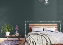
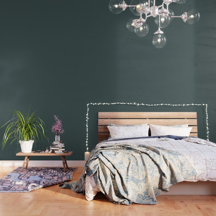
When you think of a rich green room, are you automatically drawn to an outdated version of a forest green study? Green has come a long way, baby! In fact, Night Watch was PPG Paints’ 2019 Color the Year. Emphasizing the human desire to connect with nature, Night Watch is a serene shade of green that brings the outdoors inside. Like walking through the forest after the sun has set, the peace and calm evoked by this hue is perfect for sleeping spaces where letting go of the day’s worries is key. Below we see a bedroom bathed in Night Watch-hued wallpaper by Simply Solids, available via Society6. You can skip the wallpaper and go right to the paint if you’re looking to apply your bedroom color with a brush or a roller!
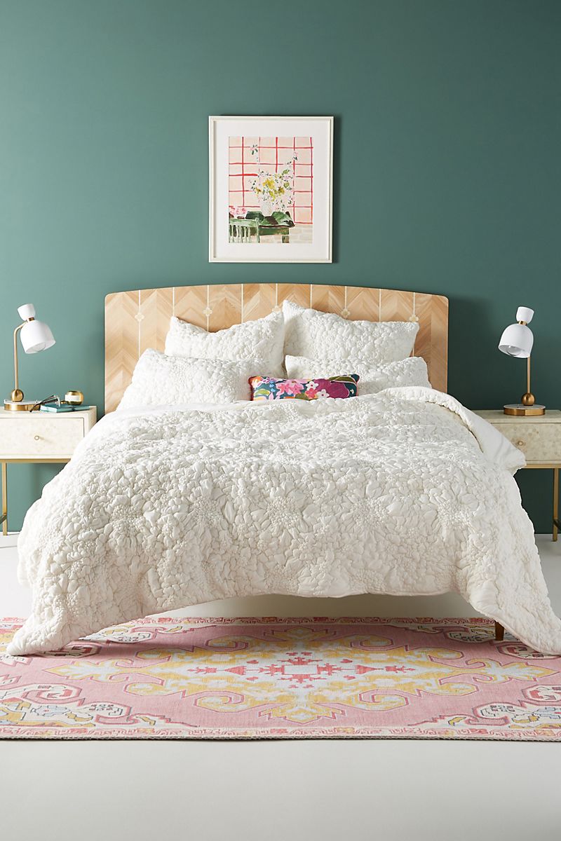
The mossy green hue showcased in the Anthropologie bedroom below is a softer version of Night Watch. Naturally evocative of the verdant world outside, this version of green has a slightly smoky look that plays up the elegance. Not to mention, it comes to life when combined with ivories, creams and beiges:
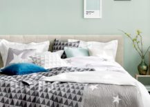
The popularity of minty blues and greens comes and goes when it comes to design trends, but this color family has true staying power. With a deliciously calm presentation that also looks good enough to eat, mint can be taken in a crisp and refreshing direction quite easily with the ample use of white. Below we see a sophisticated yet relaxed bedroom featuring Pavillion Blue by Farrow & Ball. Note the white trim, as well as the abundance of white textiles:
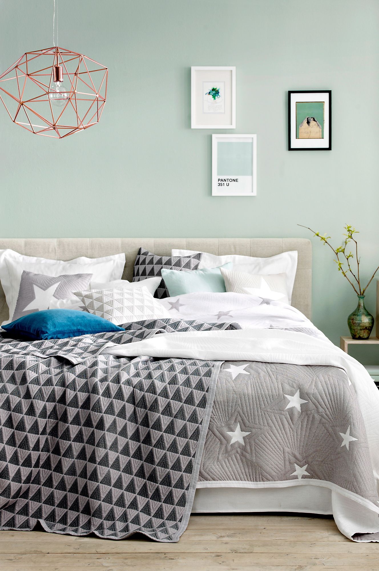
While the image above is soft in its gentle hint of mint, the space below takes a more contemporary approach to minty bedroom design. A modern display of framed art, a geometric pendant light, and on-trend bedding from Ellos create a visually interesting space that engages you without inhibiting the relaxing vibe:
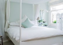
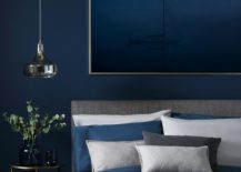
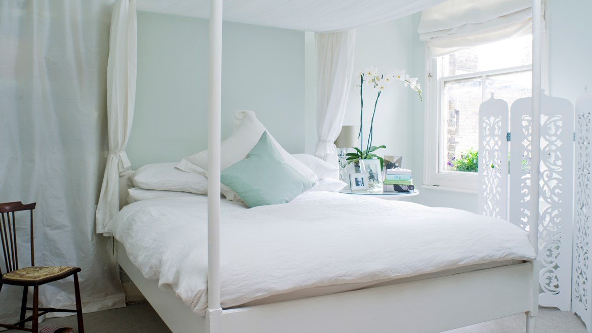
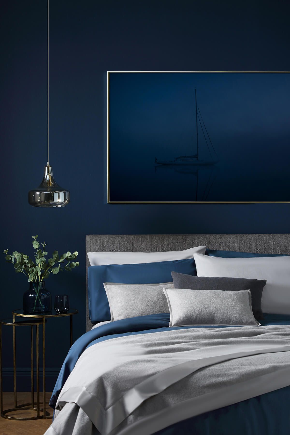
When Pantone named Classic Blue their Color of the Year 2020, designers and experts weighed in with mixed reviews. Say what you will about this strong yet calming color, it’s hard to deny that it’s steady and classic. Plus, it’s not always the norm for a deep, rich tone to be soothing. Not to mention, classic shades of blue never go out of style, and for those who love a nautical look, you just can’t go wrong with this hue. For more on Classic Blue (and plenty of great design ideas), check out this Decoist post. [image from Furniture Choice via House Beautiful]
Pink Power
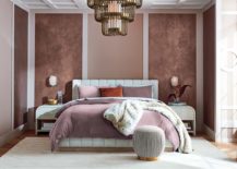
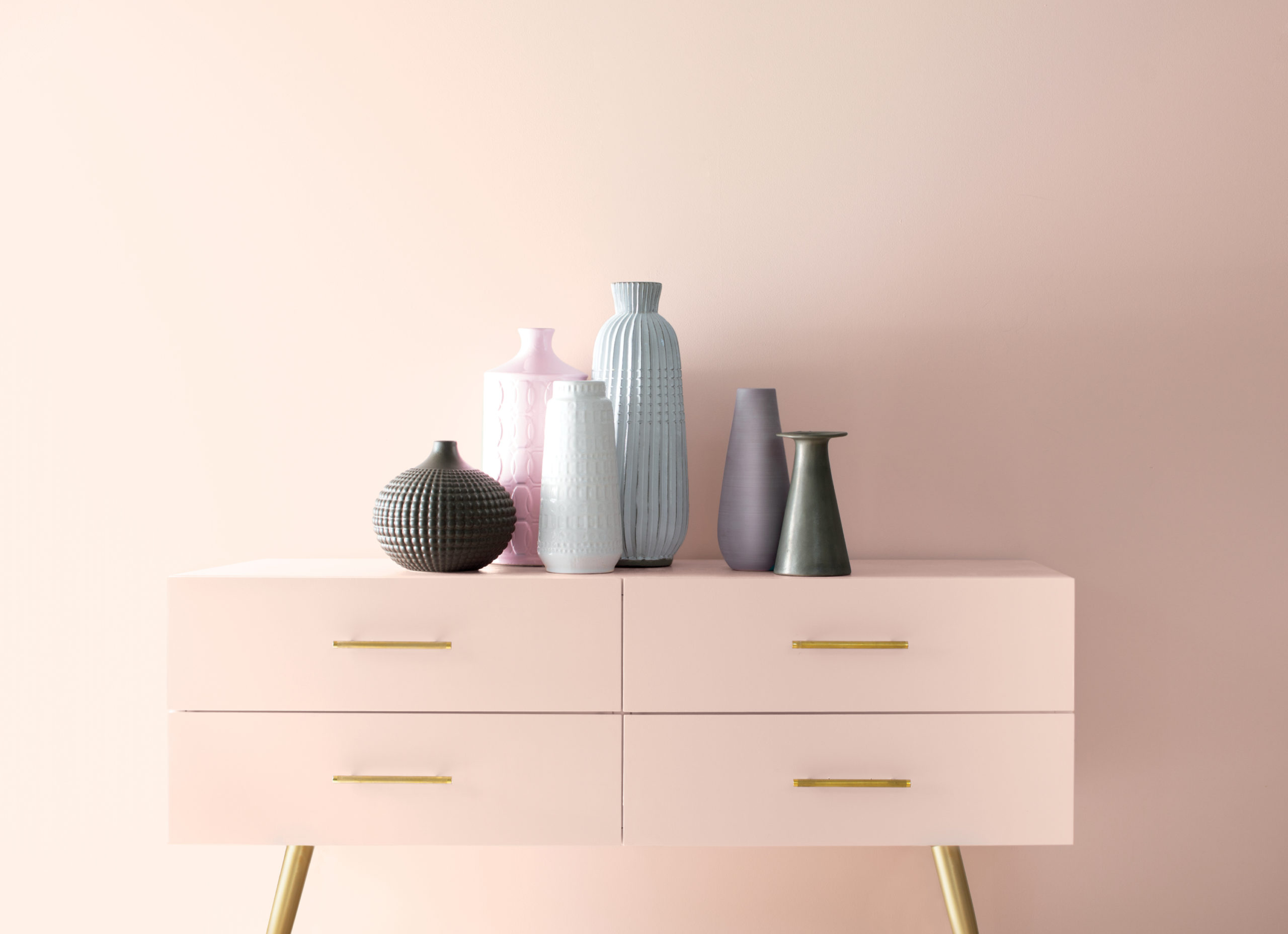
Blues and greens are beautifully complemented by shades of pink, so let’s spend some time in its rosy spotlight, shall we?! While bright and powerful Millennial Pink was going strong for years, a newer, more subtle type of pink is making waves in the world of bedroom paint colors. This different take on pink is more calming than attention grabbing, and it takes on a dusty peach vibe rather than a bright pink glow. The result: a dreamy, soothing hue that resembles the first blush of the morning sunset. Below we see a vignette styled against the backdrop of First Light, Benjamin Moore’s Color of the Year 2020:
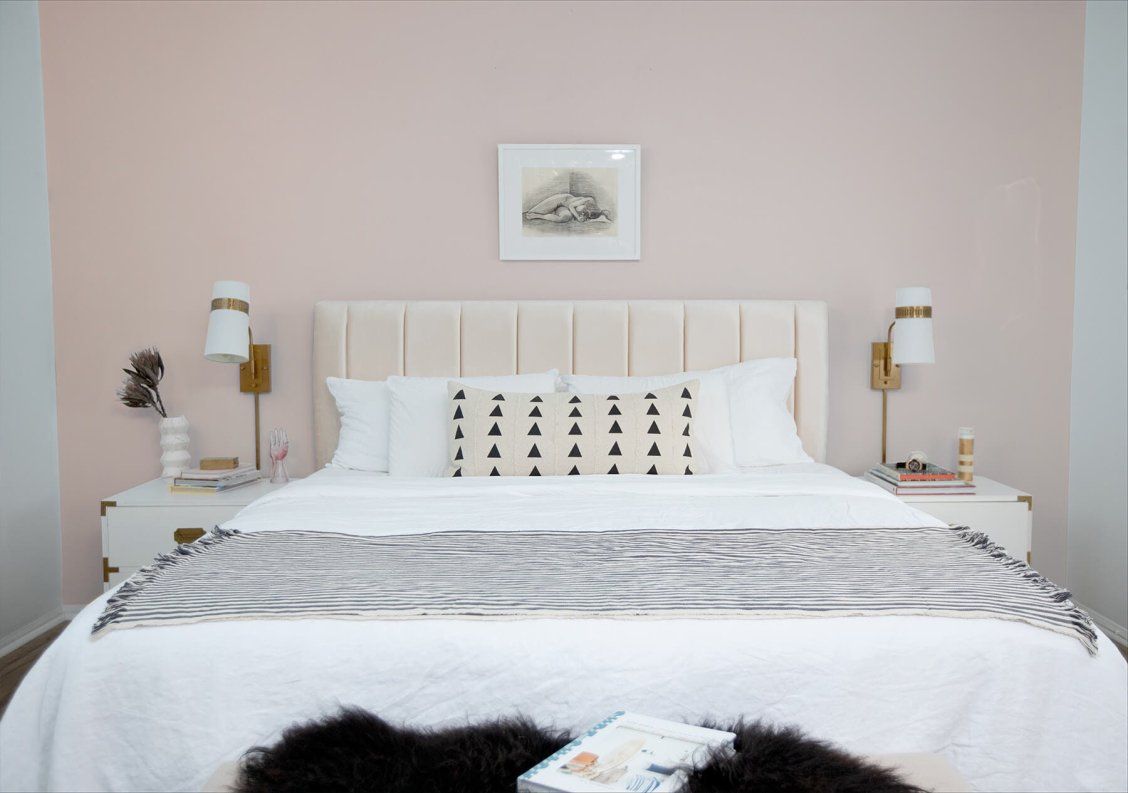
It can be fun to experiment with different shades of pink, from the peachiest to the dustiest. A similar shade to First Light with an equally calming effect is Blushing Bride, which was one of Valspar’s 2019 Colors of the Year. Below we see the color in a bedroom makeover by Lifestyle Blogger Cara Irwin of Pure Wow. By keeping the rest of the room bathed in white with dashes of black, the blush tone of the accent wall can really take center stage:
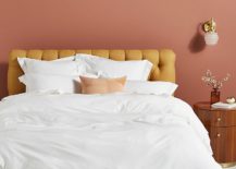
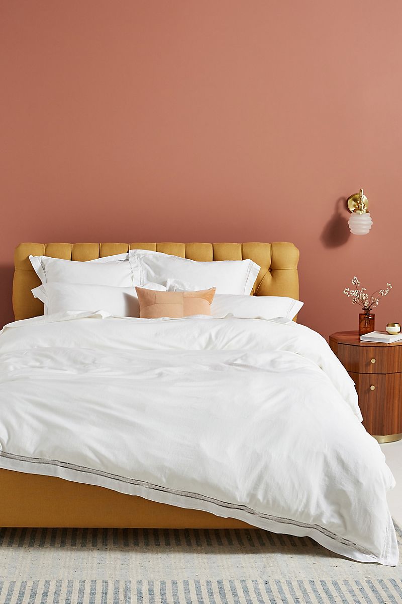
Don’t be afraid to mix pink with other warm, rosy tones, such as terracotta. The bedroom below by Anthropologie features earthy pink walls that blend beautifully with sunny hues, such as the mustard shade of the tufted headboard below. Wooden furniture and a brown glass vase play up the warm feel, along with a wall sconce featuring a brassy finish.
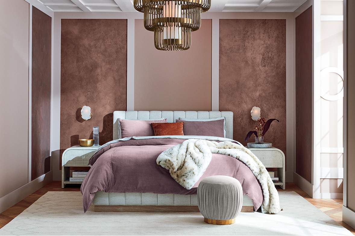
Speaking of mixing and matching pink tones for a layered effect, purply pinks can also be beautifully incorporated into the mix, creating a rich look. This option is perfect for those who enjoy the more lavender side of pink, rather than the peachy one. The bedroom below by CB2 features paneled walls and plenty of soft textiles:
Natural Neutrals
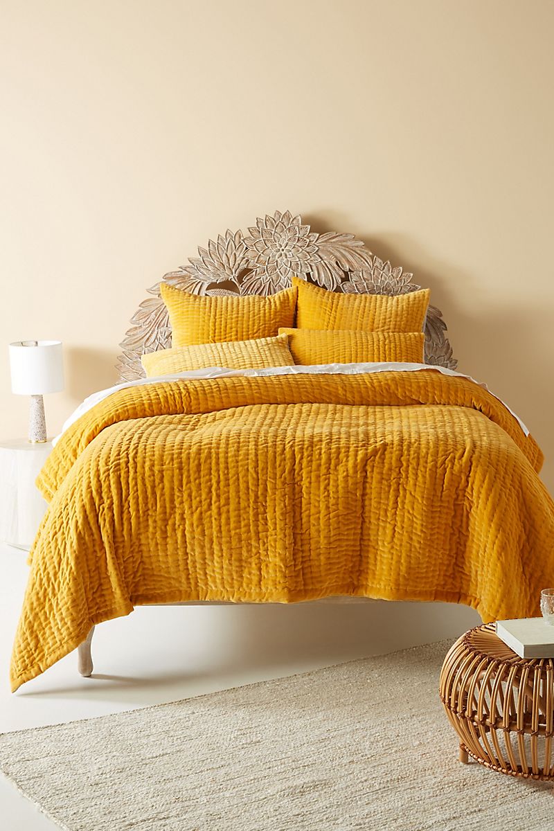
We end today’s post by featuring a couple of spaces that showcase the beauty of bedroom paint colors in natural tones. When you keep the color simple, you can add interest with texture, such as cushy textiles. How’s that for relaxing?! Buttery beige is radiant in the Anthropologie-designed bedroom below, especially when complemented with velvety bedding in saffron:
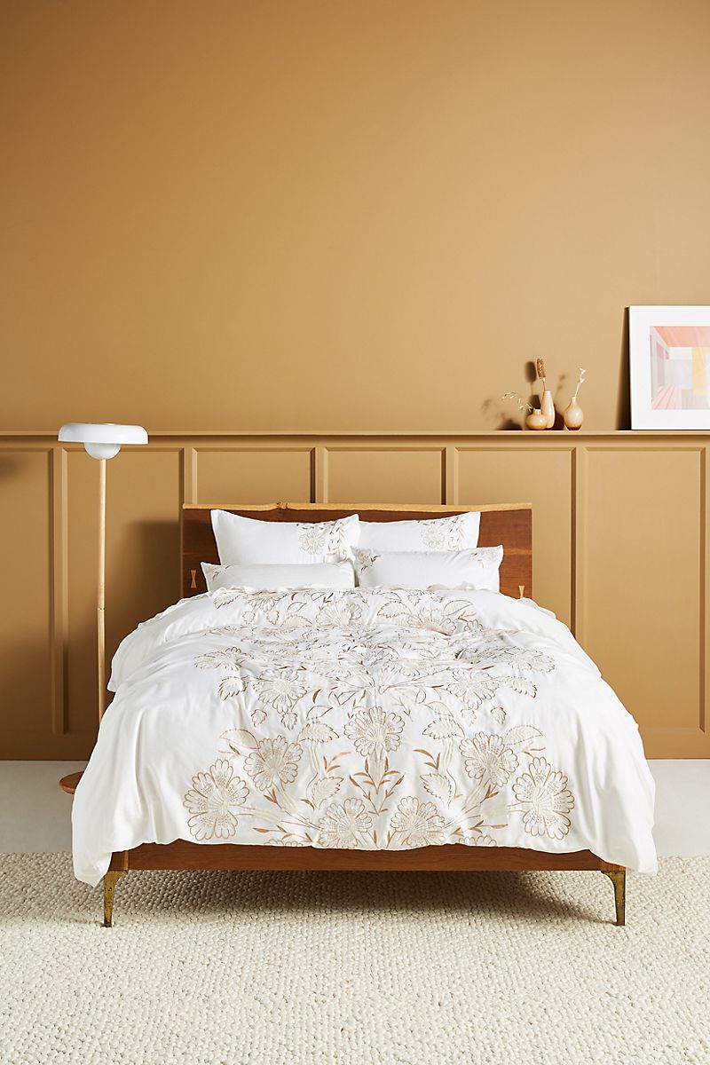
Last but not least, if you go a few shades darker than the bedroom below, you get an earthy take on ochre. Warm-toned paint colors that channel the desert are naturally calming while reminding us of the sun’s glow. This can be particularly comforting on the coldest of winter days. Not to mention, clay-like colors pair well with rosier tones, and we know that pink shows no signs of disappearing from the design realm! The bedroom styling below is from Anthropologie:
When it comes to bedroom paint colors, are you likely to play it cool with blues and greens, see the world through rose-colored glasses, or keep it neutral? Happy decorating, and thanks for reading!
You’re reading The Best Bedroom Paint Colors for a Tranquil Interior, originally posted on Decoist. If you enjoyed this post, be sure to follow Decoist on Twitter, Facebook and Pinterest.