Dull Federation Bungalow in Melbourne Gets a Bright, Modern Extension

There are occasions when planned renovations and extensions go just to plan. Then there are times when a makeover can actually make the home poorer by blocking off the flow of light. Of course, every home alteration is a product of the times and what worked a couple of decades ago might just not be relevant anymore. That is just what happened with this classic Federation Bungalow in St. Kilda, Melbourne where an improperly planned extension in the 90’s made the interior of the St. Kilda Side Yard House congested and dreary. Andrew Child Architect were called in to give this Aussie home a fabulous new makeover and that is just what we get with the new, contemporary addition that holds the kitchen, dining, and living areas.
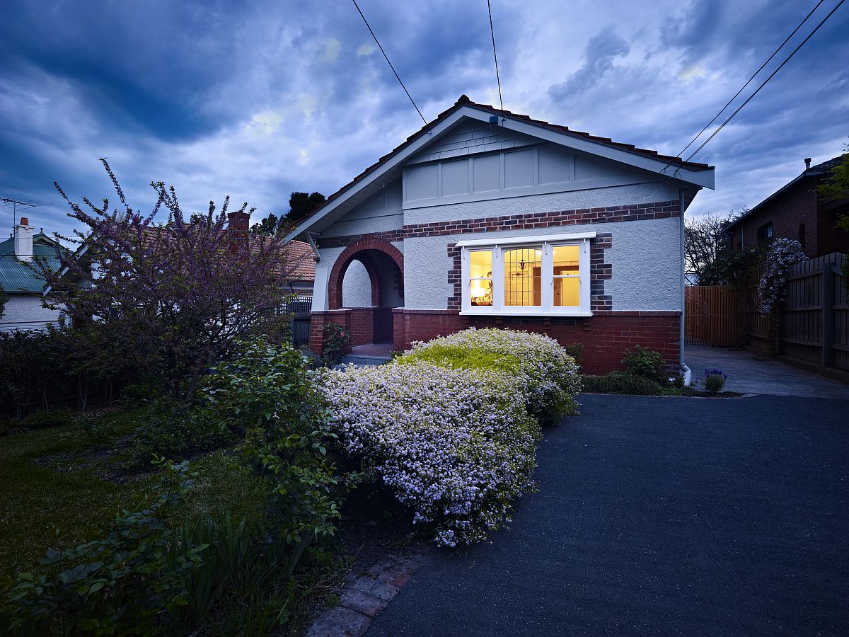
Street facade of the beautiful solid brick Federation Bungalow in Melbourne


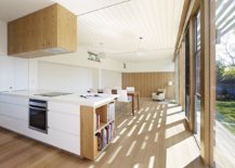
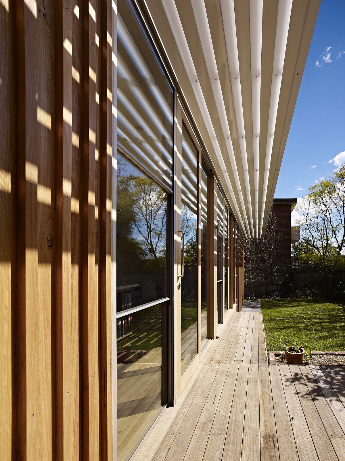
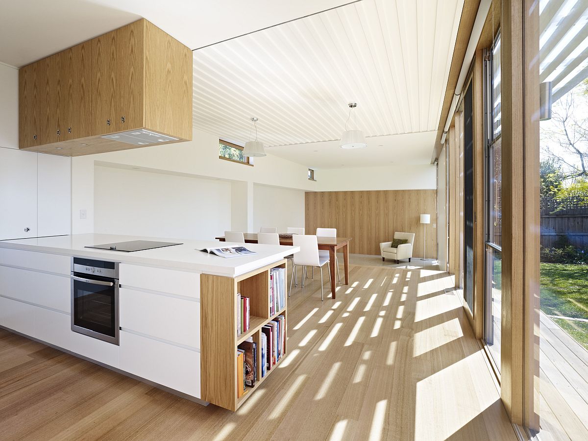
It is easy to understand the charm of this lovely new unit that has an open plan living space along with a kitchen and dining area in wood and white. Sliding glass doors connect it with the yard outside while smart timber battens and custom sunshade ensure that the extension into the side yard does not seem too bright or feel too hot in summer months. There is a lovely interplay between light and shadows inside the home now and even the older room in the existing bungalow are far brighter.
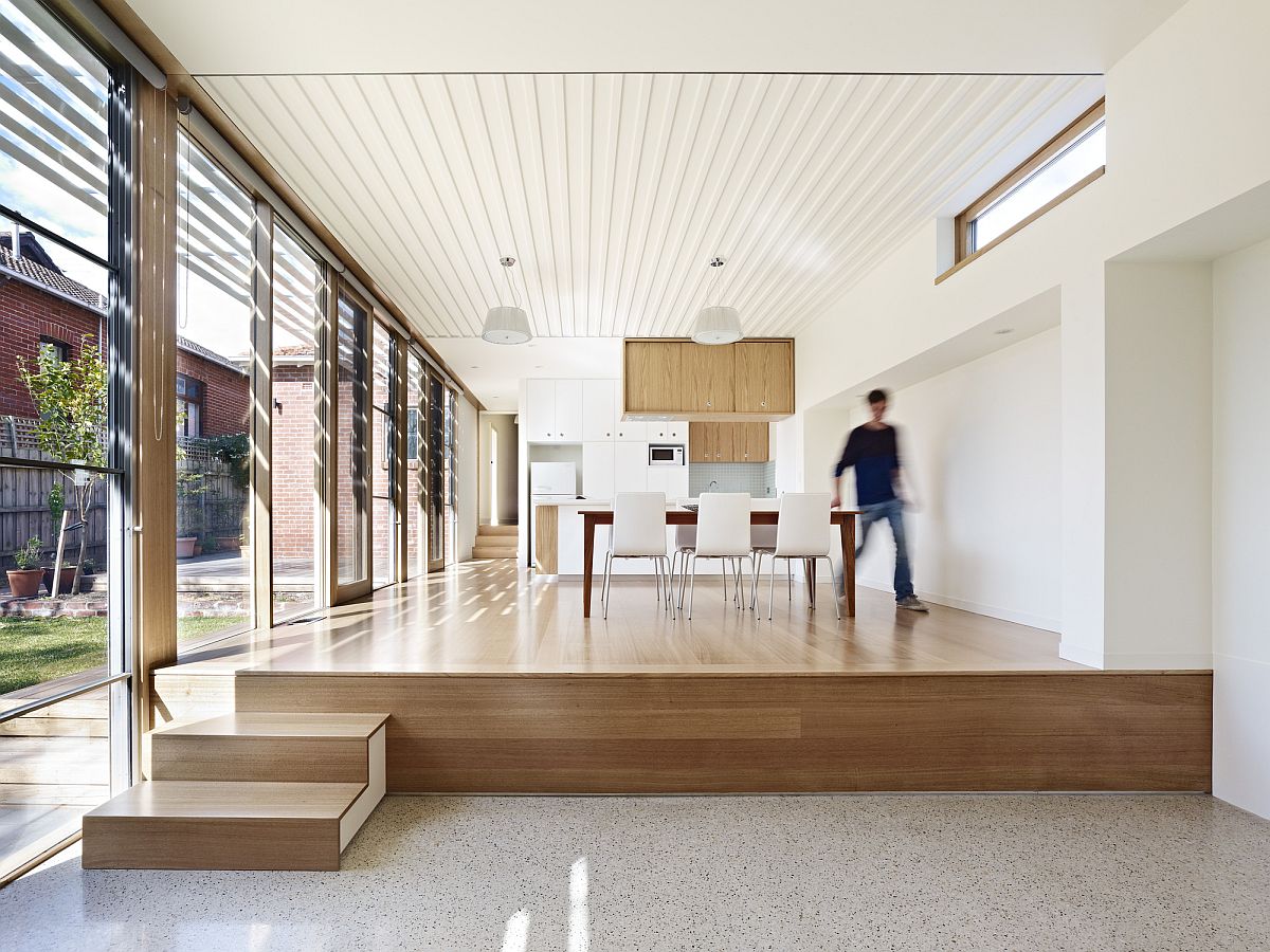
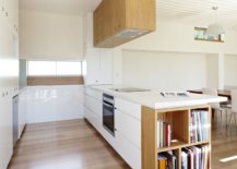
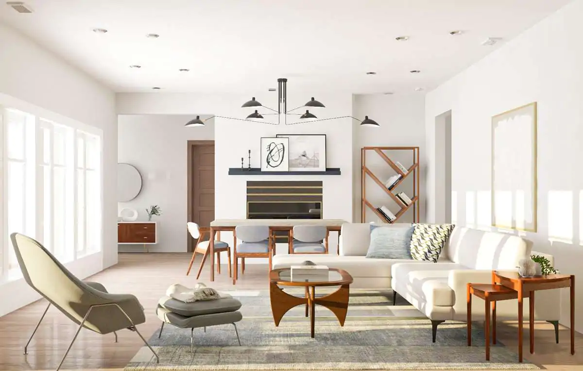
White and wood interior of the renovated home in Melbourne
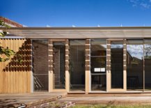
Wood and glass extension of the classic Federation Bungalow in Melbourne
Contemporary extension to beautiful solid brick Federation Bungalow
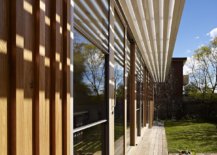
Innovative custom-designed sunshade keeps out hot summer sun
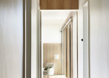
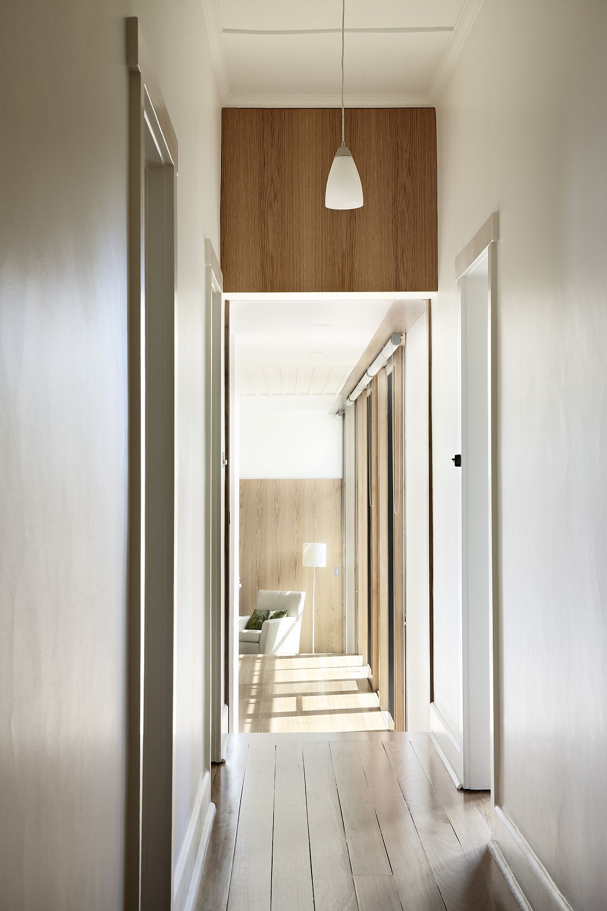
Long corridors in white and wood bring ample natural light into this revamped St. Kilda home

Even with its concrete floors that help in passive heating and cooling, contemporary décor and clever reorganization of spaces, this exquisite home Down Under still manages to retain much of its old world charisma thanks to a street façade that is left untouched. [Photography: Rhiannon Slatter]
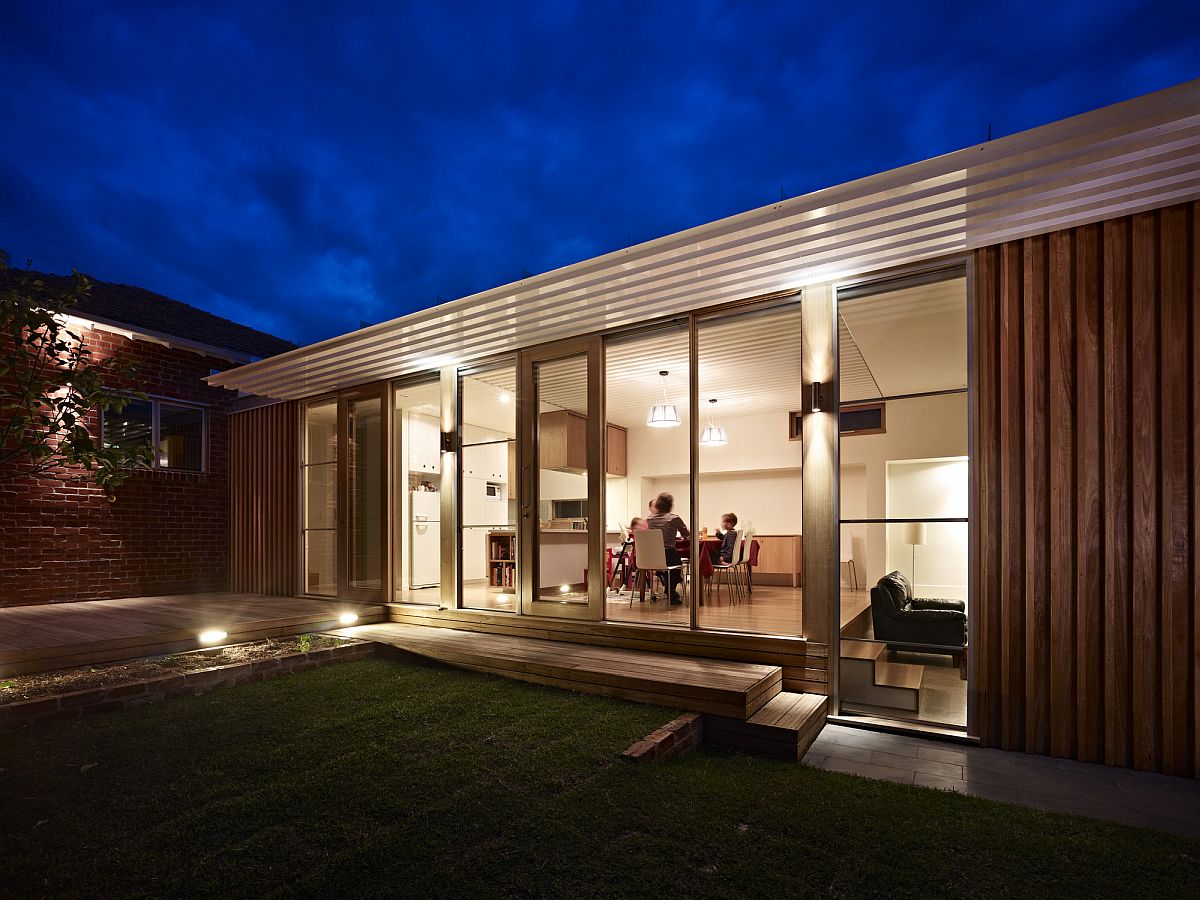
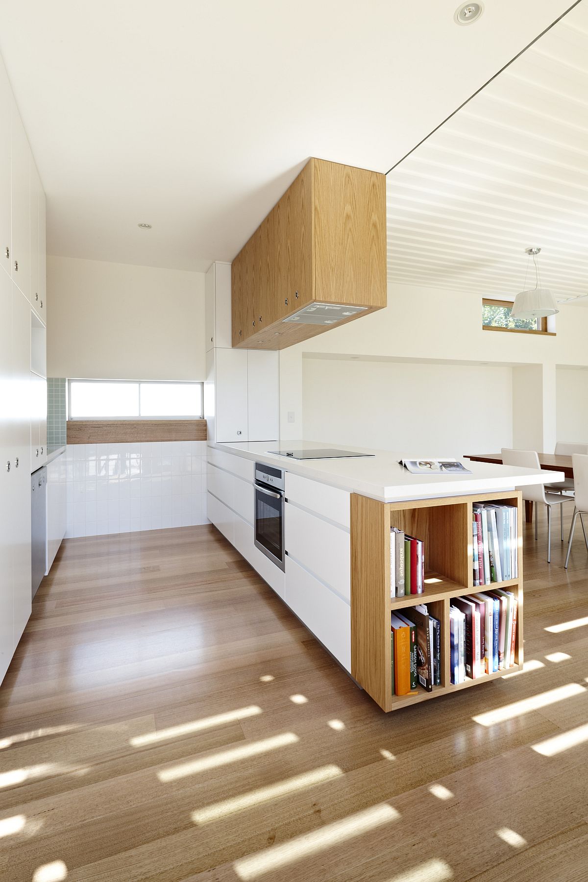
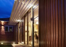
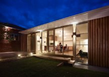
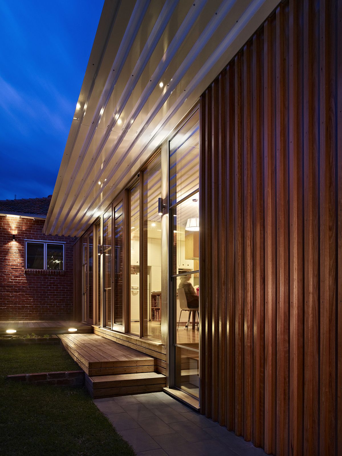
Lovely lighting adds warm glow to the slim wooden extension in the rear
New design of the house brings natural light into the smart St. Kilda Side Yard House
Open plan living area, kitchen and dining space of the renovated home in Melbourne
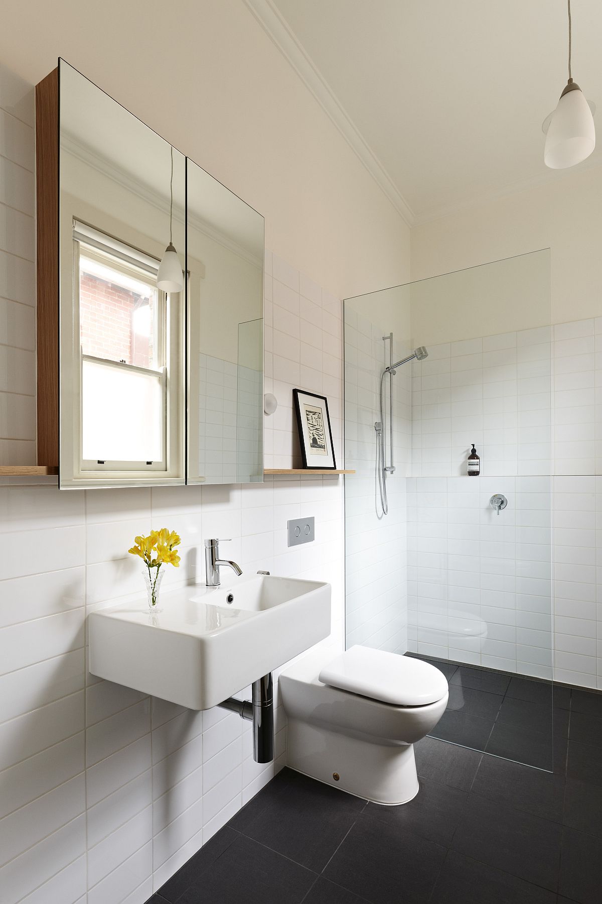
Smart modern bathroom in white with natural light creating a smart ambiance
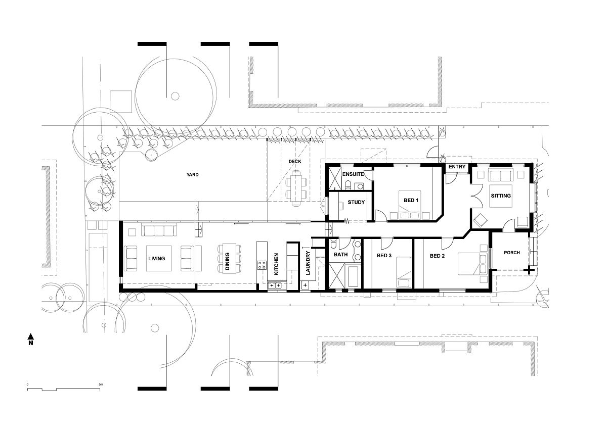
Floor plan of revamped St. Kilda Side Yard House and extension by Andrew Child Architect

You’re reading Dull Federation Bungalow in Melbourne Gets a Bright, Modern Extension, originally posted on Decoist. If you enjoyed this post, be sure to follow Decoist on Twitter, Facebook and Pinterest.

Similar Posts

  • L7 Home

    Architects: Augusto Fernández Mas (K+A Diseño),
    Mauricio Miranda (MM Desarrollos),
    Mariel Esquivel and Cesar Cardoso. Construction: K+A Diseño Main Purveyors: MicMac, Solesdi y Venster. Interior decoration: TAI Arquitectura de Interiores Photography: Onnis Luque The linear black cabin was designed by the collaboration between Augusto Fernández Mas and Mauricio Miranda as a country house for a client with three specific demands: simple layout, low maintenance, and living quarters and public areas in one floor. RA.L7 is located within Rancho Avandaro Country Club in the outskirts of Valle de Bravo, an hour and a halve drive from Mexico City. It is a project that portrays a strong character form the outside but at the same time invites passersby to enter. In the inside, it offers a warm cabin like feeling that through its simplicity and windows facing the golf course, guides the view to the outside. The lower concrete volume ads a sense of solidity and stability to the house, and its layout divided by a garage open on both sides provides an invitation to enter. [
    The project uses the topography of the terrain to its advantage, thus generating two volumes: the upper one which encloses the living and general public areas and the bottom one encompassing the garage, technical and service areas. The outside materials are Japanese style burnt wood (Shou-sugi-ban), Canadian darkened wood, concrete, and ceramic tiles (roof) that in turn evidence the simple lines of the design. The choice of materials demands close to null maintenance.
    The west façade, which faces the street, has dark wood symmetric divisions over the main interior hallway, creating privacy at an angle and almost unrestricted view when perpendicular to them. The purpose is to allow light into the house and permit the views to the equestrian club on the other side of the street while maintaining limited exposure to passersby’s. The east façade faces the golf course, thus there is an honest openness through all glass façade with sliding window doors and complemented with a glass-roofed terrace. In attention to the requested simplicity in the layout, the linear internal distribution has four rooms laid in a sequential manner culminating with living—room, dining-room and kitchen. One dramatic hallways communicates all areas in a straight line, adding to the simplicity of the design layout. With over 650 square meters of inside space, only one internal staircase was employed to communicate with the service areas and garage. There are two accesses to the house without stairs for the owner to comfortably access. In total, the terrain is 2,200 square meters of which ___ square meters were used for the house.
    There is a comforting feeling of warmth inside, but the same time opens up to go and enjoy the outside. It is to be lived inside wanting to be outside and, once outside, feeling invited to be protected inside. The linear and simple geometry of the house is soothed by the layout of the wood beams on the ceiling and the elegant and at the same time rough aspect of the wood floor and wood paneling on the walls. RA.L7 house is one of two recent projects done by the collaboration of Augusto Fernandez and Mauricio Miranda in Rancho Avandaro. Augusto Fernandez, through its K+A Diseño firm, is an active architect and constructor in Valle de Bravo with several country homes competed in the last years. Photography is by Onnis Luque.