Creative Feature Wall Ideas

A room refresh can be as complex as a total redo or as easy as creating a statement wall. Today’s post is dedicated to the power of a beautifully designed feature wall. From large-scale projects involving tile to smaller DIY endeavors, creating a surface that speaks volumes can be an engaging, fun and rewarding process. Not only does it create a focal point in the room of your choice, it’s a great way to showcase your creativity and make a space truly special. While painting an accent wall or using wallpaper are strategies often used in feature wall projects, below you will find range of options that go beyond the obvious. Enjoy! [photo of Fireclay Tile backsplash by Laura Petrilla]


Tile Talk

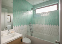
We begin with a more involved approach to creating a feature wall: tile. It’s an exciting time to be working with tile, as a wide range of new products, designs and brands are continuing to emerge. Tile design approaches the level of mosaic art in the image below, featuring Braided Picket Bathroom Wall Tiles from Fireclay Tile. [photo by Kuoh Photo & Creative, design by Nest Design Co.]

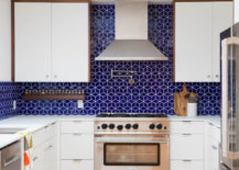
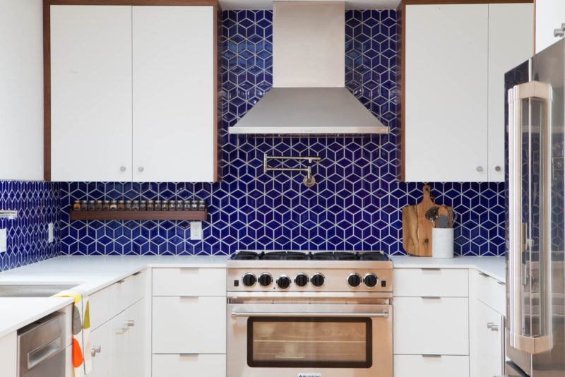
Also from Fireclay Tile, this Small Diamond Sheeted tile is perfect for a kitchen backsplash that makes a statement. As you can see, tile feature walls make a lot of sense in spaces such as the kitchen and the powder room. By choosing an interesting pattern or a vibrant color, you can take functional areas of the home to the next level. [design by Destination Eichler, photo by John Shum]


Terrazzo Tricks

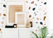
This next section of the post explores how one motif (terrazzo) can be featured on a wall using a variety of techniques. Perhaps you can use one of these strategies to create the motif of your choice. Up first: stencils! Dizzy Duck Designs’ Terrazzo Stencil takes the guesswork out of painting a feature wall. If you think painting with a stencil is outdated, the on-trend, modern result below just might change your mind:

If you’re not up for painting, consider wall decals. Trendy Peas’ Terrazzo Wall Decal set includes fabric stickers that are easily removable, as well as reusable. Let your creativity take hold without worrying about permanent implications!

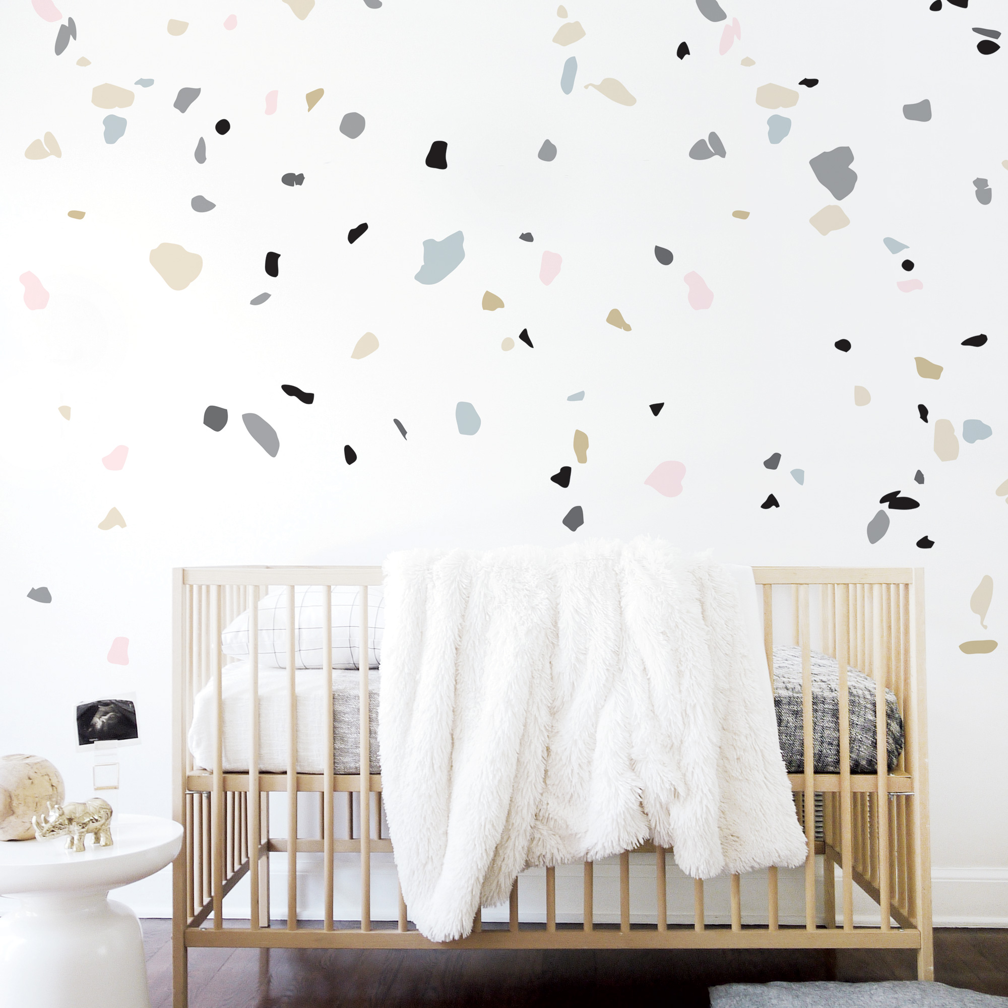
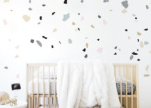
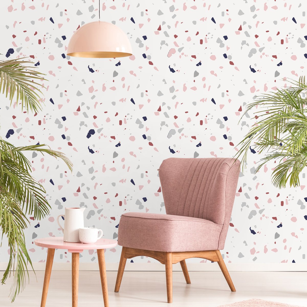
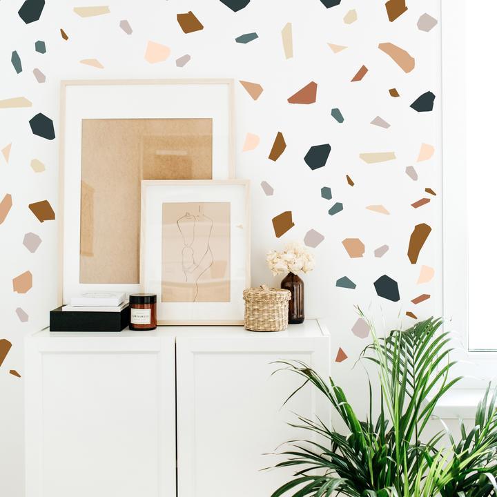
As you can see from the photos above and below, terrazzo patterns range from the rounded to the angular. Below we see Project Nursery’s Modern Terrazzo Wall Decals, a set that consists of 125 individually cut shapes. Also featured in the set: an on-trend palette of neutral hues.

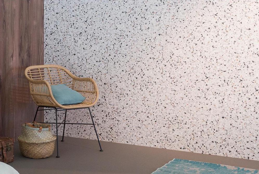
If you’re looking to make a statement that’s more permanent, consider a wall panel. Maestro’s Wall Freckled Terrazzo creates the perfect accent wall. Check out the brand’s Wall Terrazzo Blue for a vibrant option.

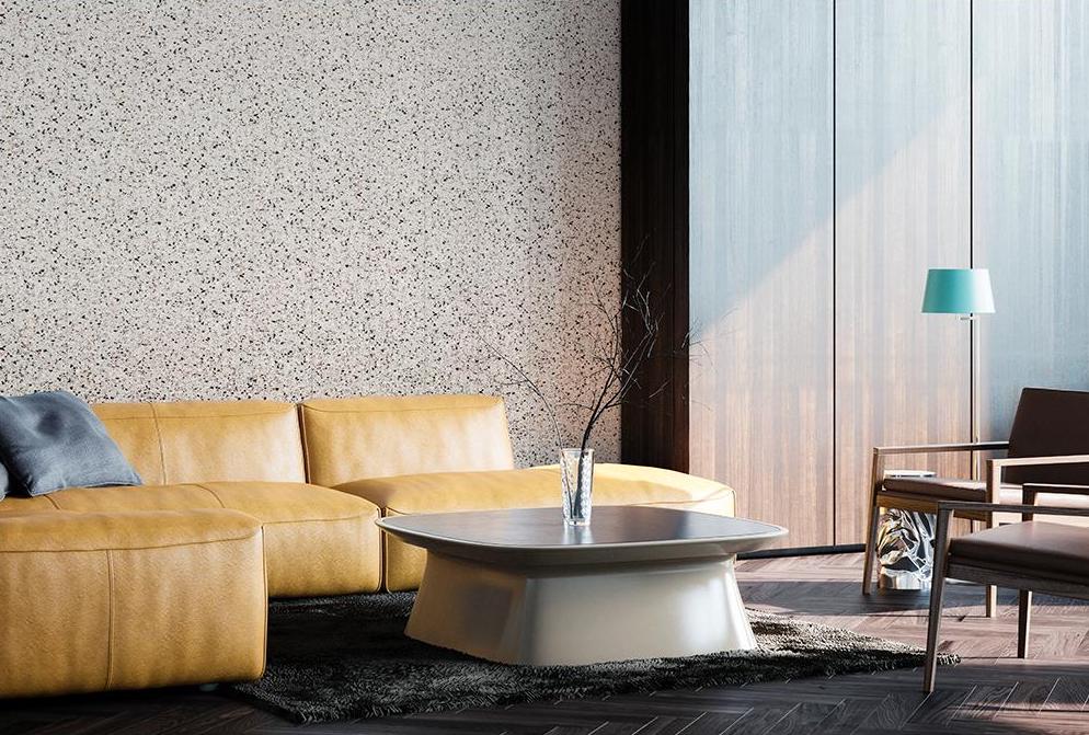
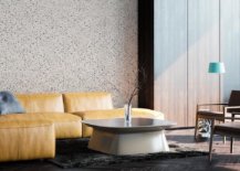
Below we see a closer view of the panel. Note how the detailed pattern truly shines in a room where clutter is kept at bay. A feast for the eyes, terrazzo is all about the beauty of small pieces that connect to make a big statement.

Keep in mind that the three options featured above (stencils, wall decals and wall panels) can all be used to achieve the motif of your choice. In other words, terrazzo not required. Whether you use decals for your feature wall or you decide to freehand a pattern, choose a design that you love and a strategy you can handle. Then let the design magic unfold!

Sculptural Style

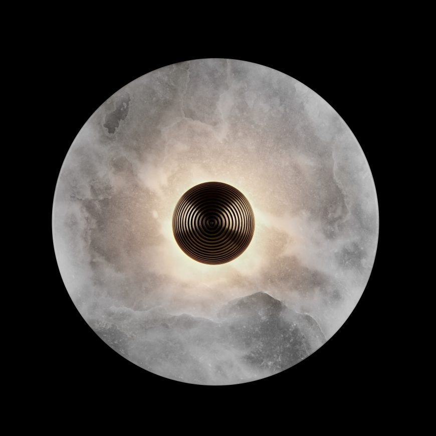
Have you ever been tempted to create an art installation on a wall in your home? Perhaps a few sculptural touches can call attention to the area of your choice. Sconces that double as modern art are a great place to start! Below we see the Amagansett, NY beach house of author and interior designer Athena Calderone. Did the round Medican Sconces from Apparatus catch your eye? Because they sure caught ours… [photo from Architectural Digest]

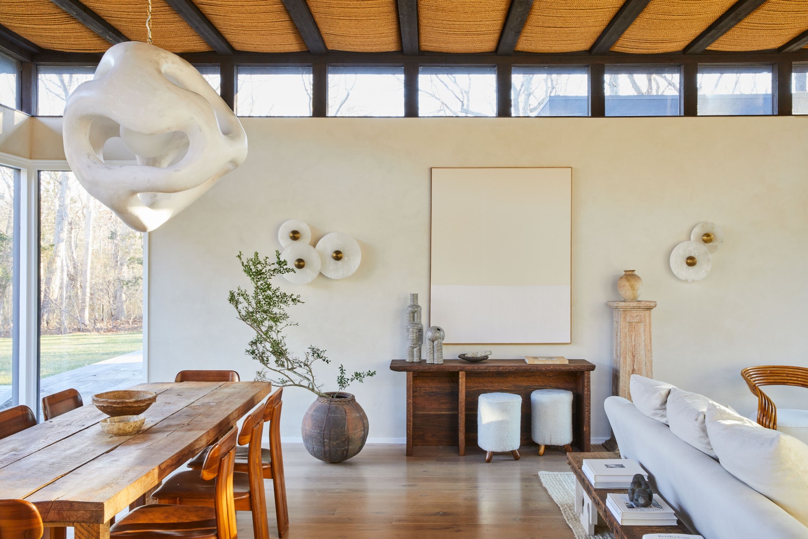
And now for a close-up of the sconces, which are crafted from translucent alabaster and fluted brass:

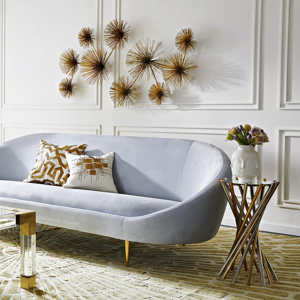
Piecing together smaller sculptural pieces can create an artistic focal point, and so can purchasing one large sculptural item. The metal sculptures of Curtis Jere are iconic, so it’s no wonder that Jonathan Adler exclusively partnered with the studio to reissue some truly unforgettable selections. Raindrops can be seen in the next featured image.

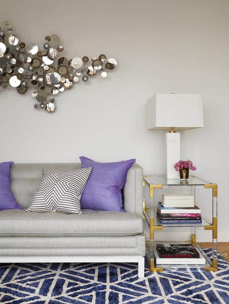
Curtis Jere’s Urchin sculpture is on display below, with its sunburst-style forms that can turn any blank wall into a showstopper. While some may not consider hanging a wall sculpture to be the equivalent of creating a feature wall, we think it’s a clever and creative way to make any wall in your home a true standout.

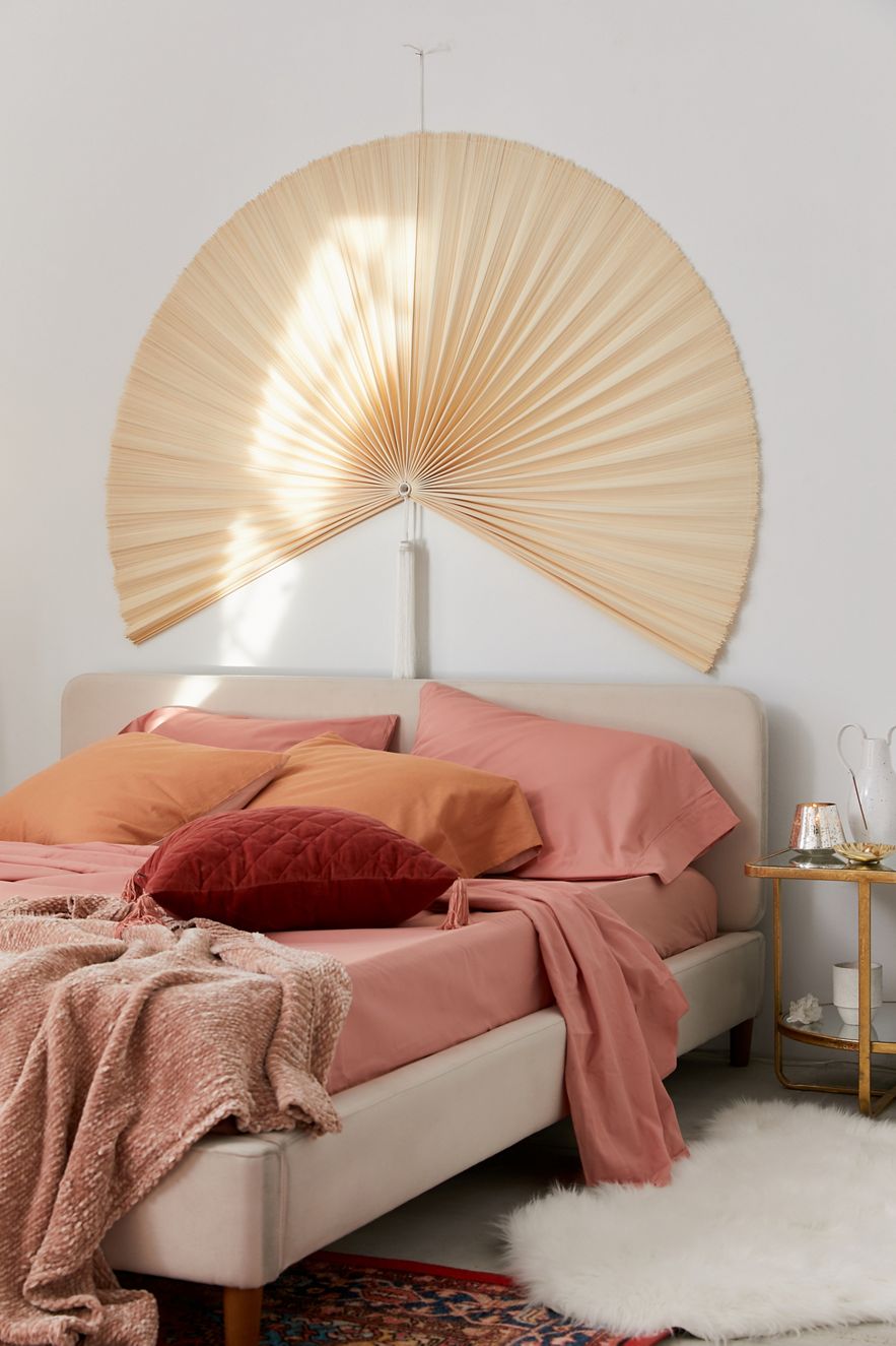
Don’t be afraid to think outside of the box as you plan and execute your feature wall endeavor. For example, Urban Outfitters’ Palmera Fan Headboard is so much more than a headboard. This giant bamboo fan is a large-scale statement just waiting to transform the wall of your choice:

Plant Power

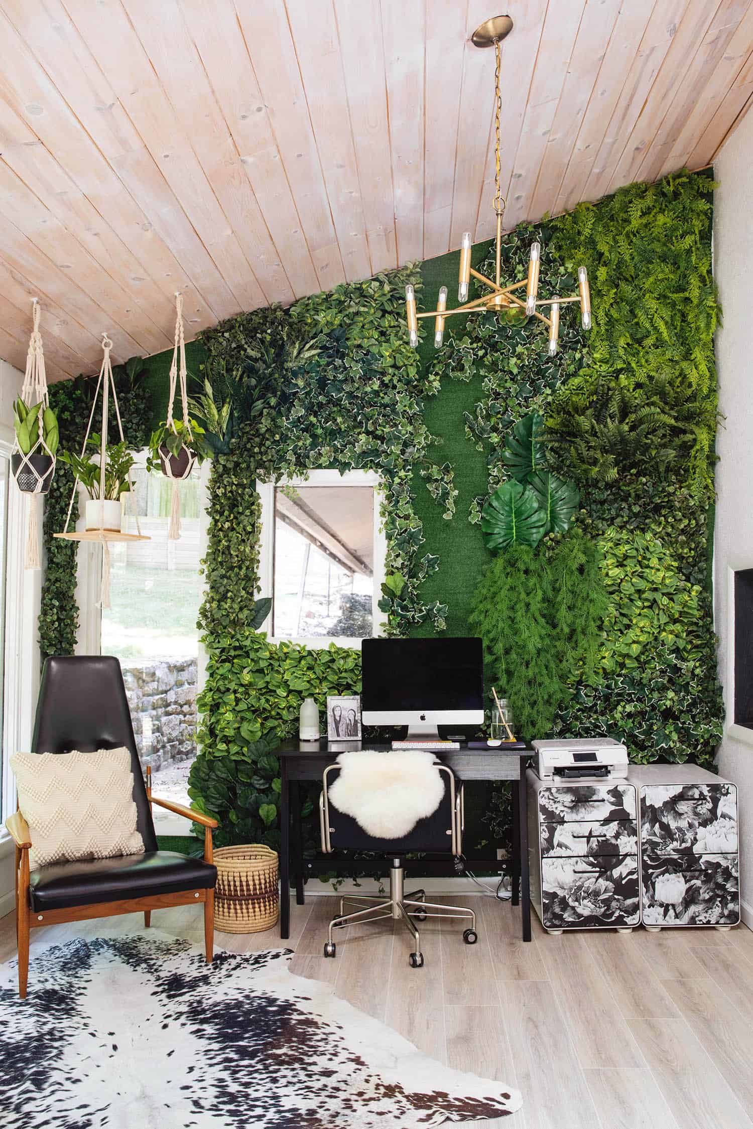
We end today’s post by focusing on the power of plants. Real or faux, they have the ability to bring the outdoors in and connect us with nature. This isn’t the first time we’ve featured A Beautiful Mess blogger Emma Chapman’s living wall. It makes her home office truly spectacular. In this post, she tells us just how to create a feature wall using a large number of faux plants. The results are impressive, don’t you think?!

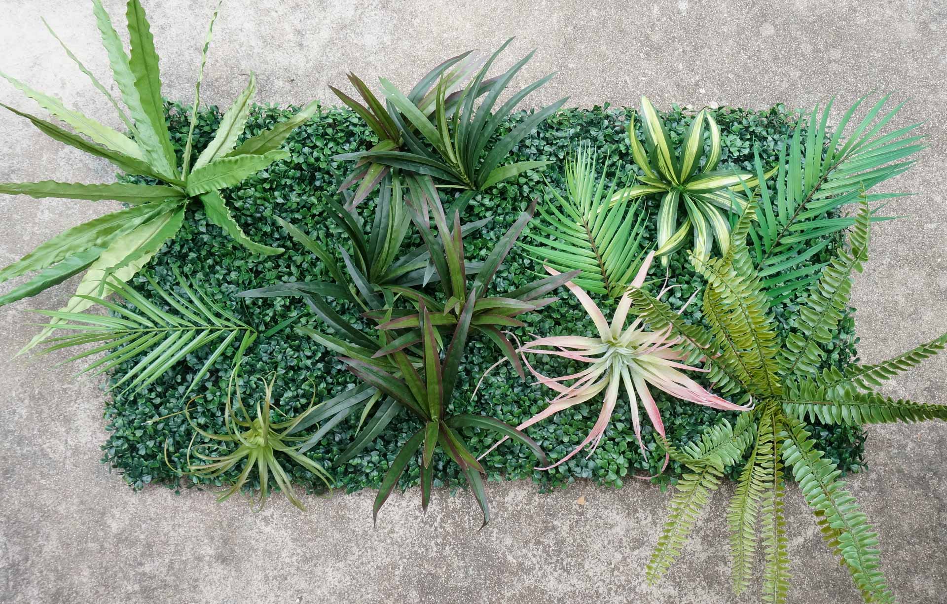
You can scale this project down by creating a small faux living wall using artificial plant panels and the faux greenery of your choice. Check out our Decoist tutorial, which takes you through the easy steps. Bonus points if you keep the budget low by purchasing your greenery on sale.

From faux plants to dried plants, note that dried foliage is one of today’s top design trends. Brands and online marketplaces such as Etsy are filled with dried greenery options if you’re in a shopping mood. And if you’re in a design mood, you can easily create a feature wall by covering it in dried palm leaves, pampas grass and more. Or you can purchase a set of Lenora Wall Hangings (one is pictured below) and hang these modern dried palm leaf creations on the wall of your choice. When it comes to creating a feature wall, the more the merrier.

We hope today’s post has inspired you to create a feature wall of your own. Whether you go big or you’re on a small budget, there are many opportunities for amazing design. Happy decorating!

You’re reading Creative Feature Wall Ideas, originally posted on Decoist. If you enjoyed this post, be sure to follow Decoist on Twitter, Facebook and Pinterest.

Similar Posts

  • Pia Residence

    Pia residence is located in an irregular land, in el Uro, N,L. The project consists in two main volumes, each by a series of alternated courtyards. The frontal volume is single leveled with a double height element that highlights the main entrance, and it is accessed through a series of a triangular concrete prints that provides a sense of continuity through the street and the sidewalk. The volume in the back has two levels and is separated from de frontal volume by a patio that functions as an extension of the social area, kitchen and studio situated in the lower level, also provides ventilation, views and sunlight to the area. The courtyard is divided a staircase enclosed in a glass volume that links the vertical and horizontal connections of the building. The posterior patio has two garden areas that unites the laundry and service areas providing a sense of visual continuity to the area. Concrete was used as the main material of the project; as an apparent formwork on the façade as polished floors and some colored cement on details. Also important is the use of the custom steel work on windows gates, doors and stairs. The landscaping consisted on low maintenance, regional plants. Pia residence is the result of the transformation of a country house to a suburban house without losing the relation between the building and the exterior, preserving, nevertheless the privacy of the interior areas. It is a reinterpretation of the Mexican architecture of the second half of the twentieth century with a new formal character. Name of the Project: Pia Residence Location: Gated community El Refugio, El Uro, Nuevo León, México Area: 200 M2 Autor: Ar. José García Toledo Collaborators: PE. Eduardo Vásquez Velásquez Ar. Fernanda Roiz Silva ID. Andrea García Aragón ID. Luis Carlos Rodríguez González ID. Sinuhé Machuca Esquivel Ar. Krizia Nasser Ar. Christian López Photography: Ar. Francisco Martín Alvarez de la Vega / The Raws Human scales: Patricio Betteo

  • Lady

    Architecture and interior design studio idea:list designed a classy, sophisticated and feminine apartment in Slovenia’s capital Ljubljana. Delicate design together with feminine lines of selected functional pieces, contrasts with pragmatically designed furniture suggests an aesthetic choice that clearly defines the identity of its user – a timeless Lady. The client wanted to keep her 62 sqm apartment bright, seemingly warm and simply shaped, with some addition of blue which she adores so much. That is why the architects sought conceptual inspiration from the period of Bauhaus and many times overlooked Elieen Gray’s interiors. With its clean lines and functionality her pieces were nevertheless designed with comfort in mind in addition to a great deal of feminine elegance and glamour. The interior was designed by carefully playing with volumes and voids according to their function while dematerializing them and maximizing their use. As such the design is consistent through the whole apartment – each full element is useful and intended for a specific purpose and each void is formed with the knowledge that it can soon be filled. The latter basically functions on its own, but if the owner fills it with objects such as paintings, statues or some useful pieces such as fashion accessories and dresses, the objects are placed in a functional frame or compositional context and do not act foreign. At the beginning the architects from idea:list studio rearranged the kitchen in the living space from an L shape design into two parallel lines that gave them additional storage space. The kitchen island formed as a volume that rests on a long storage bench that connects the kitchen part and the dining space and with its reduced lateness opens up the room and lets light seep through. This new orientation of the kitchen and consequently also the dining part enables circular visual communication between the latter two and the living room, perfectly fitting into its user’s living habits. Perfect counterbalance to an elegant kitchen in two shades of blue lies in furniture covered with oak veneer. Consequently this volumes combined with different colours and materials form a starting point upon which other spaces are designed. The latter is manifested in different functions of assembled volumes and colours. The work area and guestbed are represented in the cabinet as voids and are highlighted by wooden lines that visually continue in theform of a bench throughthe hallway and into the living space where they manifest as a cabinet under the television. The empty frame in the bedroom lets light pass through to the wardrobe while still dividing the sleeping part from the dressing room and in addition serving as a hanger and a place for a rotating mirror. Clean minimalistic lines are complimented by rounded shapes as details that make the space more elegant and sophisticated. This shows best with the shapes of mirrors in this apartment which have a dual function – for examplethe mirror in the bedroomthat simultaneously serves as storage space for jewellery likewise the mirror in the hallway (together with the blue lining) also serves as a cover for the installation cabinets, as a shelf for hanging keys and finally it acts as an introduction to the aesthetics of the apartment (and its owner) to every visitor. The luxurious deep blue velvet on the rounded upholstered backs of benches and beds adds a desired elegance to the space, while carefully selected fabrics in curtains and cushions further enrich it with different textures and delicate contrasts. PROJECT INFO
    Interior Design: idea:list studio
    Design Team: Urša Kres, Tina Begović, Urban Pahor
    Location: Ljubljana, Slovenia
    Photography: Blaž Gutman

  • Tesseract House

    A self-initiated, architect-led design-develop-build project, Tesseract house was not designed with a specific client in mind. Rather, it was conceived as a business case to prove that one can create great contemporary architecture that fulfills a demand in the marketplace, while demonstrating that unbridled creativity generates innovative and artful spaces, using conventional and readily available construction methods. All of this was accomplished without breaking the bank and with a typical budget for a house of this kind Located in Toronto’s western lakeside streetcar suburb, this single-family residence proves contextual while owing little to convention and serving as the antithesis to recent vernaculars. By simply and unconventionally engaging the immediate context this contemporary alternative has an impactful, yet unimposing outward presence. This geometry and the depth of experience from which the house derives its name is not provocatively innovative but nuanced, both simple and complex, revealing itself over time. All of this within the constraints of conventional local residential construction, the Tesseract House unapologetically desires to be more than just a place to live.

  • Taula House

    Taula House is a single-family residence designed for a multi-generational family in the Preston Hollow Neighborhood of Dallas, Texas. The name “Taula” House is derived from the Sanskrit word meaning “Balance.” Guided by the Hindu architecture principles of Vastu shastra, this modern dwelling expresses a balance between traditional beliefs and contemporary ideologies of design. Symmetry, directional alignments, spatial geometry, and delicate detailing were all paramount to the design success of the project. The exterior façade is clad with precast concrete, weathered steel, and dark grey basalt stone. Accents of Brazilian Ipe siding, polished stucco, and zinc composite panel complete the material palette ensemble. The shroud of textures and natural hues are enhanced throughout the day, as the sunlight dances and dapples across each elevation. Ribbons of steel framed glass spread in large vertical and horizontal expanses. Taula House’s structure consists of a steel perimeter frame to support the lateral load of the large precast concrete panels. The 53 unique panels extend full height, with no horizontal joints, and some reach over 30 feet tall. Wood trusses provide clear spans, creating the opportunity for the interior of the house to have no load-bearing walls. A minimalist approach to interior finishes focuses attention on the architecture and precise detailing of the house. Highlights of the exterior palette make their way into the house with a refined use of weathered steel panels and basalt stone floors and walls. The monumental stair at the entry of the house is prominently featured behind a 20-foot tall curtain wall of glass. The stair’s steel structure employs a double-cantilevered switchback design clad with white oak treads. Overall, Taula House reflects the family’s love for entertainment and the importance of peaceful seclusion. There is a graceful mix of public and private – both gathering and intimate spaces. Bold expression and materiality is not lost on this house, yet there is calmness in the beauty.