Looking to create a home that’s both stylish and practical for the whole family? This recent home transformation showcases how family-friendly interior design can blend comfort, functionality, and style. With thoughtful layouts, durable materials, and cozy touches, this space was designed to be both beautiful and livable for every family member.
The Challenge: Family-Friendly Interior Design
The client came to Decorilla asking for creative interior design for their new house, which felt cold and unfinished. Their ideas revolved around a creative interior design that would suit the lifestyle of the couple with two small kids and two dogs. The ideal solution would also improve the home’s hosting potential at the same time. The brief was clear: fewer hard surfaces, better lighting, and furniture that holds up under daily use. Along with that, the designer had to:
- Replace all light fixtures
- Select durable, comfortable, stylish but pet-friendly and kid-friendly furniture
- Adjust the layouts for entertaining and kids
- Pick paint or wallpaper in key rooms
- Advise on exterior paint, trim, and door colors
- Refine the existing style
Pro Tip: Wondering what kind of family-friendly interior design suits your taste? Try our Free Interior Design Style Quiz to discover your ideal style today!
Design Inspiration: Family-Friendly Furniture & Decor
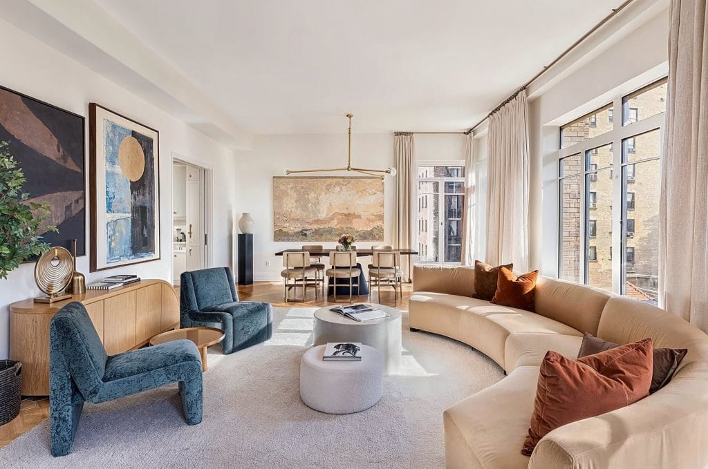
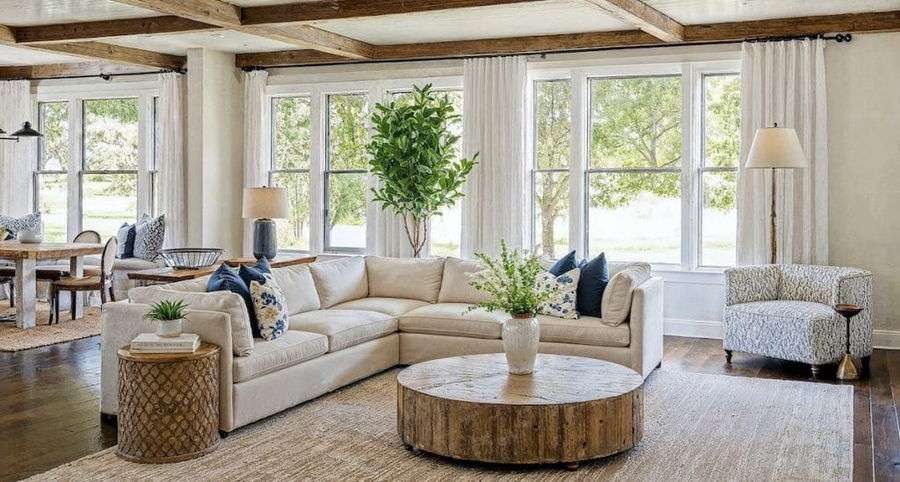
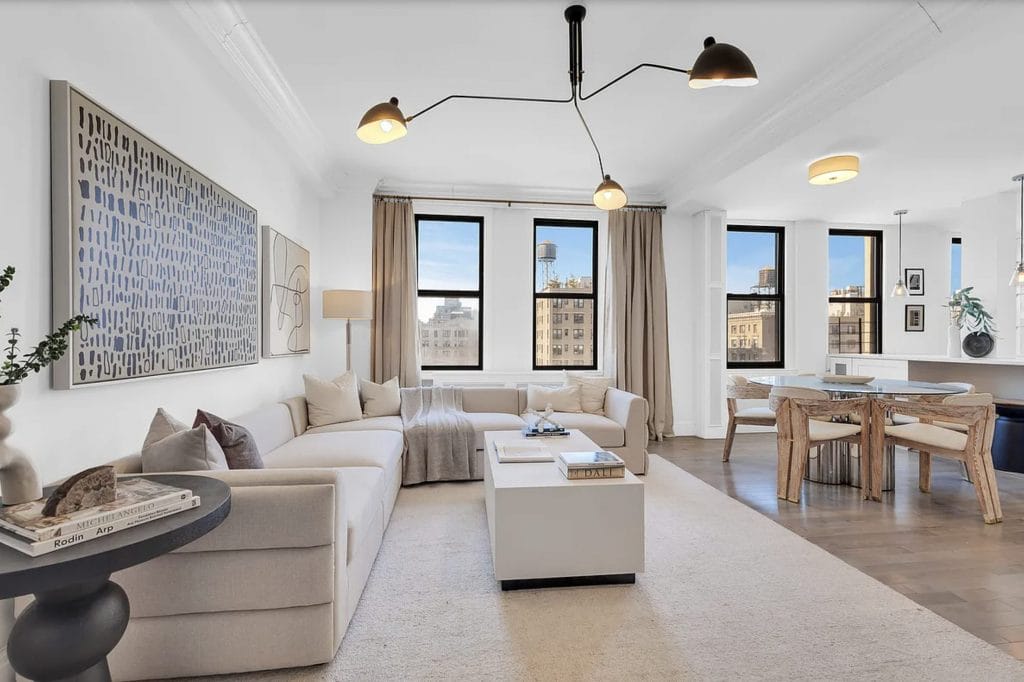
The client gravitated toward designer family-friendly living room ideas. These spaces could handle use without looking worn. Many layouts stood out for large rugs and curved sofas that softened circulation. However, deep seating didn’t dominate the floor plan; these rooms felt spacious and livable. They gave the client a clearer sense of how family-friendly interior design could support movement, mess, and hosting in the same layout.
Dining zones in the inspirational homes held a similar material language, lavish but ready for pets and kids. The push didn’t come from color or trend; it came from how these spaces controlled volume and texture. Wood tones repeated, and metal lines echoed in hardware and lighting. Chairs had back support. Tables had a width for shared dishes, and comfort was built into the structure.
Initial Concepts: Finding the Right Designer
The Decorilla team matched the client with two seasoned designers, Jessica S. and Nada M. Each boasted a strong record of delivering practical, family-friendly interior design. Both understood the brief: create a stylish layout, keep it usable, avoid fuss. From there, they moved in different directions.
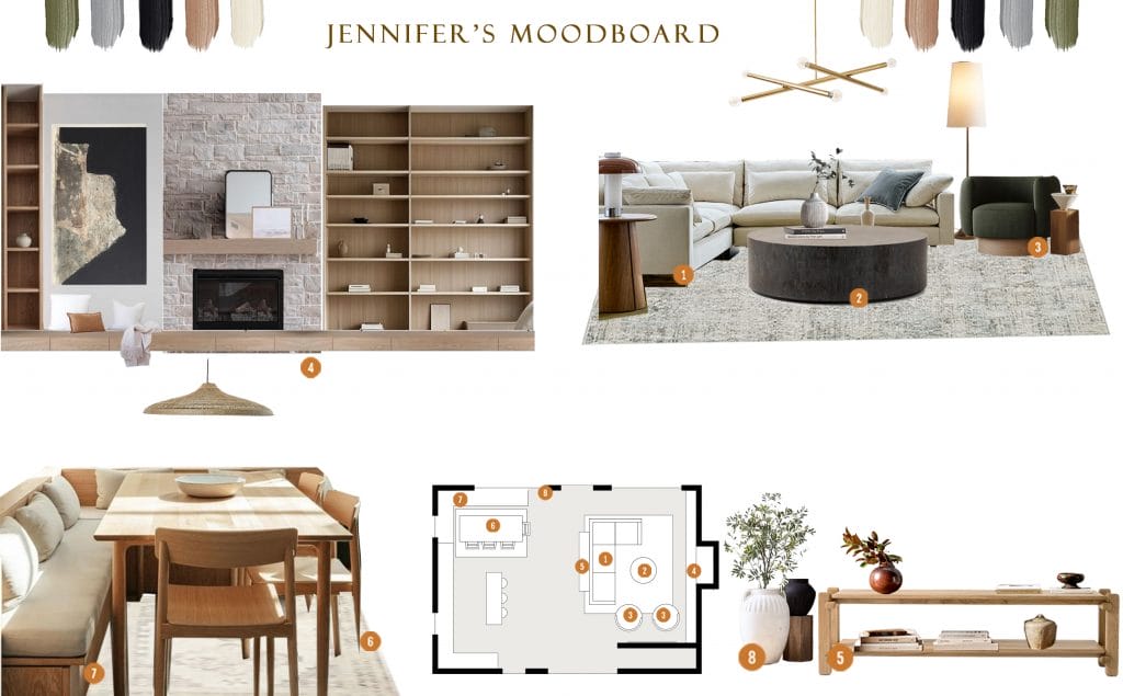
Nada’s concept leaned structured and tonal. Her proposal worked with quiet patterns, earthy shades, and clean silhouettes, tying rooms together through refined natural materials. Jessica’s vision took a more layered approach. She introduced deeper greens, sculptural lighting, and a stronger contrast between curved and linear forms.
Jessica‘s moodboard emphasized rhythm without straying from function. The client wanted to see it adapted to minor changes, and in the end, the result won them over: “Thank you for doing both mood boards with the new carpet, it’s really helping me decide!”
Results Revealed: Family-Friendly Interior Design

The redesign restructures the rooms, yet it doesn’t force them into a completely new identity. It keeps the layout open with corrected proportions, introducing a stronger sense of scale through furniture and fixture choices. The palette stays deliberately neutral, but with visible temperature shifts.
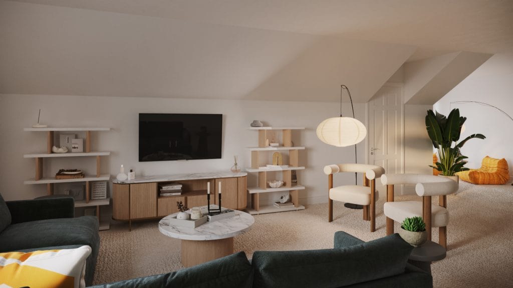
Family-Friendly Living Room

The family-friendly sectional anchors the living room with real depth. It’s scaled for comfort but kept low and modular, so it doesn’t interrupt sightlines. The coffee table repeats the wood tone from the shelving and dining chairs. At the same time, it shifts in texture, keeping the surfaces varied. Window treatments are softened to filter the morning light, and that decision drives the entire room’s atmosphere.
Lighting changes everything. The early 2000s fixtures were replaced with chandeliers and pendants that sit lower but cast wider. In return, the space feels brighter. Color stays neutral but distinct; every surface holds its own tone and temperature, which prevents the palette from washing out.
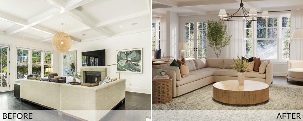
What was once a disconnected series of zones now moves as one. The old layout pushed furniture away from the center of the room, cutting circulation and flattening the sense of flow. Now, the family-friendly living room reads as intentional, and sightlines between the dining and living areas hold together.

In the dining zone of the open plan, the design introduces bench seating along the windows. This solution makes the footprint more efficient and improves seating capacity, making the most of the available space. As a result, the setup works for a dinner for two as well as for a group meal with kids and guests.
Blending Function with Style
The design doesn’t choose between aesthetic presence and everyday use—it insists on both. Each room adapts to how it’s lived in. The palette threads through every space, so nothing feels incidental. What might read as simplicity is, in fact, a practiced kind of control: a house shaped to hold children, guests, stillness, and mess, all in the same breath.
Enchanting Blue Dining Room

The formal dining room now holds a memorable presence. It holds structure through proportion —the table centers the room with proper clearance on all sides, and the chairs take up the volume but do not drag the layout down. Color moves intentionally: deep botanical green across the walls, tempered by layered neutrals in the rug and drapes, then broken up with the saturated teal of the woven chairs. The chandelier repeats the brass finish found in the side lamps, pulling the vertical lines into a coherent rhythm.
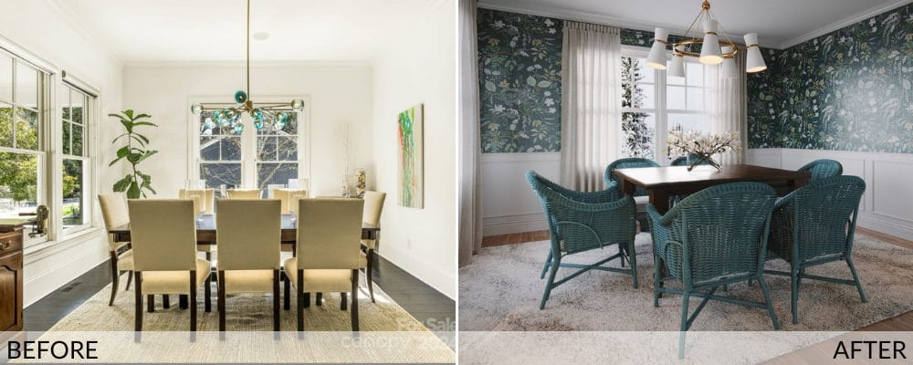
The furniture changed the pace. The previous setup felt overly formal: tall upholstered chairs, no material variation, narrow spacing, weak lighting. Now, the materials respond to use better with cane, solid wood, and textured fabric. The sideboards are curved and ribbed, lighter in tone, scaled to support, and every surface looks built to age well.
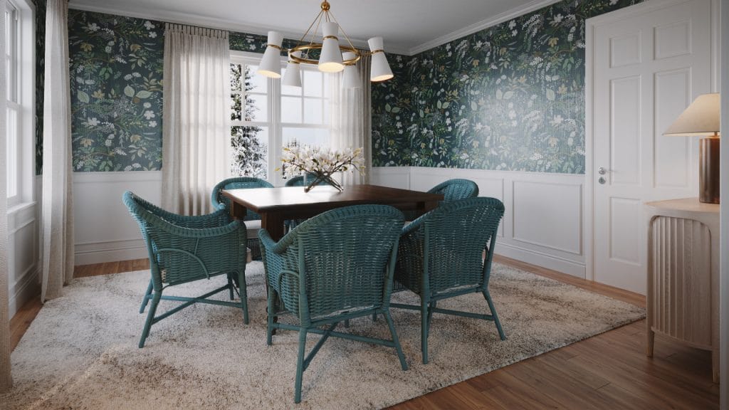
The wallpaper gives the room both texture and range. It stretches across every surface, keeping the eye engaged through the pattern while the trim remains crisp. The lower paneling and white doors cut through the green and keep the room from closing in.

Light plays differently here now. The central chandelier directs a low, even spread across the table, its angles repeating in the frames of the chairs and the verticals of the built-ins. The sideboard lamps sit tall and steady with brass bases and rounded shades. Each fixture brings purpose and spatial tension to its position.
Multifunctional Rec Room
The rec room design uses scale and division to its advantage. The footprint was large but unfocused; now it reads as three distinct zones—media, play, and movement. There are no partitions yet each section works completely independently.
The sectional forms the backbone, long and deep enough to anchor the adult zone. It’s paired with two barrel chairs facing inward across a marble coffee table. Floor lamps arc across sections to define each area. Shelving runs symmetrical on each side, keeping the vertical line consistent and placing toy storage within reach of the seating.

The play zone runs along the window, with low, accessible bins and sloped-front book display racks. These keep books facing out—necessary for pre-readers—and allow fast rotation of toys and puzzles. The LEGO table is built at child height, with recessed trays for bricks and a surface that invites construction without limiting it to one type of play.

The reading corner gives the room its strongest hit of color, with tangerine lounge chairs in wide corduroy. Their low form and thick quilting make them inviting to kids but substantial enough for adult use. The lighting stays consistent here too, with a paper globe pendant centered over the space. Textures in this area are plush but contained—nothing loose, nothing floppy, nothing built to shed.

The workout/lounging zone remains minimal and defined by absence. A Peloton bike stands beside a framed window, positioned so it doesn’t block any viewlines from the sectional. The wall behind it carries flat-mounted prints, enough to keep the space personal. Flooring throughout remains neutral and continuous—carpet holds noise and protects kids from falls, and it stays cleanable under regular use.
Family-Friendly Sitting Room

The Harmony sofa anchors the family room. Its textured gray fabric grounds the room’s palette, and its scale sets the limits for how other pieces can move around it. The layout respects the sofa’s presence—it doesn’t crowd it with excess or shrink it with weak lighting. The new pendant centers overhead but keeps a clear vertical path; nothing breaks the visual rhythm between floor and ceiling.

The chairs shift tone; their blue fabric breaks the otherwise neutral field with density. They sit narrow but tall, lifting the perimeter of the room. Their placement doesn’t follow symmetry; instead, they angle slightly toward the centerline of the sofa. Reupholstering them would have softened the contrast between materials, but the designer kept the blue as a way to carry the tone forward from other rooms.

The leather ottoman holds the center. It’s square, structured, and firm enough to function as both surface and seat. The stitching and seams create subtle visual breaks across the top, which reduce the piece’s volume. It rests directly on the rug, not floated or offset, and that contact helps establish the seating zone as a solid block.
Clean & Straightforward Entryway
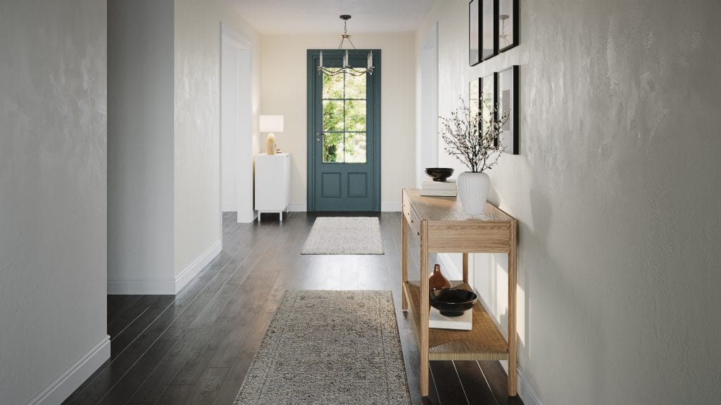
The entry serves as a spatial reset and makes a clear first claim: this house is grounded. Pale plastered walls diffuse the morning light, pushing brightness down to the darker floorboards. Two runners stretch the length of the hallway; each breaks up the corridor’s geometry and pulls design into motion.
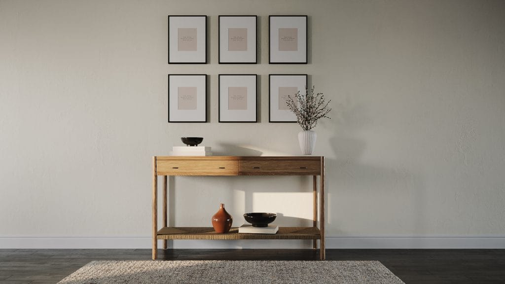
Art prints stack in a six-frame grid above the console. The matte glass softens the reflection, and the centered placement makes the wall feel still. Under it, a textured vase and low ceramics echo the earthy tone of the wood and keep the surface reading tactile. Nothing is ornamental or blatantly made to impress—just repetition, order, and restraint.
Color stays minimal. Cream walls and white trim let the darker floor planks carry the weight.
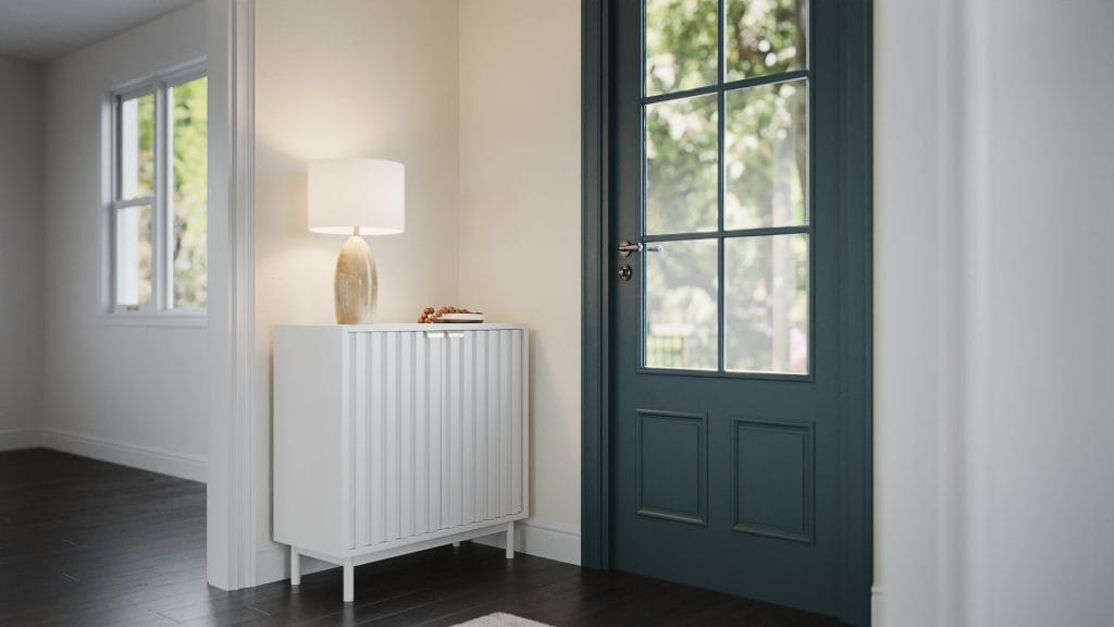
The door’s deep green is the only saturated tone in the space, but it doesn’t shout. It holds the sightline, links the natural wood tones, and echoes the landscape seen through the glass. Across from it, the console balances weight with lightness. It’s anchored by slender legs and topped with simple objects that don’t pretend to be more than they are.
Design Details: Sourcing the Perfect Pieces
Thanks to Decorilla, the client could walk through each room before a single item arrived. The 3D visuals laid out proportions, palettes, and material relationships with clarity that flat sketches never offer. Instead of imagining how family-friendly furniture might hold up under use, the client saw it and felt it. Moreover, having access to trade-only pieces and discounts also meant nothing was chosen for price alone. The client could opt for better-made, longer-lasting designs that still fit the budget.
Jessica listened carefully, adjusted layouts, swapped finishes, and weighed each change against the whole. The process stayed collaborative and efficient, focused on the client’s comfort with every decision.
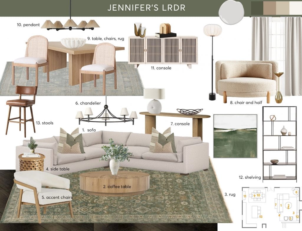
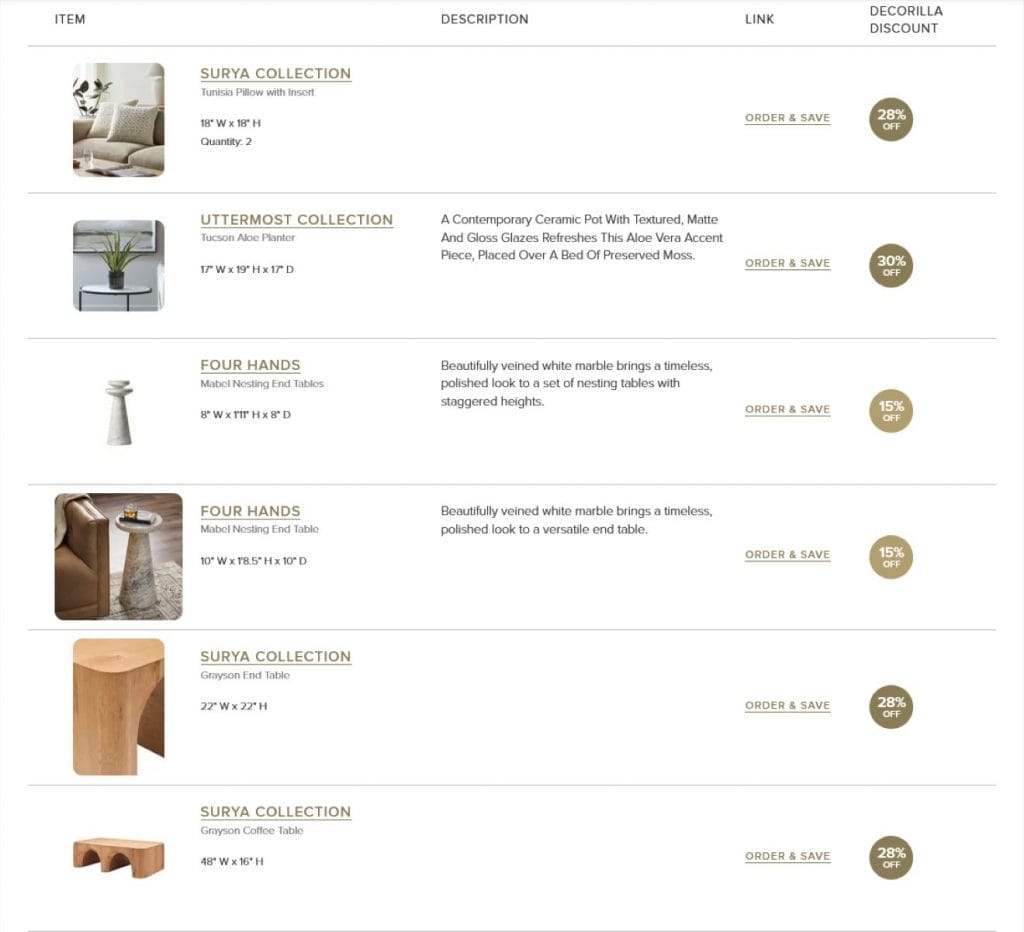
Get the Look: Family-Friendly Interior Design
Building a space that works for both kids and adults means choosing pieces that hold their shape and wear well. If you’re reworking your layout or starting fresh, these choices might help you get there. Every item here was selected for proportion, surface behavior, and how it functions inside a real home.
Looking for family-friendly interior design?
Our expert designers plan spaces that hold up to daily life and still look composed. Book your Free Online Interior Design Consultation to get started today!