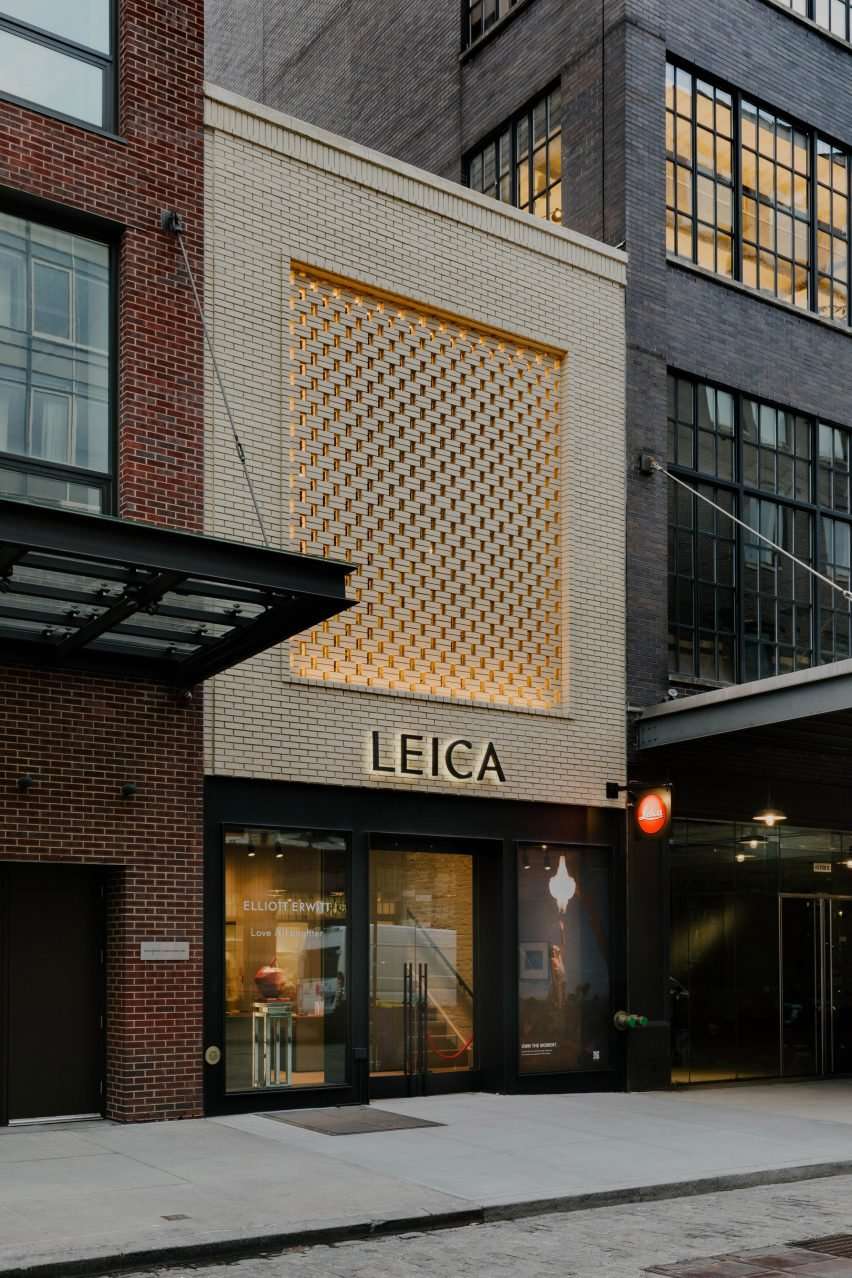
A flagship store and gallery for camera brand Leica has arrived in New York’s Meatpacking District, designed by Format Architecture Office with a cream brick-screen facade.
The Leica Store and Gallery replaces an “unremarkable” 1950s meat market building that had fallen into disrepair.
“At just two stories in height and with a modest street frontage under 20 feet (six metres), the building is also one of the smallest remaining buildings and a rare exception to the neighborhood’s upscaling trend,” said Format Architecture Office.
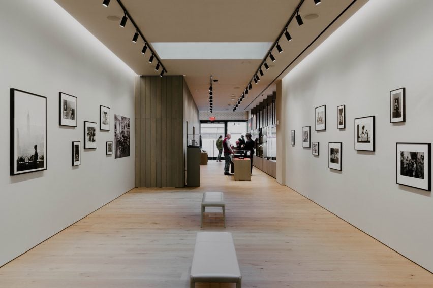
The gut renovation expanded the floor area to 4,000 square feet (372 square metres) while retaining original features like the timber-framed ceiling.
The upper floor plate was cut back to create a double-height mezzanine at the front and a series of new skylights were installed to bring natural light down into the lower level.
At the back of the second storey, a new steel bifold glass door opens onto a 1,000-square-foot outdoor terrace.
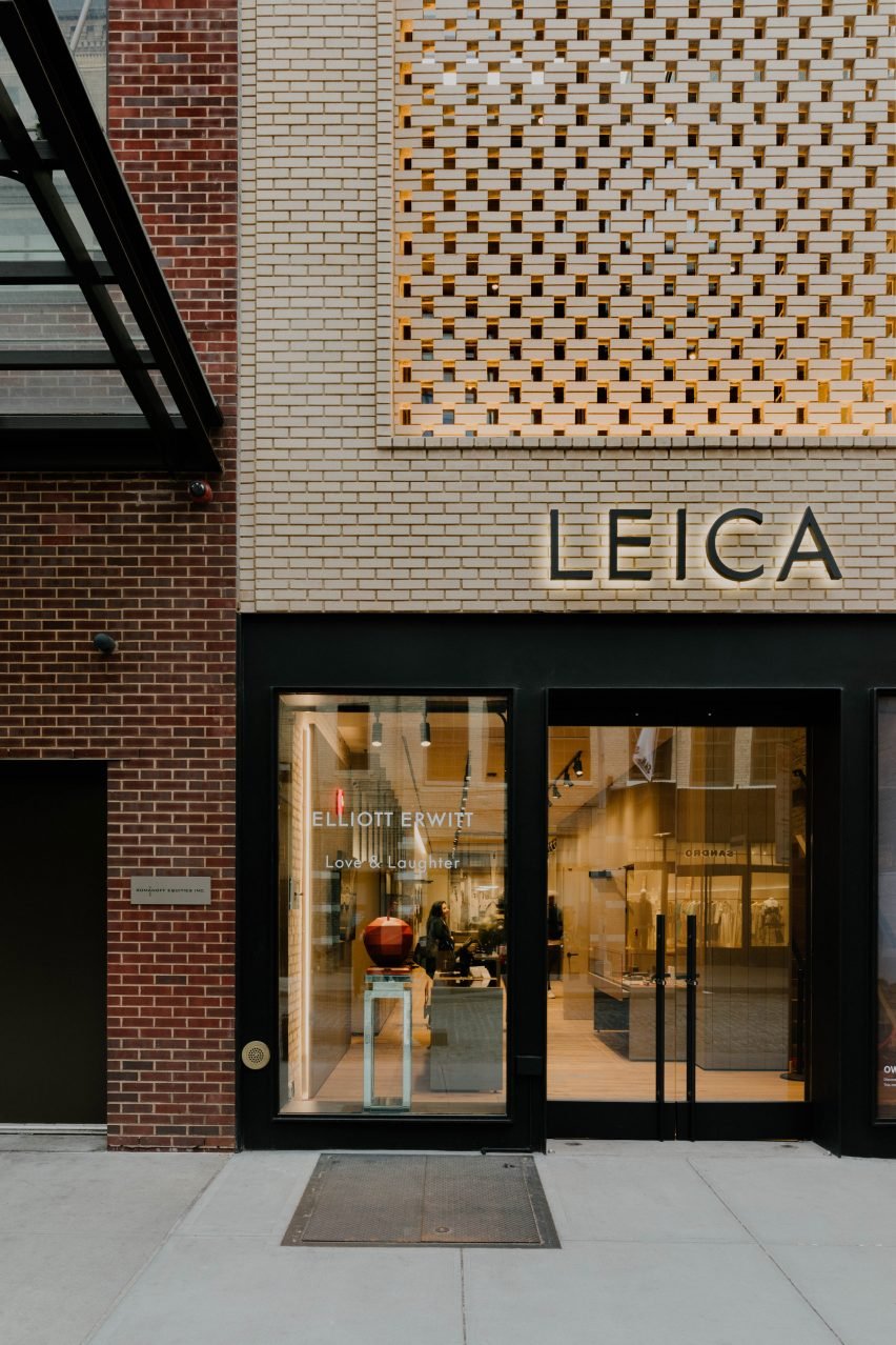
Format Architecture Office overhauled the front facade of the building, creating a steel and glass storefront at street level and a brickwork wall above.
The cream-coloured bricks in the centre are laid to form a lattice wrapped by a bonded frame, “offering a modern interpretation of the decorative brickwork reliefs found throughout the district” according to the studio.
The latticed screen allows light into the upper floor during the day, while integrated lighting within the frame creates a dramatic glow at night.
Using brick for this complex design was not without its challenges, said Format principal and co-founder Andrew McGee.
“Balancing structural integrity while still appearing as delicate as possible required meticulous planning and collaboration with engineering and construction teams,” he said.
“The balance between simple and complex can quickly lurch into banal or complicated, and the whole composition falls apart. Keeping this dial at the right level was our charge for the project.”
 Format Architecture Office imbues Manhattan office with “boutique sensibility” and cafe seating
The interiors of the store were designed as a collaborative effort by German studios Holzrausch and OHA.
From the street, a retail area features wood panelling and a series of glass vitrines for displaying Leica’s cameras.
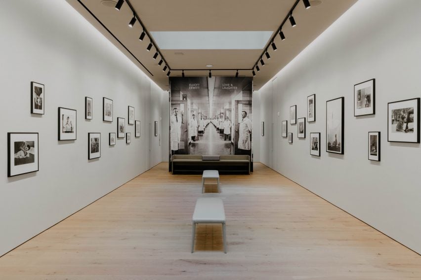
Pale wood flooring continues towards the back, where a white-walled photography gallery is illuminated by overhead track lighting and coves on either side.
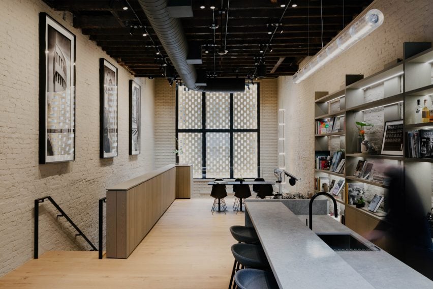
Upstairs is a studio space in which original brick walls are painted to match the new facade, representing Format’s desire to blend old and new across the store.
“A big challenge on any landmarked project is acknowledging and respecting the history of the building and neighbourhood while also finding a place within that for something new or innovative,” said Format principal and co-founder Matthew Hettler.
“To overcome this, we worked from early on with community board members and the Landmarks Preservation Commission staff to make sure that the story we wanted to tell about the building and its new chapter did not feel incongruous with its past.”
Manhattan’s Meatpacking District has undergone a radical transformation over the past two decades, from a seedy and undesirable locale to one of the city’s most sought-after neighbourhoods.
The regeneration has seen new cultural anchor projects like Renzo Piano’s Whitney Museum of American Art built amongst the historic brick structures, many of which are now luxury boutiques, galleries and restaurants.
Based in Brooklyn, Format Architecture Office has previously completed a Midtown office imbued with a “boutique sensibility” and cafe seating, and a “delightfully untraditional” restaurant in Gowanus.
The photography is by Nick Glimenakis.
Project credits:
Architecture and design: Format Architecture Office
Interior design: Holzrausch and OHA
Client: Aurora Capital Associates
Construction: Beacon and LTM
Structural engineer: Silman
MEP engineer: EP Engineering
