Reebok Flagship Store / NiiiZ Design Lab


Text description provided by the architects. Sportswear is on the trend ever since the popularity of sports from tennis to golf began. In addition, functional clothes such as gorp-core-look are combined into daily fashion, the item goes beyond the concept of sportswear and are incorporated into fashion item and are gaining popularity among the public through collaboration with luxury and overseas brand.
Reebok, a sportswear brand that has established its position beforehand, is now taking a new direction by deviating from functionality to incorporation of daily fashion products based on its technology. Recently, the classic line is gaining popularity among the public along with the sneakers released in collaboration with Maison Margiela. Following such a sportswear trend, the new Reebok flagship store embodies a fashion brand-space paradigm and is changing its former brand voice.
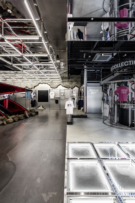
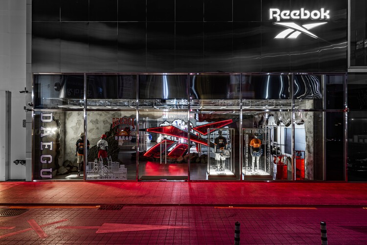
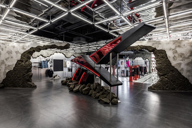
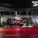
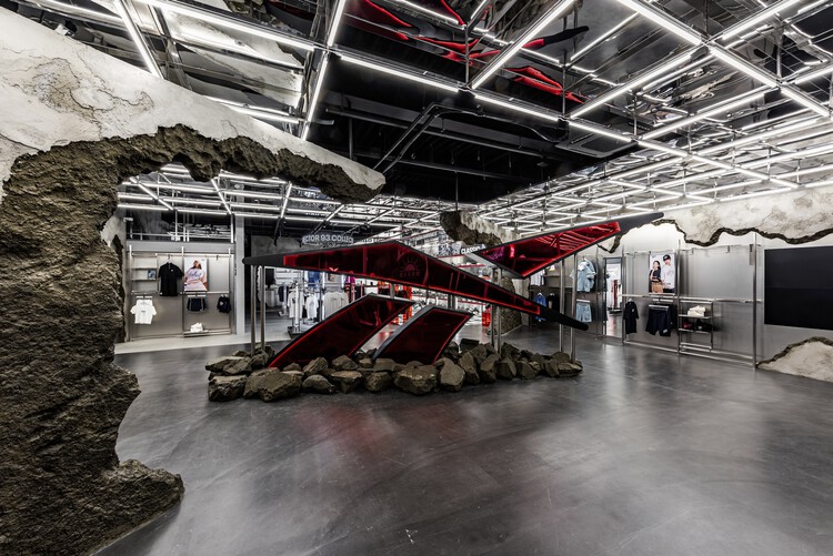
Such a new Reebok flagship store’s interior concept boldly reveals a new 1st generation sportswear brand concept, ‘Superhero Re-landing.’ This very bold design concept is evident from the entrance of the store. The emblem in front of the façade symbolizes a hero figure sinking through the ceiling of the building, thus adding impact to the new presentation of Reebok’s brand identity.
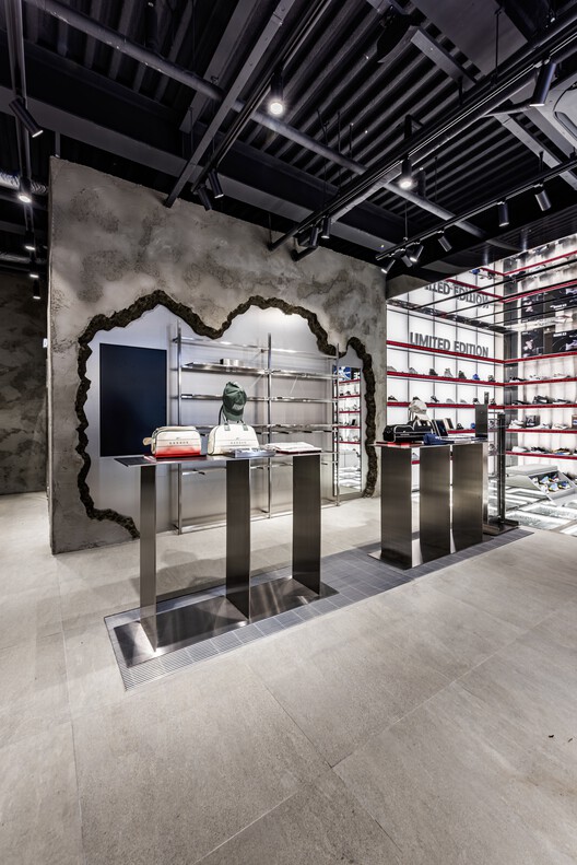
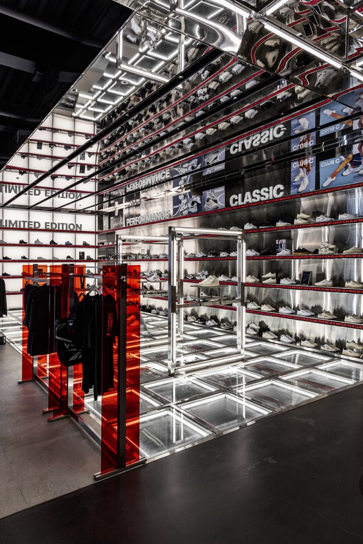
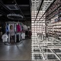
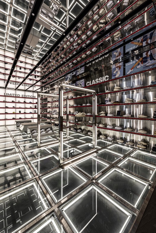
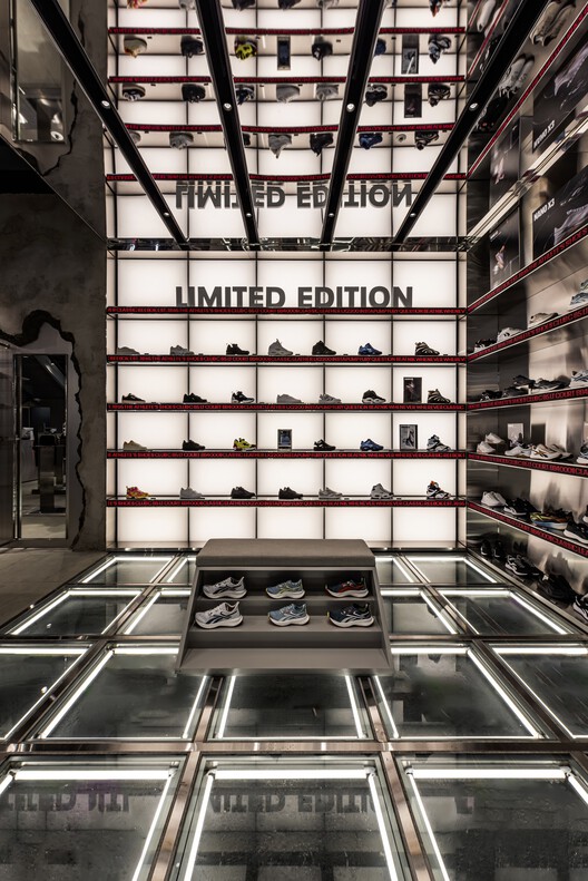
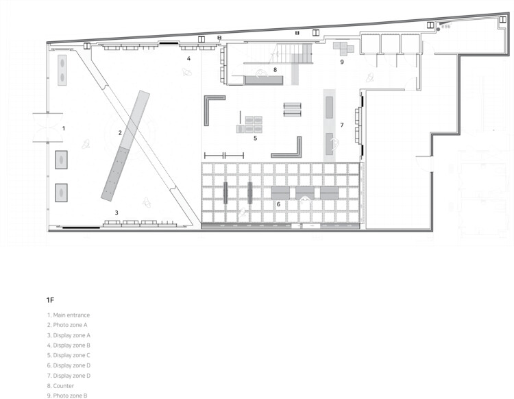
A big emblem placed diagonally in front of the space is located right in front of the building and covers a partial area of the inner space. Such placement intrigues the viewer’s curiosity and visits as the symbol utilizes the heavy crowd of Dongseong-ro. Once one passes the big emblem, the space is divided into two parts, the main signature sneakers zone, and the apparel zone. The sneaker zone contains the floor which is comprised of glass and lighting, the team has separated the display of the rising classic line and the functional line.
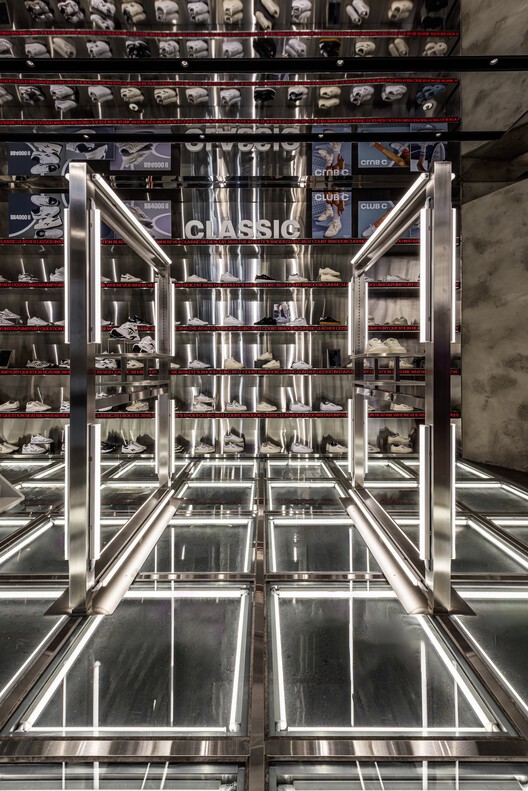
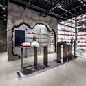
The walls assigned for the clothing and accessories zone are separated from the Sneakers Zone, they were intentionally designed with broken concrete walls revealing metallic finishes on the inside. This design concept aims to represent the Reebok brand’s high-tech identity which aligns with the new contemporary trend by communicating a street-look vibe. It visualizes a superhero tearing through his daily outfit to reveal the original costume (like Superman). The cracked and broken parts of the concrete walls represent the brand’s identity based on the high-tech background with the addition of the visible metallic material.
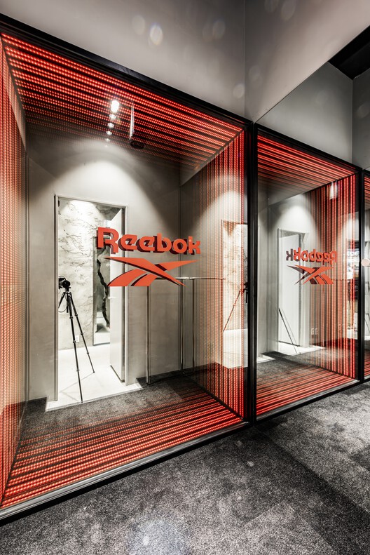
Reebok Dongseong-ro Flagship Store seeks to go beyond the typical sports brand space and showcase the brand’s current state of embracing change in line with the current trend. With the overabundance of sports brands, Reebok has persistently emphasized its identity as a functional sports brand and boldly seeks to differentiate itself by actively showcasing its unique qualities.
