US studio The Miller Hull Partnership has completed the Health Sciences Education Building in Seattle, which features corrugated metal cladding and a warm interior that departs from the “hospital-like environments found in most university medical buildings”.
The academic building marks a new entrance to the University of Washington’s South Campus, which is focused on the health sciences.
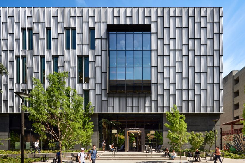
The 97,000-square-foot (9,012-square-metre) facility is used by students in six different schools – dentistry, medicine, nursing, pharmacy, public health and social work.
The project was delivered using a design-build model, in which designers, contractors and others work together under a single contract. The team included local studio The Miller Hull Partnership, which acted as the lead designer, and The SLAM Collaborative, a multidisciplinary firm with offices around the US. The general contractor was Seattle-based Lease Crutcher Lewis.
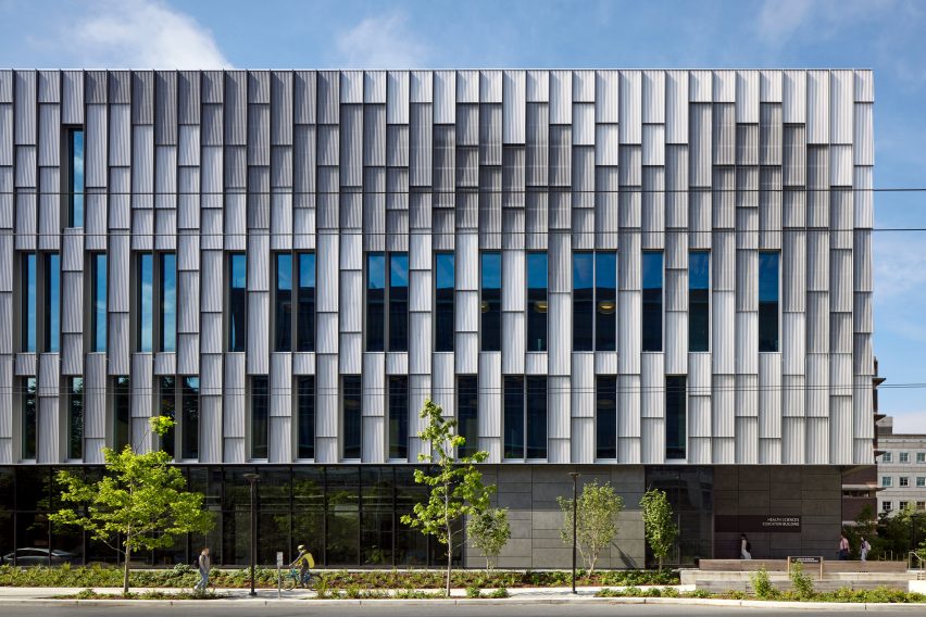
Rectangular in form, the building has four levels and a U-shaped basement. The structural frame is a mix of concrete, steel and cross-laminated timber – the latter used for roof and floor decking.
The exterior is wrapped in a light-toned skin made of corrugated sheet metal, with panels arranged to form a gradient. The skin is designed to set “a performance precedent on the university’s South Campus”.
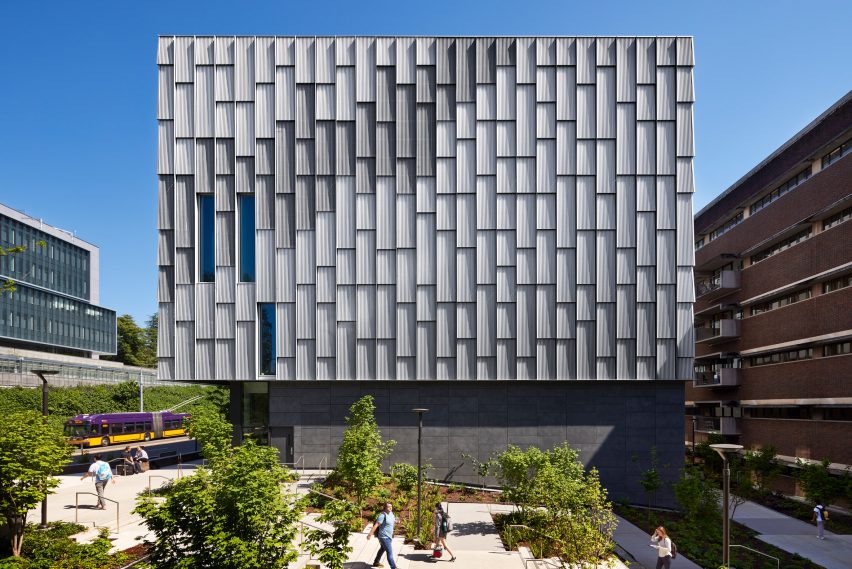
“The design team worked closely with installers and manufacturers to create a rational kit of parts that would become a facade textured with dappled light and reflections,” the team said.
“The unique and high-performing envelope combines fibreglass windows and electrochromic glazing at the south to maximise access to daylight and views while reducing solar heat gain.”
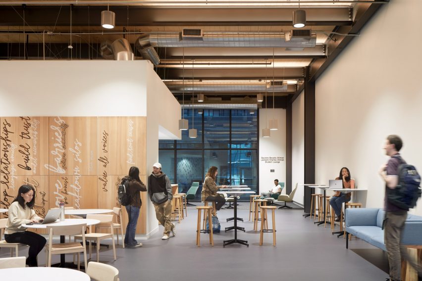
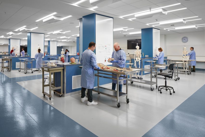
Within the building, one finds an array of learning environments, ranging from classrooms and laboratories to team rooms and open study areas. The layout helps foster interaction and “inter-professional collaboration” among the different types of users.
“The design strikes a careful balance between scheduled classrooms and student collaboration zones, providing generously sized spaces for group work, interaction and creativity,” the team said.
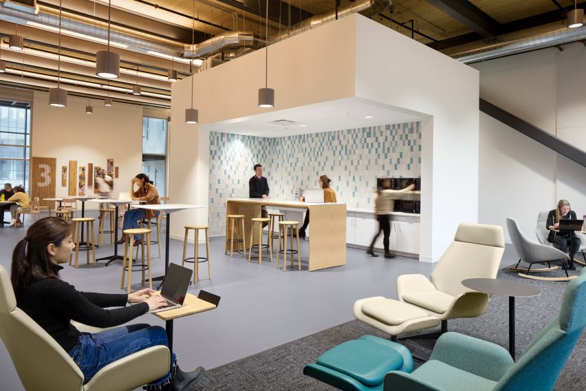
The design also provides for an optimization of resources and future flexibility.
“If programmes grow or shrink, no space will go unused because the spaces are designed for change and with an eye towards universality,” said Elizabeth Moggio, a project manager and principal at Miller Hull.
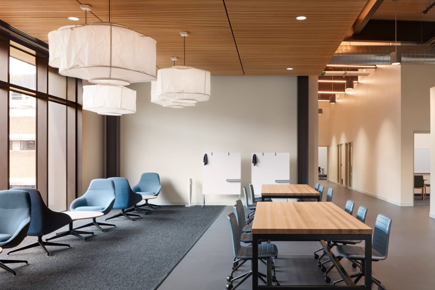
The atmosphere is meant to help students feel at ease. The team was guided by the concept of “culture for care”, defined as an environment that supports the health and well-being of users and visitors.
“Challenging the standard of sterile, immersive, hospital-like environments found in most university medical buildings, the building embodies the ‘culture of care’ through investment in wellness and student-focused spaces,” the team said.
 Democracy and Maya architecture inform Miller Hull’s US embassy in Guatemala City
Warm colours, earthy finishes and a focus on daylight are among the interior design elements. The material palette includes wood panelling, fabric-wrapped acoustic panels, carpet tiles and polished concrete.
The team also focused on encouraging people to step outdoors – an unusual approach on South Campus, where many buildings are connected by enclosed walkways.
“The design for the Health Sciences Education Building transforms the experience by pulling people outdoors, introducing a network of accessible pathways, mural and sculptural public art, and playful outdoor seating to provide students and faculty with places to pause and collaborate outside,” the team said.
Other academic projects in America include a University of California building by LMN Architects that has concrete facades and walkways clad in perforated aluminium, and an Arizona State University building by Grimshaw and Architekton, who drew upon natural elements like geodes and saguaro cacti while conceiving the design.
The photography is by Moris Moreno.
Project credits:
Lead designer/architect of record: The Miller Hull Partnership, LLP
Collaborating architect: The S/L/A/M Collaborative, Inc
Design-builder: Lease Crutcher Lewis
Landscape architect: GGN
Civil and structural engineer: KPFF Consulting Engineers
Accessibility: Studio Pacifica
Envelope: 4EA
Signage: Mayer/Reed
Acoustics: Tenor Engineering Group
Verticle transportation: The Greenbusch Group
Fire protection: Coffman Engineers
Air modeling/air quality: CPP
Client: University of Washington

