Whether you sprinkle them sparingly or pile them on, these cool cushions can turn your garden into a stylish party pad.
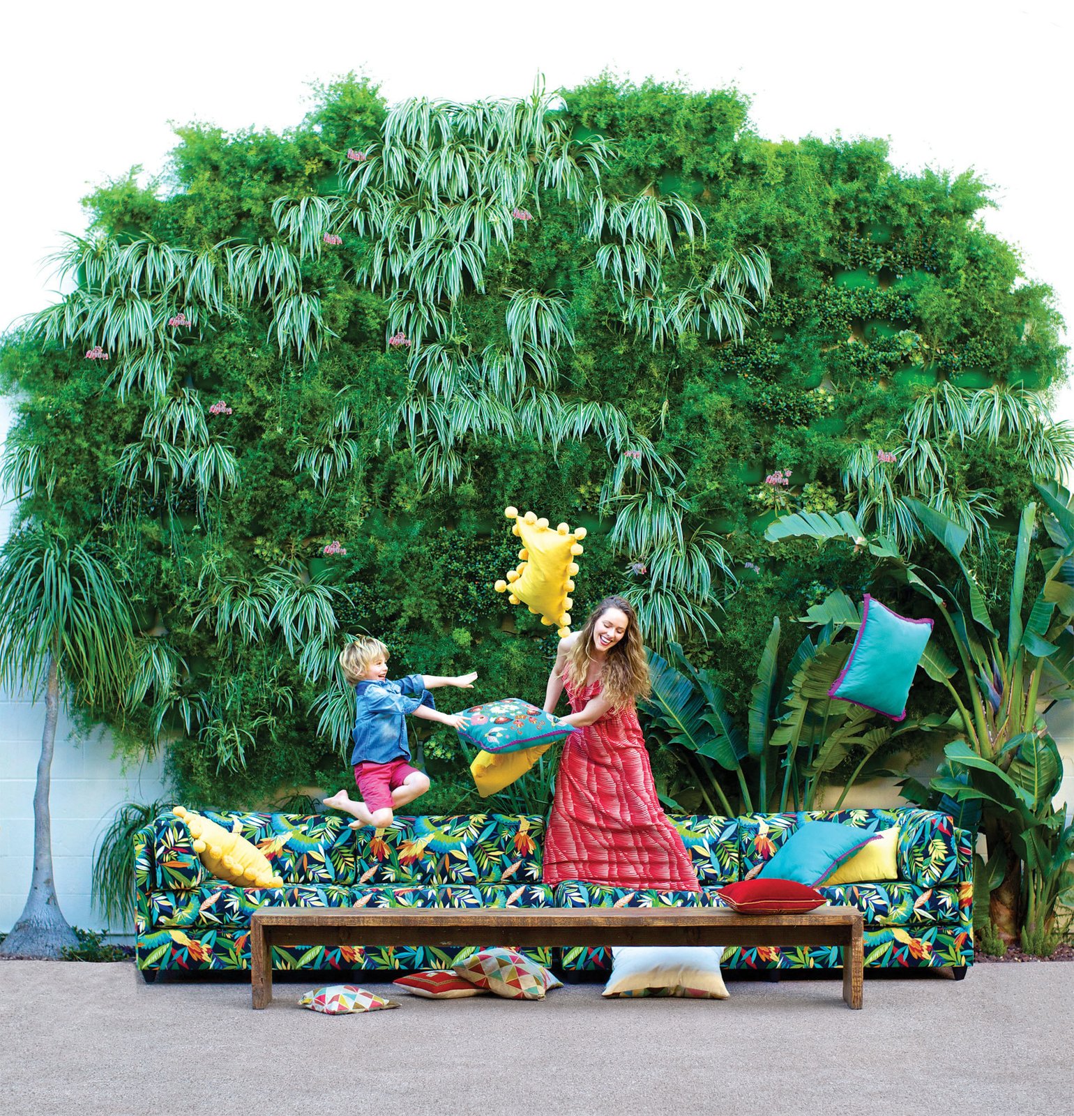
Need to reinvigorate your outdoor space, but don’t want to invest in a new furniture? Add a pop of color and texture to your patio, porch, or deck with these fun and versatile outdoor pillows.
Sunbrella Solid Indoor/Outdoor Cast Pillows
Toss on living room comfort to your outdoor space with these Sunbrella® pillows, covered in durable fabric that’s water-repellent and resistant to fading, mildew and chlorine. Photo Courtesy of West Elm 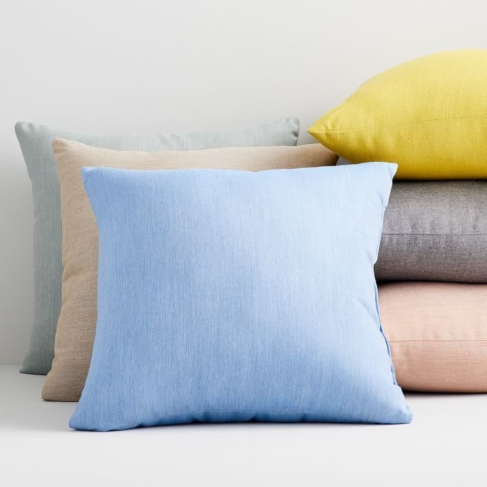
Lulu & Georgia Anissa Indoor/Outdoor Pillow, Green
Subtle sophistication often makes a big statement in a classically inspired living space. With the Anissa Pillow, your couch will get a gorgeous upgrade. Photo Courtesy of Lulu & Georgia 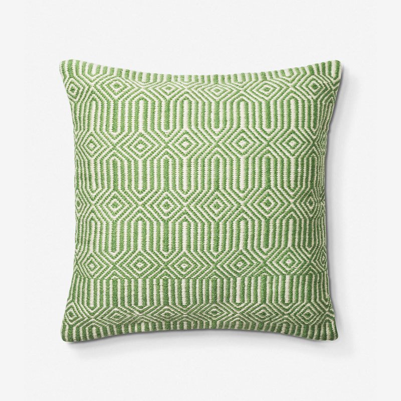
Cane-Line Divine Scatter Cushion
What’s the one thing that could make your outdoor lounge area even more divine? The cushy and colorful Cane-line Divine Scatter Cushion. Inspired by the larger footstool, this cushion is made out of hand-crocheted polypropylene which, in addition to being soft, is waterproof and ideal for outdoor use. Photo Courtesy of Modern Planet 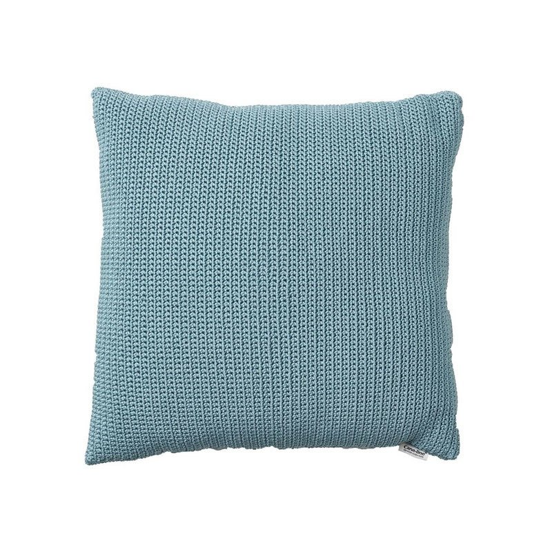
West Elm Outdoor Garment Washed Pillows
Toss on color and soft-to-the-touch texture to spaces inside or out with our Garment Washed Outdoor Pillow. Photo Courtesy of West Elm 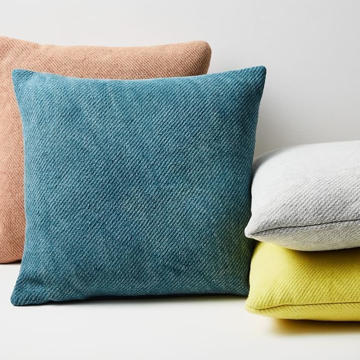
Basil Bangs Outdoor Weatherproof Throw Cushions
Cushy, colorful comfort. When the outdoors is your second living room, you need home goods that can take the extra wear and tear while staying, well, homey. These soft outdoor cushions feature Basil Bangs’ new, exclusive Tessuti Collection acrylic fabric, making them extra resilient for summer days spent in swimsuits. Their contrast piped stripes, which recall classic picnic textiles, are made of water repellent and stain resistant outdoor canvas. You’ll want to cozy up with these all summer long. Photography by Rocky Luten 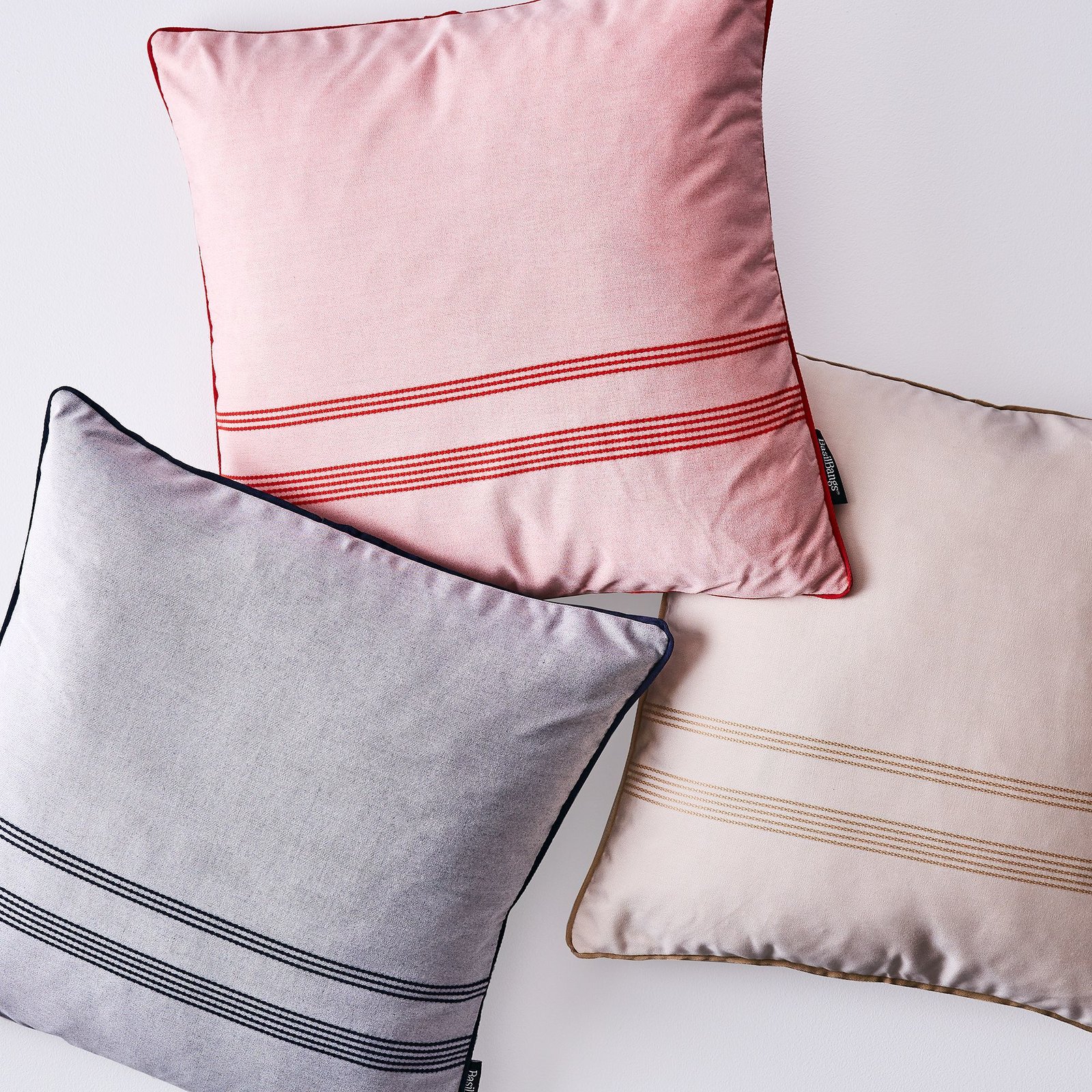
Terrain Lime Outdoor Pillow
Handmade with high performance, UV-safe Sunbrella fabric that’s both durable and soft to the touch, this bright, citrus-hued accent pillow is equally at home outdoors and in. A mildew and fade-resistant cover features a hidden zipper closure for easy cleaning and fill replacement. Photo Courtesy of Terrain 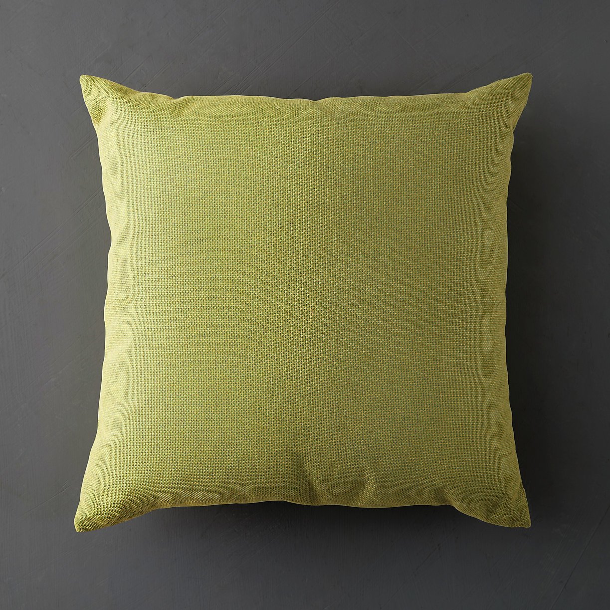
Sunbrella Indoor/Outdoor Striped Lumbar Pillows
Toss on living room comfort to your outdoor space with these Sunbrella® pillows, covered in durable fabric that’s water-repellent and resistant to fading, mildew and chlorine. Photo Courtesy of West Elm 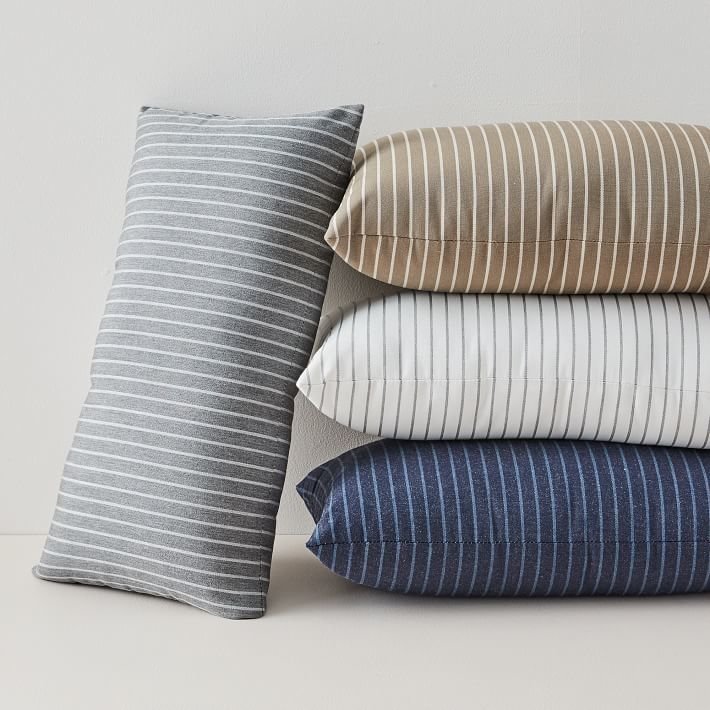
Anthropologie Abria Indoor/Outdoor Pillow
Crafted from weather-resistant materials, this textured pillow is a cozy addition to any living space – indoor or out. Photo Courtesy of Anthropologie 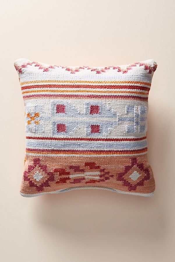
Maharam Outdoor Pillow in Chalet
The Maharam Design Studio specializes in the design and development of textiles for commercial and residential interiors. Reflecting an appreciation of history with a focus on aesthetic and industrial innovation, Maharam’s textiles are in the permanent collections of the Art Institute of Chicago, Cooper Hewitt and MoMA, among others. Expanding the collection to exterior areas, the Outdoor Pillow in Chalet (2015) consists of high-performance solution-dyed polyolefin fabric filled with fast-drying polyester fibers. It features a richly textured textile woven of boucle yarn with an intricate warp. Outdoor safe but not intended to be left outside for extended periods. Store in dry place when not in use. Fabric made in U.S.A. Photo Courtesy of Design Within Reach 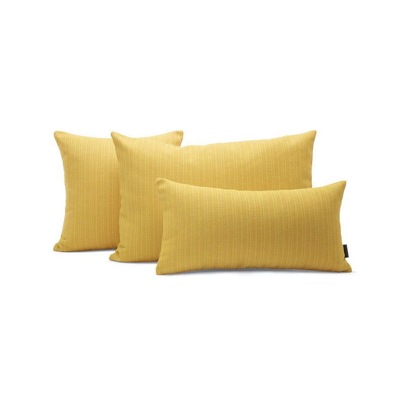
The Old Art Studio For Deny Abstract Geometric 10 Outdoor Throw Pillow
Deny Designs is an ever-changing collective of talented artists who churn out fresh, statement-making pieces, all proudly made in the USA with a portion of each purchase supporting art communities worldwide. Your outdoor space will be perfectly arranged with this durable poly throw pillow, printed with an abstract geo by The Old Art Studio. Photo Courtesy of Urban Outfitters 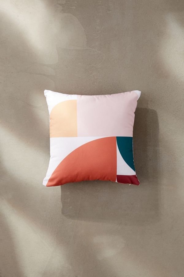
West Elm Outdoor Contrast Trim Pillows
Set the tone for the season with our water-resistant Outdoor Contrast Trim Pillow, which adds a splash of color to lounge spaces indoors and out. Filled with yarns made from recycled plastic bottles, each pillow made helps to keep water bottles out of the waste stream. Photo Courtesy of West Elm 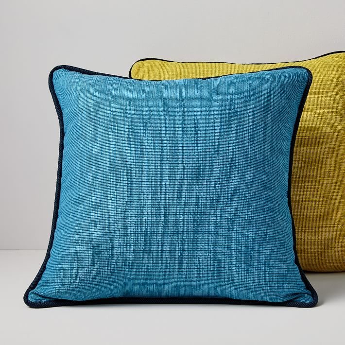
Serena & Lily Perennials Lake Stripe Pillow Cover
We’ll never tire of classic stripes. With a surprisingly luxurious feel, our pillow is wonderfully resistant to sun and moisture, making it last season after season. A micro flange gives a tailored finish and a playful pom rounds out the look. Photo Courtesy of Serena & Lily 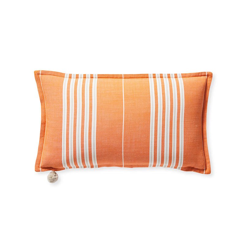
Sunbrella Solid Indoor/Outdoor Cast Lumbar Pillows
Toss on living room comfort to your outdoor space with these Sunbrella® pillows, covered in durable fabric that’s water-repellent and resistant to fading, mildew and chlorine. Photo Courtesy of West Elm 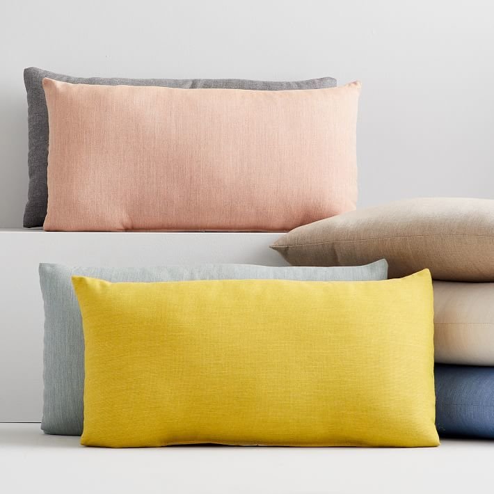
West Elm Outdoor Color Block Pillows
Our Color Block Outdoor Pillow features a modern print that adds vibrant color to lounge spaces indoors and out. Photo Courtesy of West Elm 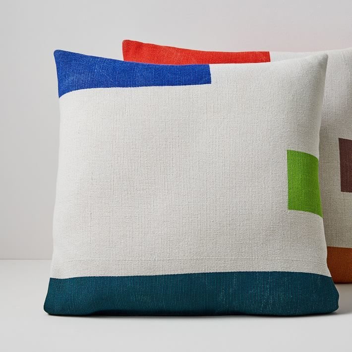
Maharam Outdoor Pillow in Beacon
The Maharam Design Studio specializes in the design and development of textiles for commercial and residential interiors. Reflecting an appreciation of history with a focus on aesthetic and industrial innovation, Maharam’s textiles are in the permanent collections of the Art Institute of Chicago, Cooper Hewitt and MoMA, among others. Expanding the collection to exterior areas, the Outdoor Pillow in Beacon (2017) consists of high-performance solution-dyed polyolefin fabric filled with fast-drying polyester fibers. It features a spacious, minimal pattern with multicolor geometric accents for an embroidered effect. Outdoor safe but not intended to be left outside for extended periods. Store in dry place when not in use. Fabric made in U.S.A. Photo Courtesy of Design Within Reach 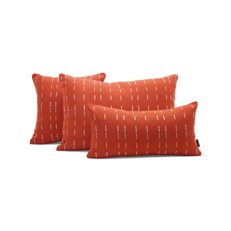
Alisa Galitsyna For Deny Retro Geometric Sunset Outdoor Throw Pillow
Deny Designs is an ever-changing collective of talented artists who churn out fresh, statement-making pieces, all proudly made in the USA with a portion of each purchase supporting art communities worldwide. Your outdoor space will be perfectly arranged with this durable poly throw pillow, printed with an abstract geo sunset by Alisa Galitsyna. Photo Courtesy of Urban Outfitters 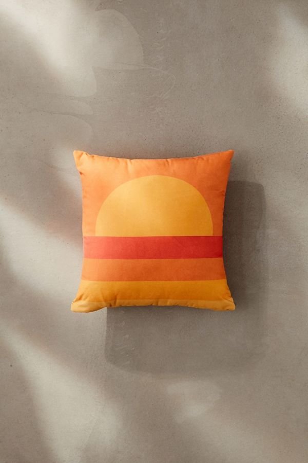
Related Reading: 15 Summer Essentials Inspired by the Beauty and Resiliency of Puerto Rico, Watch: MINNA Teams Up With Oaxacan Artisans to Weave the Ethical Home Goods of Our Dreams
