An effortless mix of modern updates and historic details makes this 665-square-foot apartment feel sleek and tidy.
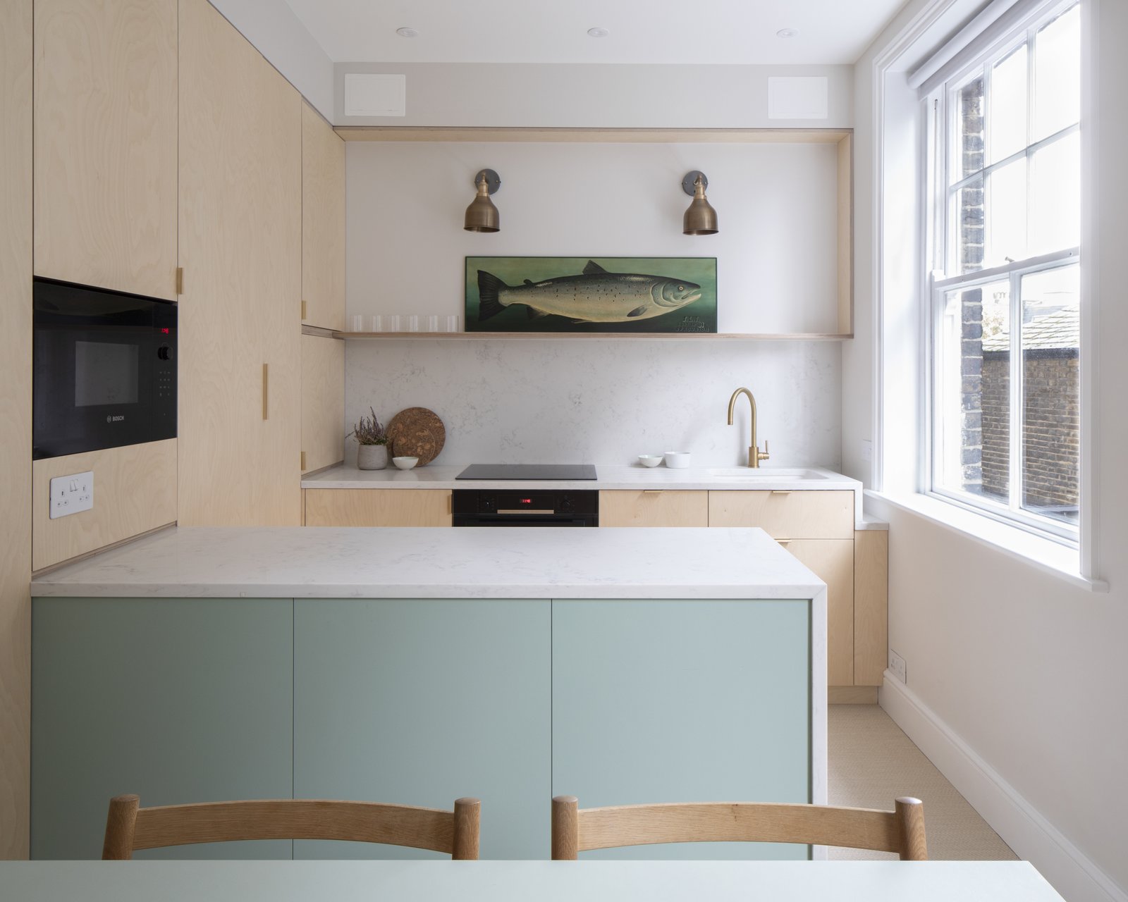
This one-bedroom apartment is located in the Cyril Mansions building, a mansion block built in 1895 that fronts Battersea Park in London. Tall ceilings, thick walls, and generous windows conveyed the building’s Victorian-era character, but this particular unit had become rundown after hosting a series of renters. Its most recent owner asked Astrain Studio for a remodel that would skew “contemporary, but remain respectful of the age of the building,” says the firm.
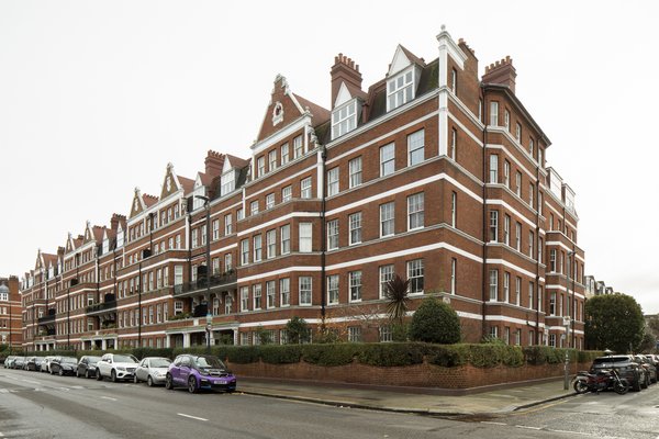
Cyril Mansions is a Victorian-era apartment building on Prince of Wales Drive in London.
Photo: Richard Chivers
Architect Irene Astrain was struck by the 665-square-foot home’s charm and quirks, but knew from the first step inside that the layout would need improvement.
“[The apartment] had been subdivided from a larger property and then rented out for many years,” says Astrain. “It was dated, tired, and cluttered, and unfortunately also quite dark, particularly in the dining area of the kitchen and in the entrance hallway. And I particularly disliked how the first thing you saw when you walked into the flat was the WC!”
Before: Entry
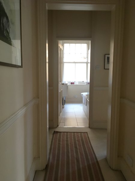
Before: Prior to the remodel, the front door opened into a hallway that segued directly into the only bathroom.
Courtesy of Astrain Studio
Astrain’s key design move was to relocate the bathroom, swapping it with the dining area, so that the outlook from the front door was enormously improved. In the new spot, the dining room is brighter and more inviting, as it benefits from an existing exterior window and no longer feels as though it’s been crammed into the kitchen.
After: Entry
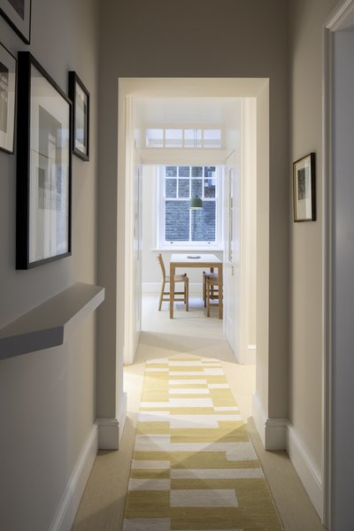
Now, the view from the front door is into the dining area. Note the angled shelf at the entry, a geometric detail which will be a reoccurring motif throughout.
Photo: Richard Chivers
See the full story on Dwell.com: Before & After: A Key Layout Swap Smooths Out the Kinks of This Victorian Flat in London
Related stories:
- This Snow-White Cabin Disappears Into a Wintry Lakeside
- A Cleverly Camouflaged Family Home Floats Above the West Texas Mountainside
- A Dramatic Hallway Forms the Spine of This Shou Sugi Ban Retreat in Mexico

