|

F5: Barry Ginder on a Finn Juhl Chair, Sean Scully, His Son’s Hands + More

When Pennsylvanian Barry Ginder was an architecture student at Temple University his art professor, Larry Spaid, influenced how he would eventually approach his own pieces. “He taught me a method of working the full surface repeatedly, and then refining the work until a moment of balance is achieved,” he says.

It was natural for Ginder to pursue both disciplines, which allow him to document the world around him. While rooted in his knowledge of structures, Ginder’s artwork strays from literal representation. Abstract versions of urban landscapes, which he describes as excerpts, take on geometric forms that seem to pulse with movement.

Barry Ginder, a middle-aged man in a navy blue jacket and light patterned shirt, stands indoors with blurred artwork or photographs visible in the background.

Not surprisingly, Ginder focuses on the experience of space—how people move through it, relate to it, and are connected by it. He strives to capture the energy of the Mid-Atlantic region, particularly his beloved Philadelphia. Color and layered surfaces add depth that echo the textures in the city.

Ginder puts acrylic on plexiglass, which he sands to transform the surface. Vibrant colors are paired with an array of lines, from sharp to gestural. These layers shift along with the viewer’s perspective, and add a depth that echoes the diversity in the city.

Sketchbooks are essential for Ginder as concepts take shape via his drawings. “Whether it’s a quote, song, or a building detail, I trace the idea and record it on paper,” he notes. “Over time, that process develops meaning and becomes a proposal.”

Today, Barry Ginder joins us for Friday Five!
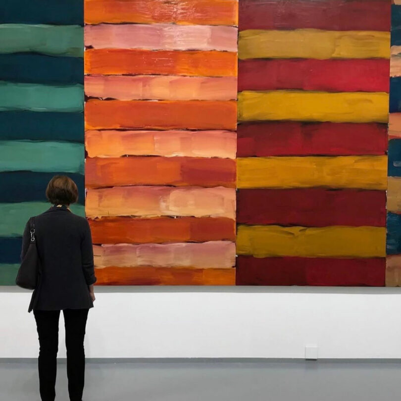
A person stands in front of a large abstract painting by Barry Ginder, featuring horizontal stripes in green, orange, red, and yellow tones in an art gallery.

1. Sean Scully

The intense depth of his paintings. The power of painting the same image repeatedly. The strength of both large and small works.

Two modern wooden chairs with gray cushions and beige throw pillows, designed by Barry Ginder, are placed next to a wooden table in a room with light wood flooring and a gray area rug.

2. Finn Juhl — Chair 45

A revolutionary chair design, one of the first to detach the backrest and seat from the frame, creating a floating effect. An iconic organic form with meticulous joinery. A timeless design.

Close-up of an abstract painting by Barry Ginder with textured layers; left side features blue, orange, and white, while the right side is yellow with black and green streaks.

Large vertical metal slabs by Barry Ginder are arranged in parallel rows, creating narrow pathways on a concrete floor in an indoor space.

3. Gerhard Richter + Richard Serra 2016

At the Marian Goodman Gallery and the Gagosian Gallery in 2016, I saw a dual showing of painting and sculpture that, in my mind, had a strong resonance in the similarity of the work. Steel and stretched paint felt like parallel expressions of pure power and emotion.

A hand holding six small, round, red cherry tomatoes against a light background, reminiscent of a Barry Ginder still life.

4. My Son’s Hands

My son is my inspiration. Through his trials, he has risen to a level often only achieved by wise old souls. This shows up in simple, everyday ways, like the gathering of a daily harvest from his garden.

Abstract geometric painting by Barry Ginder features colorful rectangles and lines, overlaid with diagonal shadows from window blinds.

5. Sunlight on My Paintings

Light is a primary source of inspiration. I often find the best source material in cityscapes drenched in light. In my work on plexiglass, the continual layering of the surface captures subtleties of depth and transparency, resonating with surfaces saturated in light or shade. In the studio, the ultimate moment is when sunlight falls onto a completed painting, creating another composition.

Works by Barry Ginder:

A modern two-story house with a slanted brick exterior, large black-framed windows, and a small balcony designed by Barry Ginder, set on a grassy slope with trees in the background.

B+G Residence in Mechanicsburg, Pennsylvania
This is a house I designed with Suzanne Brandt as part of Brandt+Ginder Architecture. It sits on 2.5 acres and was shaped not by style, but by the experience of light, wind, exterior views, and interior relationships. It’s a modern home designed with simplicity and rigor, constructed with traditional material detail in a modern aesthetic. Handmade brick, mahogany siding, a metal roof, and oversized windows create a contemporary farmhouse. It’s a handmade object in the landscape with vista-like views, and interior framed views toward the extended landscape.

A modern extension with rust-colored metal panels by Barry Ginder adjoins a traditional stone house with white-trimmed windows under a clear blue sky.
Private Residence
This project was a renovation of a historic stone building with a reddish-purple coloration. An addition was designed in copper, which over time developed a similar purplish tone, creating a modern interpretation of the original stone materiality.Copper was also carried into the kitchen, reinforcing the connection between the new intervention and the existing structure.

Abstract painting by Barry Ginder featuring intersecting vertical and horizontal lines in yellow, green, white, pink, and red tones, with a grid-like pattern on a square canvas against a white wall.
2026 View East no3
A zoomed-in detail from a continuing series of paintings based on a particular view of Philadelphia. Philadelphia is personal to me, as it’s where I went to school at Temple University. The view is from the 11th floor in West Philadelphia, looking east. Throughout the day, the scene changes, especially in the afternoon as the light shifts. This painting is one of many versions of that same view.

Nine colorful abstract paintings by Barry Ginder in a three-by-three grid are displayed on a white wall, each featuring geometric shapes and varied color blocks.
3 Squared Painting
A nine-squared composition based on the View East series. This work is part of a larger cityscape series, but more zoomed out—an actual city view rather than a graphic interpretation. It uses the same Philadelphia view that runs through the series.

A close-up of a wooden chair leg and armrest, designed by Barry Ginder, upholstered in green fabric, positioned on a wooden surface with visible wood grain.
Favorite Bench
A bench I designed with elegant details and minimal parts to create the maximum outcome. A simple leg structure is shaped and folded for support. Cushions allow for comfort and perching, but not lounging, a conversation bench. An extended wood seat becomes a place for objects. Two materials, walnut and textured cotton upholstery, are handcrafted into a modern bench.

Anna Zappia is a New York City-based writer and editor with a passion for textiles, and she can often be found at a fashion exhibit or shopping for more books. Anna writes the Friday Five column, as well as commercial content.

Similar Posts

  • Casa Haras

    1. How did you land the project and what was the brief? Initially the customers were looking for a house with volumetry that would hide the roofs, but the regulation of the condominium did not allow the use of flat slabs, nor a built-in roof. It would be our first house with apparent roofs. The required needs program and the size of the plot had the exact proportion for what we believed to be ideal for a single-storey house with plenty of open space for outside living, and so we did.
    Haras house came up as a pavilion installation consisting of 3 volumes: two parallels, with NE-SW orientation and a third perpendicular connecting with NW-SE orientation, as an “H”. The idea was based on the desire to have the central leisure area in the other spaces of the house, and with the proposed implantation, we were able to create two outdoor living areas: a main one with a deck and a swimming pool and a secondary area with a spa, a water mirror and a bonfire separated by the perpendicular volume and visually connected by the transparency of the sliding glass doors. 2. What was significant about the site? The land chosen within a stall in the interior of São Paulo, concentrated a number of positive aspects for the design of the project: views, large plot, solar orientation, generous setbacks, high soil permeability, no outside walls. 3. What was the overall design goal? The simple volume and purity of the gable roof in all 3 blocks of the house ended up contributing significantly to the harmony of the whole and to the desired country house aspect, which was further strengthened by the use of natural materials such as the stone coating on the gables of the walls and the use of the wood in the panels of doors and slatted of the facade. 4. What was the color pallet? The project explores in exterior areas the colors of natural materials such as the wood used in the slats of the whole facade of the house, the roof, also wood but with a shade of gray and stone walls. The contrast is quite striking with some internal areas, where the walls and white lining create a neutral and minimalist space. 5. What was particularly challenging? The main challenge of the project was to create a contemporary home using sloped roofs, in a minimalist architecture using natural materials. This challenge sought to coherently insert the project in the place that was built, a condominium in a stable – called “Haras” in Portuguese which gives the name of the house, with an air of farm in the interior of São Paulo- Brazil, a refuge for the tranquility at the weekends. 6. How does this project compare to other projects you have completed? This project differs from others for being a single-story house in a large terrain and with natural landscape around it. The fact that the house is single-story provided a widespread deployment in the land that generated direct relations of all the environments with the outdoor areas landscaped, which increased the sensation of the built space and strengthened the use of the external areas as a continuity of the built environment. 7. Could you please go into detail about a few pieces of furniture,including why these were selected? The pieces of furniture were selected especially for each room, proposing an integrating of the spaces. The sofa in the living room, for example, integrate both spaces, the fireplace and the outside gardens. The mix of materials is certainly a charm in this project. In the dinning room, the wood dinning table signed by the Brazilian designer Theo Egami contrasts with the metal chairs feet by Fernando Jaeger. 8. Could you please go into detail about a few fixtures, including whythese were selected? The lighting is mostly made by points of indirect light, creating a more intimate look in the house. In the social central pavilion, spots were used facing the wood lining, creating a light effect on the wood. Some interesting pieces have been used in specific spaces, such as in the kitchen, hanging with the exposed wiring that run through the wall and ceiling until they reach the bench and lavatory point, where the architects used hydraulic copper pieces to create a luminaire exclusively to the project. 9. What did you intend to impart with the rooms and how are theydifferent from each other? The flat distribution of the house program gives all rooms and environments a sense of continuity beyond the limit built, since all have direct visual relation through glazed sliding doors with more than 1150 m² of free ground and high permeability index of the ground, have secured a generous area for landscaping that embraces the house by the front, side and back indents, and advance through the central core. The differences between the rooms are related to the user, 1 double suite fully integrated with the bathroom, which has a glazed shower facing the bedroom. There are two other similar suites, also with double beds, but to receive guests in the house and finally the children’s room, a suite that has two large beds that can be shared.