Here’s the Secret to Making a Neutral Palette Pop in Your Home

Designer Joyce Downing Pickens of JDP Interiors knows that a neutral palette can be boring when done wrong. So here's what you need to know in order to do it right.
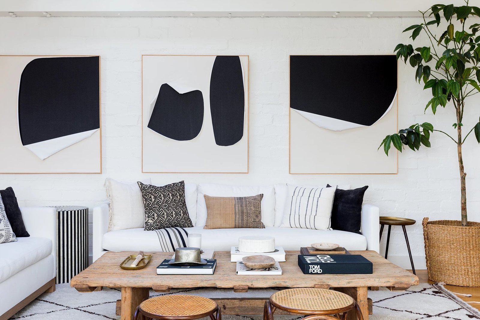
An accent pillow isn't the only place where neutral palettes can get some color. In this Hollywood Hills living room, Pickens creates a cohesive palette by using the same shades on the walls, rug, and side tables.

At first sight, creating a neutral palette seems straightforward. It leans heavily on monochromatic shades spread throughout a room, which either highlights architectural details or the homeowner’s propensity for simplicity. But the truth is, while neutral palettes are synonymous with modern homes, they can also come across as cold and impersonal. 

Joyce Downing Pickens, founder of JDP Interiors in Los Angeles, understands that this perennial trend takes some finesse to master. Her aesthetic, which she describes as “a mix of tasteful modern and old world,” exemplifies the best of what a neutral palette can achieve when done correctly. With just a few shades—namely, cream, black, white, and brown—in a variety of textures, Pickens layers rooms with the details needed to make a neutral palette pop. So Dwell had to ask: What are your tricks? 

Below, Pickens shares her secrets for building a neutral palette that feels comfortable, welcoming, and calm. Or in other words, the exact adjectives everyone wants to describe their home. 
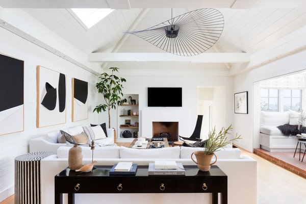
The most important aspect of a successful neutral palette?

The most important aspect of a successful neutral palette? “Texture, texture, texture!,” Pickens says.

Photo by Amy Bartlam

Neutral palettes can be divisive in home design: Some see this color scheme as relaxing, some see it as boring. Why do you think a neutral palette is worthwhile? 

I think a home should be your sanctuary from the busy world—a place where you can take a deep breath when you walk in the door. For me, a neutral palette is the best way to execute this feeling. However, I agree that if this is done incorrectly, it can be boring! It’s important to infuse a lot of texture, contrast, and interesting furniture pieces into your space in order to keep your eye entertained. 

How do you begin creating a neutral palette so that it can be entertaining? 

A collected look is always best when playing with neutrals. I would say that all successful neutral palettes have a collection of vintage pieces, something woven, something leather, an interesting light fixture, linens or velvets, and weathered wood. This creates texture (the most important aspect to a warm neutral palette) and depth. 
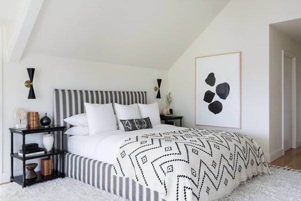
Pickens recommends searching for textural pieces in flea markets for accents or furniture.

Pickens recommends searching for textural pieces in flea markets for accents or furniture. 

Photo by Amy Bartlam

How can someone take your above tips and apply them to their kitchen, for instance? 

For a kitchen, I always want to include something with some warmth. A kitchen will feel cold and stark without wood textures, leather items, or woven fabrics. 

A good leather or woven bar stool, for example, can elevate a space much more than a metal one, and a vintage breadboard or wood bowls can add texture. If you don’t use texture, the space will fall flat and feel more like a commercial space. A good place to search for pieces, whether in a kitchen or in other areas of a home, is in flea markets. The juxtaposition of new and old will elevate a neutral space. 

What’s the best way to integrate color into a neutral palette? What are some of your favorite colors to use? 

The best way to infuse color is to choose a vintage rug that is mostly neutral but also has some color woven into it, like a rust or an olive green. Those colors are my two favorites. Then choose a variety of details, like pillows or vases, in one of those two colors to highlight the rug and balance the room. 

I think a common mistake people make with neutral spaces is trying to infuse a color into a palette by only using accent pillows. If that’s the only color in the room, it ends up feeling unbalanced. Find ways to play with color subtly while staying true to a calm, neutral backdrop. It will achieve the design you’re after.  
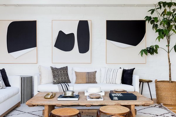
An accent pillow isn't the only place where neutral palettes can get some color. In this Hollywood Hills living room, Pickens creates a cohesive palette by using the same shades on the walls, rug, and side tables.

An accent pillow isn’t the only place where neutral palettes can get some color. In this Hollywood Hills living room, Pickens creates a cohesive palette by using the same shades on the walls, rug, and side tables. 

Photo by Amy Bartlam

See the full story on Dwell.com: Here’s the Secret to Making a Neutral Palette Pop in Your Home
Related stories:

  • 5 Prefab Home Companies to Know in Illinois
  • How to Use Subway Tile to Spruce Up a Kitchen
  • How Beni Ourain Rugs Made It From the High Atlas Mountains to Our Homes
Similar Posts

  • Hillside Sanctuary

    The owner of this property came to Hoedemaker Pfeiffer looking for a personal retreat inspired by a home lost to fire decades earlier in the hills of Appalachia. The firm’s task was not to recreate that home but rather to give its spirit new form in the Pacific Northwest. Taking inspiration from its remote site in the San Juan Islands, our team envisioned a series of simple stone volumes. From that concept emerged the main house and a guest house, each responding to its own unique location on the site. Together they provide friends and family with comfortable accommodation while offering a sanctuary for the owner at the main home. Taking full advantage of sweeping views of Puget Sound, the main home is sited on a small plateau high on top of a steeply-sloping hillside. With a view on one side and a road on the other, the site suggested a stone plinth and stone wall to form the base and rear of the house. A pair of stone fireplace volumes support the concept, rising together to form the boundaries of a central stone staircase that separates the main level into public and private realms. Atop the low stone base then perches a light-filled wood structure. Its simple shed roof tips low in front to protect from the summer sun while offering space for a photovoltaic array above. Winter light in turn penetrates deep into the main living spaces through a wall of glass running continuously across building’s south elevation. The relative height difference between this wood pavilion and that of the adjacent stone volume also allows consistent north light to flood into the primary living spaces via a series of clerestory windows, which release warm air high on the leeward side of the structure. The site for the guest house came with more significant technical challenges. The concept begins with a stone tower set near the center of the small circular parcel. Rising high above steeply-sloping grade, it acts as a three-dimensional datum through which feature program elements are allowed to puncture. The main entry offers ease of access to the project’s public spaces through a simple, full-height opening cut into the stone volume’s north elevation. The stair, comprised of a concrete base below large casement windows, allows natural light to fill the main stairway as it leads guests toward the bedrooms located at the home’s lower level. Opposite the entry, the view deck extends from the great room, cantilevering far above grade. The dining room, finally, was conceived as a three-sided glass object floating in a forest of trees. Two steel beams carry its entire weight and extend deep into the floor system. To enhance the concept, our team preserved trees only a few feet from the dining room by developing custom retaining walls capable of avoiding critical root zones. Project Team: Hoedemaker Pfeiffer (Architecture) ​Schuchart Dow​ (Contractor ​Randy Allworth, Allworth Design​ (Landscape Architect) ​Malsam Tsang​ (Structural Engineer) ​LPD Engineering​ (Civil Engineer) Nelson Geotechnical Associates, Inc. (Geotechnical Engineer) Island Tree Doctor (Arborist) ​Kevin Scott​ (Photographer)

  • Decorating with Neutrals: Gorgeous Colors and Ideas that Work Across Trends

    It is easy to get excited about bright and bold colors. They are obviously attractive and when you see lovely catalog images of homes full of bright colors and an eclectic mix of exotic décor, one might be easily tempted to think it is a look that works everywhere. But hold on for a while […]

    You’re reading Decorating with Neutrals: Gorgeous Colors and Ideas that Work Across Trends, originally posted on Decoist. If you enjoyed this post, be sure to follow Decoist on Twitter, Facebook and Pinterest.