|

link-arc shapes shunde museum as stack of rotating tubes to frame wetland views

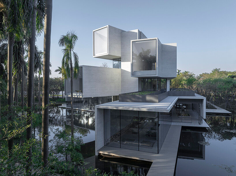
modern design by link-arc rises within china’s yunlu wetland

Beside a natural habitat for thousands of herons, Shunde Yunlu Wetland Museum by Link-Arc rises within the dense vegetation of a wetland park in China.

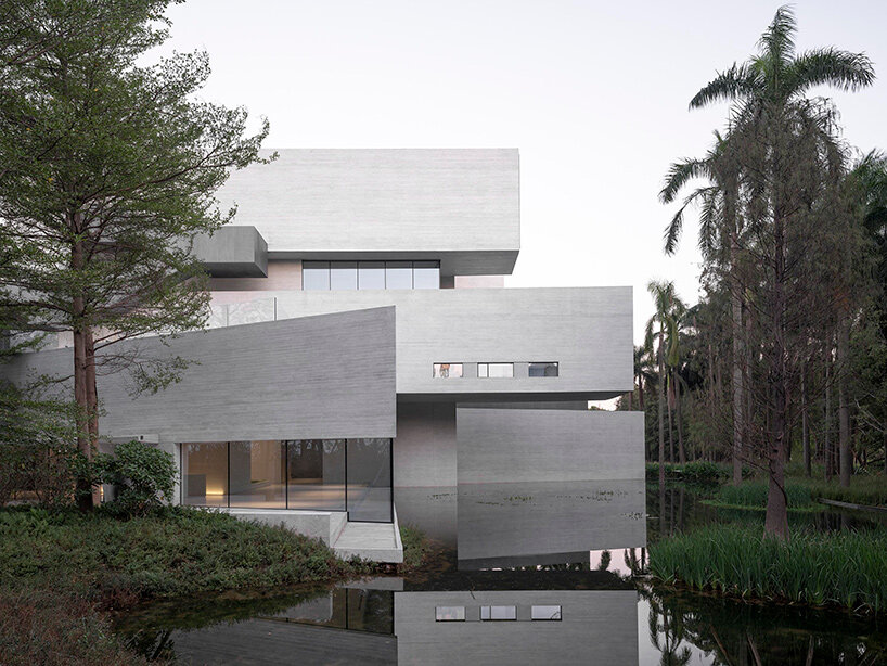
The museum sits just beyond a line of sequoia trees, set back from nearby paths and waterways to maintain a quiet edge within the park. A central water channel divides the site, and the surrounding trees create both enclosure and filtered views. Fitting the building within this context, Link-Arc orients each level toward openings in the canopy and toward the heron nesting areas across the water.

Within this protected landscape, the structure brings together a bird-watching tower and a wetland education center. Tall vegetation and reflective water surfaces form a layered background that absorbs the stepped concrete volumes which allow the museum to settle into the park’s natural density.

link-arc shunde museum
images © Tian Fangfang

a stack of tubes to frame unique views

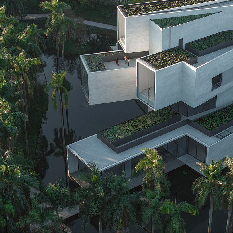
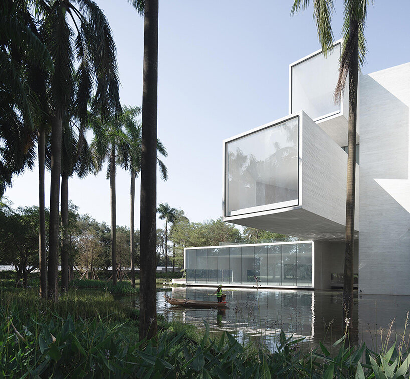
The Shunde Yunlu Wetland Museum is composed of four vertically-stacked concrete ‘tubes,’ each of which is rotated by the team at Link-Arc to align with a different level of the forest. Lower floors face root and trunk level, while the upper floors frame the crowns and treetops. These precise rotations gives the massing a sense of movement as each volume shifts to frame a specific view.

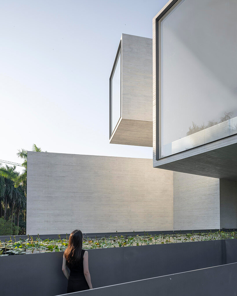
Each tube functions as a box structure, with sidewalls, roofs, and floors working together to support the cantilevered sections. This structural clarity gives the museum a stable presence above the wetland edge, where water comes close to the base of the building.

link-arc shunde museum
the museum sits within the Sequoia edge of the wetland park in Shunde

terraced rooftop lotus ponds

Cast-in-place concrete shaped by Link-Arc with pine formwork gives the Shunde Museum’s exterior a fine, wood-derived grain. The texture softens the building’s profile and ties it visually to the vertical lines of the surrounding trees. The concrete’s pale surface reflects shifting daylight, allowing the museum to sit quietly within the changing tones of the forest.

A lotus pond on the roof introduces another layer of water into the composition. This surface blends with the wetland below, easing the building’s vertical impact when seen from nearby paths or across the pond. The gesture aligns with Link-Arc’s broader approach to shaping a museum that remains sensitive to the habits of the birds nearby.

link-arc shunde museum
each level is rotated by Link-Arc to frame a distinct layer of the forest

complex, angled interiors

Inside, a tall triangular atrium connects all four levels. Sunlight filters through high skylights and passes through deep concrete beams, entering the interior as a soft, even glow. This quality of light supports the neutral finishes and reinforces the sense of calm throughout the circulation spaces.

Stairs and landings trace the perimeter of the atrium, offering layered views across multiple floors. From the mid-levels, three distinct framed openings are visible at once, each directing attention to a different part of the forest canopy. Along the glazed edges, the interior hovers slightly above the water, creating a continuous visual link to the surroundings.

Paths around the museum weave through dense plantings and tall tree clusters, reinforcing the sense of immersion within the wetland. Portions of the building lift above the ground plane to allow water to pass beneath, while cantilevered volumes frame moments of reflection.

link-arc shunde museum
the concrete tubes create vantage points for observing herons

link-arc shunde museum
pine-textured formwork gives the exterior a soft grain

Similar Posts

  • Going Bold: 20 Contemporary Powder Rooms in 10 Spectacular Colors

    The idea with decorating the powder room is most often influenced by the limited amount of space on offer. Since we tend to generally prefer neutral colors in small spaces, most homeowners feel that a similar approach works best in the modest powder room as well. Yet, more often than not, the opposite seems to […]

    You’re reading Going Bold: 20 Contemporary Powder Rooms in 10 Spectacular Colors, originally posted on Decoist. If you enjoyed this post, be sure to follow Decoist on Twitter, Facebook and Pinterest.

  • Casa Haras

    1. How did you land the project and what was the brief? Initially the customers were looking for a house with volumetry that would hide the roofs, but the regulation of the condominium did not allow the use of flat slabs, nor a built-in roof. It would be our first house with apparent roofs. The required needs program and the size of the plot had the exact proportion for what we believed to be ideal for a single-storey house with plenty of open space for outside living, and so we did.
    Haras house came up as a pavilion installation consisting of 3 volumes: two parallels, with NE-SW orientation and a third perpendicular connecting with NW-SE orientation, as an “H”. The idea was based on the desire to have the central leisure area in the other spaces of the house, and with the proposed implantation, we were able to create two outdoor living areas: a main one with a deck and a swimming pool and a secondary area with a spa, a water mirror and a bonfire separated by the perpendicular volume and visually connected by the transparency of the sliding glass doors. 2. What was significant about the site? The land chosen within a stall in the interior of São Paulo, concentrated a number of positive aspects for the design of the project: views, large plot, solar orientation, generous setbacks, high soil permeability, no outside walls. 3. What was the overall design goal? The simple volume and purity of the gable roof in all 3 blocks of the house ended up contributing significantly to the harmony of the whole and to the desired country house aspect, which was further strengthened by the use of natural materials such as the stone coating on the gables of the walls and the use of the wood in the panels of doors and slatted of the facade. 4. What was the color pallet? The project explores in exterior areas the colors of natural materials such as the wood used in the slats of the whole facade of the house, the roof, also wood but with a shade of gray and stone walls. The contrast is quite striking with some internal areas, where the walls and white lining create a neutral and minimalist space. 5. What was particularly challenging? The main challenge of the project was to create a contemporary home using sloped roofs, in a minimalist architecture using natural materials. This challenge sought to coherently insert the project in the place that was built, a condominium in a stable – called “Haras” in Portuguese which gives the name of the house, with an air of farm in the interior of São Paulo- Brazil, a refuge for the tranquility at the weekends. 6. How does this project compare to other projects you have completed? This project differs from others for being a single-story house in a large terrain and with natural landscape around it. The fact that the house is single-story provided a widespread deployment in the land that generated direct relations of all the environments with the outdoor areas landscaped, which increased the sensation of the built space and strengthened the use of the external areas as a continuity of the built environment. 7. Could you please go into detail about a few pieces of furniture,including why these were selected? The pieces of furniture were selected especially for each room, proposing an integrating of the spaces. The sofa in the living room, for example, integrate both spaces, the fireplace and the outside gardens. The mix of materials is certainly a charm in this project. In the dinning room, the wood dinning table signed by the Brazilian designer Theo Egami contrasts with the metal chairs feet by Fernando Jaeger. 8. Could you please go into detail about a few fixtures, including whythese were selected? The lighting is mostly made by points of indirect light, creating a more intimate look in the house. In the social central pavilion, spots were used facing the wood lining, creating a light effect on the wood. Some interesting pieces have been used in specific spaces, such as in the kitchen, hanging with the exposed wiring that run through the wall and ceiling until they reach the bench and lavatory point, where the architects used hydraulic copper pieces to create a luminaire exclusively to the project. 9. What did you intend to impart with the rooms and how are theydifferent from each other? The flat distribution of the house program gives all rooms and environments a sense of continuity beyond the limit built, since all have direct visual relation through glazed sliding doors with more than 1150 m² of free ground and high permeability index of the ground, have secured a generous area for landscaping that embraces the house by the front, side and back indents, and advance through the central core. The differences between the rooms are related to the user, 1 double suite fully integrated with the bathroom, which has a glazed shower facing the bedroom. There are two other similar suites, also with double beds, but to receive guests in the house and finally the children’s room, a suite that has two large beds that can be shared.

  • 45 Fall Kitchen Trends: Color, Style and Seasonal Goodness

    With changing seasons, one of the things that we most look forward to is the arrival of new design and decorating trends. Much like the world around us, the moods and colors that vary and our own wardrobe, a new season should also usher in something unique and fresh in your household. This can be […]

    You’re reading 45 Fall Kitchen Trends: Color, Style and Seasonal Goodness, originally posted on Decoist. If you enjoyed this post, be sure to follow Decoist on Twitter, Facebook and Pinterest.

  • Embrace Teal and Color Your World Blue-Green

    When it comes to color, teal is one of the most soothing, popular hues in today’s design world. Once considered an outdated wall color, teal has made a big comeback. In fact, we’ve rounded up the decor to prove it! While many people think of teal as a shade of green with a dash of […]

    You’re reading Embrace Teal and Color Your World Blue-Green, originally posted on Decoist. If you enjoyed this post, be sure to follow Decoist on Twitter, Facebook and Pinterest.