Mesmerizing Minimalism Anchored in White: New Extension to Aging Suburban Home

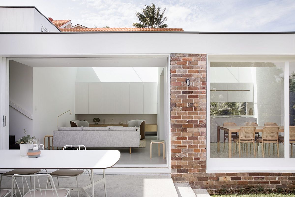
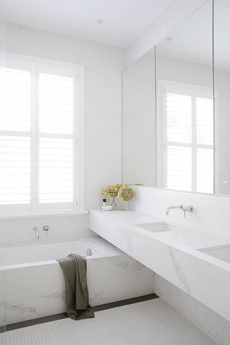
Revamping a family home to create more space often comes in the form of a rear extension that links the older existing house with the backyard in a more contemporary fashion. And that is just what you get with the minimal and sophisticated Nat’s House revamp in Cammeray, a bustling suburb of Sydney. The transformation started with the demolition of the previous extension on the site that was poorly planned and outdated. This was replaced with a new, contemporary space where white takes over pretty much everywhere and you have an urbane design that relies firmly on functionality, minimalism and exquisite contemporary décor.

Gorgeous modern extension to suburban Sydney home connects the main house with the garden


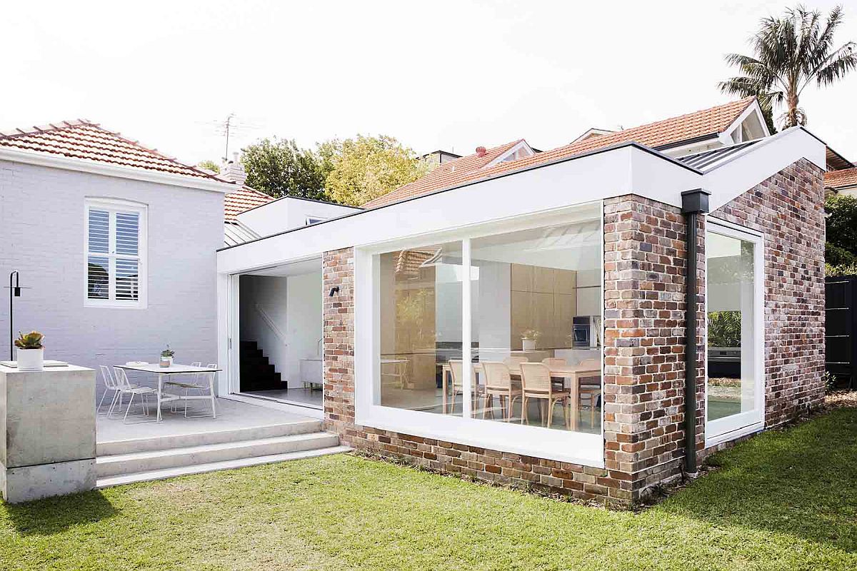
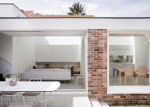
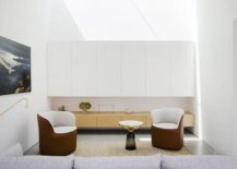
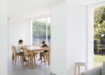
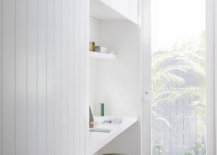
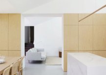
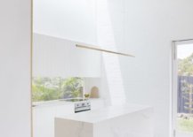
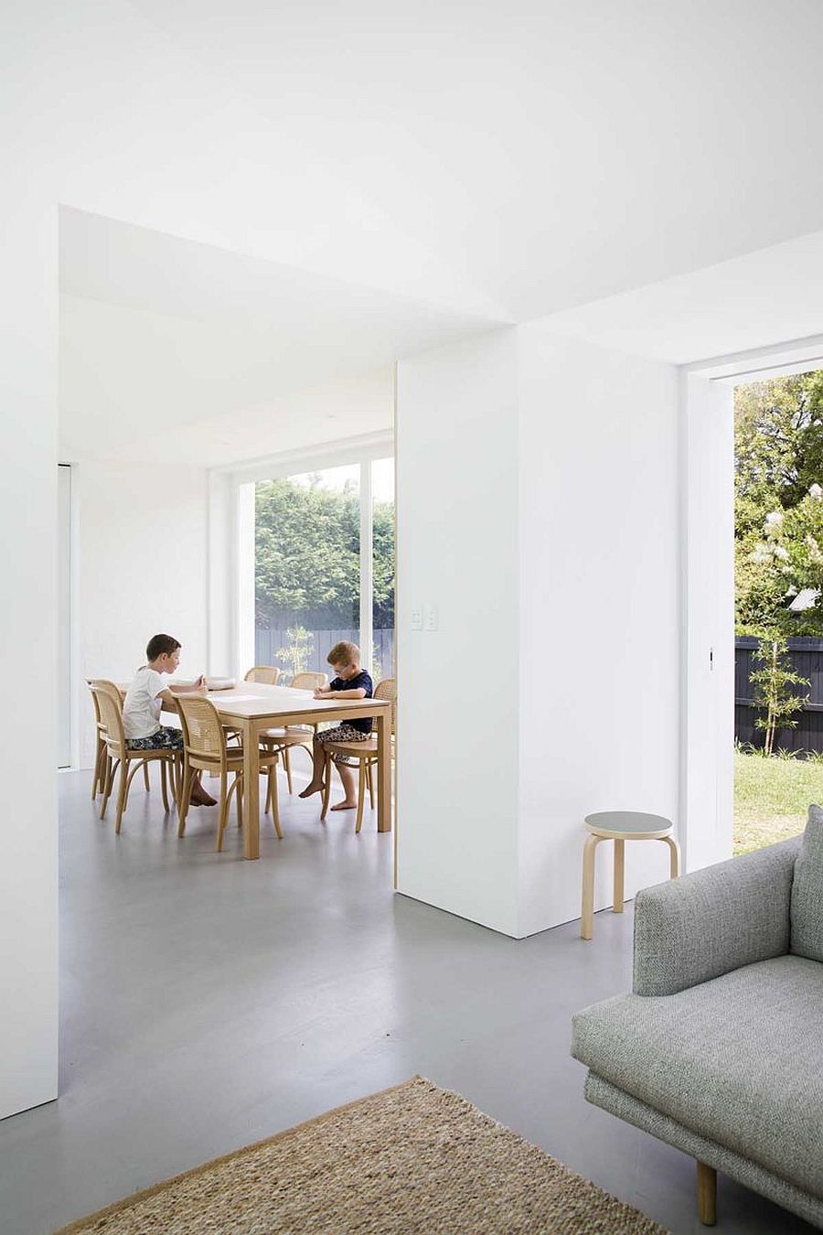
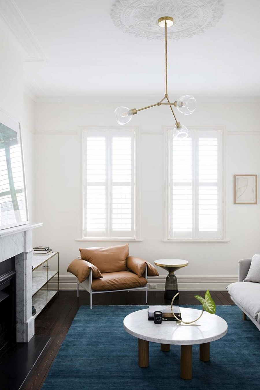
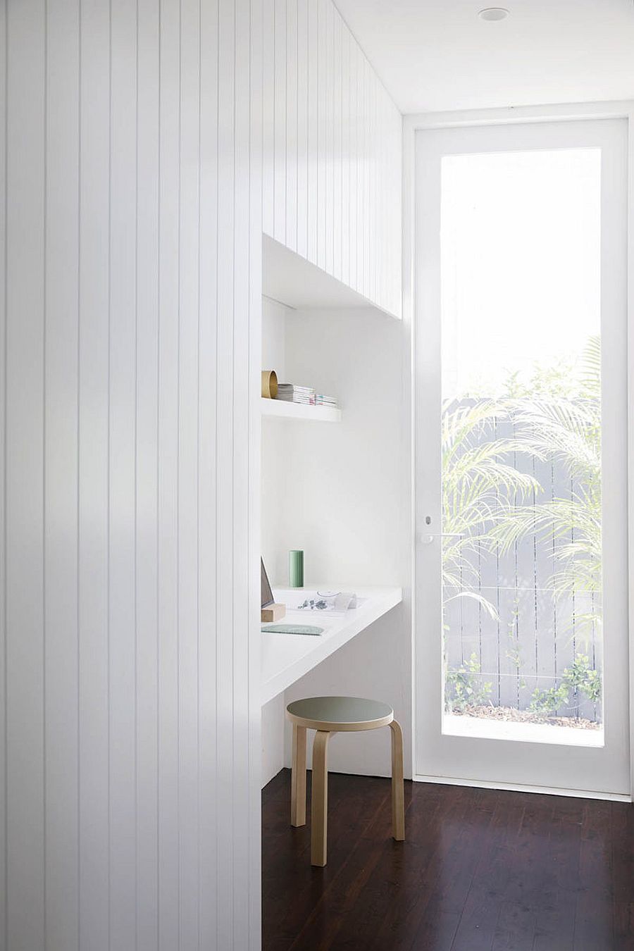
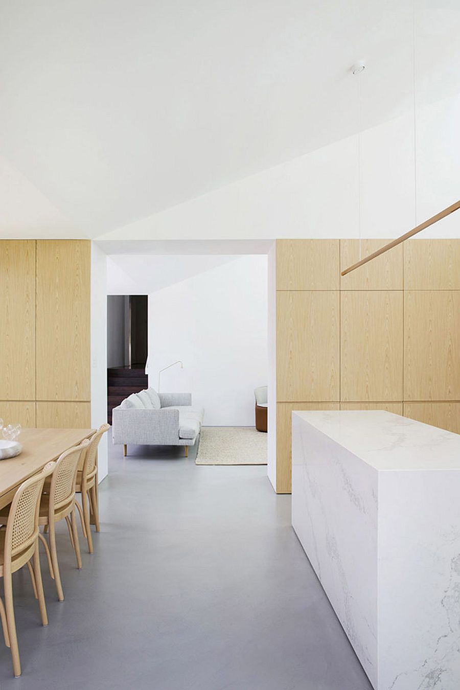
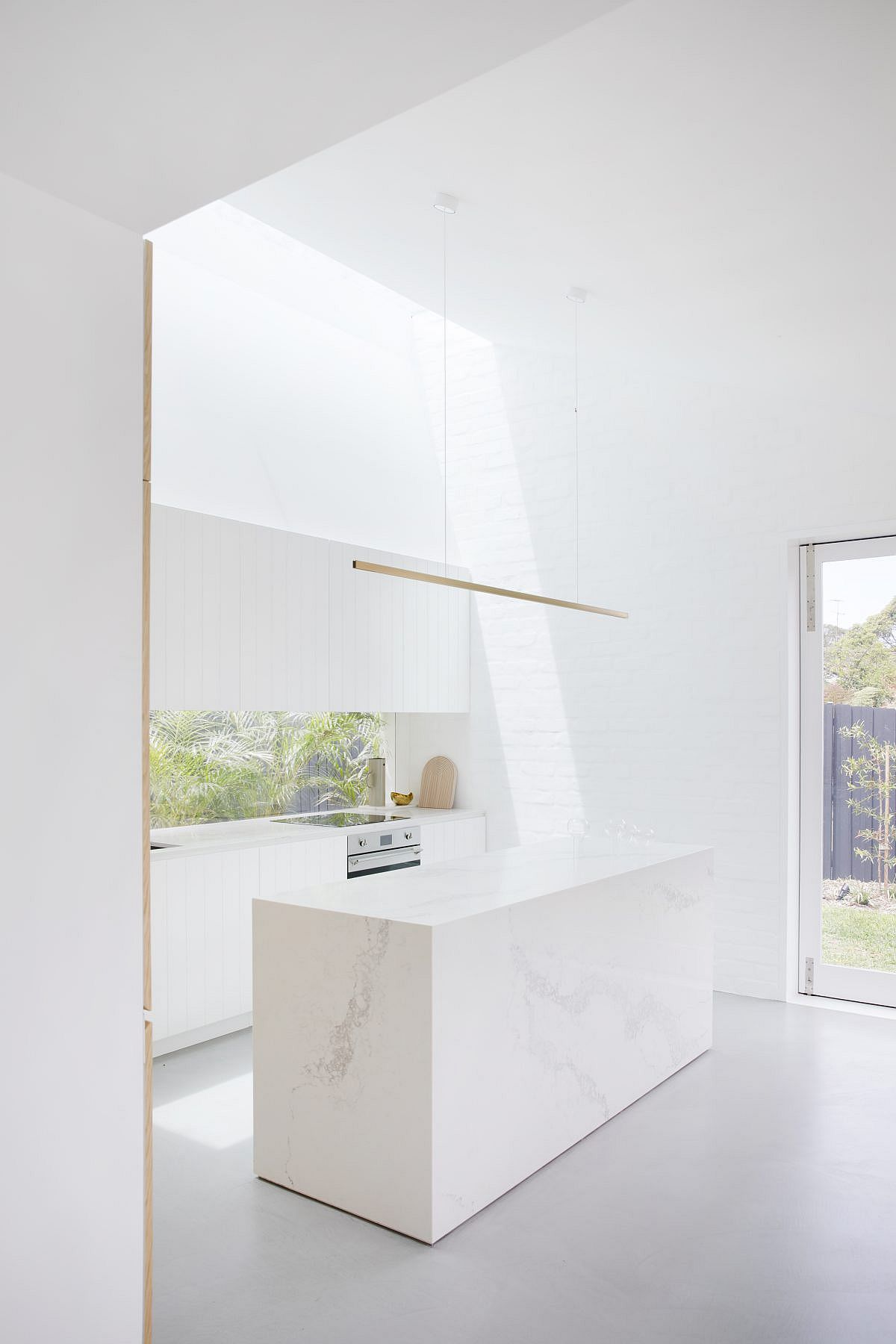
A Studio Prineas creation, the rear extension is seamlessly integrated with the old house and you find a bit of modernity spilling over into the bedrooms and personal areas as well. The extension itself contains a new kitchen area, dining space and living room – all of which are connected with the garden using large glass windows and sliding glass doors. White-painted recycled brick on the inside ensures there is textural contrast in the living space and kitchen without actually moving away from the monochromatic backdrop even as the comfy chairs and coffee table bring metallic glitter to the setting.

Modern extension to an old house in Cammeray combines the home with the garden
Light-filled living area of the revamped home in Sydney suburbs feels fresh and contemporary
Minimal decorating style and curated decor pieces make this a stylish little living space

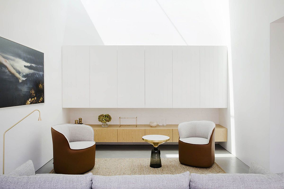
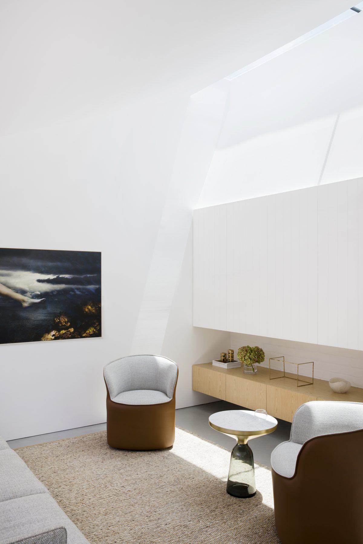
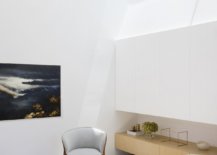
Wooden panels on the wall and storage units also offer something unique visually even as ample natural light floods every corner of the room. It is not very often that you find a home extension with such polished minimalism and that is what makes the Nat’s House so very special! [Photography by Chris Warnes]

Sliding glass doors and large windows now connect the living area, kitchen and dining with the garden
Spaces inside the original house are also given a dashing, modern makeover
Stone and tile create a cool, monochromatic bathroom in white full of light
Utilizing the little niche in the hallway to create a functional space
Wood on the walls and the dining table bring contrast and warmth to the clean space in white
Exquisite contemporary kitchen in white with painted brick walls and an island in marble

You’re reading Mesmerizing Minimalism Anchored in White: New Extension to Aging Suburban Home, originally posted on Decoist. If you enjoyed this post, be sure to follow Decoist on Twitter, Facebook and Pinterest.

Similar Posts

  • Hillside Sanctuary

    The owner of this property came to Hoedemaker Pfeiffer looking for a personal retreat inspired by a home lost to fire decades earlier in the hills of Appalachia. The firm’s task was not to recreate that home but rather to give its spirit new form in the Pacific Northwest. Taking inspiration from its remote site in the San Juan Islands, our team envisioned a series of simple stone volumes. From that concept emerged the main house and a guest house, each responding to its own unique location on the site. Together they provide friends and family with comfortable accommodation while offering a sanctuary for the owner at the main home. Taking full advantage of sweeping views of Puget Sound, the main home is sited on a small plateau high on top of a steeply-sloping hillside. With a view on one side and a road on the other, the site suggested a stone plinth and stone wall to form the base and rear of the house. A pair of stone fireplace volumes support the concept, rising together to form the boundaries of a central stone staircase that separates the main level into public and private realms. Atop the low stone base then perches a light-filled wood structure. Its simple shed roof tips low in front to protect from the summer sun while offering space for a photovoltaic array above. Winter light in turn penetrates deep into the main living spaces through a wall of glass running continuously across building’s south elevation. The relative height difference between this wood pavilion and that of the adjacent stone volume also allows consistent north light to flood into the primary living spaces via a series of clerestory windows, which release warm air high on the leeward side of the structure. The site for the guest house came with more significant technical challenges. The concept begins with a stone tower set near the center of the small circular parcel. Rising high above steeply-sloping grade, it acts as a three-dimensional datum through which feature program elements are allowed to puncture. The main entry offers ease of access to the project’s public spaces through a simple, full-height opening cut into the stone volume’s north elevation. The stair, comprised of a concrete base below large casement windows, allows natural light to fill the main stairway as it leads guests toward the bedrooms located at the home’s lower level. Opposite the entry, the view deck extends from the great room, cantilevering far above grade. The dining room, finally, was conceived as a three-sided glass object floating in a forest of trees. Two steel beams carry its entire weight and extend deep into the floor system. To enhance the concept, our team preserved trees only a few feet from the dining room by developing custom retaining walls capable of avoiding critical root zones. Project Team: Hoedemaker Pfeiffer (Architecture) ​Schuchart Dow​ (Contractor ​Randy Allworth, Allworth Design​ (Landscape Architect) ​Malsam Tsang​ (Structural Engineer) ​LPD Engineering​ (Civil Engineer) Nelson Geotechnical Associates, Inc. (Geotechnical Engineer) Island Tree Doctor (Arborist) ​Kevin Scott​ (Photographer)