Playful Use of Color Reinvents this Old Case Study House in Melbourne

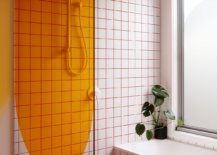
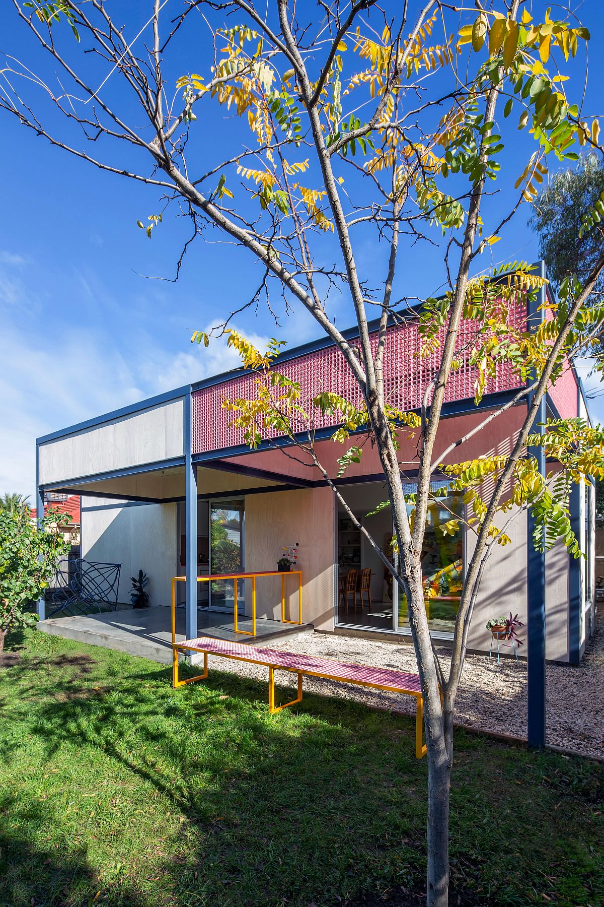
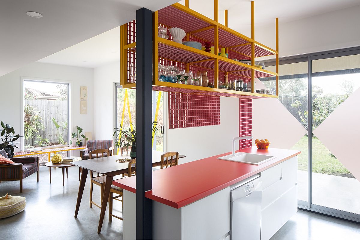
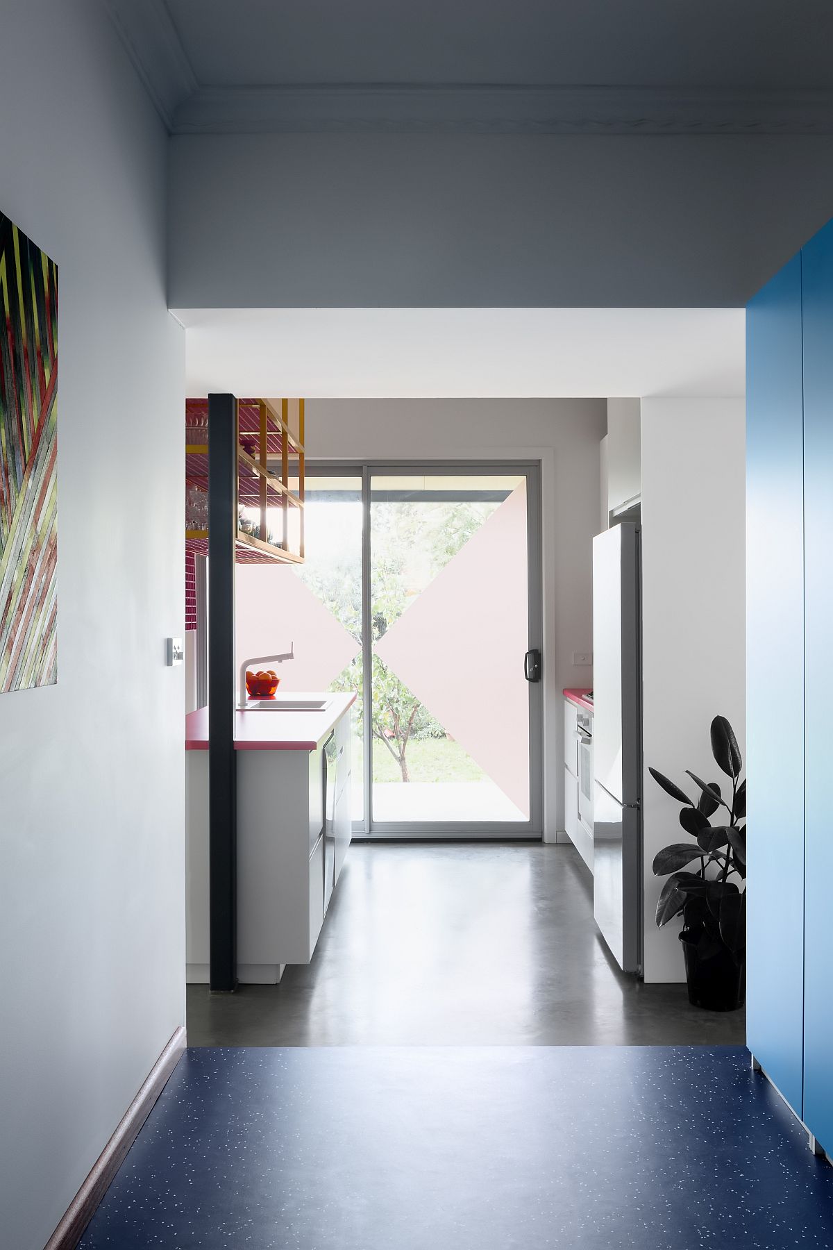
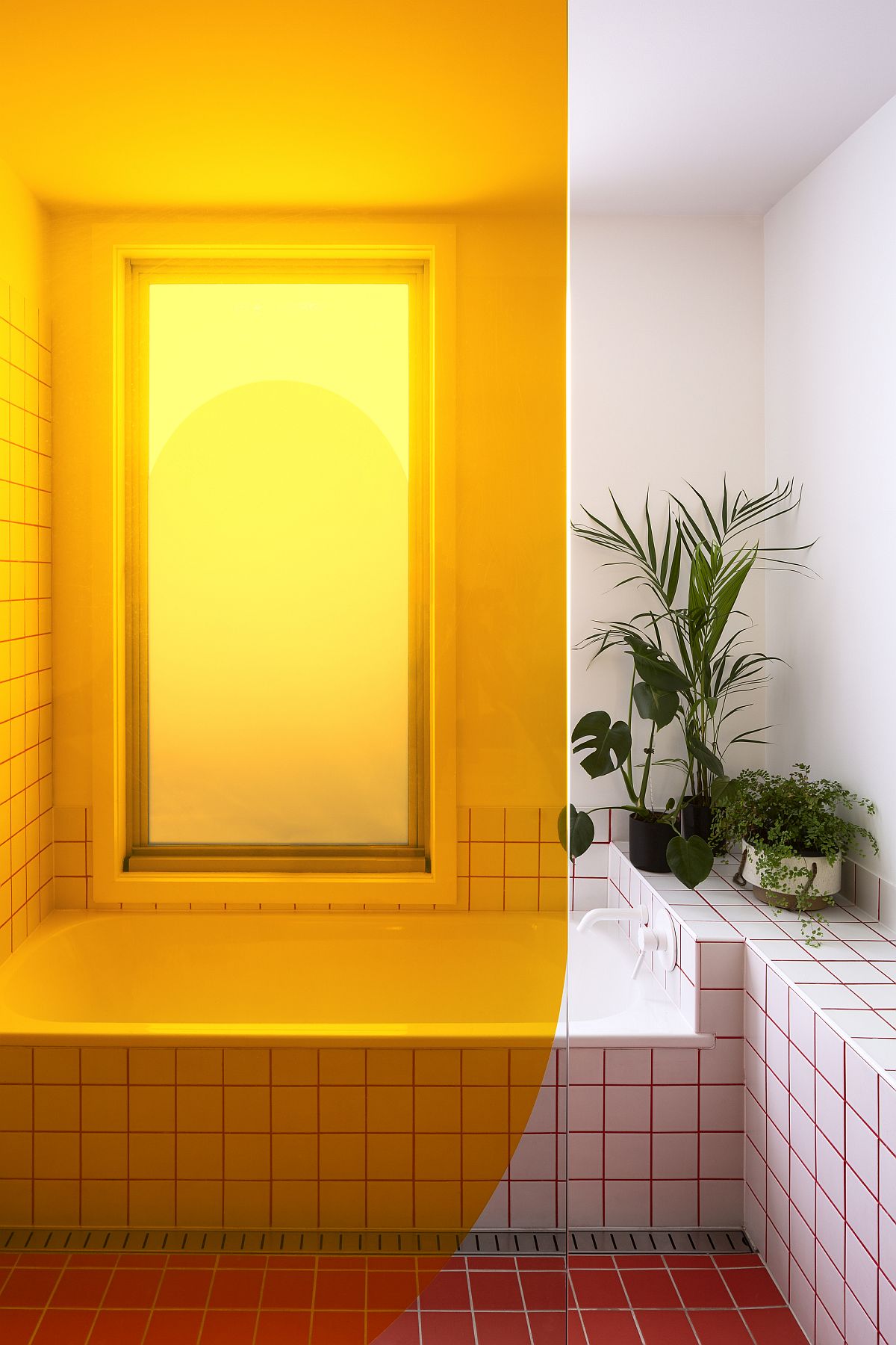
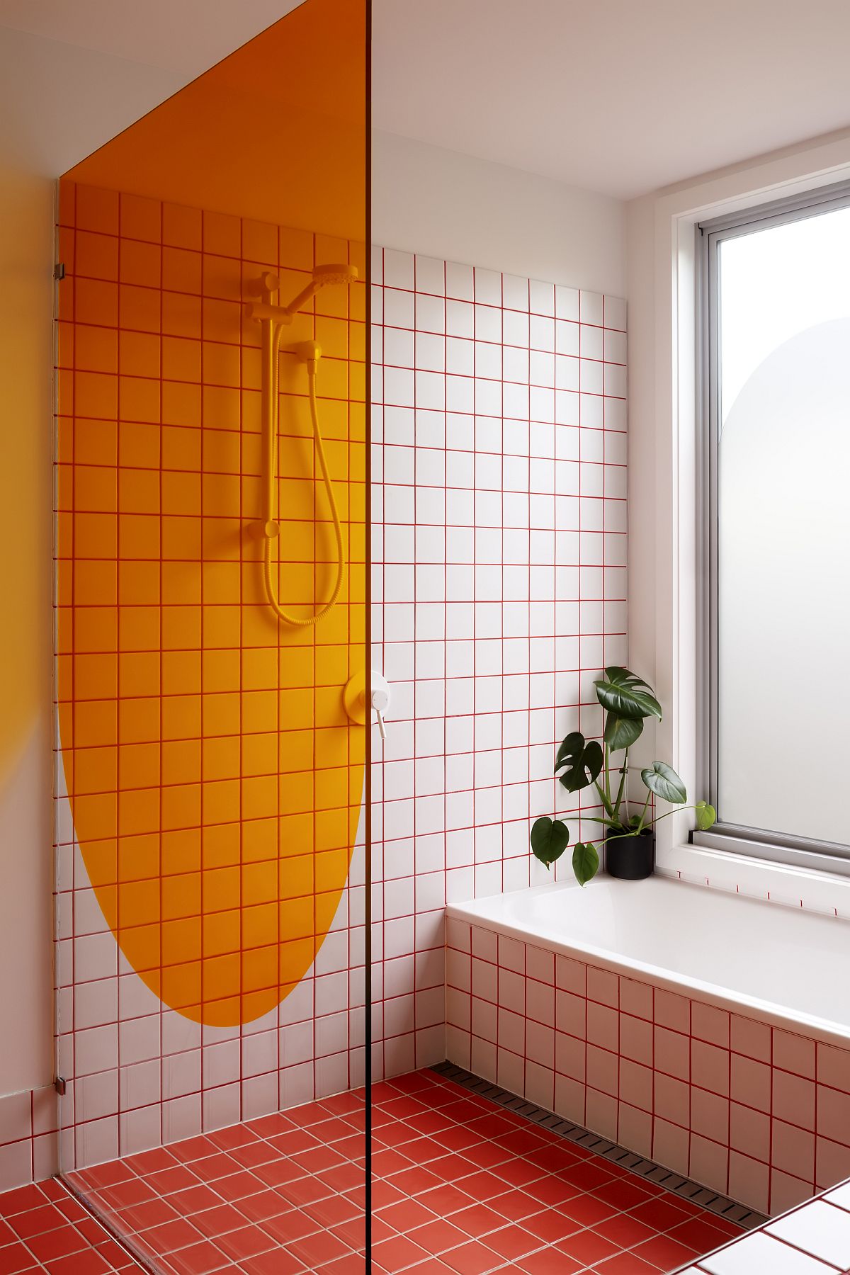
Many of the suburbs in Melbourne are home to old Case Study Houses that were originally built in the mid 1900’s and are still pretty popular among couples and young families just starting out in the big city. The Family Framework designed by Sibling Architecture we no different before a smart and ingenious renovation turned this otherwise normal little home into a color-filled and bright dwelling perfect for fast-paced urban life. One thing you notice instantly in here is the captivating use of ‘color blocks’ set against a backdrop in white. This gives the home a modern, yet eclectic appeal where hot pinks, bright oranges and bold reds make a lasting visual statement.

Pergola structure with its playful pink creates a lovely focal point in the backyard


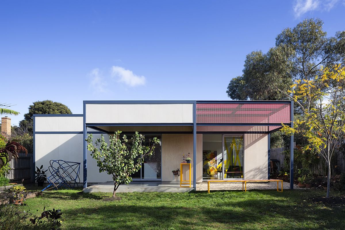
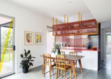
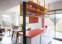
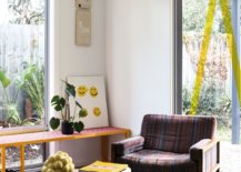
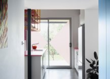
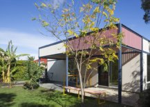
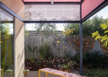
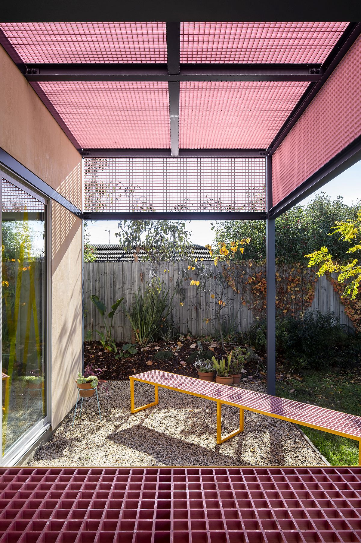
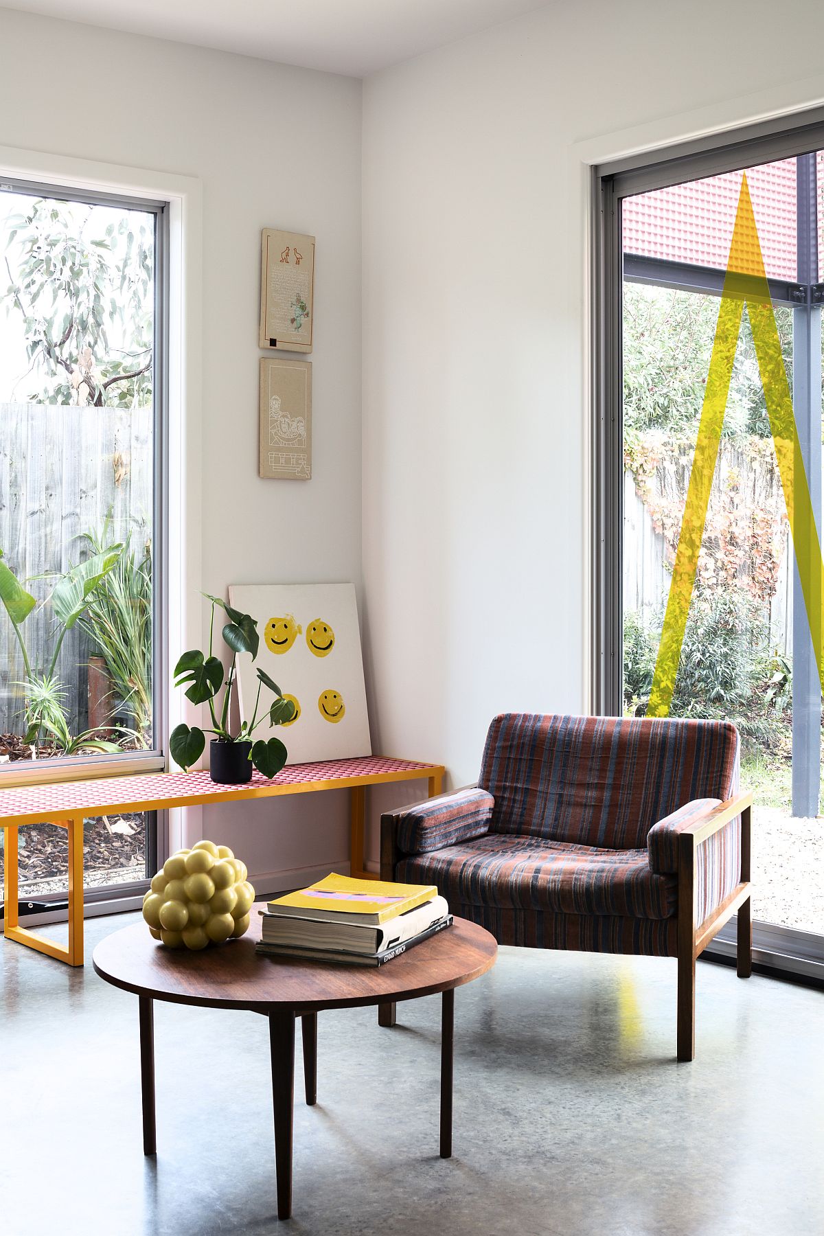
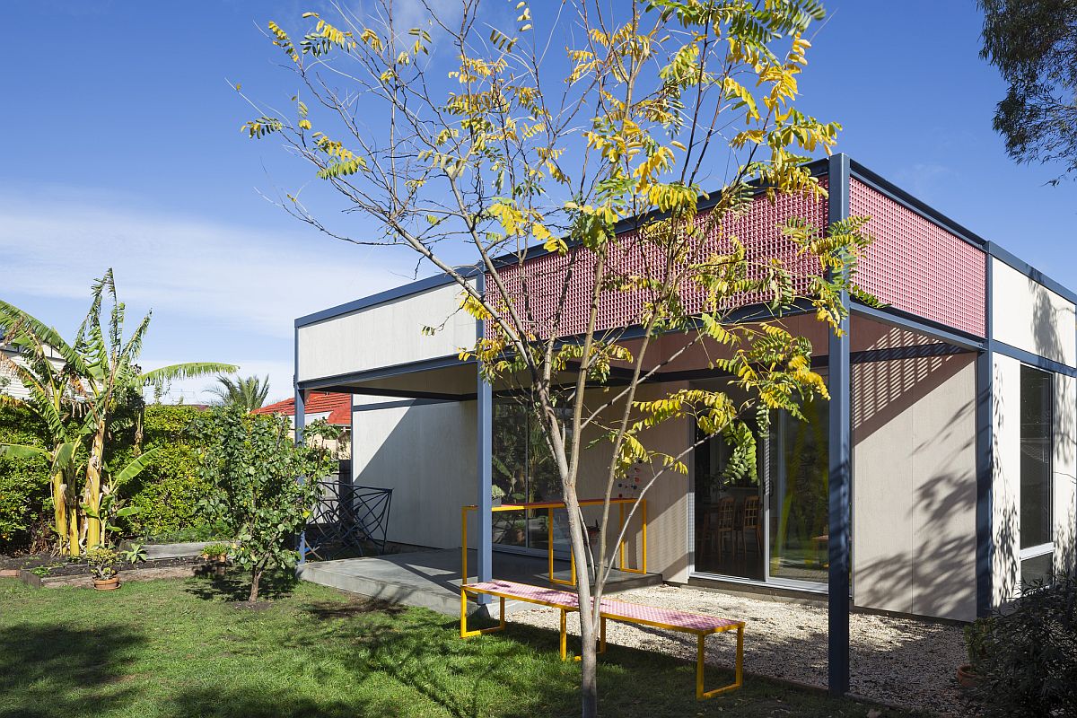
On the outside a new pergola structure with grid framework extends the living area while offering shelter from the heat during summer months. The grid pattern of the eye-catching pink pergola is repeated inside the home as well with a custom kitchen shelf that hangs down from the ceiling and a bespoke bench in the living room corner. Once again, the metal framework comes with playful splashes of color, making it even more engaging. New windows and a revamped floor plan bring natural light into the kitchen, living and dining area with ease.

Colorful and modern pergola structure also offers smart functionality to the home
Grid structure of the pergola in pink leaves a lasting impression
Metallic grid shelf hanging down from the ceiling adds a storage option in the kitchen
Beautiful lattice structure used for the pergola also becomes a part of the kitchen with colorful charm
Pink grid of the pergola can be found everywhere in the house in bits and pieces

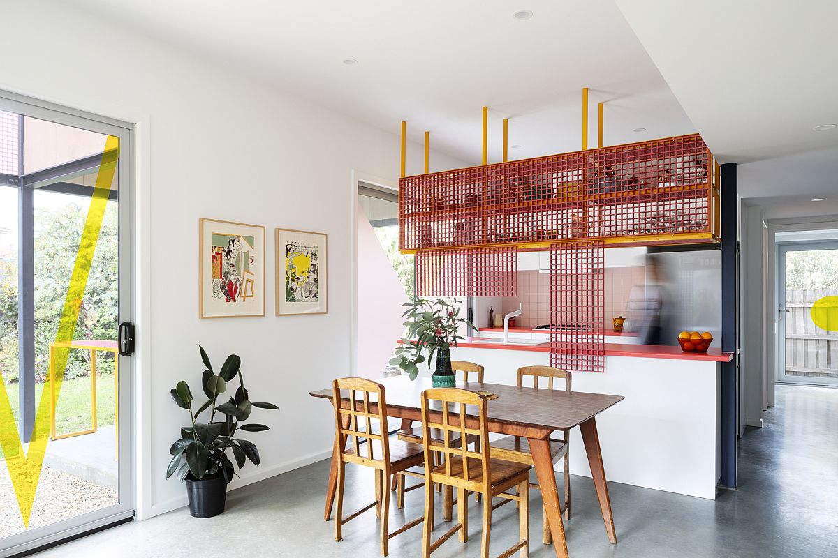
Next to the social living-kitchen space is the dining area / homework zone and there is a movable partition between the two which offers flexibility and privacy. Quirky and yet contemporary, this home transformation feels as whimsical as it is functional! [Photography: Christine Francis]

Bright blue floor and storage units give the interior a more cheerful appeal
Brilliant orange section makes an impression in this colorful, contemporary bathroom
Glass shower area of the contemporary bathroom with orange and red splashes
New and revamped backyard of the Aussie home with modern style and light-filled interior

You’re reading Playful Use of Color Reinvents this Old Case Study House in Melbourne, originally posted on Decoist. If you enjoyed this post, be sure to follow Decoist on Twitter, Facebook and Pinterest.

Similar Posts

  • Hottest Living Room Styles for Winter 2020: Trends that are Easy to Adopt

    Yes, we are still navigating through the best of fall and the many beautiful colors outside along with festive joy in the air means we are not focusing on winter just yet. But within no time the colors of fall will give way to the chill of winter and the world around is bound to […]

    You’re reading Hottest Living Room Styles for Winter 2020: Trends that are Easy to Adopt, originally posted on Decoist. If you enjoyed this post, be sure to follow Decoist on Twitter, Facebook and Pinterest.

  • Lady

    Architecture and interior design studio idea:list designed a classy, sophisticated and feminine apartment in Slovenia’s capital Ljubljana. Delicate design together with feminine lines of selected functional pieces, contrasts with pragmatically designed furniture suggests an aesthetic choice that clearly defines the identity of its user – a timeless Lady. The client wanted to keep her 62 sqm apartment bright, seemingly warm and simply shaped, with some addition of blue which she adores so much. That is why the architects sought conceptual inspiration from the period of Bauhaus and many times overlooked Elieen Gray’s interiors. With its clean lines and functionality her pieces were nevertheless designed with comfort in mind in addition to a great deal of feminine elegance and glamour. The interior was designed by carefully playing with volumes and voids according to their function while dematerializing them and maximizing their use. As such the design is consistent through the whole apartment – each full element is useful and intended for a specific purpose and each void is formed with the knowledge that it can soon be filled. The latter basically functions on its own, but if the owner fills it with objects such as paintings, statues or some useful pieces such as fashion accessories and dresses, the objects are placed in a functional frame or compositional context and do not act foreign. At the beginning the architects from idea:list studio rearranged the kitchen in the living space from an L shape design into two parallel lines that gave them additional storage space. The kitchen island formed as a volume that rests on a long storage bench that connects the kitchen part and the dining space and with its reduced lateness opens up the room and lets light seep through. This new orientation of the kitchen and consequently also the dining part enables circular visual communication between the latter two and the living room, perfectly fitting into its user’s living habits. Perfect counterbalance to an elegant kitchen in two shades of blue lies in furniture covered with oak veneer. Consequently this volumes combined with different colours and materials form a starting point upon which other spaces are designed. The latter is manifested in different functions of assembled volumes and colours. The work area and guestbed are represented in the cabinet as voids and are highlighted by wooden lines that visually continue in theform of a bench throughthe hallway and into the living space where they manifest as a cabinet under the television. The empty frame in the bedroom lets light pass through to the wardrobe while still dividing the sleeping part from the dressing room and in addition serving as a hanger and a place for a rotating mirror. Clean minimalistic lines are complimented by rounded shapes as details that make the space more elegant and sophisticated. This shows best with the shapes of mirrors in this apartment which have a dual function – for examplethe mirror in the bedroomthat simultaneously serves as storage space for jewellery likewise the mirror in the hallway (together with the blue lining) also serves as a cover for the installation cabinets, as a shelf for hanging keys and finally it acts as an introduction to the aesthetics of the apartment (and its owner) to every visitor. The luxurious deep blue velvet on the rounded upholstered backs of benches and beds adds a desired elegance to the space, while carefully selected fabrics in curtains and cushions further enrich it with different textures and delicate contrasts. PROJECT INFO
    Interior Design: idea:list studio
    Design Team: Urša Kres, Tina Begović, Urban Pahor
    Location: Ljubljana, Slovenia
    Photography: Blaž Gutman

  • Villa Bunkherr

    Artistic Character The biggest challenge of the project Bunkherr came up at the outset of the collaboration between the client and the architects. The attractive hillside property was located in a former holiday home neighborhood set amidst a picturesque landscape in Hesse, Germany. Due to great dedication, perseverance and a tenacious struggle for the client’s strong desire to build their home in this very attractive place, a construction permit could finally be successfully acquired. The design is based on the idea of a human back, which divides the property into two areas: a public hillside area, which contains the entrance to the house, the garage and a spacious, plaza-like courtyard – an inviting place to share time with friends and neighbors. Even the client’s horse finds room here. And it also has a private valley facing area, which offers a magnificent view of nature. The structure of the building is defined by two building blocks, which are arranged at right angles to one another, the upper floor is cantilevered towards the valley. The private rooms of the parents are accommodated there. Below on the ground floor there is an open kitchen, dining and living area, which is characterized by the room-high glazing. A central design concept was to create spaces for the works of the artistically influenced client. For example, the interior of the house, has sculptures and paintings that add a special personal touch to the timeless, modern style of the house. Only a few materials, such as the white screed, which is not only used on the floor but also on the furniture, and the specially designed wooden boards provide a stylish setting for this.