Polished Renovation Turns Two-Story Building in Sao Paulo into a Concept Store

Any store that you look it makes an impression on you – sometimes in a positive manner and sometimes in the negative. Most importantly, a new tore needs to reflect the image of the brand it represents and showcases. It is all about finding that right balance between aesthetics and ergonomics even while ensuring there is proper visibility. The Loja Wentz Store designed by Felipe Hess Arquitetos has all that and a whole lot more with a polished white interior that perfectly showcases the best products of this concept store along with an ambiance that leaves you captivated.

Street facade and entrance of the modern Wentz store in Brazil


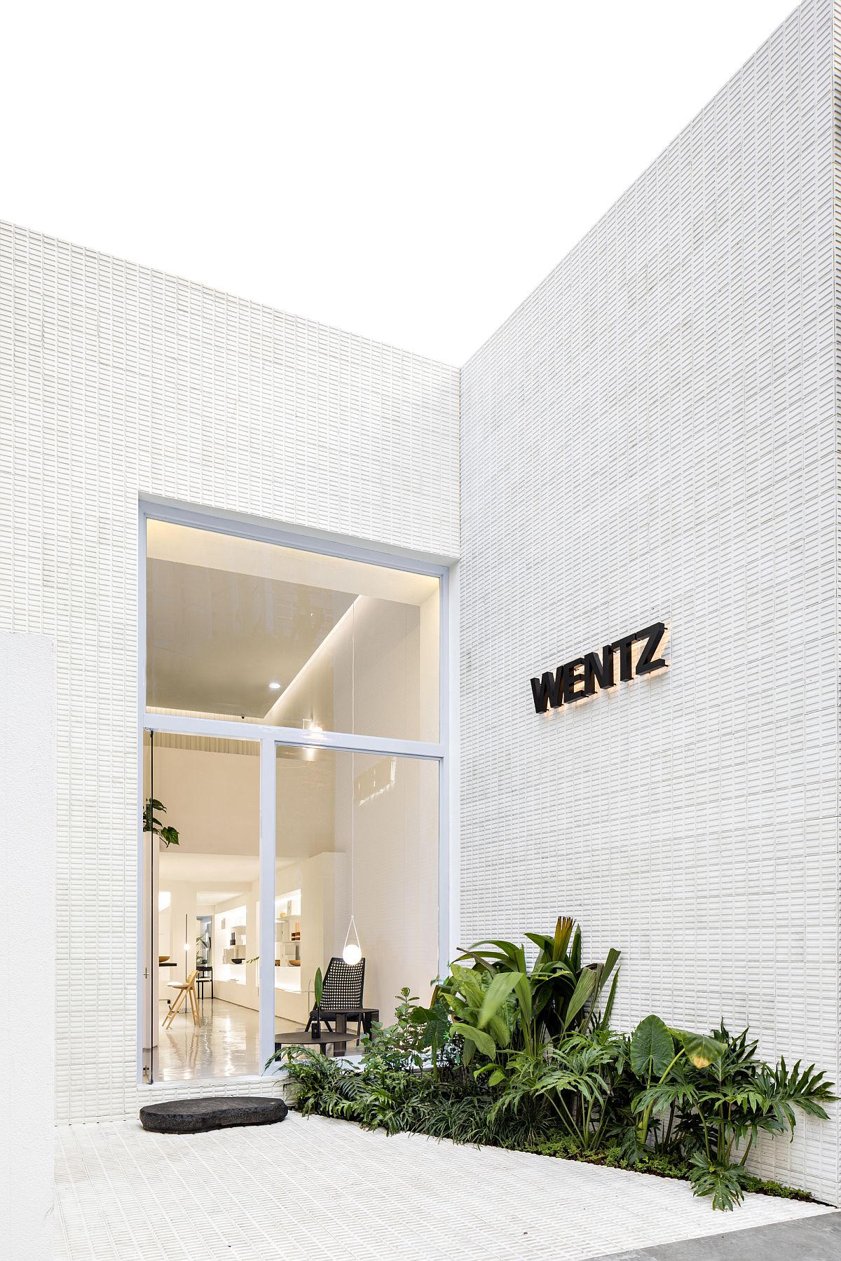
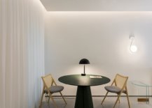
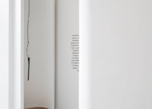
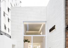
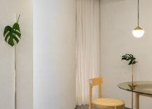
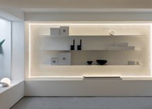
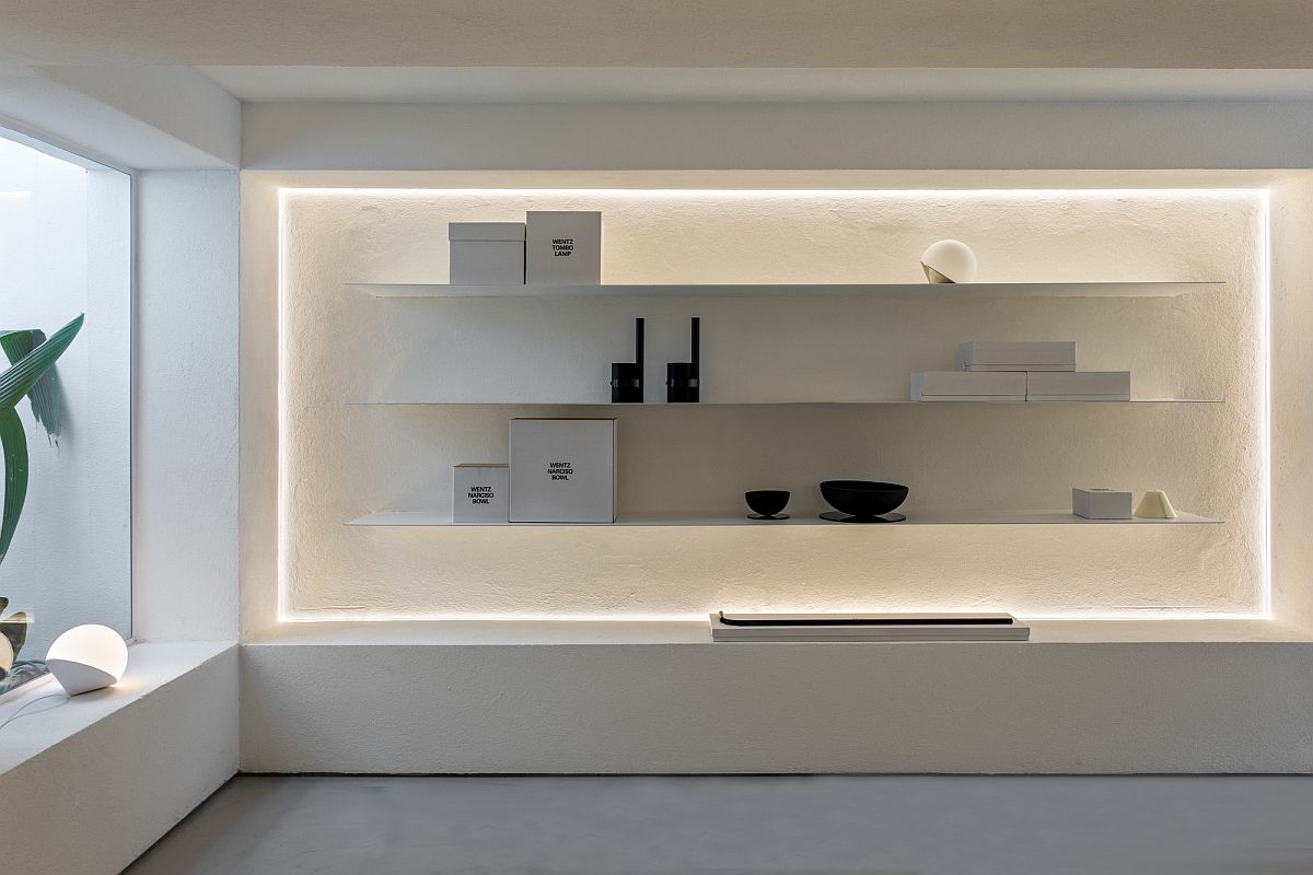
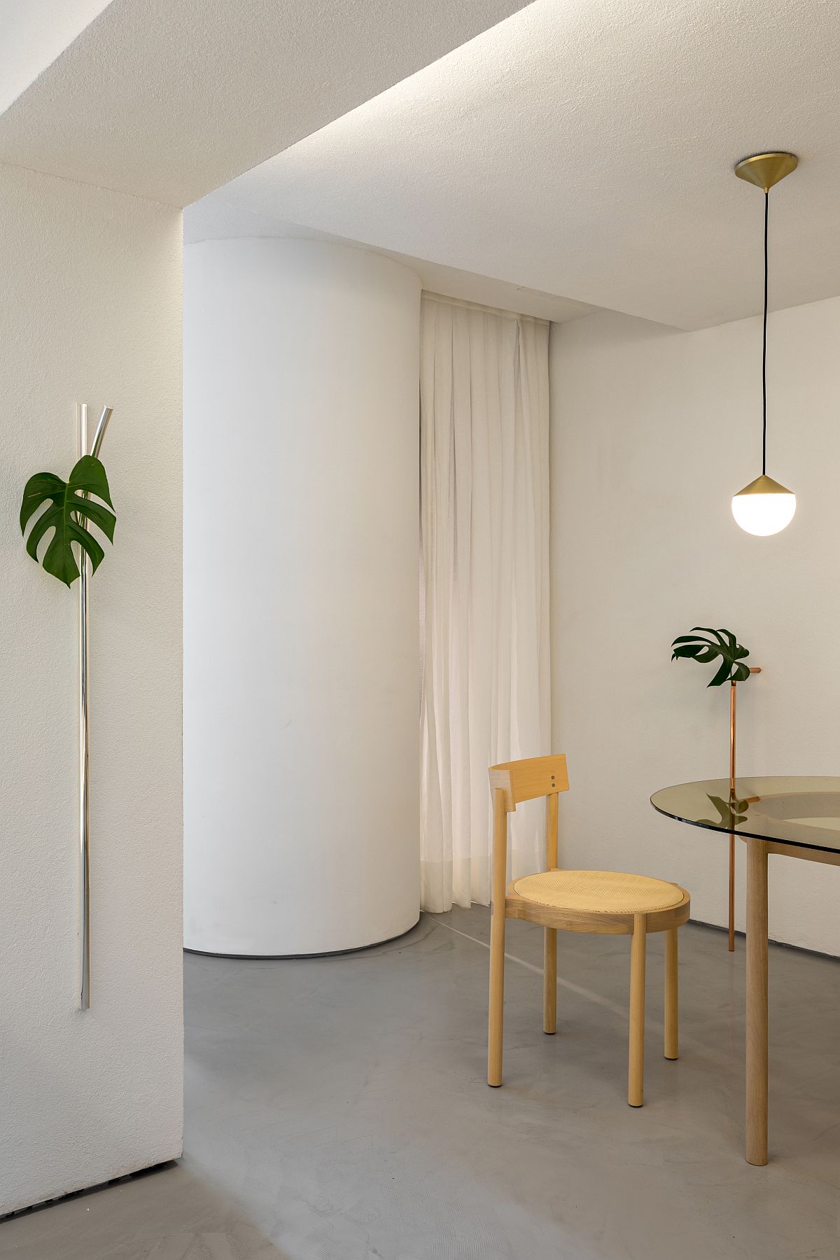
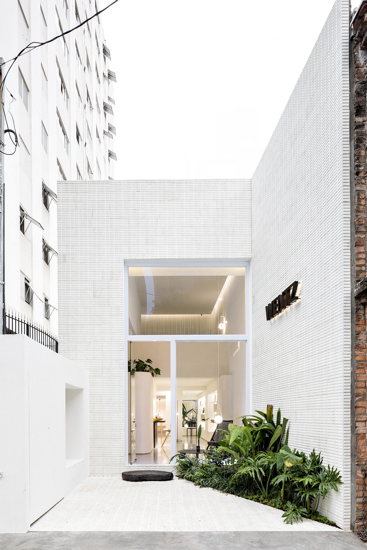
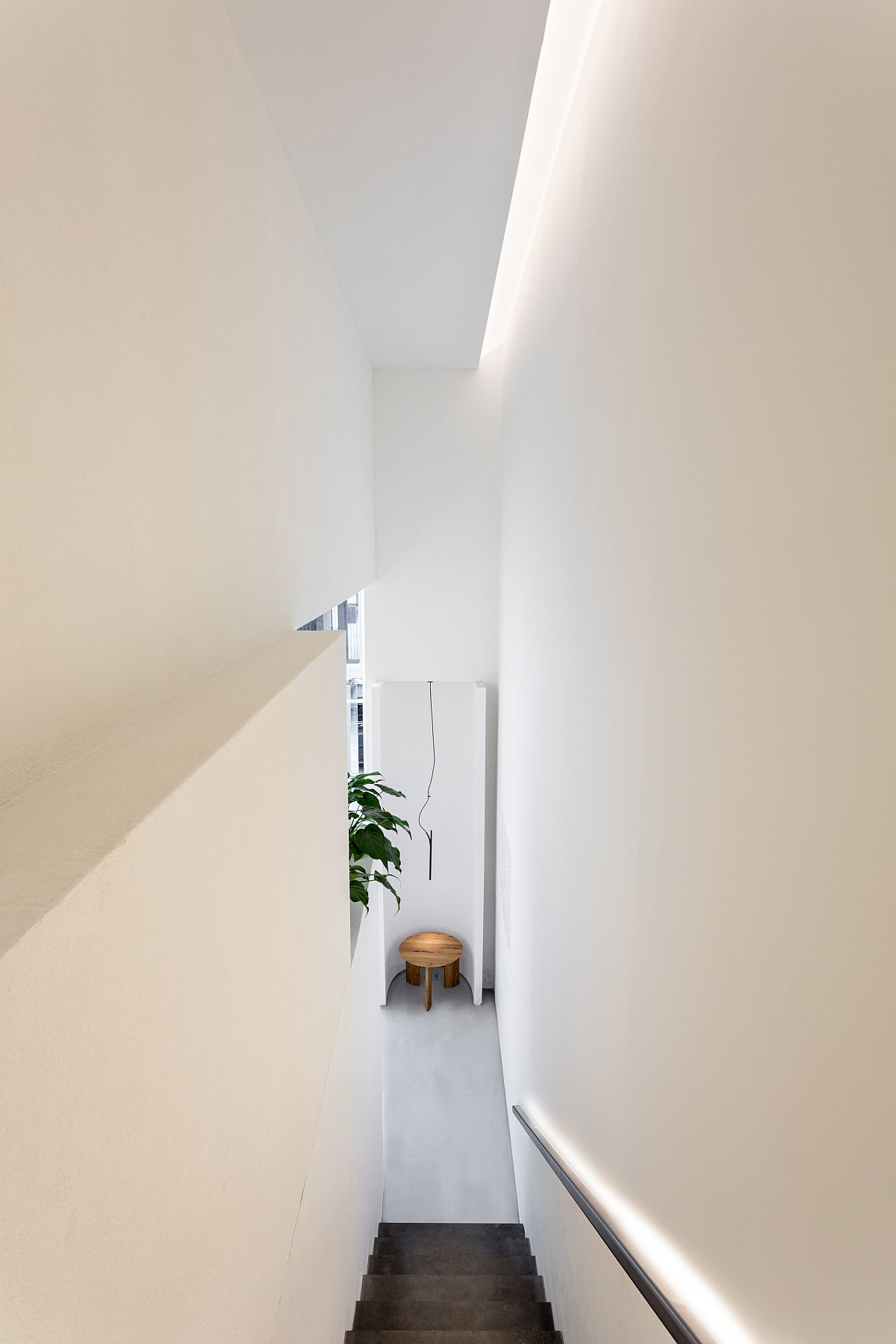
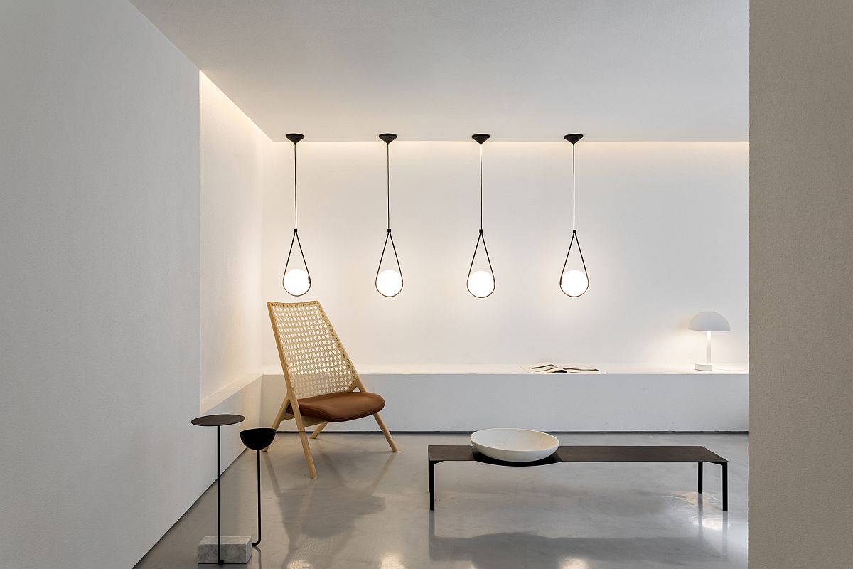
The new Sao Paulo concept store sits in a building that was once a two-story residential unit and the transformation is both practical and beautiful. An even layer of recessed lighting along with pendant lights welcomes you inside the store while and all-white, monochromatic backdrop ensures that every décor piece inside is perfectly highlighted. Each spaces feels special with a sleek staircase leading to the upper level and the mezzanine floor. A hint of greenery and gorgeous drapes complete this exclusive Brazilian outlet in an urbane neighborhood. [Photography: Fran Parente]

Entrance to the modern, revamped concept store Loja Wentz
Fabulous new Concept store for the designer Guilherme Wentz in Sao Paulo
Finding the right space inside the store to showcase the best decor collection
Greenery adds color to the neutral, monochromatic backdrop of the store in white
Lighting and decor collection inside the polished Loja Wentz store

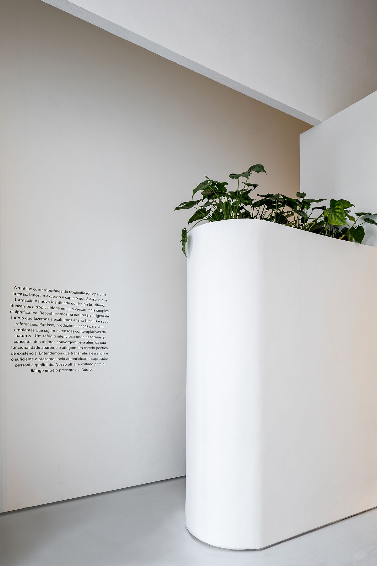
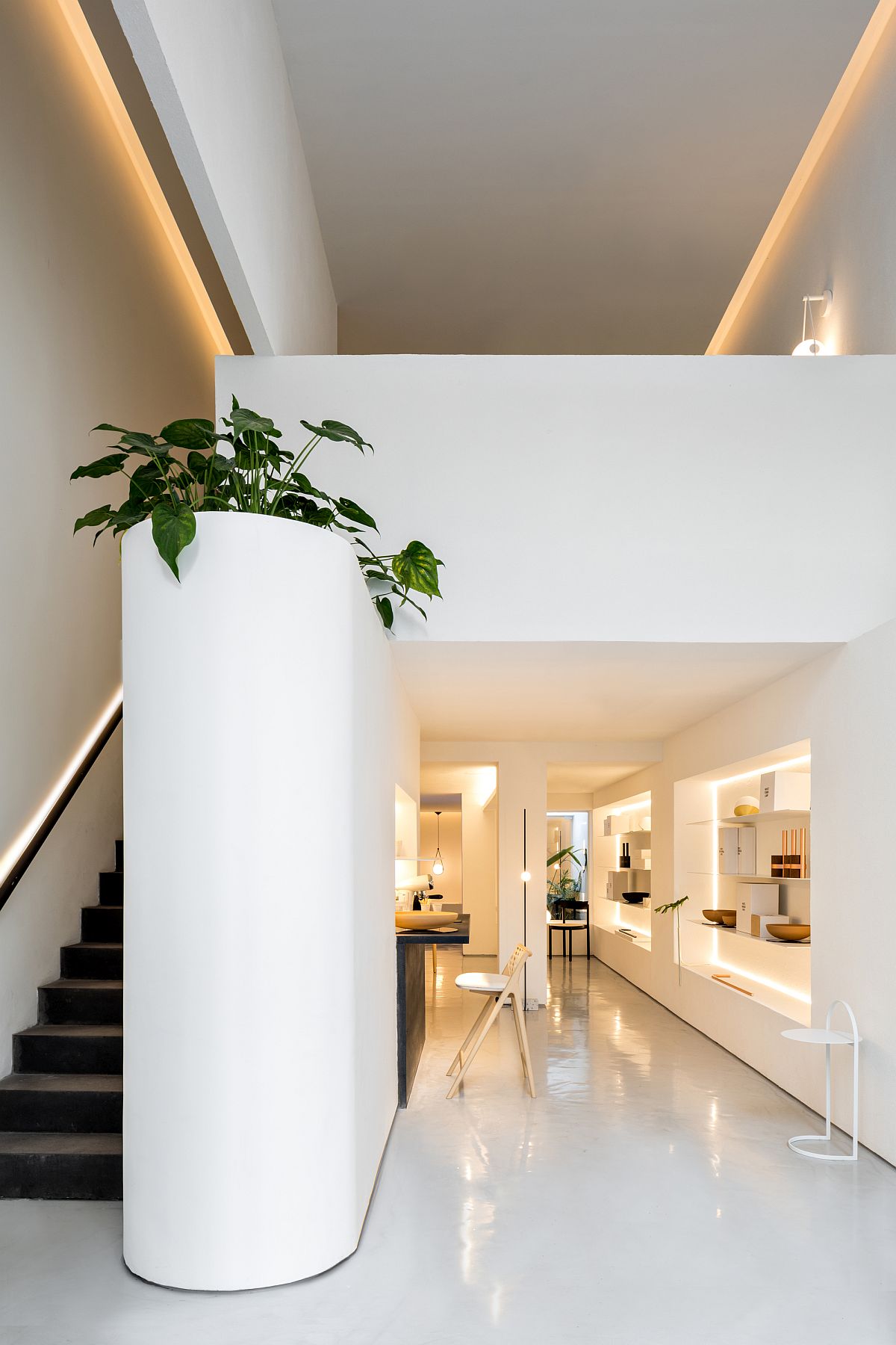
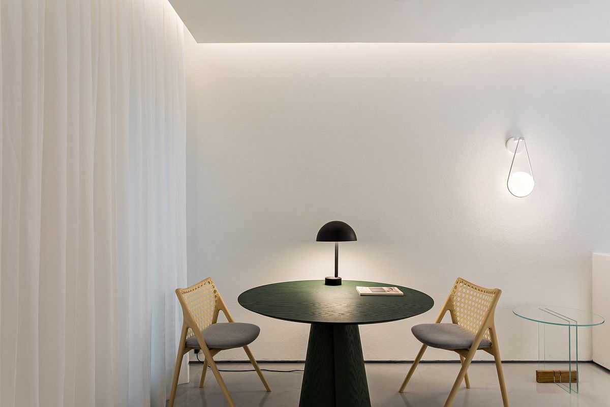
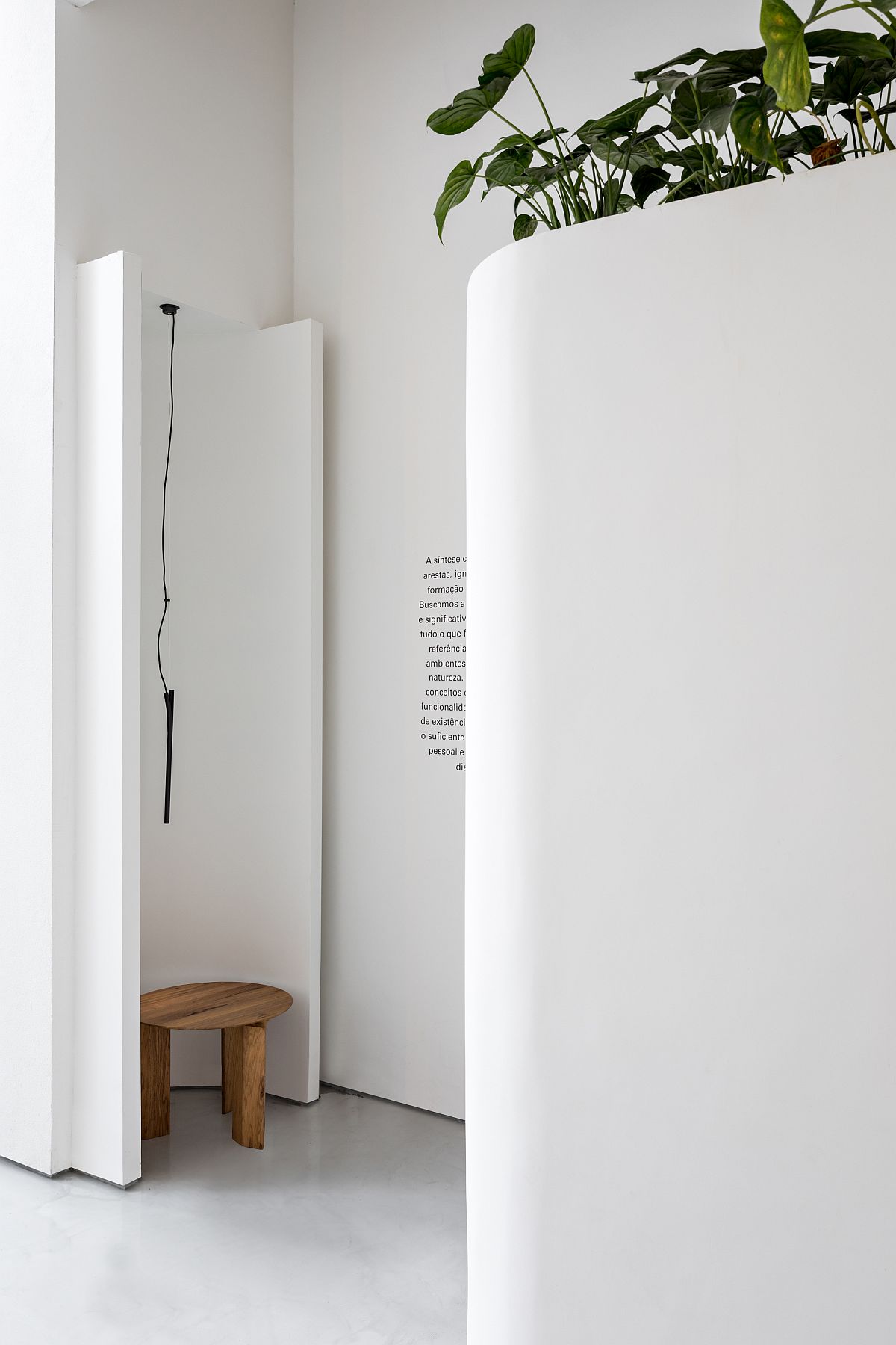
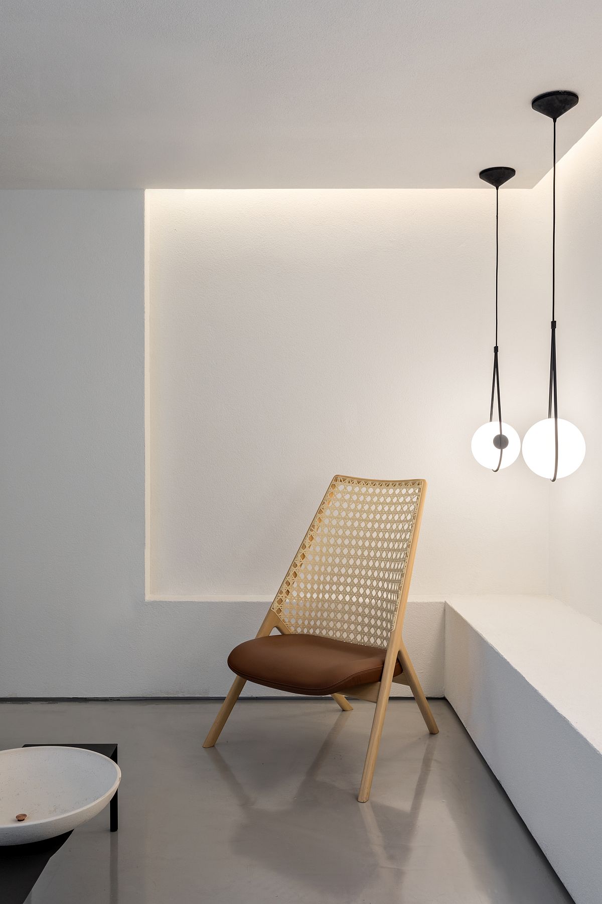
The store was built with the usage of few neutral coverings: hydraulic floor tiles at the facade, cement-based grouting for the floor, composition between textured and smooth walls to enhance volumetries. The lightning is diffuse, but also lights out the display spots in the store. The landscaping focuses on the essence that Wentz has: tropicality.

Lighting and white backdrop create a curated store interior
Loja Wentz Store designed by Felipe Hess Arquitetos
Protected and curated entrance of the store with its name and a monochromatic backdrop
Staircase in white leading to the upper level of the store with smart lighting
Curated interior of the concept store in Brazil showcases the best decor of Loja Wentz

You’re reading Polished Renovation Turns Two-Story Building in Sao Paulo into a Concept Store, originally posted on Decoist. If you enjoyed this post, be sure to follow Decoist on Twitter, Facebook and Pinterest.

Similar Posts

  • Westwood House

    Located in the Blue Ridge Mountains of Asheville NC with distant north views of Mt Spivey and a narrow sloping lot, this wedge-shaped home is a response to site. We took into careful consideration a variety of site-specific inputs including views, sun orientation, prevailing winds, privacy, and natural cooling/heating techniques among others. The result is a functional, energy efficient home with a distinctive exterior shape and warm light filled interior spaces. The home’s dominant shed roof maximizes solar orientation for photovoltaic panels while also allowing for a double-height central atrium to flood the core of the house with natural light and exhaust hot air on hot summer days. The introduction of natural light into the core of the house reduces the need for artificial lighting on cloudy days, while the chimney effect created by opening large operable skylights at the top of the atrium reduces HVAC loads by bringing cool air up from the basement. This central atrium is an example of how a design feature can multitask –it brings natural light deep into the core of the house, it cools the house using the chimney effect, and it provides a place to grow plants which filter interior air. It also allowed us to minimize the street facing windows for privacy while still maintaining a light filled interior. Anchoring the bottom of the atrium are four large arched openings and a Spanish terracotta tile floor. The tile floor is a durable surface good for watering plants and for heavy foot traffic. A keyhole opening marks the boundary between private and public sides of the house while two of the arched openings frame an intimate eating nook and entry foyer with walls covered in locally milled southern yellow pine. The last arch has steps spilling out into a sunken living room and kitchen area with access to a back deck. Locally milled cypress, a naturally rot resistant wood, covers the exterior and anchors the strong geometry of the house to the site. In the end, our desire for functionality created something more than just an energy efficient home. The interior took on an unexpected bohemian feel; one that originated from a desire for light and functionality, but resulted in warm soft interior spaces that were comfortable and welcoming.

  • Narrow Victorian Residence in Toronto Revitalized with a Practical Modern Makeover

    Giving old homes a new lease of life means transforming both the interior of the house and the exterior a swell. At times, architects and homeowners want to leave the street façade untouched while it is the rear section that is drastically changed. Nestled in a busy neighborhood of Toronto, Canada, the Northcote Renovation by […]

    You’re reading Narrow Victorian Residence in Toronto Revitalized with a Practical Modern Makeover, originally posted on Decoist. If you enjoyed this post, be sure to follow Decoist on Twitter, Facebook and Pinterest.