Say it with De-Light: Brilliant Kitchens with Fabulous Neon Signs

There are times when all we can talk about are colors, styles and hot trends when it comes to home decorating and design. Then there are occasions when we go down the less taken path and have a bit of fun with decorating ideas that feel whimsical and just plain fun. With the weekend almost here, we thought now would be the time to go down that playful road as we explore an idea that is once again becoming popular after several decades. There was a time when every city in the world was illuminated by fabulous, multi-colored neon signs which dazzled consumers and become an era-defining feature. Now is the time to bring these forgotten neon signs into your kitchen!

Color-filled kitchen in blue and pink with dashing neon sign


Neon signs might have lost their shine long ago when it comes to illuminating billboards, but they still can make for a real gorgeous addition in your own home. They can be easily found and ordering your own custom neon sign is all too easy. Some add color to the kitchen while others completely transform the space they adorn creating an eye-catching focal point. This is a look at the best kitchens with neon lights; a glittering display that will leave you spellbound –

Adding Color to Neutral Kitchens

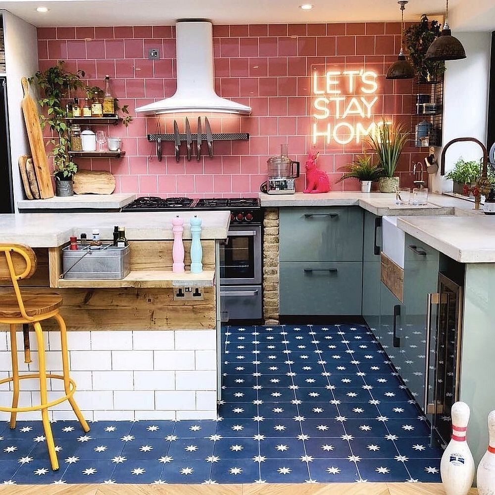
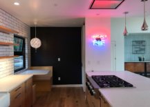
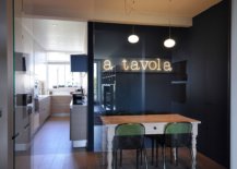
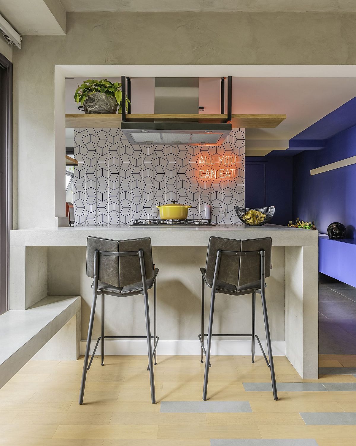
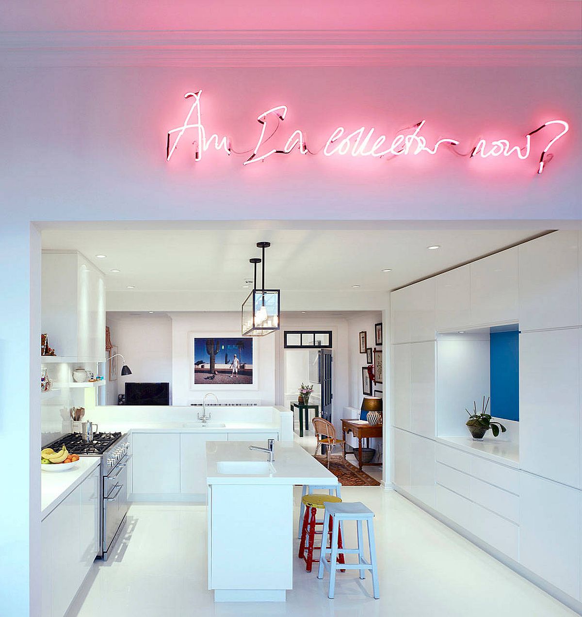
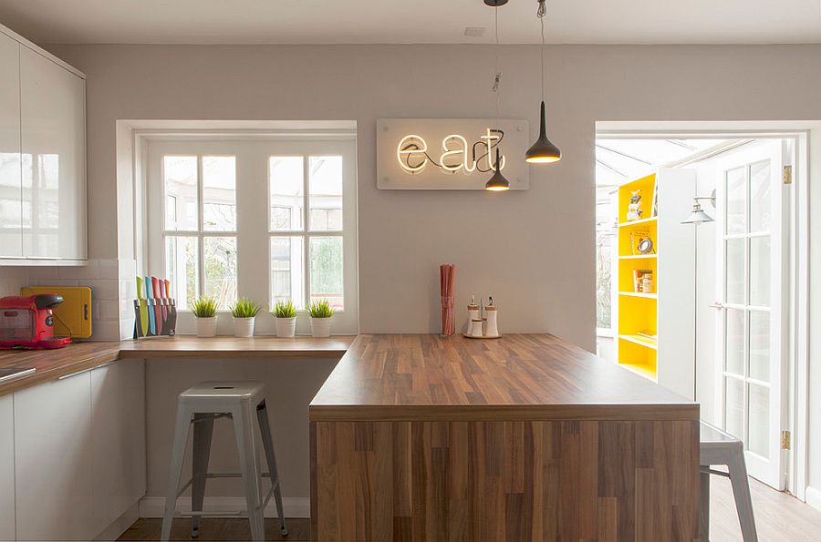
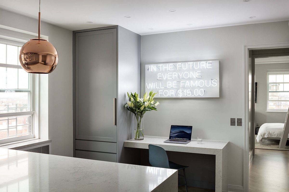
The modern kitchen is largely neutral with colors like white, gray and cream shaping the backdrop. This is understandably a convenient and easy choice to make as it allows one to switch between accent colors and styles with ease. But this room filed with neutrals does need a bit of pizazz at times and neon lights are great in this regard. Color the neon sign is not really of great significance in here and any color you like will work in the contemporary, modern or transitional kitchen. Make sure you choose a wall that get maximum attentions; preferably one opposite to the breakfast bar or is visible from the dining area and kitchen as well. This immediately uplifts the mood inside the kitchen and makes it a lot less formal!

Modern industrial kitchen with a neon sign that lights up the entire space [From: Coughlin Architecture]
Neon sign brings both color and pizazz to the small apartment kitchen in Brazil
Bright neon sign illuminates the kitchen and living area inside this white Chelsea apartment

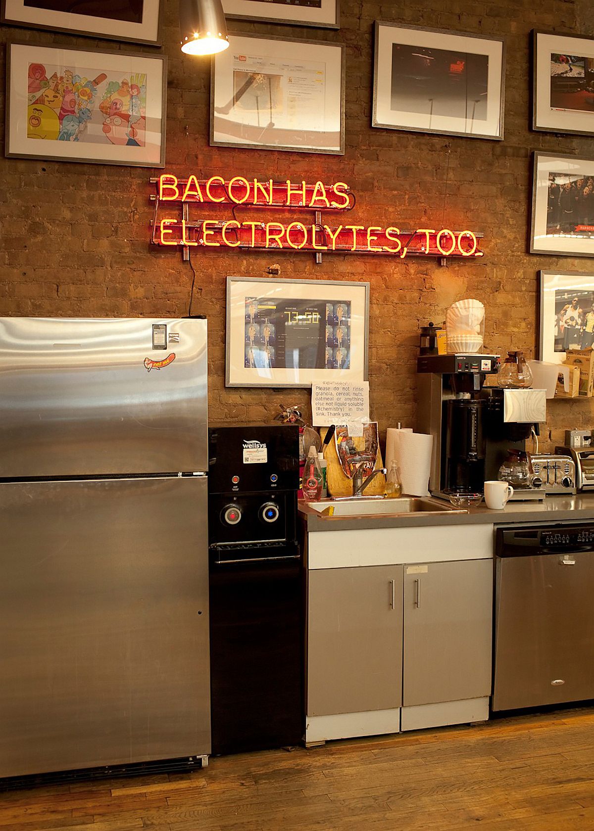
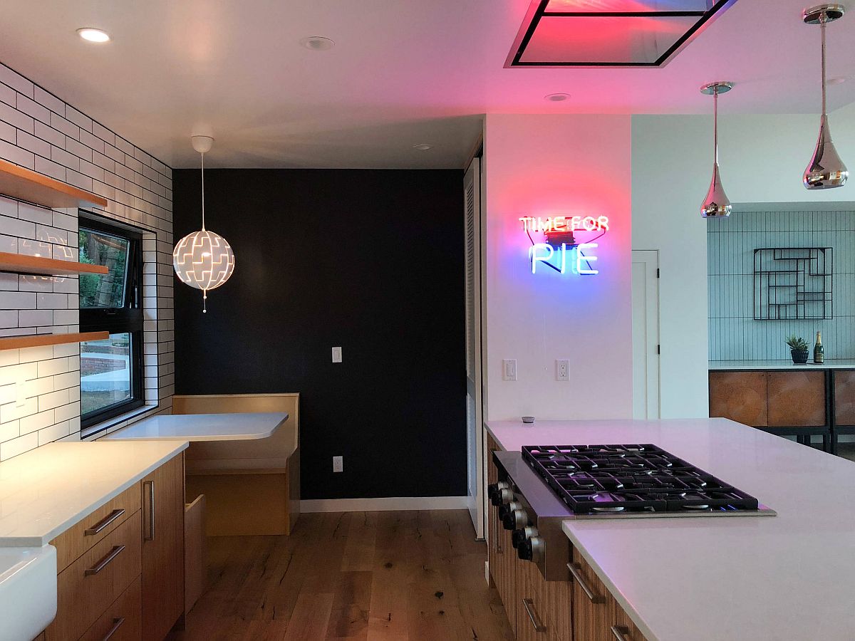
Express your Food Philosophy

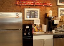
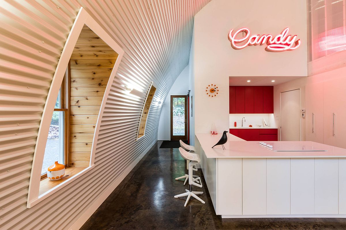
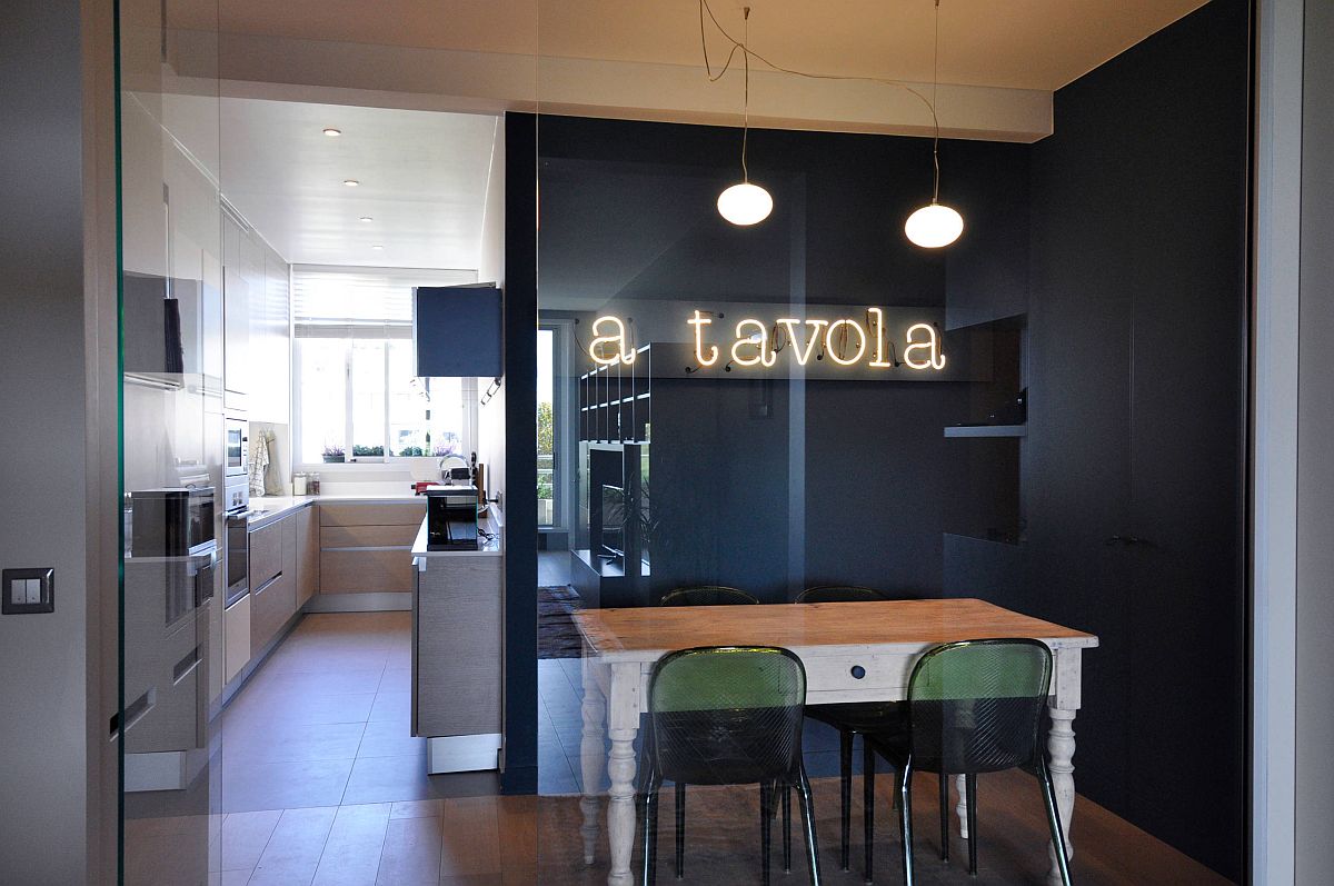
What is the one thing you love the most about fun neon signs? For us, it is surely the freedom it gives us in expressing what we want and to do so in a striking fashion. Do not stick the usual neon signs in the kitchen and go with one that truly says ‘you’. It could be something related to your views in life, a message or friends and family, your food philosophy or even just a general greeting to welcome everyone into your kitchen. Let those colorful lights make a real statement.

Express your food philosophy with a vintage neon sign in the kitchen
Dashing neon sign in the kitchen spells out ‘time for pie’ [From: Santa Cruz Green Builders]
Modest modern kitchen in gray feels far more brighter thanks to the neon sign [From: Cecile Bell interior design]

Lights and Neon Signs

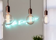
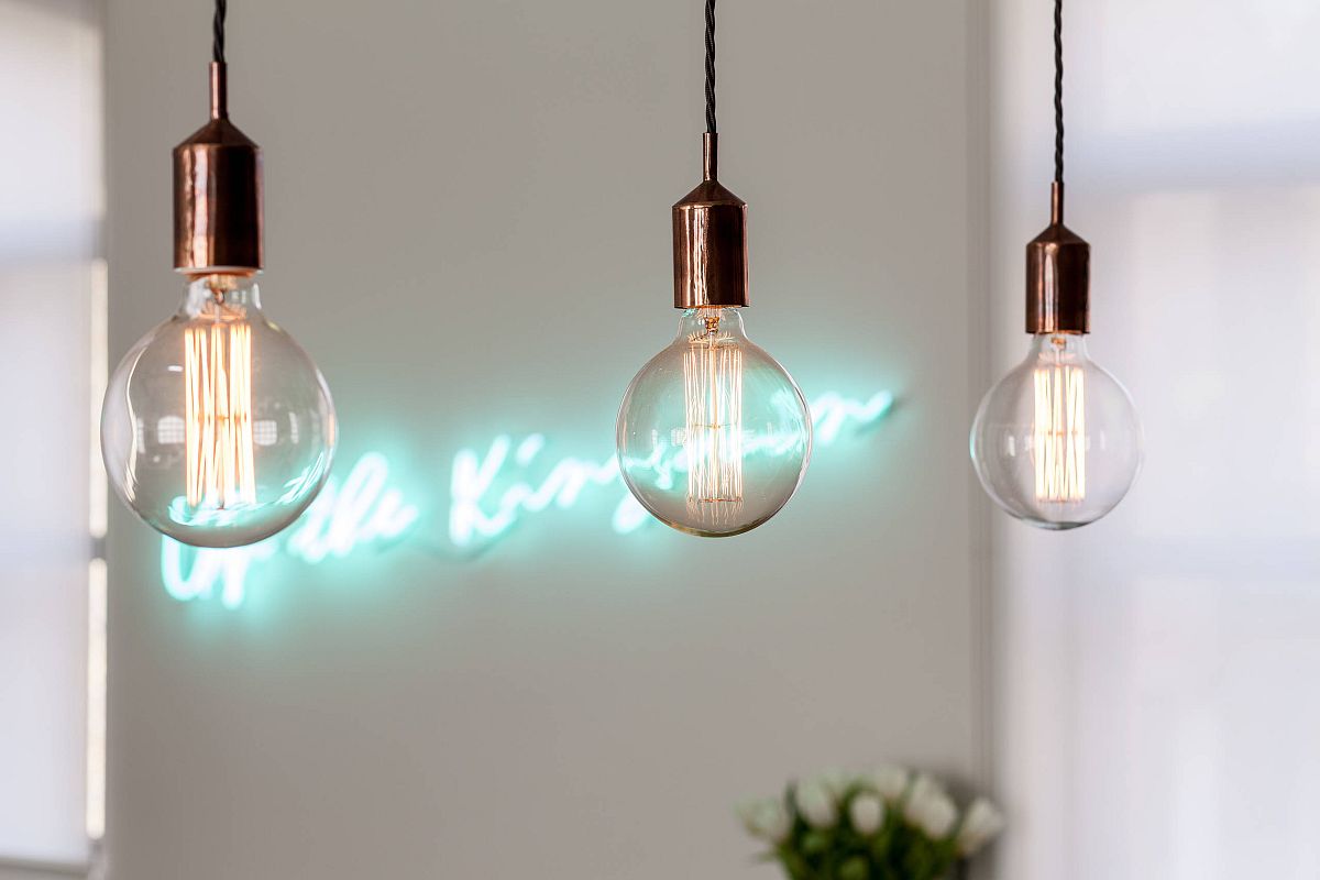
Neon signs are made are made by bending glass tubes and filling them with different gases that glow when electrified. Depending on the color one wants, different gases are mixed to create the neon sign. A staple in the advertising world till the 60’s, modern lights and LEDs quickly replaced them. Both those who still love a bit of vintage charm can combines these awesome signs with modern lighting to find a balance between both worlds. You will still need a balanced blend of accent and recessed lights for rest of the kitchen even as the dazzling neon sign steals the spotlight.

Edison bulb lighting combined with sparkling neon sign in the contemporary kitchen [From: Michelle Chaplin Interiors]
Contemporary industrial kitchen in gray with home workspace and a bright neon sign [From: Mike Van Tassell Architectural Photography]
Eat-in kitchen of Paris apartment with a gorgeous neon sign [[From: architecte d’intérieur]

You’re reading Say it with De-Light: Brilliant Kitchens with Fabulous Neon Signs, originally posted on Decoist. If you enjoyed this post, be sure to follow Decoist on Twitter, Facebook and Pinterest.

Similar Posts

  • A Fall 2019 Design Preview

    The fall collections are rolling in, and we’re liking what we see! New and ongoing trends are getting the spotlight, at times with a fresh and surprising twist. Today we unveil some of our favorite pieces in the 2019 edition of our Fall Design Preview, complete with new arrivals from brands such as CB2 and […]

    You’re reading A Fall 2019 Design Preview, originally posted on Decoist. If you enjoyed this post, be sure to follow Decoist on Twitter, Facebook and Pinterest.

  • Casa Haras

    1. How did you land the project and what was the brief? Initially the customers were looking for a house with volumetry that would hide the roofs, but the regulation of the condominium did not allow the use of flat slabs, nor a built-in roof. It would be our first house with apparent roofs. The required needs program and the size of the plot had the exact proportion for what we believed to be ideal for a single-storey house with plenty of open space for outside living, and so we did.
    Haras house came up as a pavilion installation consisting of 3 volumes: two parallels, with NE-SW orientation and a third perpendicular connecting with NW-SE orientation, as an “H”. The idea was based on the desire to have the central leisure area in the other spaces of the house, and with the proposed implantation, we were able to create two outdoor living areas: a main one with a deck and a swimming pool and a secondary area with a spa, a water mirror and a bonfire separated by the perpendicular volume and visually connected by the transparency of the sliding glass doors. 2. What was significant about the site? The land chosen within a stall in the interior of São Paulo, concentrated a number of positive aspects for the design of the project: views, large plot, solar orientation, generous setbacks, high soil permeability, no outside walls. 3. What was the overall design goal? The simple volume and purity of the gable roof in all 3 blocks of the house ended up contributing significantly to the harmony of the whole and to the desired country house aspect, which was further strengthened by the use of natural materials such as the stone coating on the gables of the walls and the use of the wood in the panels of doors and slatted of the facade. 4. What was the color pallet? The project explores in exterior areas the colors of natural materials such as the wood used in the slats of the whole facade of the house, the roof, also wood but with a shade of gray and stone walls. The contrast is quite striking with some internal areas, where the walls and white lining create a neutral and minimalist space. 5. What was particularly challenging? The main challenge of the project was to create a contemporary home using sloped roofs, in a minimalist architecture using natural materials. This challenge sought to coherently insert the project in the place that was built, a condominium in a stable – called “Haras” in Portuguese which gives the name of the house, with an air of farm in the interior of São Paulo- Brazil, a refuge for the tranquility at the weekends. 6. How does this project compare to other projects you have completed? This project differs from others for being a single-story house in a large terrain and with natural landscape around it. The fact that the house is single-story provided a widespread deployment in the land that generated direct relations of all the environments with the outdoor areas landscaped, which increased the sensation of the built space and strengthened the use of the external areas as a continuity of the built environment. 7. Could you please go into detail about a few pieces of furniture,including why these were selected? The pieces of furniture were selected especially for each room, proposing an integrating of the spaces. The sofa in the living room, for example, integrate both spaces, the fireplace and the outside gardens. The mix of materials is certainly a charm in this project. In the dinning room, the wood dinning table signed by the Brazilian designer Theo Egami contrasts with the metal chairs feet by Fernando Jaeger. 8. Could you please go into detail about a few fixtures, including whythese were selected? The lighting is mostly made by points of indirect light, creating a more intimate look in the house. In the social central pavilion, spots were used facing the wood lining, creating a light effect on the wood. Some interesting pieces have been used in specific spaces, such as in the kitchen, hanging with the exposed wiring that run through the wall and ceiling until they reach the bench and lavatory point, where the architects used hydraulic copper pieces to create a luminaire exclusively to the project. 9. What did you intend to impart with the rooms and how are theydifferent from each other? The flat distribution of the house program gives all rooms and environments a sense of continuity beyond the limit built, since all have direct visual relation through glazed sliding doors with more than 1150 m² of free ground and high permeability index of the ground, have secured a generous area for landscaping that embraces the house by the front, side and back indents, and advance through the central core. The differences between the rooms are related to the user, 1 double suite fully integrated with the bathroom, which has a glazed shower facing the bedroom. There are two other similar suites, also with double beds, but to receive guests in the house and finally the children’s room, a suite that has two large beds that can be shared.