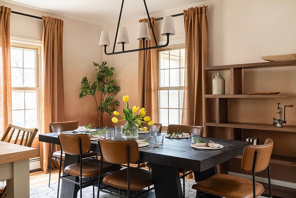
Ever wonder why everyone’s talking about color capping lately? This rising trend is popping up in designer spaces everywhere, adding a fresh edge to classic rooms. It’s an easy way to make a big impact with color—without overwhelming the space.
What Is Color Capping?
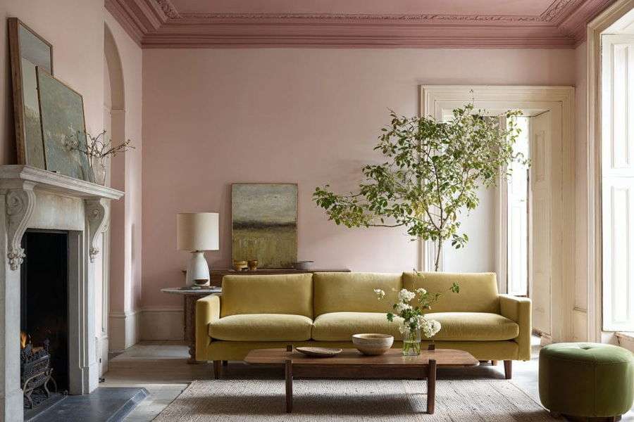
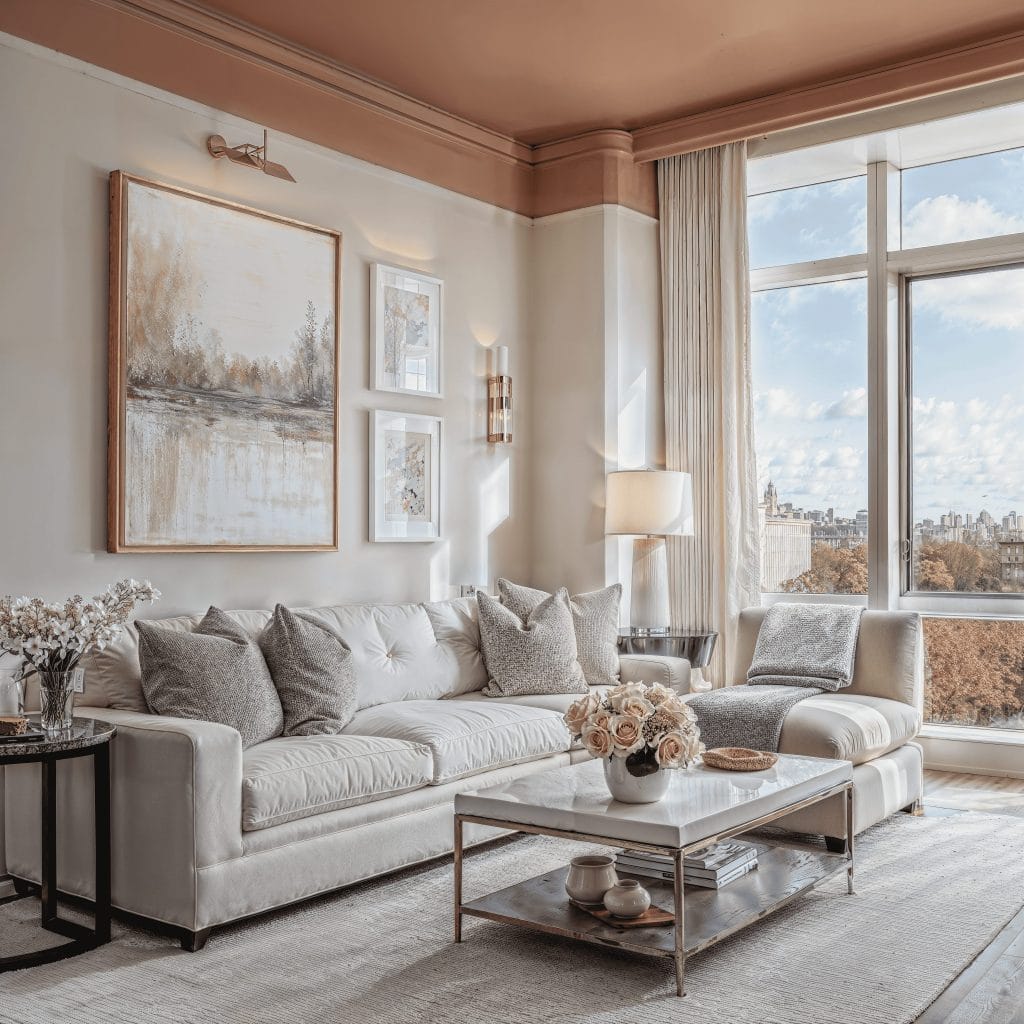
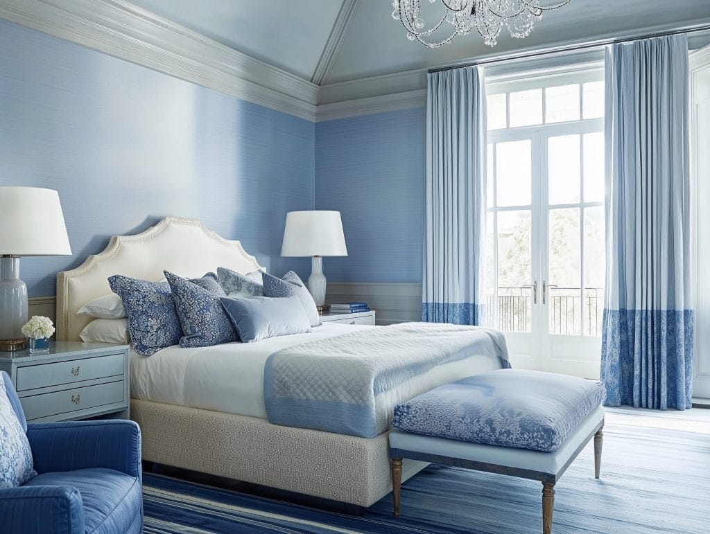
Color Capping is a tonal painting method that creates a gradual shift of color from the ceiling downwards. The change in tone from light to dark draws the eye upward and makes the ceiling a prominent feature. The effect works in both small and large rooms. In compact, stylish spaces, the gradient makes the room feel more open. In larger rooms, the tonal layers add visual rhythm.
Color capping usually starts with the lightest hue on the main wall surface. A medium shade sits just below the ceiling like a soft frame. The darkest tone finishes the look overhead, creating a layered tonal effect. However, the technique works in reverse as well, with the walls carrying the darkest tone. Each approach produces a smooth gradient that alters the perception of the room.
Pro Tip: Trying to find the right look for color capping your interior? Try our Free Interior Design Style Quiz to discover your ideal style today!
Designer Tips to Pull Off the Color Capping Look

Color capping provides a creative way to experiment with tone and shape. It works across styles and can be simplified with the right plan. Here are five color-focused strategies designers use to achieve a polished paint effect.
1. Choose a Strong Color Family for Confident Color Capping
The heart of color capping is a set of elegant shades that belong together. Pick one color family and choose at least three tones: light, mid, and dark. Mauve, olive, dusty blue, sandy beige, and warm clay tones all work beautifully because they offer enough variation for a subtle yet noticeable shift.
Sampling matters here. Place swatches on the wall, stacked vertically in order so that you can see the gradient before painting. Avoid choosing shades that are too close together. If the difference is barely visible, the effect will likely fall flat. However, do not choose tones that feel unrelated either, or the gradient can look abrupt. Always aim for smooth transitions.
Design Tip: Check your swatches in morning light, midday brightness, and evening shadows. This ensures the selected tones stay connected throughout the day.
2. Use Clear Divisions to Define Your Layers
A clean line between shades gives the effect a tailored appearance, especially between walls and the ceiling. Tape off each section carefully to keep edges crisp. Consider where the shade breaks should sit; the placement influences the mood of the entire room. A lower division about a third of the way up feels grounded and calm. Conversely, a higher middle line feels dramatic and modern.
If your walls have molding, picture rails, or built-in lines, use them. Architectural features make perfect boundaries between shades. They also help the design feel like part of the room.
Design Tip: Placing the mid-tone higher makes the ceiling color feel richer.
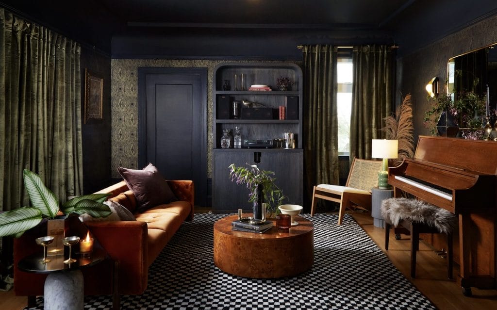
3. Let the Ceiling Play a Starring Role

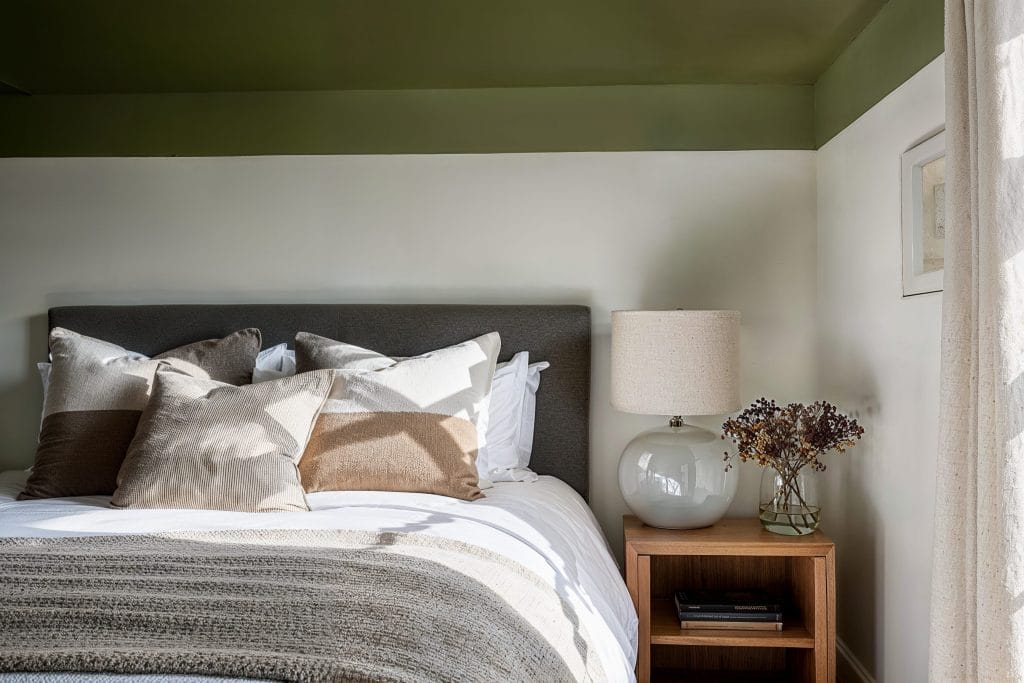
One of the most distinctive parts of this technique is that the ceiling is not left white. Instead, it becomes the darkest point of the gradient. This gives the room an unexpected twist and creates a top-heavy finish that feels daring but controlled.
In addition, painting the ceiling the richest shade makes the tonal transition smooth from floor to top. The darkest color overhead forms a visual cap, which is where this technique gets its name from. It also shifts how light bounces in the room, adding dimension without relying on heavy décor.
Design Tip: For rooms with sloped ceilings, beams, or angled corners, let the gradient flow seamlessly with the room’s structure.
4. Try Calm, Earthy Shades for a Relaxed Color Capping Effect
Earth-inspired tones work especially well for color capping because they transition naturally. Sage, clay, muted terracotta, olive, sandy caramel, and stormy blue all shift comfortably from light to dark. Their base notes help keep the space balanced, even with stronger upper tones.
These colors pair nicely with natural textures such as wooden furniture, stone accents, or woven pieces. The combination gives the gradient a grounded look without feeling heavy. It also produces an expressive tonal effect.
Design Tip: If you want a serene finish, keep the lowest shade soft and airy. Let the darker shades get richer as they rise.
5. Use Lighting to Enhance Your Shades
Lighting makes a big difference in how color capping appears. The gradient can look smoother, sharper, softer, or more atmospheric depending on how the light hits each shade. In rooms with bright natural light, the lighter sections shine, and the darkest shade creates a striking contrast above. In dim rooms, choose mid-tones instead of ultra-dark ceilings so the gradient stays visible.
Layer your lighting, too. Wall sconces, warm bulbs, or directed ceiling lights help highlight the shifts in tone. Because color capping changes as the day passes, it offers an always-evolving visual experience.
Design Tip: Opt for dimmable light options. This lets you control how dramatic the upper tones look at night.
Ready to Embrace Color Capping in Your Home?
Consider hiring a professional interior designer to help bring the look together. Book your Free Online Interior Design Consultation to start your project today!


