Designed to Frame the Views | G’Day House

The G’Day House is a commission for an Australian ex-patriate family, who requested a home that would support a relaxed attitude toward daily life and would help them re-connect with a warm-weather lifestyle. Column-free sliding doors at the Southeast corner of the house effectively double the size of the living area when open; indoor and outdoor spaces hold equal priority.

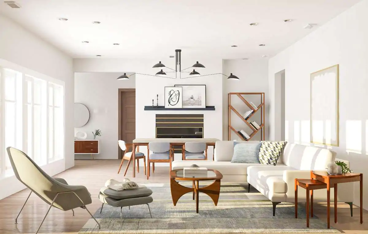
Materials, form, and spatial relationships are intended to evoke the feel of a beach house: simple, casual and flexible. The dining table and wood-burning fireplace can both be rotated to support a variety of arrangements depending on weather and number of guests.

As avid hosts, the owners felt that the kitchen should anchor the primary living spaces at the upper floor. Combining the dining room and kitchen into a single long space allowed for a narrow floor-plate and resulted in a generous side-yard area, used for outdoor cooking.

A reflecting pond and fence at the scale of house connect this space with an open terrace to the South and an enclosed garden to the North while creating privacy to the street. This sequence of outdoor spaces from the front yard to terrace encourages the direct exterior arrival of guests to the kitchen.

Credits:

Project: G’Day House
Location: West Vancouver, Canada
Designers: Mcleod Bovell Modern Houses
Floor Area: 409 sq. m
Site Area: 731 sq. m
Year: 2016
Photographs: Ema Peter

0:00 – G’Day House
1:43 – Vista deslumbrante
5:54 – Espaços privados
9:46 – Drawings

Similar Posts

  • The Leichler

    Photographer: Scott Hargis
    Architect: building Lab Our clients were young newlyweds who purchased this property in October, 2015. They were passionate about mid-century designs and all things retro and they had grand visions for their first home. They wanted it to be a standout in the neighborhood where they could entertain family and friends in style. After a thorough whole-house remodel and expansion with structural and foundation upgrades, the homeowners, who welcomed a new member (a baby boy) to the household, are now living in a completely transformed modern beauty with sleek and comfortable interiors and spacious outdoor areas. To Open or Close? We removed some walls and created an open and enlarged kitchen. To allow for maximum connection of the kitchen/dining area to the backyard, an existing post was removed and ceiling joists were extended to connect with a structural fascia. But instead of leaving a vast amount of common areas, we coopted some of those spaces to create an additional guest room/study. The same theme of openness and definition applies to the landscape design: low walls, hardscapes, outdoor kitchen, and fire pit define spaces for cooking, al fresco dining, play, and lounging. A Dining Pod
    In a bold stroke, our clients decided to forgo a formal dining area. Instead, they opted for a glorified eat-in kitchen with custom built benches and live edge waterfall table. This pod continues the strategy of capturing and articulating special areas within a large open concept. It is the core that serves myriad functions such as dining and entertaining, newspaper reading, and possible homework station in the near future. Master Pavilion A House Within A House: Instead of just expanding into the backyard horizontally, the ceiling of the newly created master suite was raised 4’. Since the addition called for reframing and building new foundations, building Lab’s designers made use of the opportunity to rethink the whole concept of this parents’ retreat. By raising the ceiling, and adding a long skylight above the head of the bed, the master bedroom is dramatically infused with natural light. The space feels expansive and tranquil, and this feeling is carried through in the master bath. The simple elegance of the master bath is achieved through both effective space planning and restrained material palettes. Most of the fixtures and cabinetry are installed on one side of this very long room. The walls on both sides are clad with Resysta®, a sustainable material made with recycled rice husks, salt, and mineral oil. The natural wood look of this cladding adds to the spa ambience and the entirely glass end wall creates a dramatic one-point perspective. All white console sink, cabinetry, and a sculptural tub complete the look.

  • Rundown Apartment from 1914 Renovated to Showcase its Rich Textural Beauty

    Most Moscow apartments that we have seen till date seem to embrace a certain posh, modern minimalist style that feels both sophisticated and purely contemporary. Yet, this gorgeous little apartment inside a building built originally in 1914 moves away from this more popular regional trend and embraces its traditional bones gleefully. The 85-square meter apartment […]

    You’re reading Rundown Apartment from 1914 Renovated to Showcase its Rich Textural Beauty, originally posted on Decoist. If you enjoyed this post, be sure to follow Decoist on Twitter, Facebook and Pinterest.