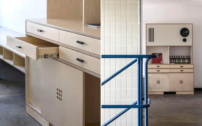
As a lifelong fan of audio solutions that blur the line between furniture and audio components – think designs like Dieter Rams’ Braun L-2 or Bang & Olufsen’s Beocenter system series – I became immediately enamored by Refynd Studio’s Speaker Shelf system for its timeless presence, one that seems every bit 1930s modern as it does 2020s contemporary. The one-off audio cabinet was designed specifically for Der Stuhl Café in the neighborhood of Yeonhee-dong in Seoul, Korea as a multi-purpose bar and sound system. Only after reaching out to the studio did I learn my initial inclinations were not completely unfounded, with the cabinet’s austere design credited to the historical facades of old European architecture and the “free spirit of the Bauhaus.”

During my stint as a toy designer years ago, I remember how often LEGOs were referred to as “the most perfect plaything ever designed” within the industry. What’s amazing is not only have the modular block toys remained relevant since the 1930s, but they’ve been able diversify their scope and appeal to include everything from the entomological, architectural, to the astronomical. The brand’s Technic line is aimed at adults, sets with bafflingly accurate detailing. And I have to admit to some trepidation starting to assemble the intricately accurate model of the Yamaha MT-10 after a long LEGO sabbatical. But as someone who subscribes to “slow and steady wins the race” I’ve come to appreciate any time with the set as a sort of meditative stress reliever. I work on it for a few minutes here, a few minutes there whenever time permits, allowing for a quiet singular focus that is so sadly fleeting these days. Eventually I will be able to display the results upon my shelf to admire or use the LEGO Technic AR app to bring it to life, but as fast as this motorcycle might be IRL, I have to admit I’m in no big rush to piece together the 1478-piece replica.
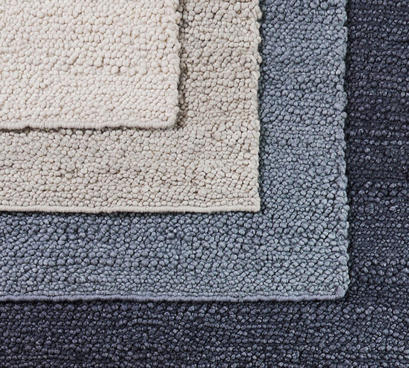
When we moved into our new home last year, we initially considered replacing the original 1960s wood flooring in our living room, noting the years had not been so kind to certain sections used and abused by a pet household. But after crunching the numbers, we decided the easier and more affordable route would be to cover it with a large rug. I knew I wanted something neutral and understated for now, but also hoped for floor covering with a textural quality that would feel good underfoot. I discovered the same company responsible for the mattress we sleep upon has surprisingly begun offering rugs also, handcrafted wool and polyester rugs marketed for the bedroom. But the organic modern Navi rug is exactly what I was hoping to find for our living room, especially for its nearly perfect 10′ x 14′ dimension. The Navi’s pebbled texture is understated aesthetically – mirroring the tiny pea gravel found in our yard – but much more pronounced as a tactile experience, a feature we’ve come to appreciate underfoot or while laying across its hand-loomed expanse. One day we’ll replace those warped wood floors, but for now we’re happy how this rug really does tie the room together.
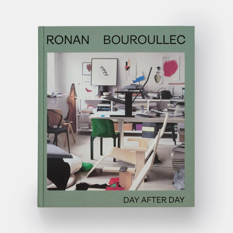

If you, like me, believe the journey is more interesting than the destination, then you’re the ideal candidate to appreciate this upcoming 456-page tome from art and design publisher Phaidon dedicated to the visual archive of prolific French designer, Ronan Bouroullec. While Ronan is intrinsically tied to his brother Erwan in name and creation, each also operate as unique wellsprings of creativity on their own, something this upcoming hardcover title puts clearly into the spotlight in chronological format. The book reads sort of like the earliest days of social media when documentation was the primary impetus for sharing images, a colorfully rendered and captioned timeline of the designer’s life, work, and inspirations. This 3,000 image “feed” just happens to be in book format, and belongs to one of the most famous names in design. Yet, you might find yourself wishing there was a “like” or “share” button while thumbing through its pages.
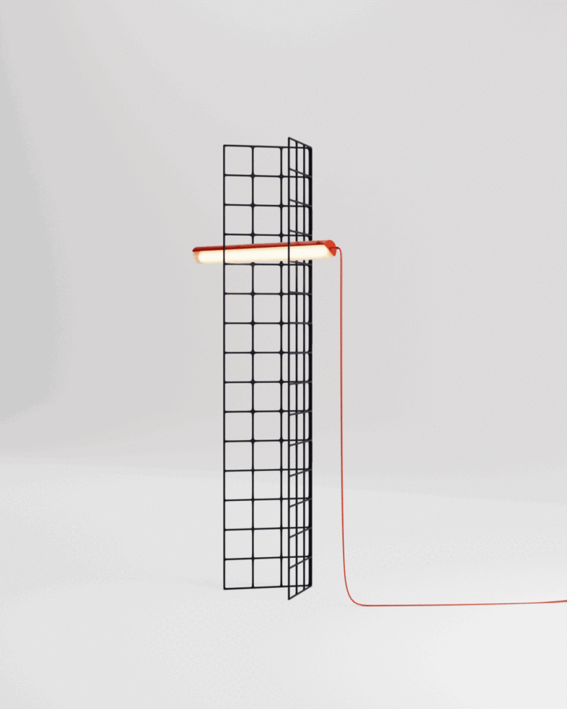
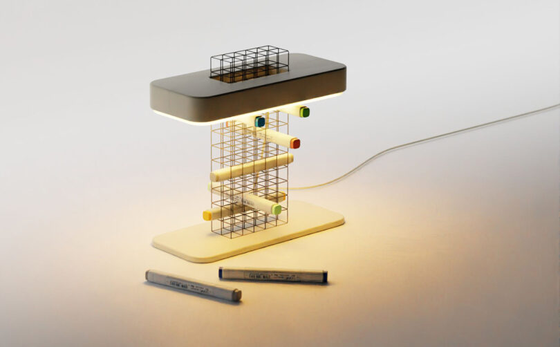
You could say it was love at first sight/light. I’ve become totally enamored by architect and product designer George Chacko V’s (aka Design by Joffey) modular lighting and organization concept, a modular metal wireframe system that exists at the intersection of lighting and storage solution. The possibilities seem endless in its configuration and storage applications thanks to the open grid form. Admittedly, I think there’s also something a bit 80s retail display about the airy wireframe grid design, but I mean that in the most nostalgic-positive way.
This post contains affiliate links, so if you make a purchase from an affiliate link, we earn a commission. Thanks for supporting Design Milk!

