Unable to expand due to local planning restrictions, a couple ask Shands Studio to make their Fairfax residence feel sunny and streamlined.
When a California couple decided to renovate their modest home, which was built in 1923 and last renovated in 2006, they initially hoped to create an addition with a dining space and larger kitchen. The residence, however, is tucked into a hillside in a wildland-urban interface area—a place where homes and natural vegetation meet—in Northern California. Consultation with the local fire department revealed they would have to pave and widen the long gravel street for any expansion to be approved, which would have pushed the project cost too high.
| $110,090 Labor |
$3,450 Electrical Fixtures |
$10,375 Plumbing Fixtures |
| $33,170 Cabinetry |
$7,390 Windows & Doors |
$22,250 Countertops & Tile |
| $15,000 Appliances |
$4,000 Entry Canopy |
$26,500 Architecture Services |
| $375 Consultants |
||
| Grand Total: $232,600 | ||
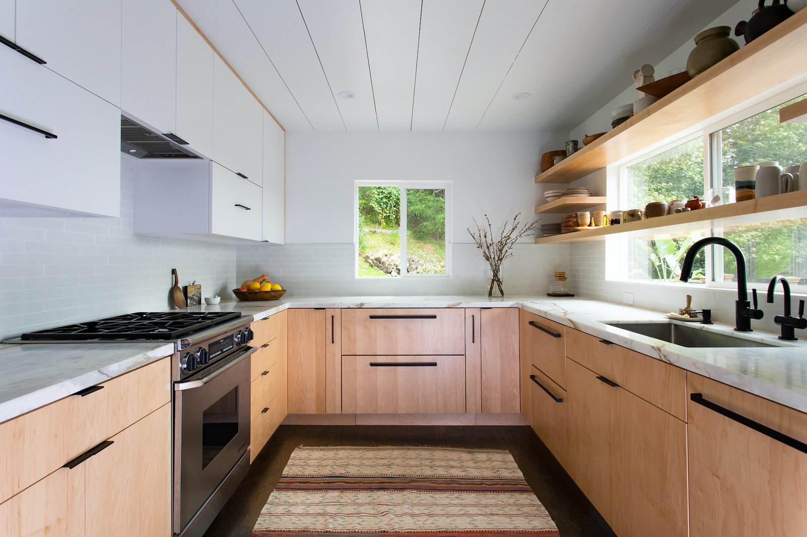
Instead, the renovation by Shands Studio focused on bringing more light into the interior and efficient use of space to transform the kitchen, living room, and two bathrooms, as well as replacing the entry awning.
“The clients were drawn to Georgia O’Keefe’s home and studio, which they had visited outside Santa Fe, New Mexico,” says Barbara Shands. “They were interested in how the minimalist spaces were softened by the wood, furnishings, and textiles. This informed the design ideas for each space where clean lines are balanced with the texture and color of materials.”
This approach formed a backdrop for the clients’ collection of textiles and objects, accrued during their extensive travels. “It was important to them that the renovation be complemented by these items,” says Shands. “They provide character and contribute to the overall aesthetic of the home.”
Before: Entrance
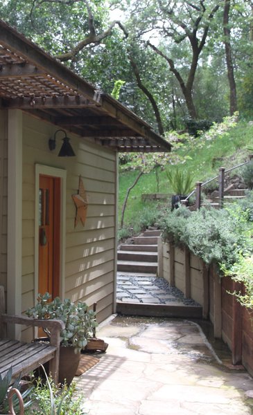
The site is located in Fairfax, California, at the end of a dead-end street. Set in a forest with views to the north, its natural surroundings provide a peaceful retreat from daily life. The steep hillside and narrow driveway made access for construction challenging, and the number of vehicles on site had to be restricted.
Shands Studio
After: Entrance
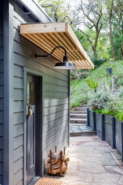
The entrance to the home was painted in a uniform, dark blue-gray to visually unify the different elements and make it more contemporary. The existing latticed timber awning was exchanged for a more minimal, robust awning that provides shade and shelter from the rain, and the light fitting above the door was replaced.
Daniel Blue Photography
The clients are an active couple that love the outdoors. The one-acre property, which has a ridgeline view to the north, is very secluded and provides ample privacy for outdoor living. The property also has easy access to numerous hiking and bike trails. As part of the renovation, a discreet outdoor shower was added to take advantage of the hot summers and offer the opportunity to rinse off after hiking.
Before: Kitchen
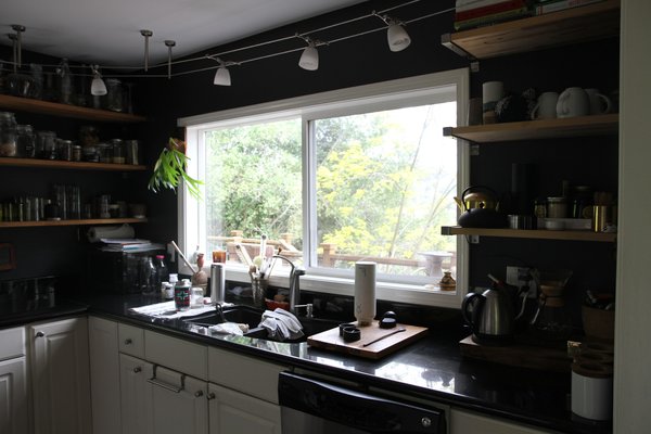
Since most of the windows face north, there was not a lot of direct sunlight, resulting in a dark interior. Storage was another concern, as the existing kitchen and bathrooms did not offer a lot of storage space.
Shands Studio
See the full story on Dwell.com: Budget Breakdown: A Murky 1920s Home in California Is Leveled Up for $232K
Related stories:
- An Introspective Brick Home in Mexico City Wraps Around a Jungle-Like Courtyard
- An Elegant Backyard Pavilion Lets an Australian Home Soak Up the Sun
- Before & After: An Eco-Friendly Family’s 400-Square-Foot Cottage Teems With Plant Life
