Architect Eran Chen established ODA in 2007, and has earned a reputation for designing mold-breaking structures meant to deliver a better urban future. In the past decade alone, he’s completed more than 50 buildings, becoming one of the most prolific architects in New York while doing so.
Eran’s mom seemed to all but predict his eventual career during his childhood. “When I was around 12 years old, I sat down and drew my family’s living room, in perspective view. The drawing captured everything, the windows, furniture, and accessories. When my mom saw it, she said, “Eran, you’re going to grow up to be an architect,” and I guess that really stuck with me. Over the years I thought about going into medicine or psychology, but something always brought me back to architecture. It was my destiny.” Eran’s also quite musical, and jokes that his mom must not have seen a career as a rockstar in his future!
“For me, architecture isn’t just work, it really is my life. So, I never fully switch from one to the other,” he shared. “I do, however, need mental breaks from time to time, and spending time with my family is my favorite way to do that. We’re fortunate enough to have a house in upstate New York and every Friday night, we drive up there for the weekend. The time in the car is perfect to make the mental shift, and once we get there, we’ve left our city lives (and worries) behind.”
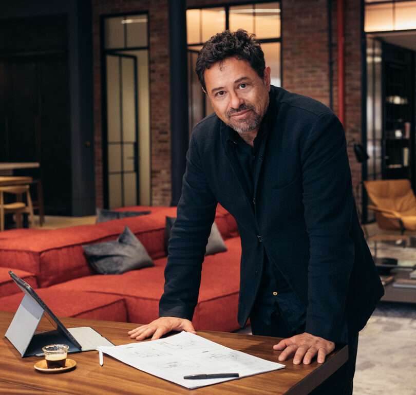
Eran Chen Photo: Ohad Kab
Recent projects include the renovation of the former Postkantoor in Rotterdam, an urban plan in Chicago, and the conversion of a defunct parking garage into a public park and class A office building in Buenos Aires. His writings on architecture have been published in Unboxing New York and in ODA: Office of Design and Architecture, which features notable projects from Eran’s portfolio and the firm’s range in architecture – from apartments to buildings to neighborhoods.
“No ideas should be cherished as works of art unless they are,” he said. “That’s how our process unfolds at ODA: we start off with so many ideas, then we test and scrutinize them, without having an attachment until they form into the pieces of art they’re meant to be.”
Eran’s work has been widely published and recognized by the AIA, the Society of American Registered Architects, and others. In addition to guest lecturing globally, he’s also an Adjunct Professor at both Columbia University and New York University.
This week, Eran Chen is joining us for Friday Five!
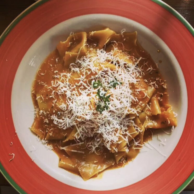
Photo courtesy Pepolino
It’s an authentic, family-owned and run Italian restaurant that’s my go-to in my neighborhood. I love it when the family speaks Italian in the restaurant. The food is simple, so the quality really shines through. It’s off the beaten path and a hidden gem, since most of the restaurant is on the second level.
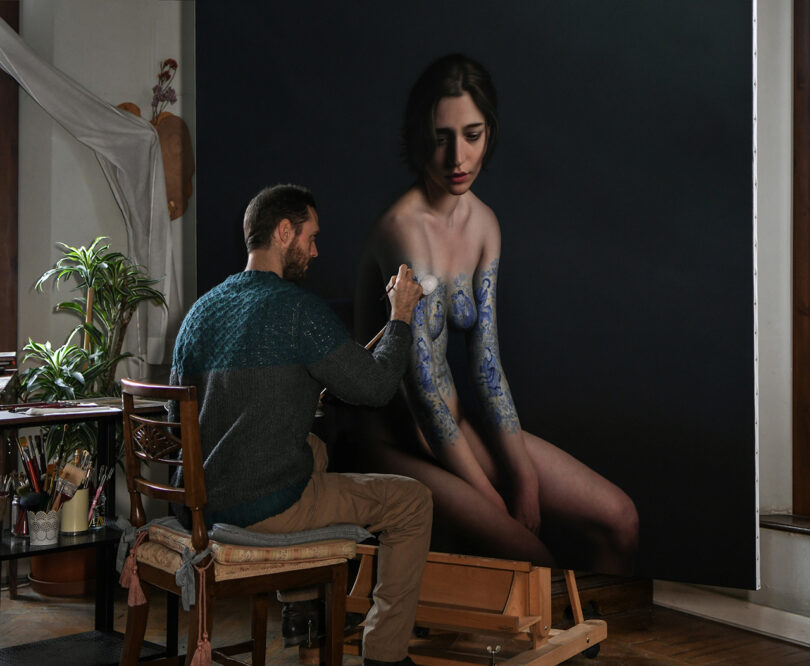
Photo: Marco Grassi
Marco is a young artist from Italy, who creates hyper-realistic oil paintings. I have several of them in my loft. His work reminds me of the old Dutch masters, every work is a masterpiece. Each of his paintings takes up to four years to complete – and it’s worth the wait.
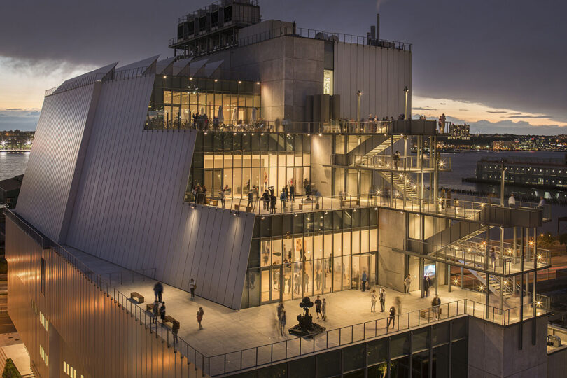
Photo: Nic Lehoux
The Whitney Museum on the High Line in New York is my favorite museum – and one of my favorite urban experiences. Renzo Piano’s design feels like a natural extension of the High Line, combining views of the city, the Hudson River, and of course, the art. I love how you make your way down the museum through outdoor terraces, it’s truly a perfect integration of the urban environment.
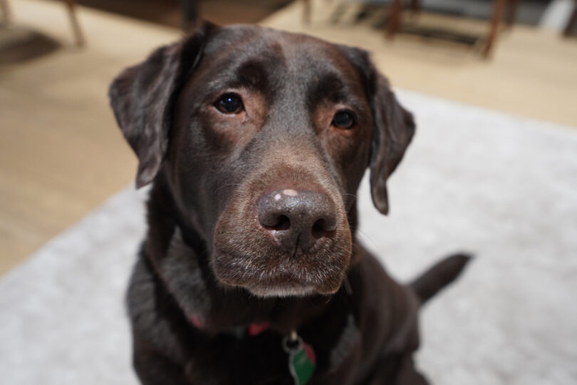
Photo: Eran Chen
4. My Brown Lab, Boo
My fourth child, not in importance but in age. He’s the only one in my house who doesn’t criticize me or ask me for anything… except food.
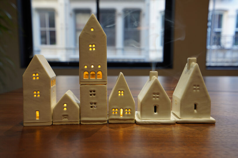
Photo: Eran Chen
5. Small Ceramic Homes
I have these 6 tiny white ceramic homes that were made by a craftsman in Tbilisi, Georgia. They each have either a small light inside or a chimney made to hold incense, so that at night they emanate a small glow.
Work by Eran Chen + ODA:
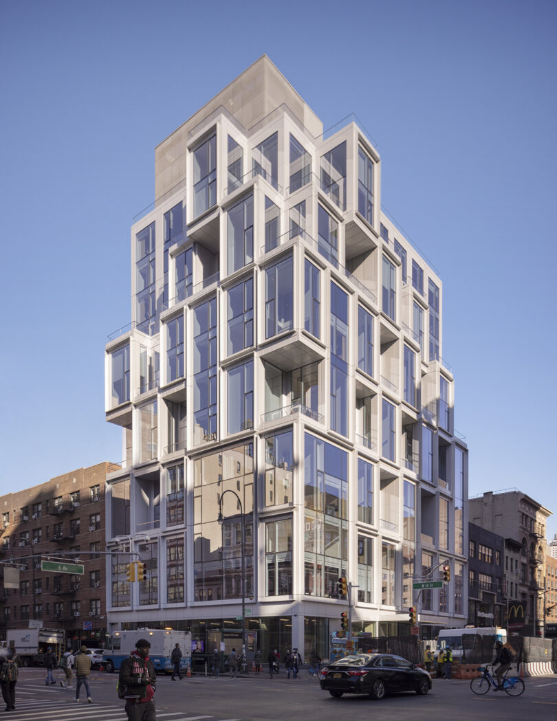
101 West 14th Street Located at the nexus of Greenwich Village, West Village, Union Square, and Chelsea, 101 West 14th Street is a boutique residential building designed by ODA Architecture and developed by Gemini Rosemont Development. Recently completed, the 13-story condominium features 10,000 square feet of amenities and 44 one-to-four-bedroom residences with interior design by Whitehall Interiors. 101 West 14th Street is modern yet contextual, with a glass box façade and fractal geometry that creates a sense of lightness, airiness, and depth. The building’s geometric façade, which has become a signature element across ODA’s architectural portfolio, grounds the bustling corner and provides breathing room for the passersby. Similar to what’s found in nature, pattern repetition has a natural soothing effect on our brains. Photo: Scott Frances
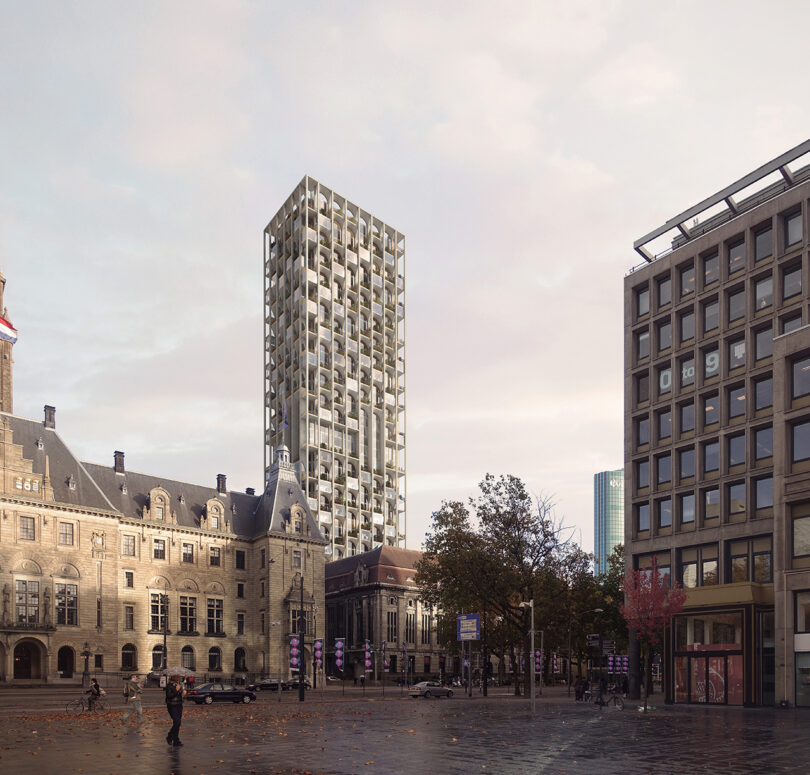
POST Rotterdam Located in Rotterdam’s city center, this historically important building stands as a testament to its inextinguishable spirit. Built in 1916, it was one of the only original structures still standing after the Rotterdam Blitz, the aerial bombardment that in 1940 leveled nearly all of the city’s historic core. Restoring, designing, and engineering the conversion of such valuable heritage requires the utmost reverence for the remarkable history of the building, but also the vision and ambition to deliver a civic hub worthy of its central setting. ODA’s design features a new 150-meter tower rising towards the rear of the Postkantoor and straddling the existing open courtyard at the Rodezand wing. The vaulted plinth of the tower will greatly enhance the experience of the courtyard, coupling it with the Great Hall of the Postkantoor. Designed with nonpareil windows, the POST tower shows openings that vary in size and shape to funnel daylight. This variety sets a break from the series of glass-facade towers along the new Rotterdam skyline and celebrates the elegance of the main hall along its profile. Photo: Forbes Massie Studio
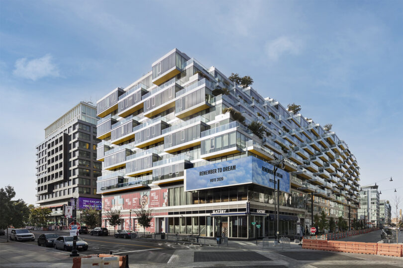
West Half West Half houses 465 apartments – nearly 1000 people – in a single square block. The internal circulation of the building, the curated multi-level amenities, access to outdoor space, and the cascading nature of the facade which creates a connection at the street level give the building a transparent, approachable feel, while the bright yellow underbelly of the facade is a subliminal layer of color theory 101: Happiness. ODA’s three-pronged approach of integrating architecture, interior design, and landscape design gives West Half a thorough narrative: from the three-dimensional patterns of the lobby interiors that mimic the facade to the amenities that punctuate the building with pockets of life, to the extensive terrace landscaping with first-of-its-kind built-in planters that grow and change with the seasons. Photo: Scott Frances
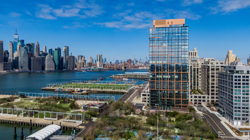
Quay Tower Quay Tower and The Landing’s design concepts stem from the history of the neighborhood, merging its past as a hub of manufacturing to a now transformed, prime residential area. The façades of this affordable housing complex represent the industrial past by the use of Brooklyn’s characteristic materials, and the residential present through the insertion of outdoor spaces to the overall volume. The juxtaposition of traditional materials and residential volumes signifies the historical transition of this Brooklyn area. The floor-to-ceiling windows are a design feature commonly utilized in modern architecture to establish a strong connection between indoor and outdoor spaces. In the context of Quay Tower’s building facade facing a waterfront area and views of Brooklyn Bridge Park, these windows play a pivotal role in enhancing the residents’ experience and engagement with the natural surroundings. Photo courtesy Quay Tower
This post contains affiliate links, so if you make a purchase from an affiliate link, we earn a commission. Thanks for supporting Design Milk!


