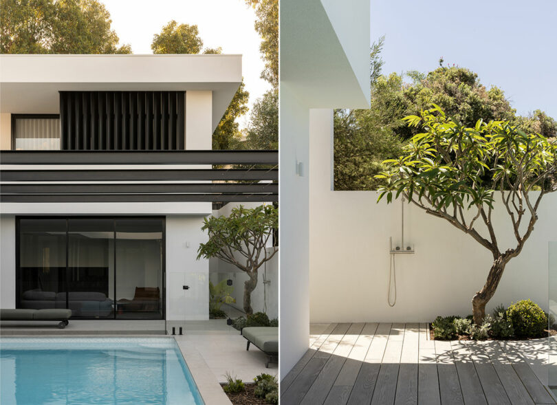
Like apparel, contemporary architecture and interiors have a tendency to be as fickle as fashion with trends exiting the zeitgeist as quickly as they entered. And while no physical structure can suspend the implications of time, it can exude an enduring distinctive style. The Vulcan House, located in a suburb of Perth, Western Australia, is exemplary of this sensibility exercising a design that is anticipatory of its inhabitants’ potential for growth and maturing tastes. The residence is occupied by a young family of four, discerning clients who orchestrated a creative collaborative comprising interior designer Nickolas Gurtler, architect Dorian Morelli, landscape architect Tristan Peirce, and Formview Building. An evolving scope conspired with pandemic restrictions and relentless supply chain issues throughout the six year construction odyssey wherein this forever home was forged.
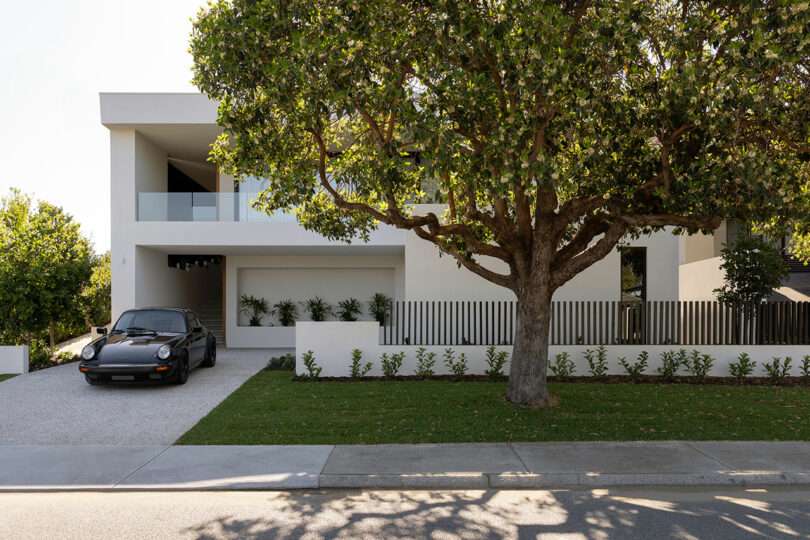
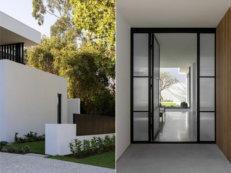
Behind the unassuming facade and beyond the reeded glass threshold lies a punch list of prerequisites for timelessness, from space planning to carefully curated decor. Gurtler and Morelli begin with programming configured to gently delineate between public and private divisions – parsed into communal, boudoir, and basement levels – while providing unadulterated vistas throughout. Whether it be clear sightlines out over the forest canopy to Perth’s cityscape or down a volumetric hallway to artwork on an accent wall, there’s potential for discovery in perpetuity.
“The communal spaces are placed towards the front of the home to maximize the views whilst the children’s wing sits further back down a long corridor. This approach creates a very natural way in which occupants and their guests interact with the home,” says Gurtler. “The basement level is more secluded, the ‘wine room’ accessed by a concrete staircase is designed for guests to be led down rather than explore naturally.”
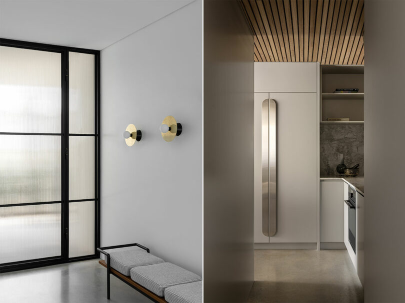
The visual narrative is established upon entry where those rules of engagement apply to materiality as well. Guests are greeted by burnished concrete floors that spill throughout the first and ground floors paving the way for a series of artful installations and custom lighting in brushed nickel, polished brass, and raw bronze finishes articulated against textured walls. The foyer introduces visitors to lighting by Atelier Areti adorned from above a 1950’s designed bench seat by Gastone Rinaldi for Poltrona Frau.
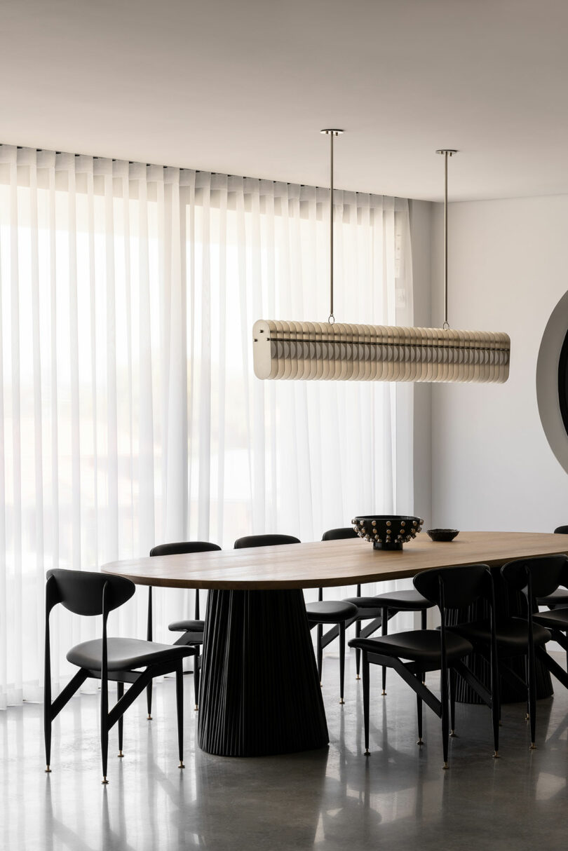
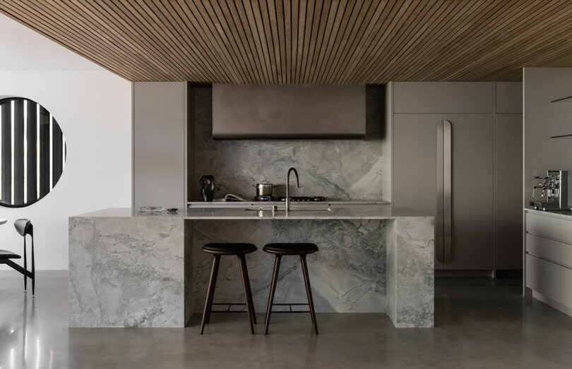
Pressing forward the space opens up to a nearly-fully glazed dining and living area made even more dynamic by the tension between the monolithic kitchen situated across from a chic parlor. A teak battened timber ceiling extends over stainless steel appliances, French gray cabinets with custom curved door handles, and dolomite countertops from the Bahia quarry in Brazil – all begging to be of service to the making of a fine meal.
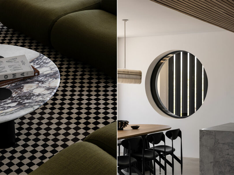
A puncture in the wall adjacent to the kitchen creates an oculus offering a literal look at the exterior while pulling the steel structure in and onto the interior architecture’s material palette. In line with that geometry is a brushed nickel pendant light by Lost Profile Studio suspended above the gathered bronze and oak custom dining table by Jack Flanagan.
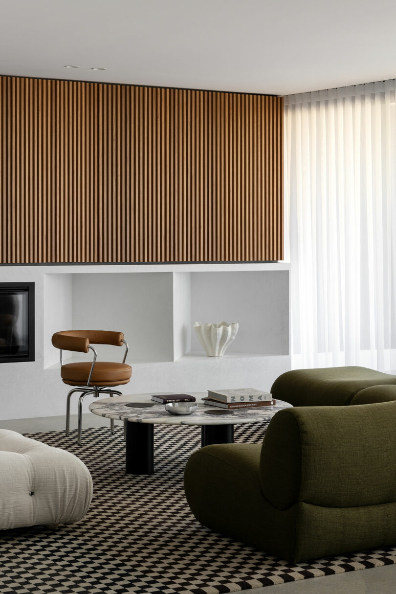
Across from the round window are rectilinear geometries built into the wall and finished in a white venetian plaster, which are accented by teak latticework concealing the entertainment system. Other touches include a bronze sconce by LA-based Apparatus and a rug created by Reuber Henning unfurled beneath furnishings by Charlotte Perriand and Mario Bellini. Of note is the curvaceous, military green, modular wool sofa by Australian maker Jardan meant to accommodate flexible configurations for generations of entertaining whether that be formal occasion or casual use.
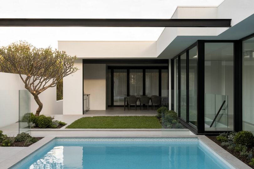
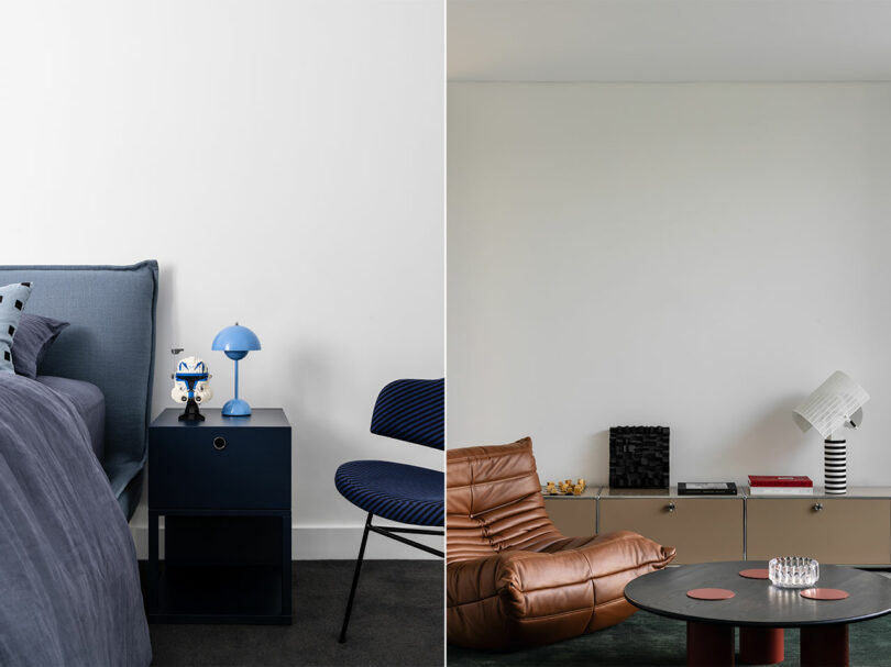
Opposite the main living area is a playroom of sorts, which opens to the pool area for an adaptable space that won’t be outgrown. A plush rug from B-Corp Armadillo acts as a soft crash pad for comfortable and practical furniture like the leather Togo chair by Michel Ducaroy for Ligne Roset.
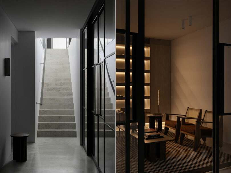
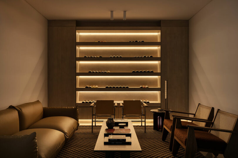
Accessed by a burnished concrete staircase, the wine cellar-turned-lounge and mudroom make for a moodier atmosphere. The palette of tans, browns, and merlot awash in warm backlighting allows for rich expression of the soft leather sofa designed by Mario Marenco opposite a pair of walnut chairs by Australian architect Daniel Boddam and side table by Jaime Hayon, all staged to encourage conversation over a rug by Reuber Henning.
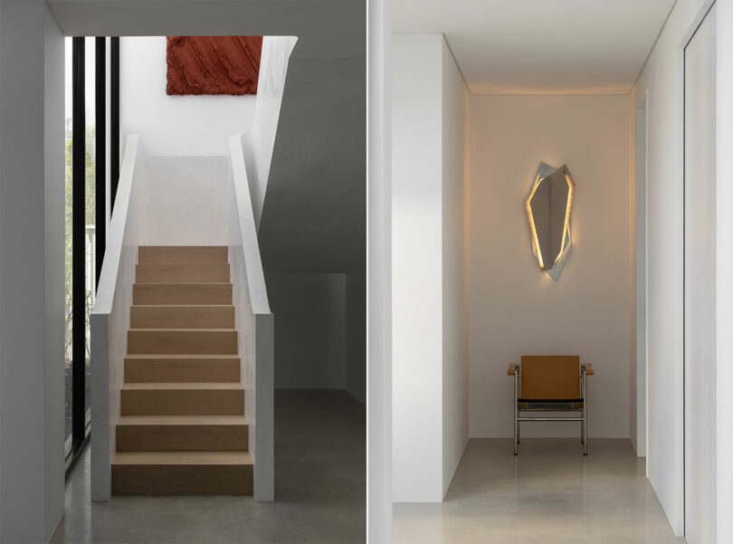
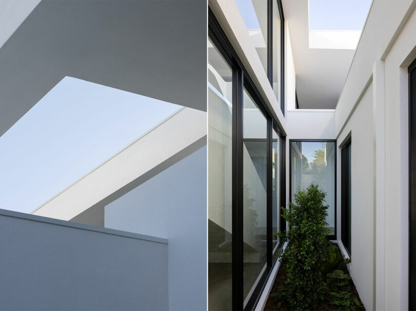
Generous glazing accompanies circulation through the rest of the residence overlooking outdoor elements and offering a chance for quiet contemplation when happening upon lighting-cum-sculpture like the brushed chrome sconce by Lost Profile Studio.
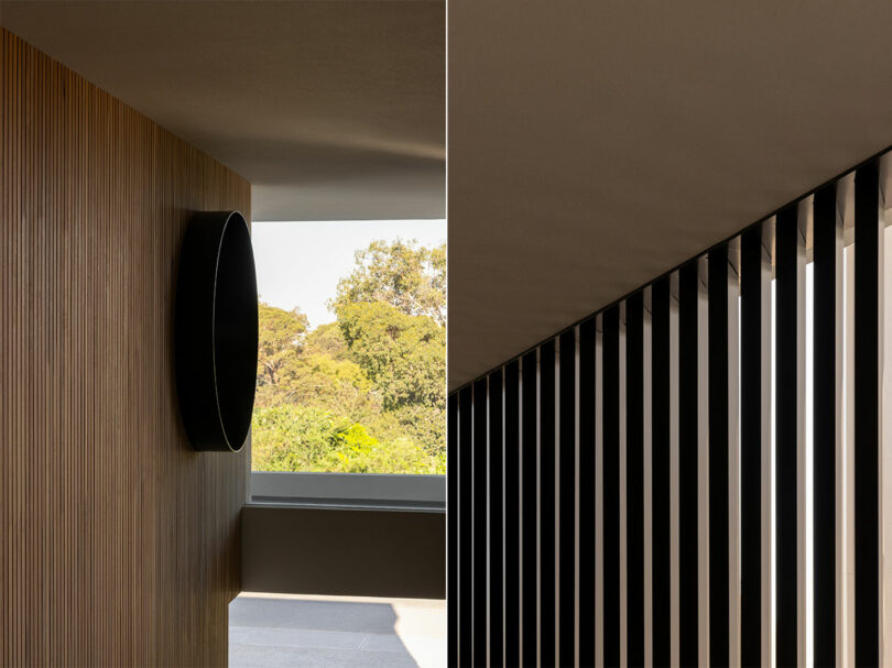
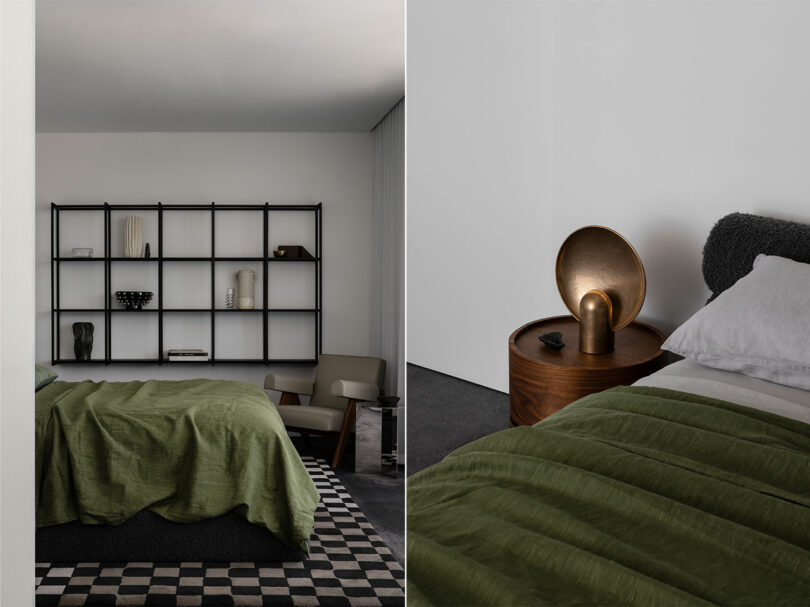
The wing of children’s bedrooms and bathroom are positioned along a wide hall and are donned in additional fixtures by Lost Profile Studio, Jurassic marble, and additional geometric references. The guest bathroom and powder room also pull from a similar material repertoire while introducing aged iron fixtures and chromed glass lighting by Rich Brilliant Willing.
A second stair ascending to the primary bedroom and en suite celebrates circulation with a hybrid spiral and conventional sculptural shape accented by a wall sculpture in a deep oxblood color by Sydney-based artist Henryk and a trio of wall sconces in an amalgam of raw bronze and opal glass by New York artisan Allied Maker. Part private retreat, part showcase, the space is outfitted with shelving to showcase a vibrant collection of ceramics, glass, and sculpture with plenty or room to grow. Cassina chairs, a charcoal wool upholstered bed by Daniel Boddam, and bronze table lamp by Henry Wilson lend a restorative feel.
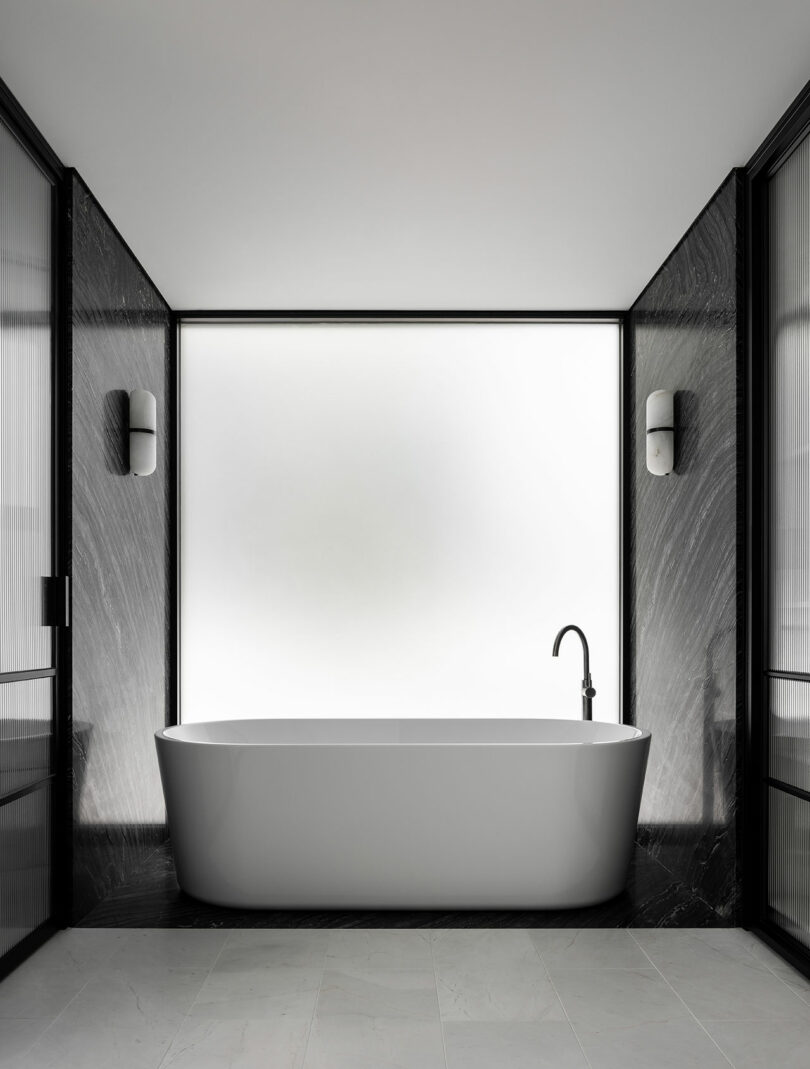
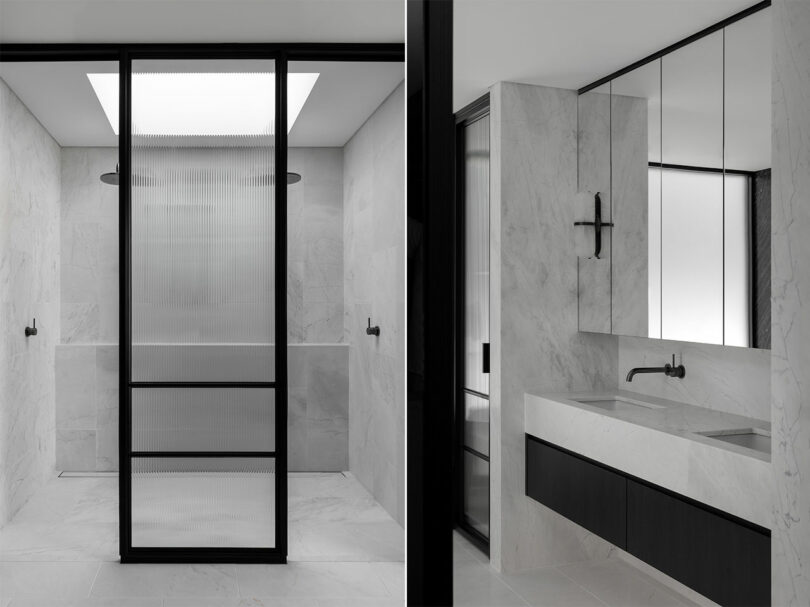
The primary bath is an equal display of precious material with liberal use of Elba marble, fluted glass, and black steel trim. The “glamdrobe” is outfitted with accent and task lighting that makes an evolving identity a delight to dress.
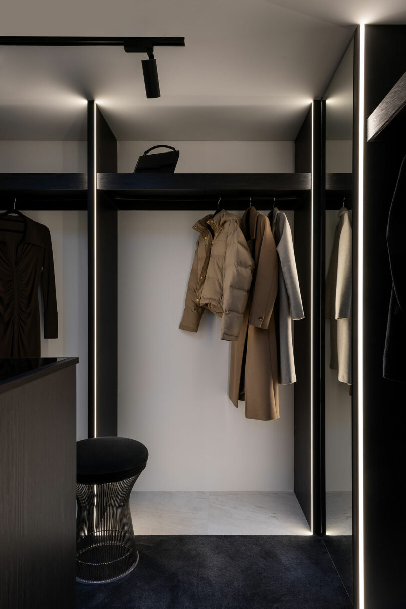
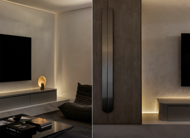
It is this sort of dialogue between disciplines that promises longevity. “Each object was selected based on its visual appeal, style, durability, and staying power,” says Gurtier. “We commissioned a lot of the pieces specifically with local makers, which allowed us to implement items that were appropriate in scale and finish to our vision. The selections speak to the modernist architecture,” he adds. “There’s a certain ‘relaxed’ feel to many of the artifacts, we wanted to choose items that both softened the clean lines of the architecture, but were also tactile, voluptuous, and comfy.”
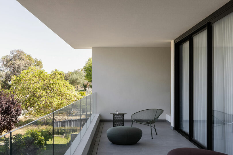
Photography by Timothy Kaye.
This post contains affiliate links, so if you make a purchase from an affiliate link, we earn a commission. Thanks for supporting Design Milk!

