US architecture studio GBBN designed three brick buildings that allow social housing to both “fit in and stand out” in Cincinnati, Ohio.
Located in the Over-the-Rhine neighbourhood, Wilkommen includes three separate infill projects that GBBN, an international studio with an office in Cincinnati, designed with Cincinnati Center City Development (3CDC) and Model Group as part of a 12-building effort to increase mixed-use housing in the city’s urban core – the largest addition of affordable housing in the area in decades.
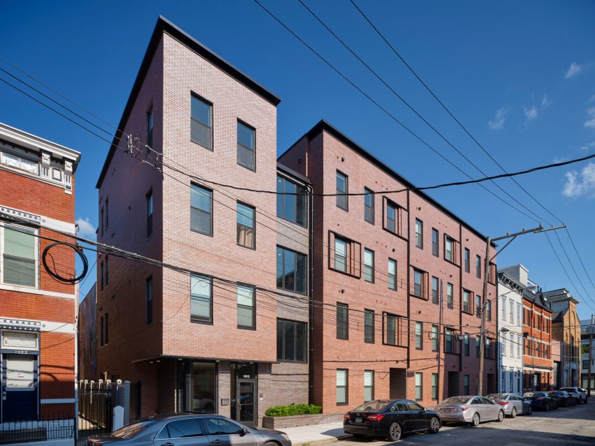

Completed in 2022, the three buildings – on Vine, Republic, and Pleasant Streets – total 73,000 square feet (6,800 square metres) and include mixed-income residential housing and retail space.
Constructed on former surface lots, the buildings work to repair holes in the historic fabric that “were created by years of demolition, economic disinvestment, and subsequent gentrification and displacement”.

“Delivering design equity to a lower- and middle-income population that is often excluded from the dignity, functionality, and delight of good design, Willkommen is committed to the principle that affordable housing can enhance the historic fabric of a city while affirming the value of its residents,” the GBBN team told Dezeen.
The team selected red brick for all of the facades to draw on Cincinnati’s masonry vernacular and to highlight both the commonalities and differences between the structures.

The team tried to maximize the allowable envelope for each building – working within the Ohio Housing Finance Agency (OHFA) design guidelines that regulate square footage and unit requirements – and then folded the facade in or out in order to make its particular location feel safer, functional, and more connected to the urban environment.
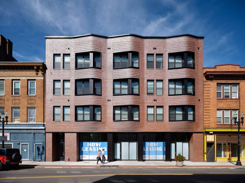
The 5,770-square foot (535-square metre) building on Vine Street “features an undulating brick wall that floats above a glass storefront.”

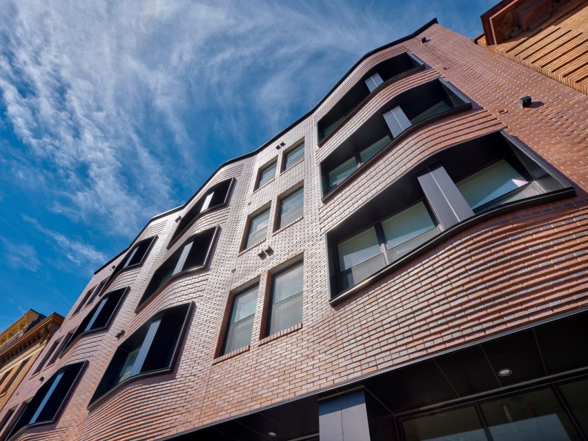
The ground-level approach magnifies and expands the street’s commercial activity while the upper three bays ripple out of the facade providing privacy, light, and views to the residents.
Created with parametric design and augmented reality tools, the undulating facade is a modern take on the neighbourhood’s historic oriels and combines technology with the region’s historic reliance on masonry craftsmanship.

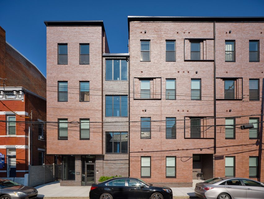
Located a block to the west and measuring 7,600 square feet (700 square metre), the building on Republic is nestled between smaller neighbours and has a flat facade with stepped-in windows and a recessed stairwell to create relief and detail.
It “seeks to bring ‘eyes to the street,'” the team said. “The light from its lobby and stairs, and its stoops, encourage residents to connect with their neighbours while they keep watch over their community.”

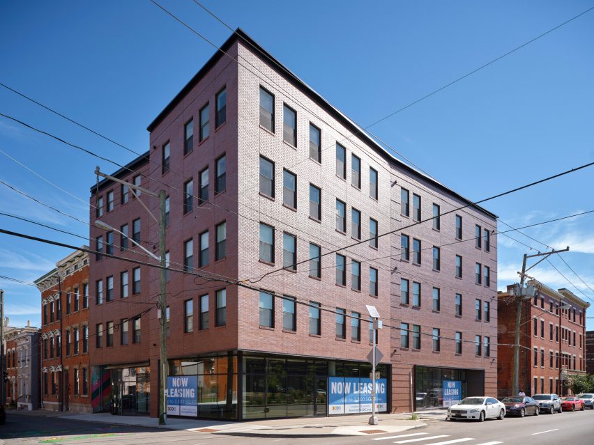
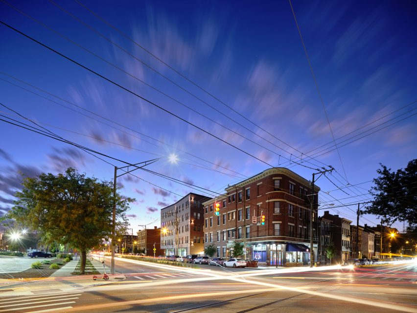
Located a few blocks away and across a significant arterial street is the 5,950-square foot (550-square metre) building on the corner of Pleasant Street. Its facades bend in the center pulling the corner away from the building’s mass.
“Fronted with oversized sidewalks, its elegantly-creased brick bulk rises above glass storefronts, inviting commercial activity across Liberty Street,” the studio said. “Depending on the unit, tenants enjoy views of the city skyline, civic events, the mural, or the rolling hills beyond the downtown basin.”

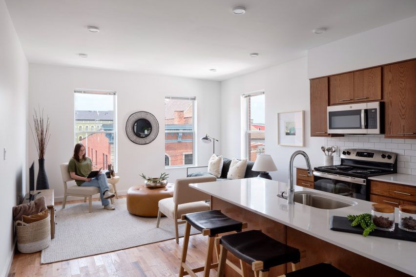
The buildings’ interior palettes are simple with light walls, warm wooden floors, cabinetry, soft details like wooden apartment numbers, and coloured entry doors for each unit.
“Within each site, [Wilkommen] develops a hyper-local approach and holistically advances healthy, equitable density,” the team explained, noting the project’s connections to services, multiple modes of public transit, and urban amenities like parks, swimming pools, food sources, and community organizations.

In working to close Cincinnati’s affordable housing gap – roughly 20,000-30,000 more units – GBBN said it recognizes the need for cross-discipline advocacy, policy changes, and financing structure navigation.
“It means that, as architects, we have to do more to help our clients identify and take advantage of funding sources that they may not have known about – and that’s something we’ve been doing more of since our work on Wilkommen.”
The studio recently expanded a 19th century brick house in Pennsylvania into an education facility with a glass bridge connection and metal-clad, barn-like structure.
The photography is by Ryan Kurtz.
Project credits:
Civil engineer: Bayer Becker
Structural engineer: Schaefer
MEP engineer: Engineered Building Systems
LEED consultant: Sol Design + Consulting
Contractor: Model Construction
Client: Cincinnati Center City Development (3CDC) & Model Group
