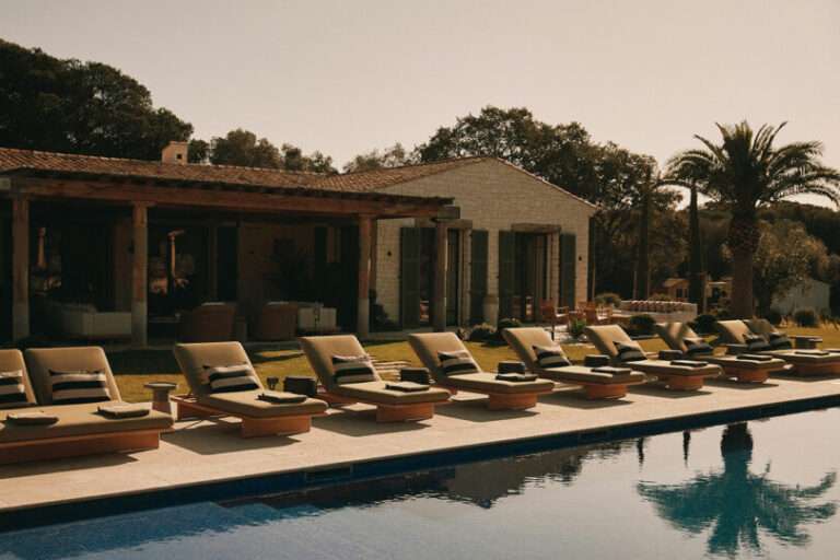
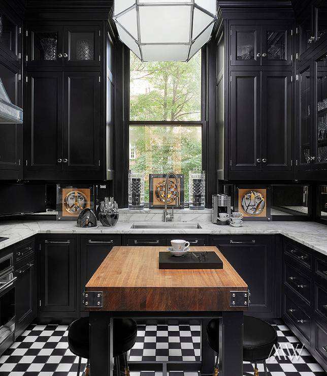
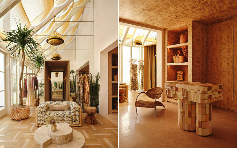
A symphony of rich textures play while gossamers dance in the sunlight of Ulla Johnson’s Los Angeles, California, flagship store designed by Kelly Wearstler whose repertoire of collaborations with furniture makers, craftsmen, and artisans give the space its local gusto.
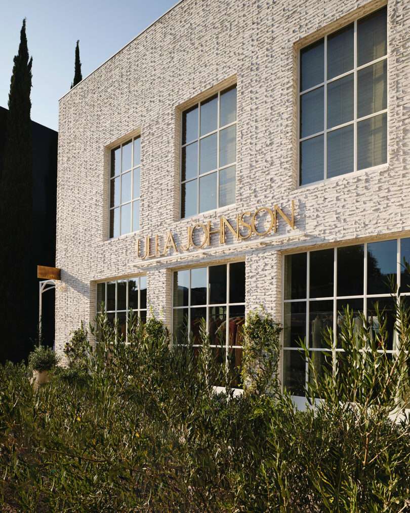
Ulla Johnson flagship facade with a weeping mortar brick finish
The immersive shopping experience begins upon arrival as visitors park in an oasis-like lot – designed in collaboration with landscape architect Miranda Brooks – and proceed through the structure’s side entrance. The facade’s weeping mortar brick finish is a simple prelude in contrast to the warm, duetting styles that resound throughout the expansive 3,000-square-foot urban building.
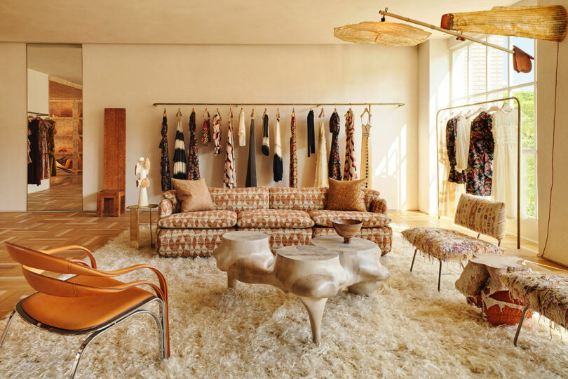
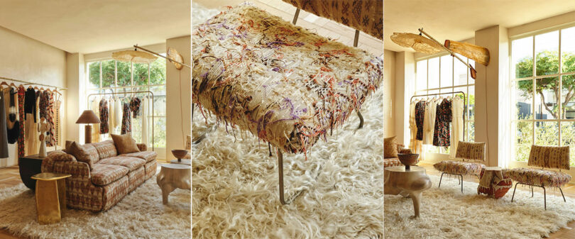
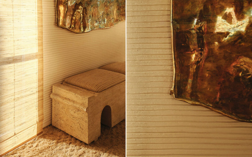
“Ulla’s collections are layered and colorful, so the design needs to embody these elements. The inherent femininity of her style presents a fascinating challenge in crafting an interior that can juxtapose those characteristics,” Wearstler says. “The goal is to ensure that Ulla’s fashion remains the focal point, with the space serving as a beautiful backdrop to showcase her pieces.” And so it is with an ensemble of European White Oak parquet flooring accented by Rosa Corallo stone inlay, polished plaster, and woven raffia fringe walls by CMO Paris that syncopate with the visual merchandising.
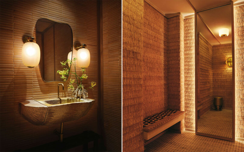
Image Left: Vintage sconces by Barovier & Toso; Custom wall tile by Bantam; Vintage Italian mirror circa 1950s; Custom sink by Jonathan Cross Image Right: Raffia Frange wallcovering by CMO Paris; Custom bench by contractor; Custom cushion by Kelly Wearstler; Vintage African runner sourced from Jamal’s Rugs; Afrital Stool by Christian Astuguevieille; Ceiling lighting: Vintage flush mounts by Lisa Johansson-Pape
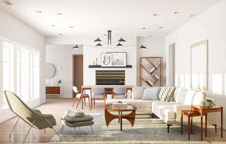
Earth echoes through the entry into an airy, two-story solarium flanking the rear and reaches the most intimate of programming – quite literally – anchored by a 16-foot indoor Brachychiton tree. The casual public realm on the ground floor is reflected in the decor of two spaces joined by a passageway, which conceals service components and change rooms, that feel plucked from a personal estate more so than staged to be points of sale.
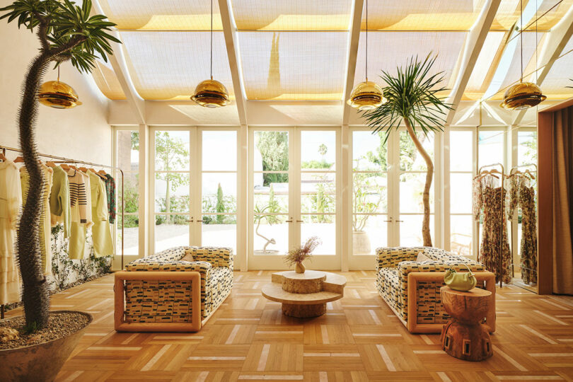
Vintage Nictea ceiling pendants by Afra and Tobia Scarpa; Bisque Terracotta Planter by Taliny Chhung; Vintage Cornaro 140 Armchair by Carlo Scarpa; Vintage coffee table circa Belgium 1970; Side table by Hiroyuki Nishimura
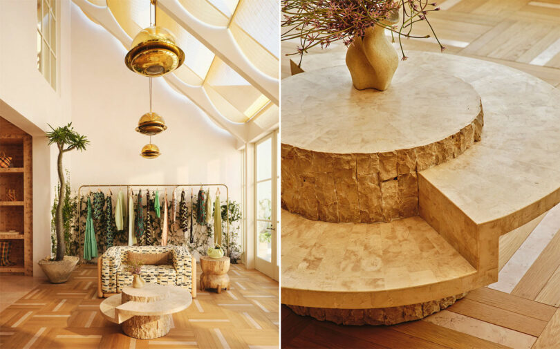
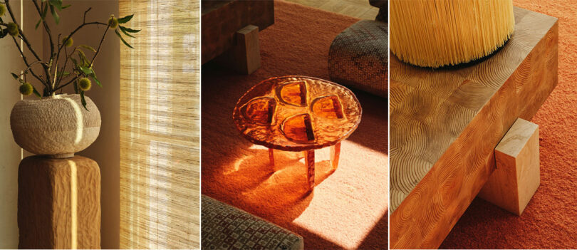
Generous skylights allow every textural element from furniture to fabrics to be sun-kissed while customers lose themselves in conversation encouraged by intentional seating. LA-based Ross Hansen’s sculptural resin table and California artisan Vincent Pocsik’s table anchor microcosms for socialization.
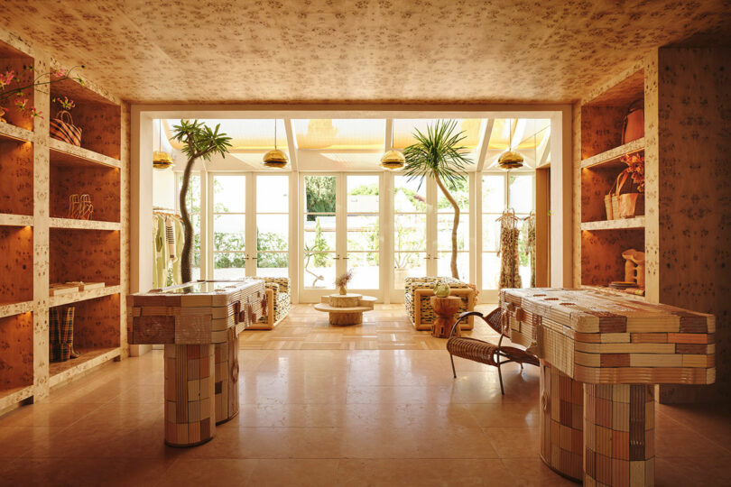
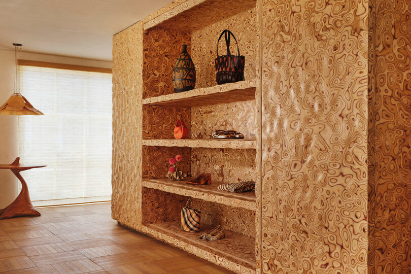
“Burl Wood Room” featuring consoles by Jeff Martin; Vintage planters by Willy Guhl
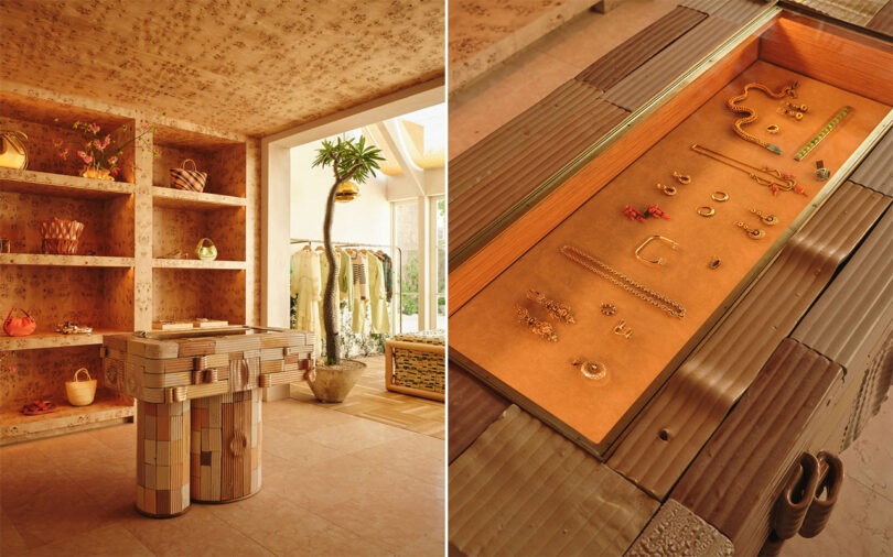
Jewelry from collaboration Ulla Johnson x Kentshire collaboration
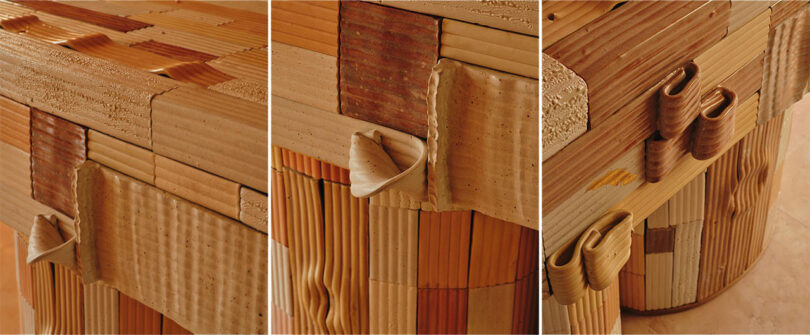
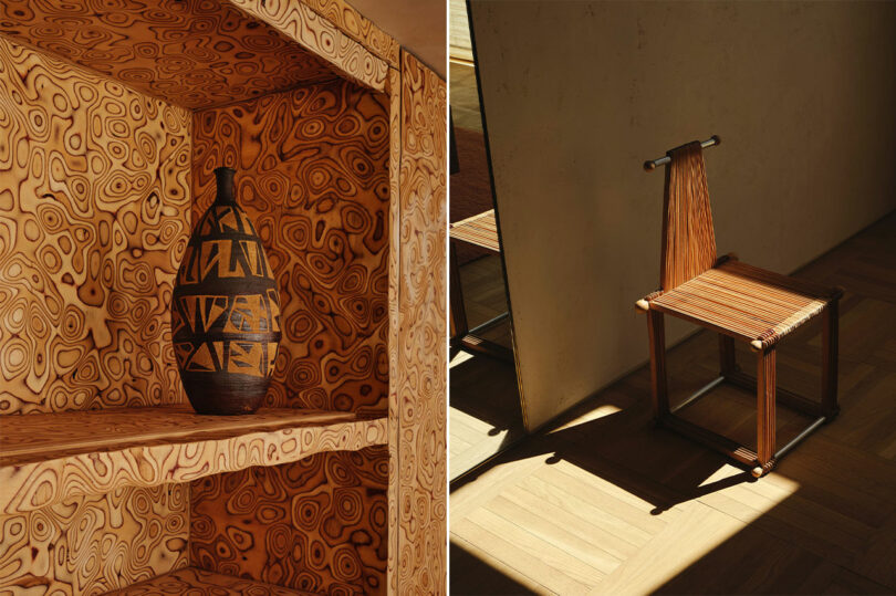
Adjacent to the solarium is a lavish display for accessories and objets coined the “burl wood room.” It reads more like the interior of a jewelry box than a simple showcase and mimics a Wrightian technique of compressing space, which accentuates this whirling textured enclosure, before releasing patrons back into breathier rooms. The shift adds to the impact of revisiting a double-height volume. Canadian artist Jeff Martin’s eccentric jigsaw tables add to the effect.
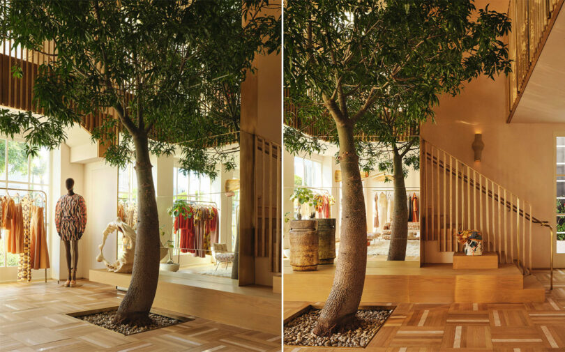
Oak and stone flooring by FAME; Vase right “Growing Pains” by Dee Clements; Vase left Normany Deco Urn by Chris Brock, on loan from JF Chen; Wall Sconce by Olivia Bossy
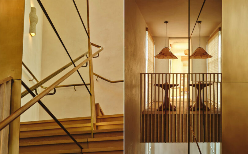
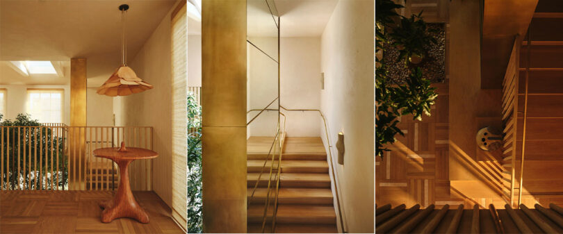
Behind the flora and opposite the accessories is a mirrored staircase that ascends to an area exclusive in access, which hosts a generous VIP fitting room and can accommodate press events or the discretion required for particular clientele.
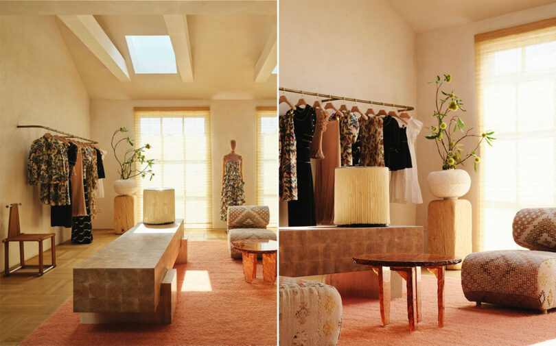
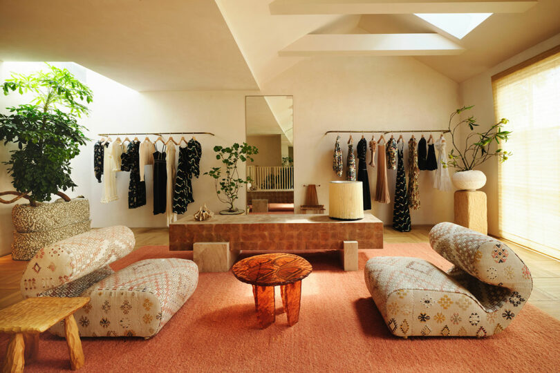
Custom console/bench by Kelly Wearstler; Vintage lamp by Gianfranco Frattini for Arteluce; Vintage wood chair circa 1980s; Corner plant stand by Brittany Mojo; Vintage lounge chair by Joe Colombo, upholstered in vintage textiles; Custom Floret table by Ross Hansen
Wearstler’s staging throughout is masterful. Every interior vignette is as anthropological as it is the practice of interior design. Retail items are positioned in staccato between a mixture of both vintage goods and locally sourced contemporary designs. Three sconces crafted by Olivia Bossy hang in the main atrium while a handmade ceramic sconce by French artist Olivia Cognet stuns in the VIP fitting room not far off from a Moisart chair by French artist Christian Astuguevieille. Noteworthy still is a pair of Carlo Scarpa 1970s Cornaro wood-framed armchairs, Ingo Maurer’s fan-like Uchiwa wall lights, and a high-backed carved wood hall chair by Urano Palma.
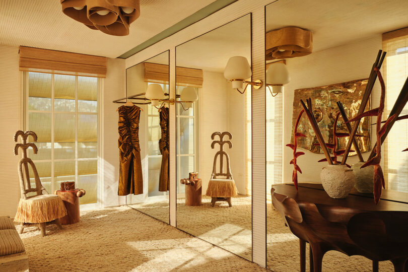
Moissart Chair by Christian Astuguevieille; Jabin Totem side table by Daniel Orozco; Vintage wall sconce by Gunna Asplund; Custom plaster wall covering by Studio 1 Plaster
The project marks a significant milestone for the renowned interior designer. “It was our first exterior architecture project. The building hadn’t been updated in decades, so we needed to revive the architecture first and foremost,” Wearstler says. “We embraced tons of natural light and found opportunities to bring the outside in. The Brachychiton grounding the center of the boutique near the staircase couldn’t have existed prior to the renovation.”
Implications of the store’s location are twofold for the fashion designer. “We already have a connection with many of the makers, producers, and incredible denim dye houses here, and now our proximity allows us to harmoniously create custom and exclusive pieces for the store,” Johnson says. “I look forward to expanding what we can make in L.A for L.A.” But more importantly is its positioning with potential to serve as a hub in West Hollywood’s Design District. “Creating community and public space here felt very important, the local makers, and the women who have long been supporters of the brand,” Johnson continues. “This intention is aligned with some of the initiatives West Hollywood has undertaken, in so far as nurturing permeable soil and creating a rich pedestrian life.”
Photography by Adrian Gout.

