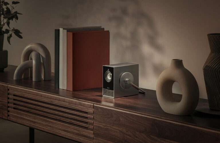
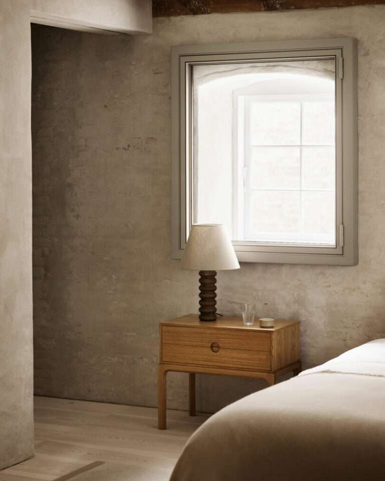
This stunning Paris home belongs to gallerist Amélie du Chalard, whose love of art and design has helped fill her space with treasures, new and old, from Fritz Hansen. After discovering the Danish brand, she fell in love with the designs of Poul Kjærholm, and over time, has collected a number of his pieces that now live in her gallery-like home, amongst other favorites.
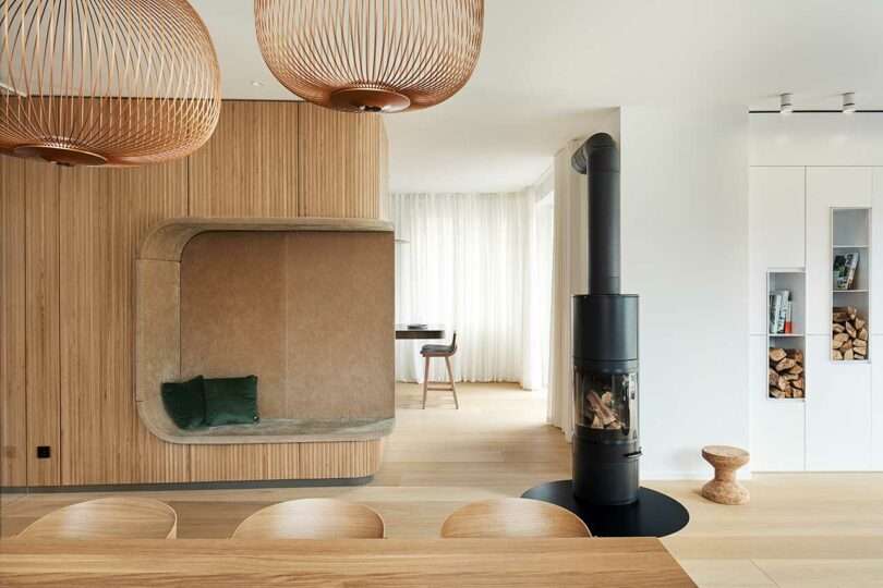
Photo: Philip Kottlorz Fotografie
Previously dated in appearance, Studio Alexander Fehre came in to transform the main level of an old villa in Stuttgart, Germany. After removing the most amount of walls possible, the results are a clean, minimalist home with mostly white surfaces. To give the space a more cozy feel, a curvy wood clad storage structure was incorporated into the center, along with pops of dark green teal.
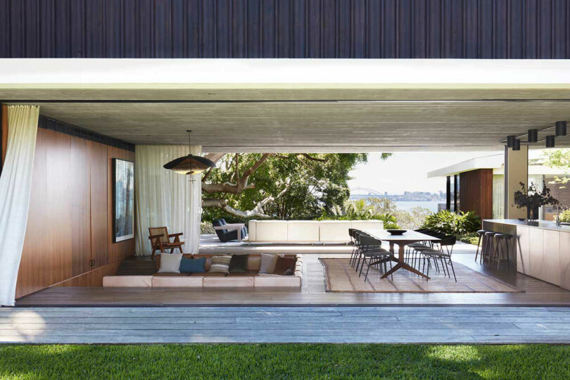
Photo: Prue Ruscoe, courtesy of BowerBird
Casa Figueira is a family home nestled in the tranquil suburb of Rose Bay in Sydney, Australia. Four design firms were at the helm of this design, which perfectly strikes a balance between a contemporary style and a mid-century Brazilian aesthetic. The desire to create an open-air living space, resulted in an open pavilion flanked by two long sides of sliding glass doors marking the perfect indoor/outdoor connection.
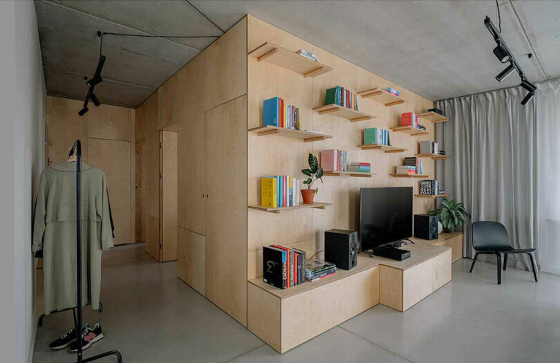
Designer Mateusz Jóźwiak, of Photon Studio, hired himself when it came time to design the Box in the Box Apartment for himself and partner in Poznań, Poland. The finished apartment showcases a perfect blend of spaciousness, functionality, and natural materials, all centered around a clever, light-colored birch plywood structure that houses many functions.
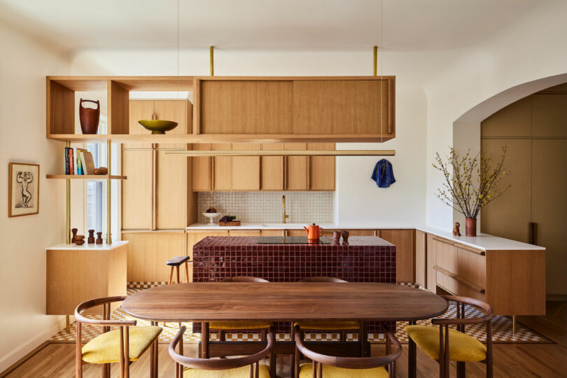
Photo: Nicole Franzen
Located in New York City, this East Village apartment underwent a renovation by GRT Architects, which focused on reimagining the apartment’s layout while maintaining its early 20th-century character. The redesigned interior features a new layout, organized by a central corridor and tailored to the clients’ lifestyle.
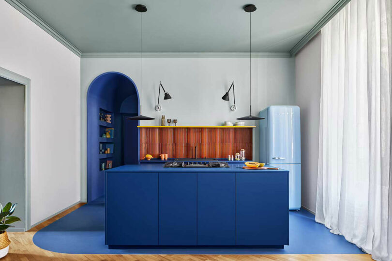
Photo: Riccardo Gasperoni
For this 90-square-meter apartment in Milan, chromastudio dramatically reimagined the interior with a new layout and a dramatic color palette. Setting the tone for the apartment’s aesthetic right off the bat is the vibrant kitchen with a royal blue island, paired with a light blue Smeg fridge, rusty orange colored tiles, and a bright yellow shelf.
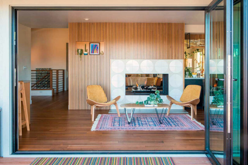
Destination Eichler partnered with Eyerly Architecture to reimagine this dated, 1970s split-level ranch in Pleasanton, California, and bring it into today’s times. The young owners appreciated the original 70s character, but they desired a fresh spin with added functionality seen in modern builds. Post renovation, the house now features modern details, mid-century furnishings, and a plethora of beautiful tile from Fireclay Tile.
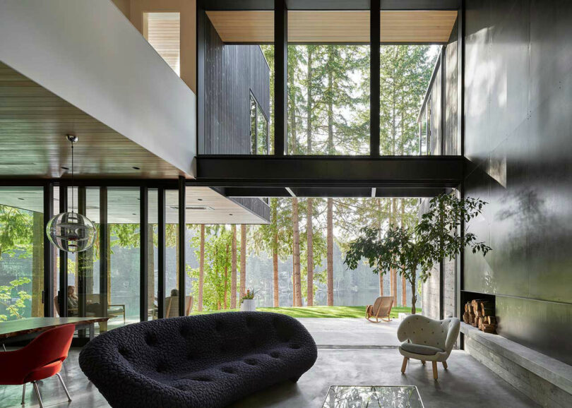
Photo: Kevin Scott
Outside of Redmond, Washington overlooking Ames Lake, the Scout Lake Residence lives on a site that was once a Boy Scout camp from the 1950s through the 1990s. Stephenson Design Collective designed the lakeside house and gave nod to the client’s job as the CCO of the video game Minecraft by using the game’s use of blocks for inspiration. Once you know that fact, it’s impossible to not see the stacked blocks that make up the tree-surrounded home.
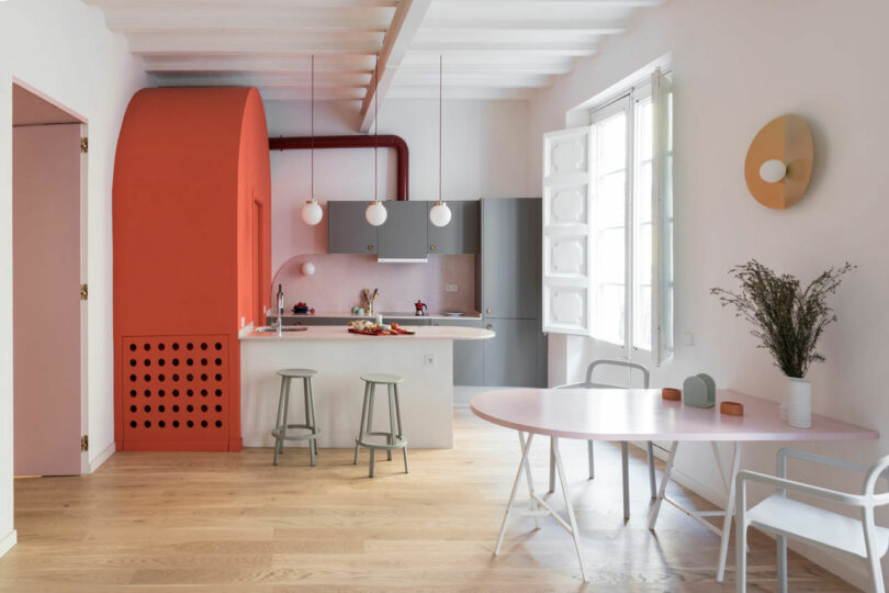
Photo: Roberto Ruiz
Located in one of Barcelona’s oldest neighborhoods, this 65-square-meter apartment is housed in a building that dates back to the 13th century. A young Italian woman hired Colombo and Serboli Architecture (CaSA) to completely transform it, which resulted in an open layout with vaulted ceilings, a playful color scheme, and original details. With the Barbie movie making a big splash earlier this year, the pink used throughout was on trend.
And the most popular interior design post of 2023 is…
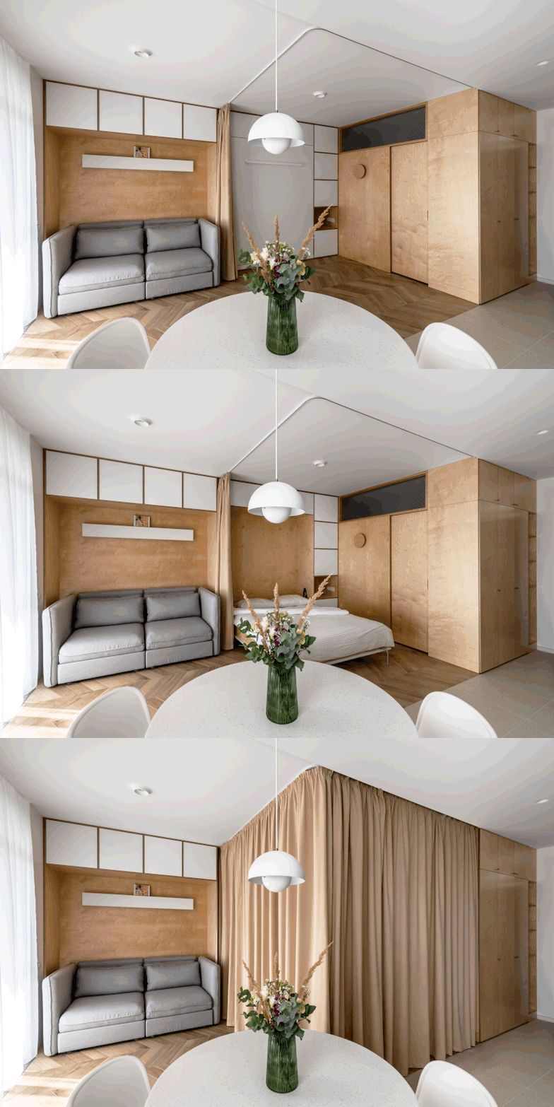
Photo: Nikolay Korsun
The most beloved interior of the year is this cozy 430-square-foot apartment in a new modern building in Rivne, Ukraine, designed by TAK office. The compact studio consists of a single room that operates as a kitchen, dining space, living room, and bedroom. To maximize space, the designers opted for a Murphy bed that’s hidden when not in use and when it’s time for sleep, the room transitions into a bedroom with a privacy curtain.
Check out the rest of Design Milk’s end of the year coverage here!
