As the leaves begin to change and the air becomes crisp, it’s time to consider incorporating fall-inspired color schemes into your home interior design. Fall colors can bring warmth and comfort to any space, creating a cozy and inviting atmosphere. Here are some tips to help you incorporate fall colors into your home design.

Classic Autumn Color Palette
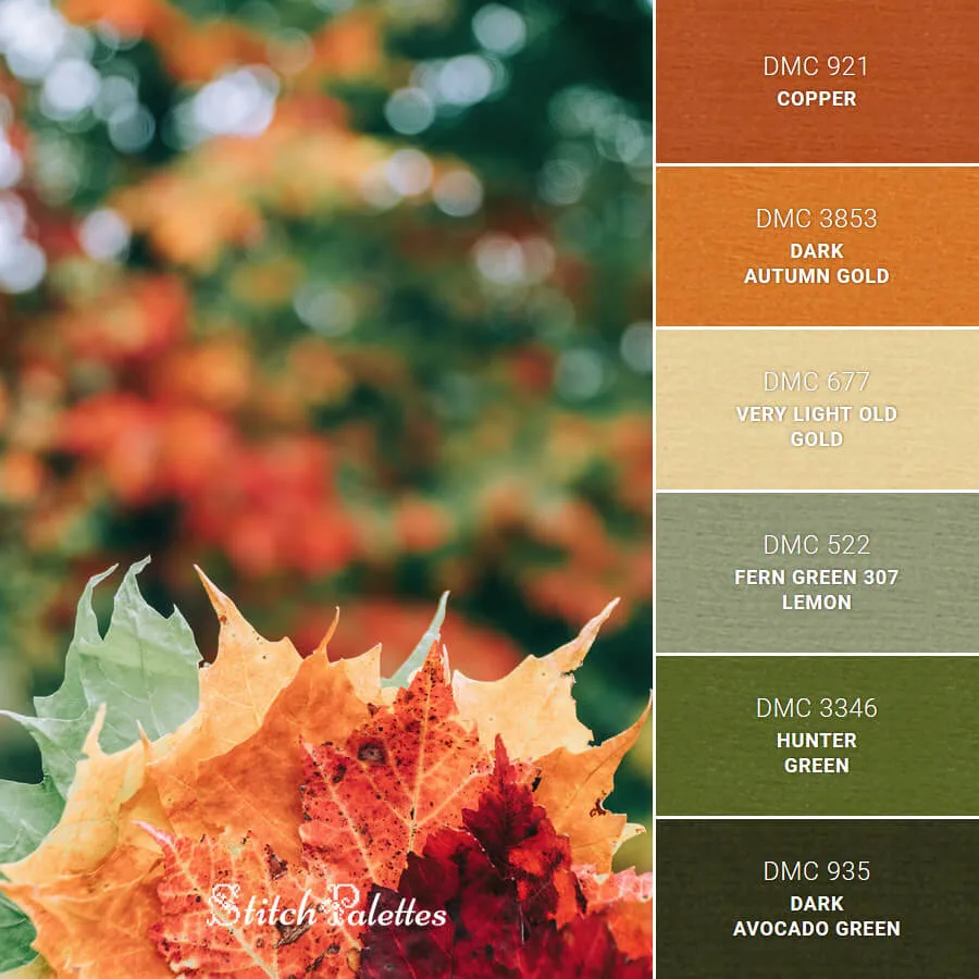
The classic autumn color palette is inspired by the colors of fall leaves. It includes warm, earthy tones like burnt orange, deep red, golden yellow, and rich brown. These colors are perfect for creating a cozy and inviting atmosphere in your home. Consider incorporating these colors into your home design:
- Deep reds: Think maroon, burgundy, and crimson. These colors can add a sense of elegance and sophistication to any room.
- Burnt oranges: These warm, cozy hues can create a welcoming and inviting atmosphere.
- Rich yellows: From mustard to goldenrod, yellow tones can add a pop of brightness and warmth to any space.
- Earthy browns: Chocolate, espresso, and other rich brown shades can create a sense of comfort and grounding in your space.
- Olive greens: These muted greens can add a sense of calm and relaxation to any room.

Incorporating Fall Colors
There are many ways to incorporate fall colors into your home design. Here are a few ideas to get you started:
- Paint: Consider painting an accent wall in a deep red or burnt orange shade to add warmth and depth to your space.
- Accessories: Swap out your summer accessories for autumn-inspired ones. Think throw pillows in fall colors, cozy blankets, and autumn-inspired artwork.
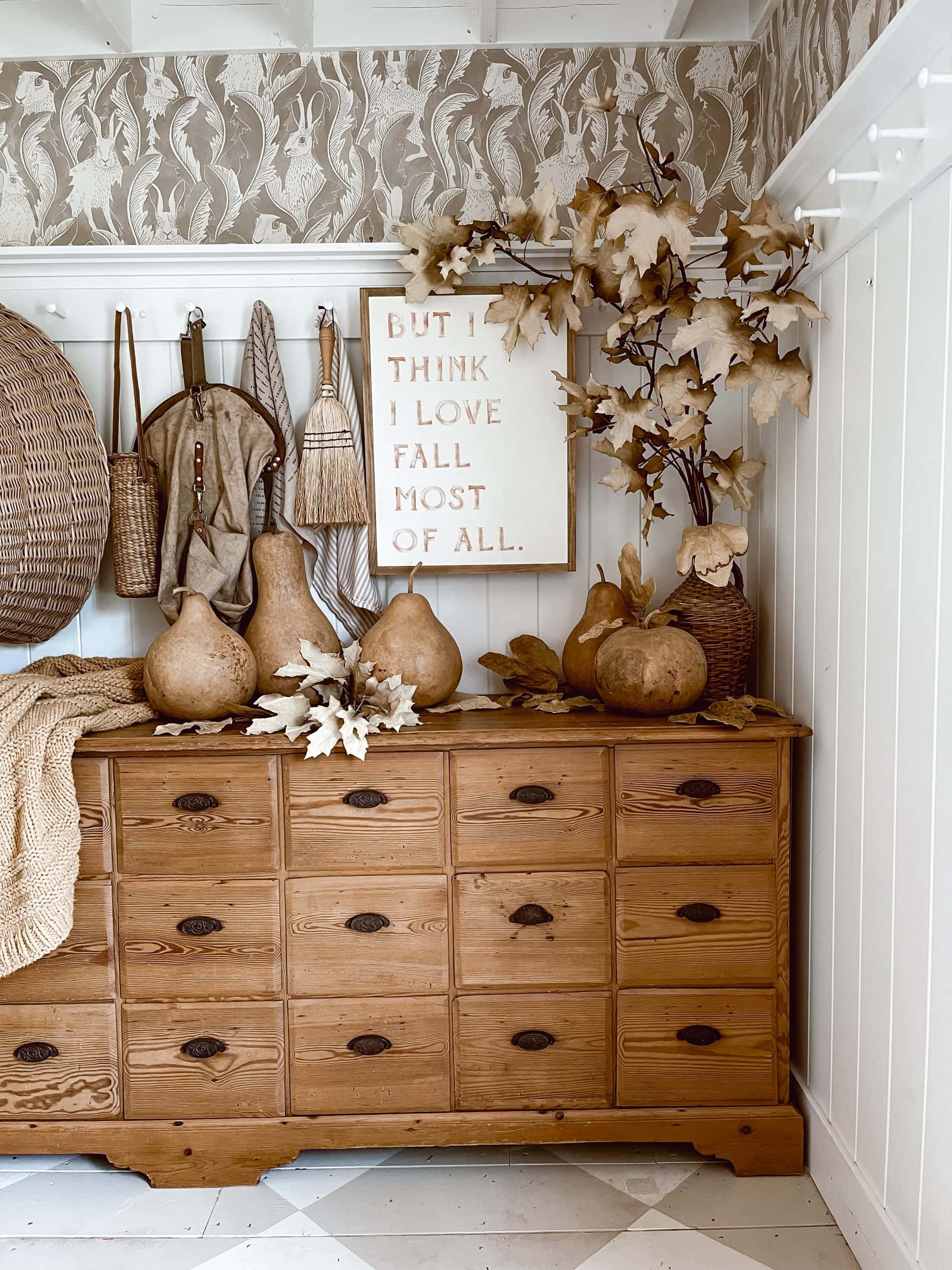
- Seasonal accents: Incorporate seasonal accents such as pumpkins, gourds, and fall foliage into your décor. These natural elements can add texture and warmth to your space.
- Textiles: Consider incorporating fall-inspired textiles such as plaid or knit fabrics into your décor. These fabrics can add a cozy, rustic feel to your space.

Tips for Mixing and Matching Colors
When it comes to mixing and matching colors, there are a few things to keep in mind. First, choose colors that complement each other. Colors that are opposite to each other on the color wheel, like blue and orange, create a striking contrast. Colors that are next to each other on the color wheel, like green and yellow, create a harmonious blend.

Second, don’t be afraid to mix patterns. Mixing patterns adds interest and texture to your space. When mixing patterns, choose patterns that have a similar color scheme. For example, if you have a plaid throw pillow in warm, earthy tones, pair it with a floral pillow in the same color scheme.

Finally, use neutrals to balance out bold colors. Neutrals like beige, gray, and white create a calming effect and allow bold colors to stand out. Use neutral accessories like curtains and rugs to balance out bold colors on your walls and furniture.

Mixing and matching colors can be intimidating, but with a few tips and tricks, you can create a cohesive and beautiful design. Here are some tips for mixing and matching fall colors:
- Stick to a color scheme: Choose a few fall colors and stick to them throughout your design. This will create a cohesive look.
- Use neutrals: Neutrals such as beige, gray, and white can help balance out bold fall colors.
- Use the 60-30-10 rule: When choosing colors for a room, aim to use 60% of one color, 30% of another, and 10% of an accent color.
- Consider contrast: Pairing light and dark colors together can create a sense of contrast and depth in your space.
Fall-inspired color schemes are a great way to create a cozy and inviting atmosphere in your home. Incorporating the classic autumn color palette into your home design is easy, with the use of warm, earthy tones for paint, autumn-inspired accessories, seasonal accents, and the use of neutrals to balance out bold colors. Remember to mix and match colors and patterns that complement each other for a harmonious blend.